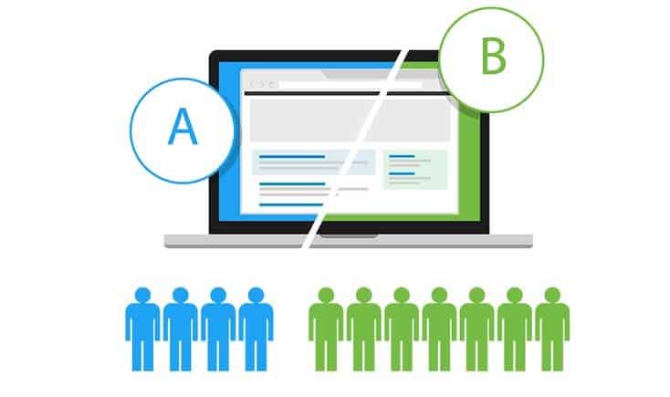
We are used to thinking of A/B split testing as a way to improve UX and increase conversions. But it’s actually a two-way road.
How you design your tests should be based on UX research – not on guesswork and intuition.
This will save you lots of money and time, making your tests more predictably efficient.
A quick reminder: what’s split testing?
If you’re not familiar with A/B split testing, here’s a very basic explanation. In each such test, you create two versions of a certain element on your site. It can mean two different colors for the CTA (Call-to-Action) button, the layout of a section, the copy, a menu’s hierarchy – just about anything, really. A randomly selected half of your visitors are shown one version, while the other half see the second version.
After letting this test run for about two weeks, you compare the results. Was there a significant difference in conversions between the two? If yes, then you keep the more successful variant. You can learn more about split testing here.
Why use UX testing to plan A/B tests?
A/B tests are an extremely powerful way to optimize conversions–as long as they are carefully planned. But with literally hundreds of things you could change, what should you start with?
There are 3 main ways to design such experiments:
- Educated guesses. You can brainstorm alone or with your team and come up with a list of elements you can alter. Or perhaps your execs will have an opinion of their own. The problem with this approach is that as an insider, you can’t be objective. You don’t know how your visitors will see your site and where they will stumble. Some of your ideas may be correct, but others won’t.
- Scoring models. There are also some “scientific” approaches to A/B testing prioritization – such as PXL (Prioritization by ConversionXL) by , PIE (Potential, Importance, Ease), and ICE (Impact, Confidence, Ease). You range pages based on their importance and on how easy it is to A/B test each, or on the perceived impact of the test. This is supposed to help you set priorities. There is a big issue here, though. It’s still guesswork. It’s more systematic, sure, but you still base your choices on your own idea of what’s important. And that idea can be wrong.
- UX testing. This is the approach I would recommend. Don’t try to guess what your visitors have trouble with – go and find out. There are several approaches: mining data from the site, target groups, heat maps, online UX testing services, etc. They all carry some costs but believe me, you’ll save money in the end if you invest in UX research.
Setting your priorities: which page should you test?
It can be tempting to go for something obvious and easy, such as the CTA button or the text above the fold. But your real problem can lie elsewhere – even on a page you consider minor. It can be that users look for something on your site and don’t find it. Only proper usability testing can help you uncover the root cause.
Here are a few examples of unexpected issues you can discover:
- There is no FAQ (Frequently Asked Questions) page – you thought your site was self-explanatory, but users need more info.
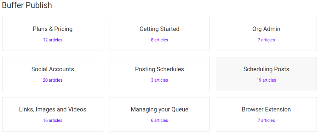
A FAQ page doesn’t need to be fancy. What it needs to be is clear and easy to navigate. A good example is a basic FAQ from Buffer:
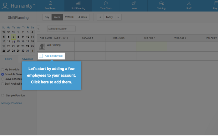
Another good idea is to add tooltips to different elements on your site to provide explanations on the fly.
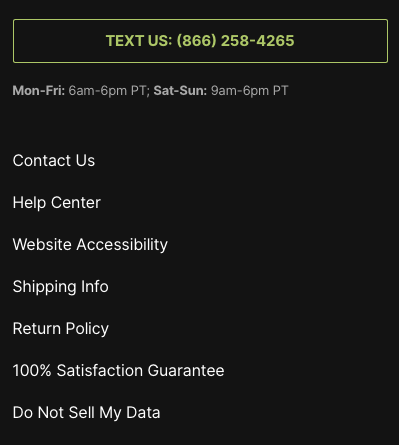
- The refund policy is hard to find or isn’t clearly explained. You might need to rethink your navigation or rewrite your copy. As an example, ManCrates includes the Return:
- You should also test how much time it takes for your pages to load. A slow-loading site is one of the worst UX-sins one can commit.
Google’s industry benchmark is below 3 seconds. If you find that your load time is much longer, the first thing to check is your images and plugins. But if the culprit is your hosting company’s slow response time, you might want to choose a faster provider.
But I can’t afford UX testing! Or can I?
As I’ve said, the best way to identify the stumbling blocks is to involve human testers rather than automated tools. Don’t think that UX testing with real participants is only for companies with big budgets, though. There are affordable ways to do it, too:
- Create a test group of your friends and relatives. You don’t need many people to run a usability study. A Google study shows that even 5 users are enough to detect key problems!
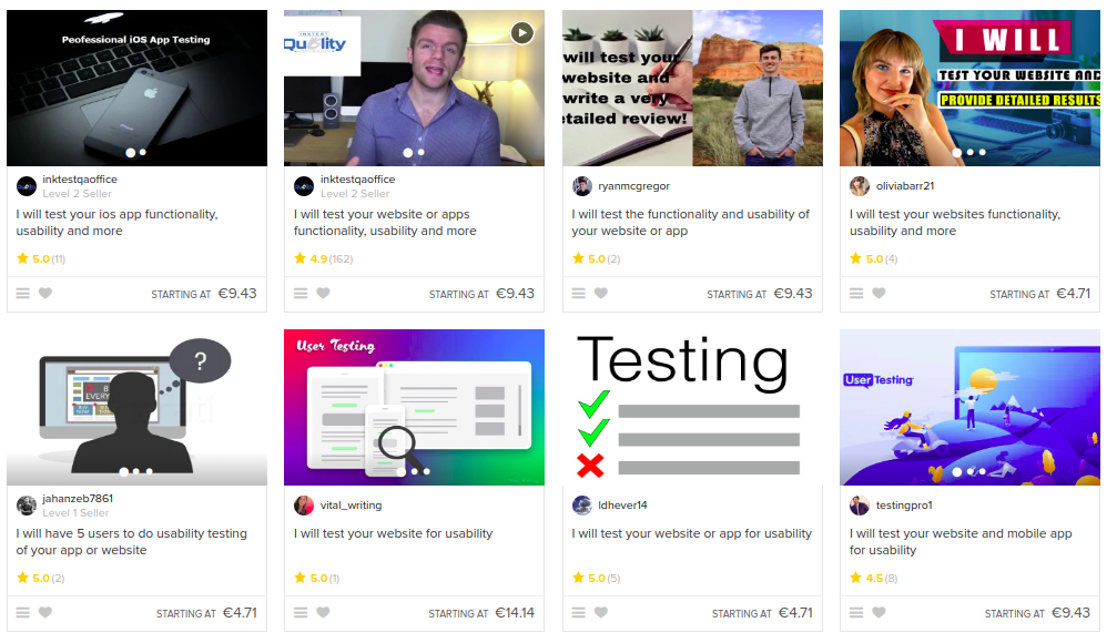
- Hire independent usability testers on Fiverr:
- Use specialized online services like TryMyUI, Usability Hub, or UserTesting (some even provide live videos of target visitors interacting with your site).
- Try guerrilla UX testing: approach people in public places, like cafes, and ask them to test your site. This is easier than it sounds: as long as you are open and friendly, most people will agree to help. Don’t forget to bring a laptop, of course.
Formulating a hypothesis with more UX research
Let’s say that you’ve identified several priority pages to run A/B tests on. The next step is to collect more data and decide what to change. Here are several budget-friendly and efficient approaches (see here for more):
- Heat maps. They track how users move their mouse cursor around the page. You can see what attracts their interest and where they pause or struggle. There are even touch heat maps for mobile apps nowadays. Examples include CrazyEgg, HotJar, and Heatmap. This is what a sample heat map looks like:

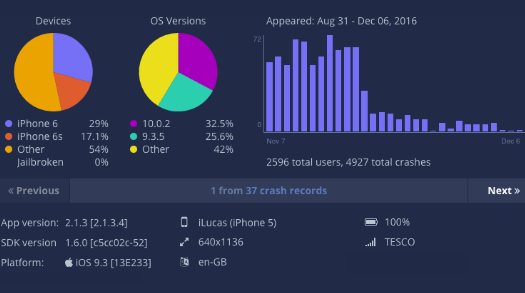
- Bug/crash reports. Users tend to bounce when a site crashes, so you want to know in which points of the interaction this happens. Services like BugSee, Appsee and Buddybuild include this feature.
- Statistics and feedback. Many tools allow you to collect data on visitor sessions, communicate directly with users, and get their feedback. You can try Userreport, Usersnap, or Usabilla, for example.
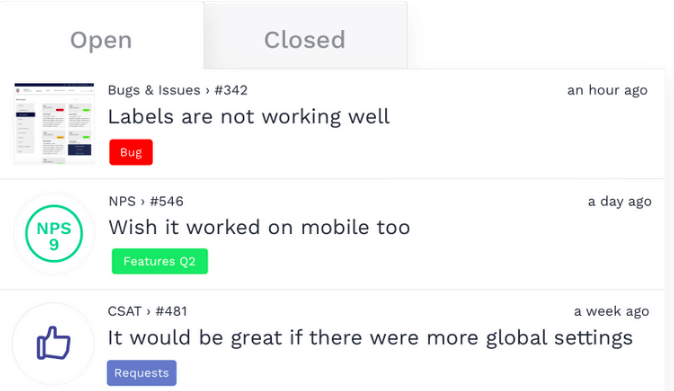
Common issues that usability testing can help uncover
Here are a few common issues that UX testing can help uncover on this stage:
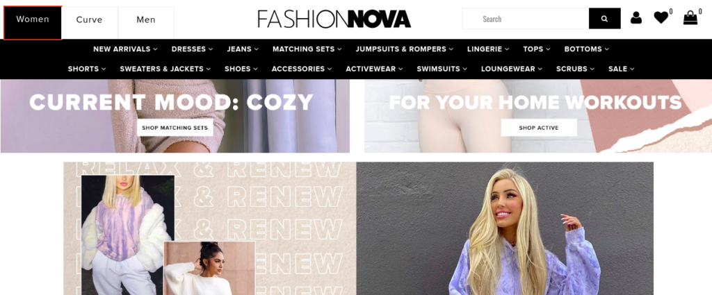
- Too many options. The so-called Hick’s Law states that the more choices you give to a person, the longer it takes them to pick one. You might need to cut the number of item categories or services on your page. In the example below, there are far too many options on the horizontal top menu. Plus, it’s unclear why ‘Curve’ is a separate category!
- Unfamiliar positioning. Have you positioned your buttons, forms and menus a bit too creatively? Most web visitors are rather change-averse. They are used to seeing the signup button, language selector, and other elements in specific spots on a page.
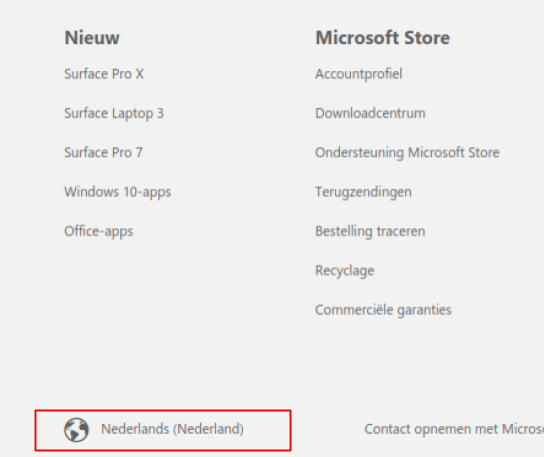
Microsoft provides an example of poor element positioning. When trying to change the language from Dutch to English, the user first looks for the selector in the header. But on Microsoft, it’s at the bottom in the footer. And instead of a list of languages, it opens a huge window with a list of regional sites:
- Poor attention management. Some of your design elements can look so interesting that users will focus on them – instead of your CTA, for example. You need to keep visitors’ attention on what’s really important.
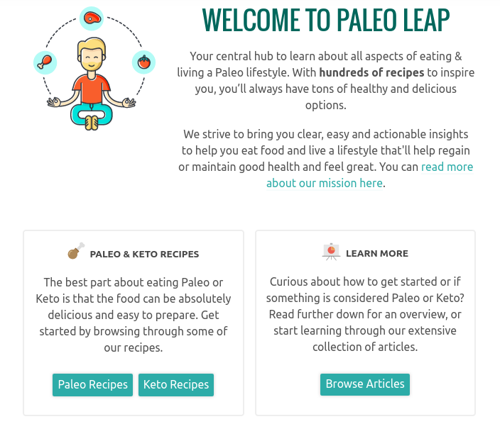
On the website below, it’s unclear what the CTA is and where users are supposed to click:
- Unclear value message. Perhaps users simply can’t understand what it is that you’re selling? Here is an example of a fuzzy message – what does this value statement even mean?

Designing better variants
Finally, with some more UX research you can make sure that the altered version of an element is the best it can be. There’s no point in pitching two poor variants against each other, is there?
You can start by creating several quick prototypes of an element. For instance:
- A CTA button in different colors;
- Several checkout form designs;
- Varying menu structures;
- Different styles of images or videos;
- Copy written in more or less formal style, etc.
These don’t need to be finished designs implemented on your website. A simple mockup will do. You can sketch everything in Moqups or Balsamiq, for example.
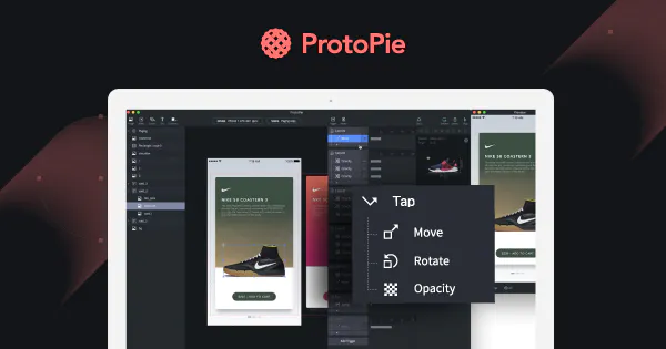
For more engaging prototypes, you can also use interactive services like Proto.io or ProtoPie:
Next, get together a group of at least 5 test users or turn to guerrilla UX testing again. Ask your target group which option they like best. Once you’ve identified the winner, use it for your A/B test.
Is it really worth it?
You might be thinking: all this preliminary research is just too complex. It sounds like preparing for a military campaign, not a split test.
Do I have to spend weeks on surveying and prototyping before I can run a single A/B test?
The answer is yes.
If you’ve done your UX research well, your new build should be successful and win over the control variant. But even more importantly, you will have learned a lot about your customers – their values, problems, and opinions.
You see, A/B testing isn’t about mindlessly trying different options. You don’t just insert one key after another into a keyhole, hoping one of them will work. Like any type of scientific experiment, split tests are about gaining knowledge. So go on and try this more scientific approach – you’ll see what difference it makes.
Want to learn more?
- Learn how to conduct effective usability tests in the online course: Conducting Usability Testing
- To learn more about A/B testing and other quantitative user research methods check out Data-Driven Design: Quantitative Research for UX
- To brush up on the basics of UX and Usability, then consider taking the online course on User Experience
- The Interaction Design Foundation is home to the world’s largest free, open-source library of UX Literature. Check it out here.
Good luck on your learning journey!
