Testing the usability of your mobile app in 2017 means going well above and beyond what is usually considered ‘best practices’. Opting for focus groups to test both during development and after release is a welcome approach, but it is not without its drawbacks. Same goes for monitoring your app with traditional, quantitative analytics that provide you with numerical data.
Obviously, you will want to have real people, and a part of your target audience at that, to test your app and tell you if they see anything in its user interface or user experience that they found unappealing or lacking. There is no more hands-on or direct way to understand your app’s strengths and weaknesses than through the eyes and hands of your users.
However, placing people in a testing environment changes their mindset. Knowing that they are being watched and monitored affects the way they use the app – it changes the use of gestures, as well as the time spent on different screens, skewing your results.
On the technical side, your app can perform differently in a testing environment versus out in the real-world.
As you might imagine, having distorted results on the use of gestures in an app can have profound effects on the usability of an app and, consequently, on the user experience.
As for quantitative analytics, having numerical data is a great first step to learning more about the gesture usage within an app. Its biggest drawback, however, is that it cannot help you visualise key user inputs.
Yes, you know 25 percent of your users attempt to swipe up to bring the full menu, but why? The key question remains unanswered. This is where you can harness the power of a relatively new, qualitative analytics tool – touch heatmaps.
Touch What?
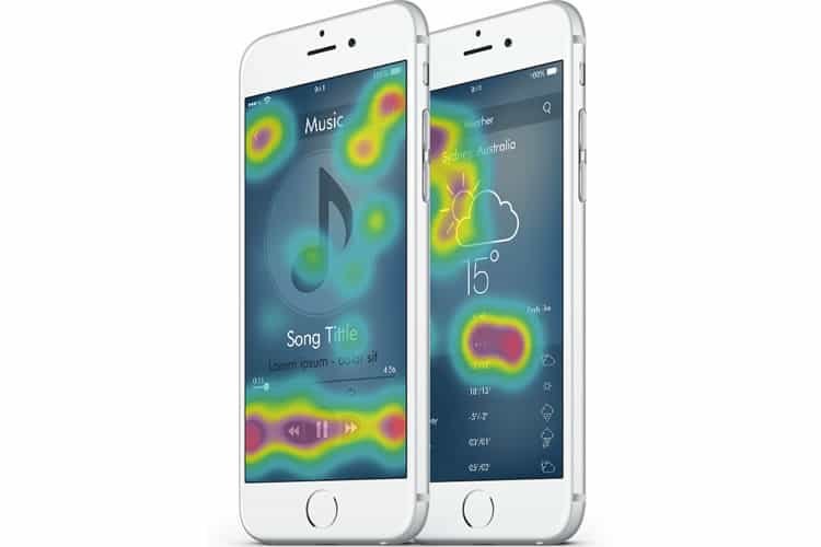
Heatmaps. This is a tool that aggregates all the data on the various gestures used to interact with an app (taps, double-taps, swipes, pinches, etc.). This data is then presented visually, as a heatmap, on a layer placed over the actual app. That way it becomes easy to literally see where people are interacting with the app and in what frequency.
The frequency of these interactions is colour-coded, using a typical heatmap gradient from blue to red. Blue represents places where interactions are at the lowest, while red represents the exact opposite. Spotting most (and least) popular navigation elements, app pages and features becomes effortless.

Touch Heatmaps and Usability Testing
Testing the usability of an app essentially means paying close attention to all UI elements and the UX, in general, to make sure the app is intuitive and straightforward, that it is allowing users to go about their business quickly and get a problem solved promptly. This is what makes watching for unresponsive gestures one of the pillars of modern usability testing.
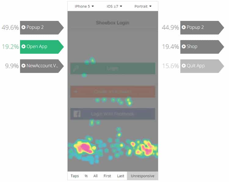
Unfortunately, many app pros are oblivious to unresponsive gestures and are clueless to the fact that unresponsive gestures that are left unresolved can ruin months and months of hard work. Unresponsive gestures are moments whenever a user interacts with an app, and his/her gesture is met with no response from the app, whatsoever.
There could be many reasons behind unresponsive gestures. Maybe the app has a bug causing a particular button to be unresponsive. Maybe the user is attempting an incorrect gesture (swiping instead of double-tapping, for example). Another reason may be that users are trying to interact with an app’s element that was not designed to be interacted with at all (for example, confusing an image for a button, or trying to swipe away from the app’s final screen).

Whatever the case may be, unresponsive gestures are an important issue for an app’s usability and require immediate attention. Traditional, quantitative analytics will not be able to provide useful insight on unresponsive gestures. Focus groups might come across unresponsive gestures, but they might not react in the same manner as they would in the ‘real world’. They know they are supposed to test the app, so their perception of unresponsive gestures might be distorted. In a real-life scenario, however, this could lead to frustration, app abandonment and poor reviews in app stores.
Tracing Patterns
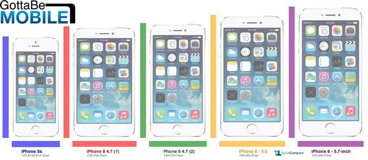
Monitoring unresponsive gestures should be a fundamental practice for all product managers and developers. But that is not the only way touch heatmaps should be used to test for usability issues. With the help of such a tool, devs and product managers can identify other usage patterns that might signal UI or UX issues, like the problem of various screen resolutions breaking the app’s design. This typically was more important for Android developers, as those devices come in all shapes and sizes.
However, Apple’s iPhones are growing bigger, and the iPad portfolio is growing stronger, making screen size optimisation equally important across both major mobile operating systems. With touch heatmaps, developers can spot if individual app elements appear off-screen, or if certain screen sizes break the app’s design.

Then, there is the issue of distractions. Are your users being distracted by elements that they should not be distracted by? With touch heatmaps, it is relatively easy to discover if your users’ attention is all over the place. If gesture activity is spread all across the screen, instead of being focused on a couple of essential functions or CTAs, your users are most likely distracted. Once discovered, you can use focus groups or other types of polls to ask your users what is missing on a specific app screen, or ask for suggestions how to improve.
To Usability and Beyond!
Usability testing continues to be a key factor when creating a well-built, successful mobile app. However, a decade into mobile apps development, user expectations have changed, and with them our approach to testing mobile app usability.
While some ‘classic’ methods have managed to endure through the shifting tides of the mobile industry, new ones have emerged to fill in the blanks and complement them in critical areas. Organizing focus groups and having people test the app in person is still essential. So is the use of quantitative analytics tools, as numerical data will always remain a sturdy alarm trigger.
App pros are finding multiple ways to employ touch heatmaps when building apps, usability testing included. Tracking and eliminating unresponsive gestures, tracing patterns of user behaviour on various screen sizes, or highlighting user distraction are all great use cases for touch heatmaps. They are offering app pros a new, clear and unbiased picture of their app’s usability, eventually helping them build better apps, easier.
Want to learn more?
If you’re interested in mobile UX, you could take the online course on Mobile User Experience. It includes templates you can use in your own projects and you’ll get an industry-recognized certificate to improve your career. If, on the other hand, you’d like to…
- learn all the details of Usability Testing
- get easy-to-use templates
- learn how to properly quantify the usability of a system/service/product/app/etc
- learn how to communicate the result to your management
… then you might take the online course Conducting Usability Testing.
Lastly, if you want to brush up on the basics of UX and Usability, the online course on User Experience could provide you with the necessary knowledge. Good luck on your learning journey!
(Lead image: Depositphotos – affiliate link)
