
Ever wonder why the navigation (URL) bar on your smartphone’s browser is located at the top of the screen, rather than at the bottom, where your thumb can easily reach it?
One might assume that the most logical placement for such a prominent, oft-used feature would be as close as possible to the input device – in this case, your thumb.
Sometimes, logic isn’t quite the end-all approach to UX design.
In an article I wrote a few weeks ago on user research and derived value, I discussed the importance of conducting a number of highly specific user research methods prior to development. Here, I will delve into an equally important counterpart to user research: user testing.
It’s one thing for developers and designers to work off of an idea that makes sense to them, but when they enter the real world of usability testing, they might be in for a rude awakening:
Most end-users are not as logical as those who develop the applications.
Safari and Chrome-for-mobile have used thousands of focus groups, many of which likely targeted this particular inquiry.
Here’s a likely scenario: perhaps the developers on-staff had, during the initial build, put the bar on the bottom. When asked to test the product, the focus groups may have noted that the browser was very different from their desktop user experience, and asked about the navigation bar in particular.
This is not the case for companies like Facebook and Instagram, who have native apps, and dedicated mobile experiences for users with mobile devices.
When designing and developing an app, be it for web or mobile, the focus of the user experience needs to explicit.
The sentiment is similar to when your sophomore year high school English teacher repeated, countless times, that the thesis statement is the most important part of a research paper. Part of this sentiment is doing the research that tests the credibility of your thesis.
Prototyping: The Hidden Value of Hidden Motives
UXDs know, that after a great deal of user experience research is complete, UX managers and associates may often develop a paper prototype, so that rapid changes in functionality can be implemented and tested without the need to involve your alwaysbusy designers and developers.
For those of you that are new to the concept, paper prototypes are not necessarily prototypes made out of paper, but rather conceptual sketches of the UX design that allow for an Agile style of testing. Often, paper prototypes are used to:
- Identify any bottlenecks in the existing UX design by way of real user input
- Make rapid changes to the aspects of the design that are causing bottlenecks
- Return the usecase to a real user and determine if the changes were effective
The basic paper prototype design ought to come complete with a quick overview of menus choices, functional features, and of course, the user’s finger (which serves as the cursor). Consider this extensive user experience paper prototyping test.
Source: LukenWarm (YouTube Channel)
Let’s stick with the mobile navigation bar example that I referenced earlier. When the smartphone became a reality with the first generation iPhone, the browser was, naturally, a huge feature. It also took a great deal of space up — no pun intended.
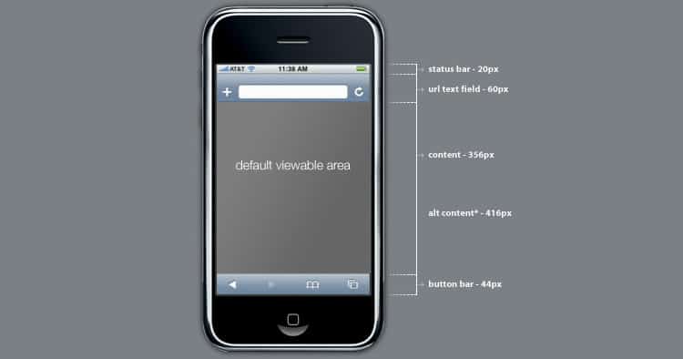
The navigation field (the space where the URL is entered) and accompanying buttons took up roughly 14% of the usable space. In other words, the top of the browser was almost explicitly static when it could have been – and should have been – more dynamic.
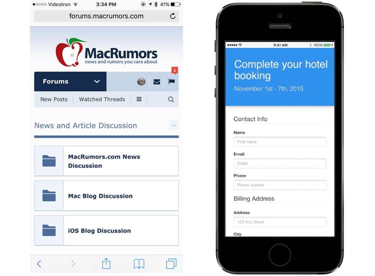
For all intents and purposes this issue has been solved (i.e., user tested) on Chrome-for-mobile, where they’ve set up the navigation bar to hide, out of sight, when not in use. The mobile version of Apple’s Safari browser still has a static bar that takes up dynamic space.
Chrome-for-mobile’s navigation bar design is likely the result of countless paper prototype focus groups. Google’s UX researchers and designers likely asked groups of participants to test two different versions of the mobile browser, one with full screen browsing, one without.
This brings us to a very important concept in user testing: the value of exposition.
One way to get valuable data is to avoid explaining anything to the testee, and have him or her figure it out on their own. This can help measure whether all the available features are actually intuitive, rather than directing their attention to something that they would not have otherwise noticed. This is especially useful in cases where the testee is not the most experienced mobile user.
Keeping in mind that the user’s background is important. Running a focus group that has a variety of user types and personas will make it easier to measure how approachable a feature can be. Sure, bringing in a fellow designer may show you how he or she would approach a hidden URL bar, but what about a 40 year old car salesmen who types with one finger at a time?
Data can be collected by one of two methods: a set list of questions, or a pre-use user diary, where the testee can record his or her thoughts with an open end. The Chrome team may have had both types, as well as countless beta testers – for those who opt in.
But it’s not over after the data is all collected. The real work begins when you try to find the patterns in the data afterwards. Out of the data collected, Google’s UX designers likely noted that users seemed comfortable with the idea that the URL navigation bar could subtly hide as they scrolled down, while a quick scroll up would reveal it again.
User Acceptance Testing: Hiding in Plain Sight
After a piece of software has been completed, or in our case a full screen API for Chrome-for-mobile, it needs to be tested for real. In Google’s case, they have the ability to push Beta versions to users who opt in to be Beta testers.
In this way Google’s Chrome Team can view exactly where the user’s fingers were placed. They can identify whether the user was hesitant in their understanding of where the URL navigation bar went and how to retrieve it, and thus truly narrow the viability of the tested feature.
Obviously, most design and development teams don’t have the kind of user pool (or budget) that Google has the privilege of working with. The data collected from the prototyping phase is much more crucial in that regard. What is being tested during the beta phase is the implementation of the user opinion data, and how well it matches up with what was collected.
UXDs: remember to keep the focus on the features that are being tested, and identify the subtleties that motivate proper functionality. Feedback on the user’s experience with the new protocol can be valuable both verbally and non-verbally. So get creative with your group testing – paper prototypes and beta tests are not the end-all for group testing.
Want to learn more?
If you’d like to improve your skills in User Research, then consider taking the online course User Research – Methods and Best Practices. The course certificate is recognized by industry and it will help you advance your career. Alternatively, there is an entire course on Usability Testing which includes templates you can use in your own projects. Lastly, if you want to brush up on the basics of UX and Usability, you might take the online course on User Experience. Good luck on your learning journey!
(Lead image: Depositphotos)