There is a principle of “give before you take” with apps. If you want your users to do something, such as rate the app, allow notifications, or make a purchase, you should give them value first. Where in an app is one of the most significant tests of this principle? You probably guessed it – the payment screen.
If users are going to enter their credit card number and hit that button, it is not enough for them to want to buy the item. That is just the first step. They also need to feel that their credit card details will be safe in your app’s hands, that their connection is secure, and that they can trust your app not to disappear with their money.
On top of that, their experience needs to be totally smooth, with no performance or usability glitches, or else they will abandon your app altogether. The last thing you want to do is get a user all the way to the payment screen, only to scare them away during checkout. Here are several key initiatives you can take if you want to have the perfect payment screen.
Go Bug-Hunting and Crash-Crushing
The most annoying glitch in a payment screen is when the user encounters a screen that never loads or an endless loop of error messages. This is when you want to make sure that no bugs are bothering your users.
When is the best time to do this? There are two answers to that question – one is: before the app is launched, and another is all the time. An app analytics tool can help you or your dev team hunt down and destroy all the bugs that could bother users as they make their purchases. It can also help that the App Store accepts your app. For the post-launch stage, you will want to make sure you have a reliable crash alerts tool, so that you will be made aware immediately if there is an unexpected performance problem with the payment screen.

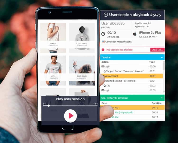
Pro tip: Top developers from brands like eBay use user session recordings to visualise the events that led preceded a crash and reproduce the crash effectively.
Keep Users Safe …
You might be using a mobile payment gateway that wires the money and makes the transactions from your users to your app. You already know some gateway tools. PayPal is probably the most well-known one. Shopify is another.

The first rule for these tools is: choose wisely. Whichever gateway solution you decide to work with will have your all your users’ credit card details. You need to be sure that the company behind the SDK is reliable and trustworthy, and also FAST. Those few nail-biting seconds when the app is processing a user’s payment should be just that – seconds.
… And Make Sure They Feel Safe
If you think about it for a second, the concept of giving away one’s credit card details over the Internet is a little crazy. All it takes is one very gifted hacker, and someone’s bank account could be emptied! That is why making sure that your payment SDK (and in fact, all your SDKs) are secure and privacy-protected is just the first step.

After that, you will also want to make sure your users know how safe they are, especially at this critical stage in their user journey. You can do this by merely displaying an icon indicating a secure connection – a green checkmark or a lock icon in the address bar. This will give your users an extra feeling of security.
Walk In Your Users’ Shoes
If you do not know what your users are experiencing on the payment screen, you will not know how to make that experience better. A combination of empathy, UX research, user feedback, and app analytics can help you understand your users’ behaviour and experience better. As a result, you can make more informed decisions about your payment screens.

The best way to get a complete picture of your payment screens’ usability and user happiness is qualitative analytics, which completes the analytics puzzle and shows you exactly how users interact with these complex, and crucial, screens. By using session recordings, qualitative analytics gives you not just numerical data on your users’ behaviour, but a real-time glimpse into their experience of your app. This way, any usability issues on your payment screens will immediately make themselves evident, enabling you to address them quickly and confidently.
Test Across Devices
Different devices = different screen sizes = potential usability problems. With a wide variety of devices and sizes on the market, UX issues abound. Sometimes a difference in screen sizes causes a button or text field to hide beyond the limits of the user’s screen. Sometimes scrolling will becomes faulty or impossible.

This can be solved by rigorous testing on your end – making sure that every device can display your payment screen correctly. With user testing and app analytics such as touch heatmaps, usability issues such as disappearing elements and unreadable screen margins are easily found. What you will want to find is whether users are failing to tap on buttons necessary for funnel completion, and where they are tapping instead.
Make It Easy
Filling in credit card details on an app should take only a couple of minutes. Thus, the longer it does take, the more likely a user is to encounter trouble, get fed up with the mobile shopping experience, or change their mind about the purchase. There are a few small, quick fixes that can make your credit card payment form a breeze to fill in.

For example, you can ensure that the payment screen automates the formatting of the user’s credit card number (automatically insert spaces or dashes between every four digits) and of its expiration date (MM/YY or MM/YYYY?). You can make sure that the proper keyboard pops up on the user’s screen for each field (number pad for card numbers, scroll wheel picker for dates, and full keyboard for card owner names.) It is also recommended to have the field selection automatically move from one field to another as soon as the user finishing filling each one out, to save them a few extra taps.
Display a Payment Breakdown At All Times
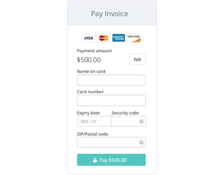
The most embarrassing payment mistakes are often involving a mistaken sum. Maybe the user accidentally entered the product twice. Perhaps they did not check the shipping costs before placing the order and were surprised to see a more significant amount deducted from their account. Human errors can happen at any time. A suitable method of preventing these issues calls for you to display the order details, shipping address, and total price on the screen at all times. This way, your users know exactly what is in their cart and where they will receive it, and they will be able to edit their order before hitting the “order” button. Check out this example from Wave:

Summary
Ultimately, payment screens can have a significant effect on a company’s bottom line. By the time a user reaches the payment screen with the intention to buy, the app has gotten everything right. It provided a great experience, offered enticing items, and encouraged the user to make a purchase. A broken payment screen can make all that hard work go to waste. Fortunately, with a little research, a lot of testing, and a healthy dose of empathy, your app’s payment screen can end in a win-win for both you and the user.
Want to learn more?
If you’re interested in mobile UX, you could take the online course on Mobile User Experience. It includes templates you can use in your own projects and you’ll get an industry-recognized certificate to improve your career. If, on the other hand, you’d like to…
- learn all the details of Usability Testing
- get easy-to-use templates
- learn how to properly quantify the usability of a system/service/product/app/etc
- learn how to communicate the result to your management
… then you might take the online course Conducting Usability Testing.
Lastly, if you want to brush up on the basics of UX and Usability, the online course on User Experience could provide you with the necessary knowledge. Good luck on your learning journey!
(Lead image: Depositphotos)
