How are you reading this sentence, right now? I do not mean on a laptop, or on your smartphone. I mean how are you reading? How exactly is information captured by the eyes and processed by the brain? One popular meme that circulated a few years ago argued that we read words as a whole, not as individual letters. Maybe you have seen this jumbled paragraph on Twitter, or in an email chain:
It deosn’t mttaer in waht oredr the ltteers in a wrod are, the olny iprmoetnt tihng is taht the frist and lsat ltteer be at the rghit pclae. The rset can be a toatl mses and you can sitll raed it wouthit porbelm. Tihs is bcuseae the huamn mnid deos not raed ervey lteter by istlef, but the wrod as a wlohe.”
While some psychologists posit this reasoning is not precisely accurate (though they do admit the claim has some veracity), it illustrates a concept that translates well in user experience design: the way we read and process websites. Like the jumbled words in the paragraph above, we do not perceive and parse every single individual element of an interface. We scan, our eyes flicking between different components, searching for the exact information we are looking for.
Keeping this principle in mind, User Experience (UX) and User Interface (UI) design become exercises in corralling. Like a sheepdog herding a flock, designers need to tame the user’s eyes and direct them to the information they are looking for, or the information the designer wants them to see first (or last).
There is a variety of methods to gain control of the user’s attention – some of them highly technical, the result of years of testing and eye tracking, and some more apparent, that I knew even before I started writing for the UX/UI design company I work with. However, whether they are UX 101 or a technique only wielded by the masters, these practices help you deliver a better, more engaging experience to the user.
Visual Hierarchy
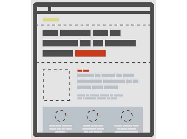
The most straightforward way to control your user’s eyeballs is to employ a deliberate visual hierarchy, which is just a fancy phrase for how your interface is organised and which elements dominate it. By changing a few characteristics of each component, you can control what the user pays attention to first.
The most obvious of these characteristics is size. Our eyes jump to larger text first and ignore the fine print. However, several other factors play into determining what we notice first on a website or app screen.

Colour and contrast are other popular factors to manipulate. Our eyes are naturally drawn to bright colours (think a highlighter or a traffic cone), but if those seem a bit garish for your design, you can also employ contrast to emphasise two disparate elements at once.
Counterintuitively, the absence of colour can also act as a draw. The importance of whitespace and negative space in user experience design is well-documented, and when appropriately leveraged, whitespace can both attract attention and inject some readability into the UI.

Other factors go beyond the characteristics of the content itself and instead focus on its location, proximity, and alignment on the page. An obvious example might be a navbar with drop down columns. We expect related information to be grouped tightly together on the screen.
Tracking Patterns
You might have realised that these factors that inform the visual hierarchy are not exclusive to the digital realm. Newspapers, magazines, and other printed material have used these same principles for years, long before the advent of the Internet.
However, we read and interact with the printed material and digital interfaces differently, which means other variables are underpinning the visual hierarchy, more than just size or colour or contrast. These variables are much newer compared to their analogue counterparts. They have formed as we have become digital natives.
As we have immersed ourselves in websites and apps, we have come to expect where specific information will be, which changes the way we read and process what’s on our screen. Where do you expect to see a company’s logo? Where would you find the search bar or a settings tab?
These are all conventions that user experience designers are familiar with, and that you are too (whether you realise it or not). Together, they make up how we read interfaces, and where our eyeballs go when presented with a new screen.
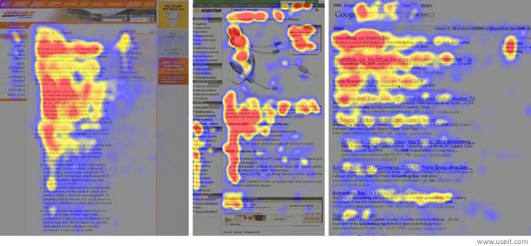
After studying how users read websites with eye tracking software, Nielsen Norman Group and Brandon Jones determined two significant tracking patterns: the F-pattern and the Z-pattern respectively. Note that these are mostly just applicable for sites written in languages read from left-to-right.
When we process a website that is heavy in text and low in graphics or images, our eyes read in an F-pattern, starting from the top-left corner of the page and moving horizontally before dropping down and repeating the process.
The following is a heat map of eye position on three text-heavy websites. Take a look at the F pattern for yourself!

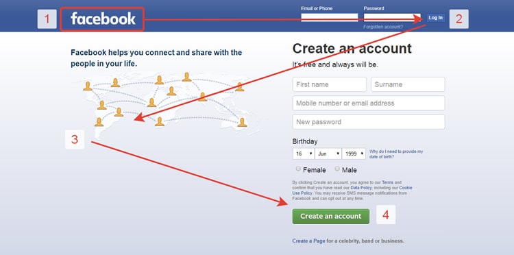
In contrast, our eyes move in a Z-pattern when presented with a website that is high in imagery, and low in text. The Z-pattern helps inform the layout for news websites, like CNN or MSNBC, as well as sign-up pages or other marketing sites. Facebook’s sign-up screen, for example, relies on the user processing the information in a Z pattern.

Putting It All Together
The techniques described in this article can you help you optimise the layout and UI of your experience at both the micro- and macro level. The standard factors of visual hierarchy – colour, contrast, size, and the like, are essential to remember when designing individual elements or components.
However, when you are viewing the layout holistically, you want to think big picture. That is the tracking patterns: how the user will be reading your content at the macro level. By mastering both techniques, you will have complete control over your user’s eyes, and thus, their attention. With that control, you will be able to usher them seamlessly to the information they are looking for, decide what you want them to notice (or not notice), and overall deliver a better, more engaging user experience.
Want to learn more?
Are you interested in the intersection between UX and UI Design? The online courses on UI Design Patterns for Successful Software and Design Thinking: The Beginner’s Guide can teach you skills you need. If you take a course, you will earn an industry-recognized course certificate to advance your career. On the other hand, if you want to brush up on the basics of UX and Usability, try the online course on User Experience (or another design topic). Good luck on your learning journey!
(Lead image: Depositphotos)
