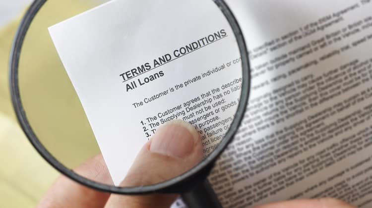
You might consider small print boring or not valuable or interesting, but discussing small print: the way it is presented and used, could be interesting to explore and could raise some interesting points for writing and graphic communication and information design in general.
This article is partly inspired by the point from information designer Patricia Wright from Cardiff University:
We need to develop theories of NOT reading as well as theories of reading – theories that explore people’s motivation for reading some documents carefully while ignoring others completely. (Wright, 1988)
Small print is used in a range of situations from terms and conditions information in financial documents, to text on food packaging, to supplementary information on TV adverts. I am sure we have all experienced it, terms and conditions with financial reporting being a common one.
Could medicine information leaflets and packaging, law / legal / directive documents, software terms and conditions, and maybe also forms, verge on small print or even be considered as small print examples?
How is small print defined? Two definitions of small print are:
- ‘Text in a formal agreement that is printed smaller than the rest of the text, sometimes in the hope that it will not be noticed: don’t sign anything until you’ve read the small print’. (Cambridge Advanced Learner’s Dictionary & Thesaurus, 2016).
- ‘Matter in a contract, etc., printed in small type, especially when considered to be a trap for the unwary. The small print of a contract or agreement is the part of it that is written in very small print. You refer to it as the small print especially when you think that it might include unfavourable conditions which someone might not notice or understand. Read the small print in your contract to find out exactly what you are insured for’. (Collins English Dictionary, 2016).
Even at this early stage, small print is not positively referred to.
Car Park Information and Payment Signs
As Martin Cutts of the Plain Language Commission mentions (Cutts, 2011) ‘presenting important information illegibly is blatantly unethical’. Furthermore, Martin received a £60 fine for parking in a car park in Stockport, UK (see Figure 1). Instead of paying the penalty he opted to make a case stating that car park sign did not make a reasonable effort to alert him to the supposed contract and its terms. Indeed, the terms and conditions text was only 5mm high which from 7 metres away driving at 10mph ‘people just don’t see or read this stuff’. Martin eventually won an 18-month battle against Excel Parking Services.

TV Adverts
Below is a photograph of small print used on a competition TV advert. In general, small print on TV adverts range from legible to completely illegible. The example below is not a one-off occurrence, in fact, many TV adverts display small print in this way. Notice also that in the 5* television advert small print (Figure 2), necessary information is contained within the small print (the purple text and grey text below that) such as:
- How much you will be charged for entering the competition by text (SMS) message.
- How to decline subsequent marketing text messages (SMS’s).
- When the competition ends.
- Where to go for more information.
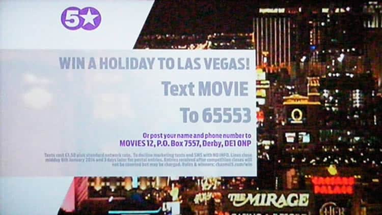
The grey text below the purple text is unreadable (unless you have your eyes 1cm away from the TV screen). Other typical places for small print is at the bottom of the TV screen on TV adverts, typically the text is small and set in a condensed typeface weight which is tough to read and that renders poorly on television screens.
In the instance of say small print from an internet service provider advert, in the small print they tell you crucial and potentially decision changing things. These may range from things like bandwidth/usage cap and subsequent charge for going over it, information about mandatory line rental that is required for the service, other costs to get the service / product up-and-running, dates about how long the current offer lasts, and so on. Who do you pay line rental to? which is required for the actual internet service: the internet service provider or your landline telephone provider? What happens if for example, the issue of a bandwidth cap is not told to you either when ordering on the phone or through the website? You get your service / product, start using it, only to find out that you have gone over the bandwidth allowance and that you have been charged for it. Then you have to contact the provider / company (which takes time and effort, it costs the provider time, money and resources, and the same for you) you have to sort it out (decide if you want to pay, cancel the service, or upgrade / change to something different). It takes up energy and time from your customers, increases calls to your support call centre or customer services and potentially damages the supplier / consumer relationship. Why devalue and make this information so hard to read?
Food Packaging and Drink Labelling
Another common place for small print is on food packaging and drink labelling. Typically information about the product will be in a minuscule typeface size, and nutritional information is presented in different ways from plain text to tabular format, to other graphic devices. Furthermore, it is worth noting that the way nutritional information is presented, does not always help people understand what the nutritional data means. The design, writing and industry specific terms used does not help people understand what the numbers and values mean, and how they relate to say, a daily intake or what is healthy for a general person.
Between 1999 and 2000 Frank Philippin, a graphic designer from Brighten The Corners, undertook a research project at the Helen Hamlyn Research Centre, at the Royal College of Art, UK. In his publication Small print: improving visual pack information for older consumers (Philippin, 2000), he discusses and explores a range of issues to do with food packaging, drink and medicine labelling design. He raises some points:
- ‘Many of us also have reasons for reading what is known as “small print”. We might be on a salt or fat-related diet, we might be on a budget, we might suffer from an allergy and must avoid specific ingredients. Finding and reading the small print becomes an exhausting enterprise.’ (Philippin, 2001).
- ‘A key message to emerge from the project is that improving visual information for older people entails engaging in a moral argument about degrees of honesty and persuasion in pack design. The central conflict between advertising imagery and “truthful” information in how we “read” packs must be addressed.’ (Philippin, 2001).
- ‘Mandatory information, however, tends to drift off to some remote area on the sides of the package, “hiding” in light, condensed typefaces, away from the keen consumer’s eye.’
Martin Cutts wrote in Pikestaff 64 (Cutts, 2013a) and Pikestaff 65 (Cutts, 2013b) that drink cans San Pellegrino Limonata and San Pellegrino Aranciata produced by Nestlé have eighteen teaspoons of sugar in each can (a similar amount as in a can of Coca-Cola). The San Pellegrino drinking recipients (cans) contain more than a third of an adult’s ‘guideline daily amount’ which is particularly concerning given the rise in obesity and diabetes. The cans do list the sugar amount, but only in small print on the back of the can stating 32g. But, how much is 32g and how does it relate to the recommended daily intake, or what is okay for an adult or child?
Another issue is that nutritional information is typically rendered in a very small text that even a person with good eyesight can only just about read it. What about individuals who do not have good vision, or who are ageing or who do not have their glasses with them? I understand there is not unlimited space available on these products, but surely we can communicate better. The UK has an ageing population that is also living longer. Indeed, there has been a 1.7 million increase in the number of citizens aged 65 and over (from 15% in 1984 to 16% in 2009). This trend will very likely persist. In fact, it is envisaged that by 2034, 23% of the population will be aged 65 and over (Office for National Statistics, 2010).
Small print on food packaging could be a thing of the past (Martindale, 2013), the Food Information Regulation, from 13th December 2014, introduced mandatory food labelling guidelines (Department of Health, 2013). Companies are no longer able to supply their voluntary labelling. Some of the guidelines are as follows:
- The term ‘salt’ must be used since it is more readily comprehensible by consumers than ‘sodium’.
- The minimum font size for large packages should have an x-height of 1.2mm (See Waller, 2011 for more on this topic of the x-height). The minimum ‘x-height’ for the nutrition declaration in small packages (if the largest surface of your package or container has an area of less than 80 cm2) is reduced to 0.9mm.
The guidelines are aiming to bring about clearer instances of writing (writing which people can understand) and better more legible typographic design, and they seem very positive. What challenges will arise to designers due to the increased space required-for text information?
One final point is worth mentioning here on food and drink packaging: in the UK, it is common to have these rectangular signs and nutrition information tables on the packaging which state energy, fat, saturates, sugar and salt values. Let me share what have I observed regarding food and beverage labelling:
- Text is presented too small, people with good eyesight can only just read the text. Individuals who are ageing or who require glasses but are not wearing them, will not be able to read the text information.
- In nutritional information on food and drink labelling, there is a concerning amount of industry specific terms (lingo, gobbledygook), not in plain English and which is frequently abbreviated. Would you know what ml, g, kJ, kcal and RI stand for? ml stands for millilitres, g stands for grammes, kJ (I have no idea… any thoughts?) stands for kilojoules, kcal (I have no idea… any ideas?) stands for kilocalories, and RI (right intake…, recommended intake…?) stands for reference input.
- Even if the abbreviations are unabbreviated and explained, what do they mean and relate to? For example, something says: 119 kcal, how much is 119 kcal? Does it refer to a whole can or just one item within the product as a whole? Is it a good or bad amount?
- In the nutritional information table, percentage values used do not add up to 100% or relate to the can as a whole or a recommended daily amount. Are the values based on a per whole can amount or per ingredient, or something else?
- Sometimes the values in nutritional information tables are not given in a logical number, for example, one can is 330 ml, and one column on the can’s nutritional information table provides values for per 100 ml, 100 ml is neither a half, a third or a quarter of the total can amount.
- On some labelling, they use an asterisk (*) device to explain and expand on abbreviated text (although the explanation of the asterisks is stuffed away and is not close the original asterisks).
- The term ‘Reference Intake of an Average Adult’ is widely used, but it is not clear if the amount is per day or item, or per person, or per something else.
What Legislation is there for Food Packaging and Drink Labelling?
Food packaging and drink labelling are subject to regulation. In the UK on the GOV.UK webpage Food labelling and packaging (GOV.UK, 2016) it states that to be able to sell food and drink products, the labelling must be clear, readily visible, not misleading, permanent, easy to read and understand.
In addition to this, one must also show basic information, certain warnings and provide a list of ingredients. These include the name of the food, quantity information and a ‘best before’ or ‘use by’ date (or instructions on where to find it).
On the front, side or back of the packaging, one must also provide a list of ingredients, any special storage conditions, the name and address of the manufacturer, packer or seller as well as instructions for use or cooking.
In May 2016 the Food and Drug Administration (FDA) in the US announced the new nutrition facts label for packaged foods.
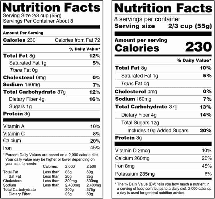
While I have not seen the label implemented onto any packaging, in an article from Laura Entis (Entis, 2015) Differences between EU and US nutrition labels go far beyond ounces and grammes she mentions the following points:
- Perhaps the largest discrepancy between the two systems (EU and US) relates to how calories and other nutritional information are communicated to consumers. Nutritional labels in the US have to provide the number of servings per container so calories can be more easily broken down. Conversely, in the EU, all calories listed are based on 100g (3.5 ounces) or mL. “It’s portioned versus grammes,” says Gisela Leon, a senior regulatory consultant at EAS Consulting Group.
- Each method has its advantages – in the EU, because all packaged items’ calorie counts are measured by 100g or mL, the metrics are the same, making it easy to compare the nutritional content of food items. However, in the US, carefully researched portion sizes are meant to eliminate the need to do math at all.
My initial observations on the US labelling are:
- It is evident from the labelling to me anyway that the percentage values are based on a recommended daily value / amount (2,000 calories).
- It is positive that the label used the word calories, rather than the abbreviation Cal.
- Can you spot a new error and difficulty that has been introduced? Any guesses?: The abbreviation mcg. Any ideas as to what it stands for? Mega calcium gauge? … The use of abbreviations has to stop; it is extremely problematic for users.
From the earlier UK drink labelling example in this article, what I can say is this: labelling in the area of food and drink is complex, there are values and information on both labels which are hard and not easy to understand.
Webpages
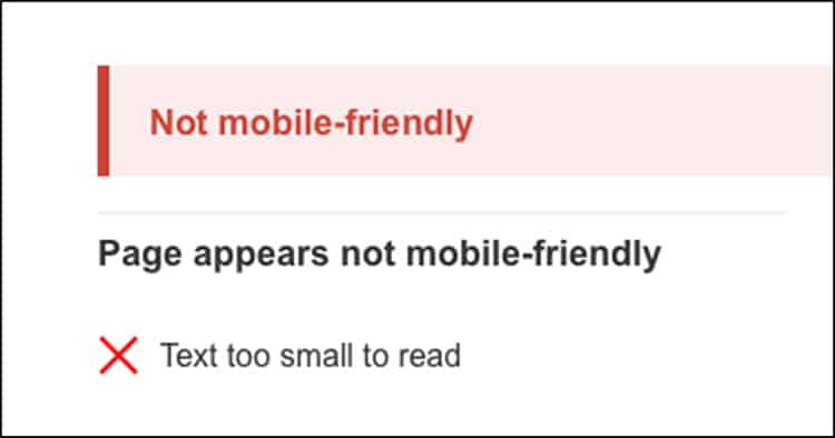
On the issue of font / typeface size being too small, we have seen in recent years Google (Google, 2015) introduce a guideline recommendation of 16px minimum font / typeface size for body copy and text size on the web. If the text size on a website is less than 16px, Google considers the web page not mobile-friendly and this, in turn, will affect the site’s page ranking in Google. I have noticed quite obviously, the rise actually in websites using larger font / typeface sizes, and as a website designer and reader, this guideline recommendation from Google is positive regarding good graphic communication design and being able to read text easily. I suspect it has had a positive effect on being able to read text easily on the web.
In the small print example on http://www.soundcloud.com (Figure 5) you can see that the text is small but more troubling than that is the contrast of light grey text on a white background. The resulting contrast is too faint to be able to read easily. The difference is 0% for white and 21% for the grey text. It needs to be at least 35% shade (of black) for people with good eyesight to be able to read. Why make this information so hard to read? Is the information available anywhere else?: ‘Legal’ is available from the menu on the top right of the screen, but ‘Privacy’, ‘Cookies’, ‘Imprint’ and ‘Popular searches’ are only available from this small print section.

Small Print in Law / Legal / Directive Documents
At first look, the example below might not be considered typical small print because the text size is of standard body text size. However, what is interesting is how information ends up becoming looking and reading like small print (not respected and treated as not important) when this happens, does it, in turn, make the information small print?
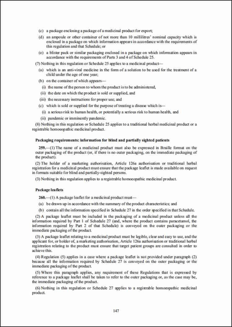
Yes, we know that this type of information and documentation is boring and tedious. Maybe, for this kind of literature there has to be some strong underlying motivation to read all the text or small print, else people will move onto something else, or reject it entirely. Or is this just how these documents are. Maybe they are just trying to find a particular section. Is there anything that can be done? A real question might be: what do we want people to do with the law / legal / directive documents? Suggestions are as follows:
- Find a section or heading.
- Make a note or mark section to refer to at a later date.
- Show any changes to legislation.
- Understand the text content and terminology used.
- Read it from start to finish.
- Feel motivated to read significant amounts of text.
- Refer to a particular clause or paragraph.
- Understands what to do if they require help or have further questions.
Rob Waller from The Simplification Centre, wrote a paper called Layout for legislation (Waller, 2015). In it, he discusses various aspects of legislation documents and provides design concepts and improvements. Rob Waller even organised an event in London on the 13th April 2016 called Simple Action 4: the small print. In it, they came up with some interesting responses to the consultation from the Department for Business, Innovation and Skills (BIS), as they were looking for ways to make terms and conditions (T&Cs) more accessible. In a draft report from the event (The Simplification Centre, 2016) they focused on four practical measures within the BIS’s executive summary:
- For price and subject matter terms to be prominent and transparent so that it is easier to make comparisons between the T&Cs offered by different suppliers.
- Putting key facts together bold and up front (e.g. on two pages).
- Making T&Cs more navigable, by grouping certain terms under clear headings.
- Encouraging business to enable and support consumers to actively engage with T&Cs. For example, working to reduce the length and complexity of T&Cs to make it more likely that T&Cs have been read and understood by consumers, boosting the confidence of both parties in the agreement.
Nick Parker, a writer with The Simplification Centre’s group, published an Open Letter to Apple (Parker, 2015) which addresses this point of why UK consumers find themselves agreeing to T&Cs under US law for much of the software they buy. Here are some points from the publication:
- The last time my iTunes updated, a menu popped up asking me to click to agree to the updated terms. In the bottom of the screen, the page count said ‘page 1 of 99’. Your Apple Music terms are nearly 20,000 words long. They’d take nearly two hours of my life to read.
- I’ve asked lots of people if they’ve ever read one of your end user agreements. Every single one of them has said something along the lines of, ‘Of course not! I just click accept!’.
Hazardous Product Labelling
Is it okay to make the information supplied with high-risk unsafe products extremely small and difficult to read? Harmful properties of a product, warnings, and what to do in the event of an accident are routinely supplied as the small print on a range of goods, and this is particularly concerning. Other information on these types of products ranges from instructions of how to use the product, manufacturer contact information, pictograms, safety information and ingredients.
General Observations
As soon as you have to use small print, you have no option but to try and use it. It could be consulting an instruction manual for a product or as David Sless from the Communication Research Institute mentions ‘reading the instructions on a child’s medicine bottle in the middle of the night, with the child screaming in the background’ (Sless, 2004). This issue is put under even more pressure if you have to read something under a short time pressure or in an emergency situation, for instance using information regarding medicines, as previously mentioned, or in an emergency situation like bandaging or plasters. Or ‘reading the terms and conditions of an agreement in a crowded, noisy shop’ (Sless, 2004).
People seem to detect very quickly what small print is and decide to not read through it. A recent example you might have experienced is the mandatory privacy policy pop-up box which sometimes appears when using Google. David Sless (Sless, 2004) mentions ‘It is a matter of common experience in our time that we are all routinely confronted by more information than we can absorb. As a consequence, many of us have developed information avoidance strategies’.
In some cases, there is regulation in place, or there might be some legal requirement to have certain information (typically made into small print) on a product or website. A recent example of required information for websites by regulation, is the EU directive regarding cookies, you may have read a similar notice to the following one when using a website recently: ‘This site uses cookies to offer you a better browsing experience. Find out more about how we use cookies and how you can change your settings. I accept cookies. I refuse cookies.’
Terms and conditions on the back of bank statements, if they made the information more blatant and put some design into it, they could potentially reduce the number of calls, emails or letters to customers services or visits to the help / support website. In a research study and testing of 10 people, David Dickinson and colleagues from Consumation (Dickinson et al., 2010) observed ‘Layouts that reduce text density, use purposeful sectioning, highlight key messages, and use a logical type hierarchy helped people to find the right information more quickly’.
If as a producer of information you hide or make information sneaky, for example, not giving the reader a reasonable chance of reading the small print or hiding away hidden charges, it causes problems for both sides involved, regarding energy, cost and resource. A survey showed just 7% of people read full terms and conditions when buying a product or service online, while a fifth say they have suffered from not doing so. 43% of those who do not always read the terms and conditions say they are boring or difficult to understand (Smithers, 2011).
Regarding the issue of how information ends up becoming looking and reading like small print (not respected and treated as not important) when this happens does it, in turn, make the information small print or for that matter any information small print?
I observed that on both low and high hazardous product labelling there is usually a warning device of what not to do. Many of the warnings were boxed (either in a shaded box or outlined). Ruth Shrensky from the Communication Research Institute produced a research paper called Boxed risk warnings: research findings (Shrensky, 2006). In this paper, she mentions that from research and testing observations with people, they either skip, do not read, or ignore boxed information. From the many points raised in the paper, she mentions the following: ‘readers might catch sight of the word “Warning” and think “Yeah, yeah, hazardous to health if used improperly, I know, I know, b-o-oring!” and not bother to read the rest’. ‘If they know, or think they know, how to use a product, they may not look at the document until a problem occurs’. The information designer Michael Babwahsingh (Babwahsingh, 2014) in his paper called The things you don’t see says: ‘We can easily ignore important pieces of information because they may seem too obvious or “common sense” (which isn’t so common at all)’.
There appears to be little written about small print, and issues involved in its writing, design and implications.
Regarding long small print information, do we need some extreme tactics to get people to read it? Do we need in the case of long small print text information in an electronic environment some kind of CAPTCHA form box (Figure 7) which tests and requires people to answer a question regarding each paragraph within the small print? They can then only proceed if they have read and responded to the question correctly on the content of each section? The downside to this is that it could be quite stressful for people to use.

Do people feel that they can challenge, contest, question or change small print? Or do they accept that what is in the small print, is unchangeable and that they are not able to disagree? Where is the contest small print/terms and conditions telephone number, email address or hyperlink? Do people think they cannot change the small print and only accept what it initially says because they cannot do anything about it?
Conclusions
- The text is presented too small (and usually in a bad typeface weight: either condensed or too light) that people with good eyesight can barely read it. Avoid text at sizes that people do not have a fair chance in situ of reading, it is bad practice.
- Car park information and payment signs: here we can observe that small print information has been presented too small which is not easily legible and that information is contained within small print that is important and affects people. Possibly attempting to hide or devalue information has consequences for both sides involved and did the producer of the information intend to make it difficult to read, were they deceitful or unethical on purpose?
- Small text and in an often condensed weight typeface on TV screens, renders poorly.
- Stuffing information into small print has consequences, people might not get the information they need to make an informed decision which later costs them time, money and effort and also the provider the same. Does it lead badly or under-informed decisions? An option to fix this problem would be to either make the small print (which is typically stuffed at the bottom of the TV screen) larger and much more readable or maybe the advert could somehow write in and contain all the small print details and information within the main messages of the advert? You could communicate more of the small print up-front within the main messages. How much do you build-in and add to the length of the initial primary information, how much is too much, how much editing is needed?
- Sometimes relevant information is contained within the small print but because it has been designed and presented as not important people do not value the information and do not read it, or because they have decided from the presentation and treatment of the information that it does not matter. The other related issue regarding this is that indeed valuable information is contained in the small print, which affects people, which is made to appear as not important by the producers when it is important about the central message of the communication or item as a whole.
- Mandatory guidelines are emerging in the industry (Food Information Regulation, Google) that aim to improve issues of unclear writing and too small text.
- Nutritional and ingredients values on food packaging and drink labelling are not related or communicated in a way that general people can understand. The information the provider gives and communicates to the users’ and the distance between what they intend them to figure out to what they understand, is massive.
- The way nutritional information is presented on food packaging and drink labelling is particularly unclear and foggy. There is a load of complicated issues in this area, from abbreviations to values which people have no idea what they relate to or mean. The industry needs to use good writers and graphic communication / information designers, and test the communication and design with people to ensure they can use and understand it.
- Regulation regarding writing, design and communication has both good and bad effects.
- Why make small print unnecessarily hard to read by using poor colour contrast or a condensed or light typeface: which renders poorly and increases illegibility?
- Use good typographic design, spacing and practice to enhance motivation when reading the text. Any printed text that has an x-height of less than 1 mm, when held close to the eyes, is bordering on illegible for people with good eyesight.
- The population of the UK and the world is ageing and living longer, that means a higher percentage of your users have less than ideal vision.
- For lengthy documents: consider the use of good typographic practice, illustrations, images or pictograms to support boring text information. Find out how people want to use such a document. Use pictures and images to make more of the information, and to make it more appealing.
- Consider using colour in greyscale information.
- If the word count length of the small text is significant, consider editing it as best as possible to reduce the length or use headings to relate the different types of information in paragraphs and to increase accessibility to the issues in the content (headings give readers more ways into text information).
- If people detect the information they are getting is small print, they either dismiss or skip it, move through the information in a very brief and quick manner.
- If it is worth writing and displaying: give it good writing and design.
- Use good writers, graphic communication / information designers, that are concerned with both aesthetics and usability, not typically just aesthetics alone…, they will help you make the information, communication and design more usable. In the food and drink labelling example discussed in this paper, they seem to not have used a writer, graphic communication / information designer, not done any diagnostic testing or used any common sense.
- If you have to use long lines of text like on the back of toothpaste packaging, you could try splitting the long lines of text into two columns.
- If you have to provide information that is typically considered small print, give them a chance of being able to read the information easily by making sure that: the x-height of the typeface is of a readable size (please note that not everyone has the same quality of eyesight), the weight of the typeface promotes legibility (neither too light or too condensed), the line length should not go past an ideal 66 (counting both letters and word spaces) characters (Bringhurst, 2004) and the leading is generous: 3pt+.
So to go back to what Patricia Wright said:
We need to develop theories of NOT reading as well as theories of reading – theories that explore people’s motivation for reading some documents carefully while ignoring others completely. (Wright, 1988)
People do not read small print because:
- Text is too small to read.
- Text is illegible.
- There is too much text, it would take too long to read, so they skim or skip altogether.
- It is in a box.
- It is poorly contrasted from the background.
- Information is made to look devalued and not important.
- People are not given a reasonable chance of being able to read the information supplied.
- Regarding lengthy information, there is a low motivation perceived in using this type of information (small print).
- They can just read the small print information, but abbreviated and industry specific terms are used which general people (non-experts) do not understand or know how to use in their daily life.
- They feel they cannot contest or change the small print, and ‘it must be the same for everyone else’ subsequently they just move through it as quick as possible and accept it.
Where to go for Writers, Graphic Communication / Information Designers?
- Association Typographique Internationale
- Center For Plain Language
- Centre for Information Design Research
- Clarity International
- Communication Research Institute
- Information Design Association
- Information Design Journal
- International Institute for Information Design
- Plain English Campaign
- Plain English Foundation
- Plain Language Association International
- Plain Language Commission
- The Helen Hamlyn Centre for Design
- The Simplification Centre
- Visible Language Journal
References
- Babwahsingh, M. (2014). The things you don’t see. Retrieved September 2016, from http://michaelbabwahsingh.com/2014/05/31/the-things-you-dont-see/.
- Bringhurst, R. (2004). The Elements of Typographic Style. Version 3.0. Canada: Hartley & Marks Publishers.
- Cambridge Advanced Learner’s Dictionary & Thesaurus. (2016). Small print. Retrieved August 2016, from http://dictionary.cambridge.org/dictionary/english/small-print.
- Collins English Dictionary. (2016). Small print. Retrieved August 2016, from http://www.collinsdictionary.com/dictionary/english/small-print.
- Cutts, M. (2011). Victory for better legibility. Pikestaff 52. Retrieved December 2013, from http://www.clearest.co.uk.
- Cutts, M. (2013a). ‘Healthy’ Nestlé laces drinks with twice the sugar of Coke. Pikestaff 64. Retrieved December 2013, from http://www.clearest.co.uk.
- Cutts, M. (2013b). Warnings called for as sugar debate gets spicy. Pikestaff 65. Retrieved December 2013, from http://www.clearest.co.uk.
- Department of Health. (2013). Technical Guidance On Nutrition Labelling. London, UK. Retrieved January 2014, from http://www.gov.uk/government/publications/technical-guidance-on-nutrition-labelling.
- Dickinson, D., Teather, J., Gallina, S., Newsom-Davis, E. (2010). Medicine package leaflets – does good design matter? Information Design Journal 18(3). Amsterdam: John Benjamins.
- Entis, L. (2015, September 8). Differences between EU and US nutrition labels go far beyond ounces and grams. The Guardian. Retrieved September 2016, from https://www.theguardian.com/lifeandstyle/2015/sep/08/food-labeling-us-fda-eu-health-food-safety.
- Food and Drug Administration. (2016). Changes to the Nutrition Facts Label. Retrieved September 2016, from http://www.fda.gov/Food/GuidanceRegulation/GuidanceDocumentsRegulatoryInformation/LabelingNutrition/ucm385663.htm.
- Google. (2015). Use Legible Font Sizes. Retrieved August 2016, from https://developers.google.com/speed/docs/insights/UseLegibleFontSizes.
- GOV.UK. (2016). Food labelling and packaging. Retrieved August 2016, from https://www.gov.uk/food-labelling-and-packaging/overview.
- Martindale, N. (2013, December 9). Silent Salesman Must Speak Up. Future of Packaging supplement. The Times. Retrieved August 2016, from http://raconteur.net/business/silent-salesman-must-speak-up.
- Office for National Statistics. (2010). Ageing. Retrieved October 2010, from http://www.statistics.gov.uk/cci/nugget.asp?id=949.
- Parker, N. (2015). Small print is broken: an open letter to Apple. Retrieved August 2016, from http://www.nickparker.co.uk/s/your-small-print-could-change-the-world-by-nick-parker.pdf.
- Philippin, F. (2000). Small print: improving visual pack information for older consumers. Helen Hamlyn Research Centre/Royal College of Art. Retrieved August 2016, from http://www.brightenthecorners.com/library/rca_hhrc_report.pdf.
- Philippin, F. (2001). Can packaging be honest? Baseline magazine, number 34. Viewed August 2016, from http://www.brightenthecorners.com/library/rca_hhrc_report_baseline.pdf.
- Sless, D. (2004). Designing public documents. Information Design Journal 12(1), p24–35. Amsterdam: John Benjamins.
- Shrensky, R. (2006). Boxed risk warnings: research findings. Communication Research Institute. Retrieved August 2010, from http://www.communication.org.au.
- Smithers, R. (2011, May 11). Terms and conditions: not reading the small print can mean big problems. The Guardian. Retrieved September 2016, from https://www.theguardian.com/money/2011/may/11/terms-conditions-small-print-big-problems.
- The Human Medicines Regulation. (2012). The Human Medicines Regulation 2012 – Part 13. Retrieved August 2016, from http://www.legislation.gov.uk/uksi/2012/1916/pdfs/uksi_20121916_en.pdf.
- The Simplification Centre. (2016). Terms & conditions and consumer protection fining powers: Call for evidence. Retrieved December 2013, from http://www.simplificationcentre.org.uk/downloads/reports/BIS-SC-response-250416.pdf.
- Waller, R. (2015). Layout for legislation. Retrieved August 2016, from https://www.simplificationcentre.org.uk/reports2/technical-paper-15-layout-for-legislation.
- Waller, R. (2011). 10. The Clear Print standard: arguments for a flexible approach. Retrieved December 2013, from https://www.simplificationcentre.org.uk/reports2/technical-paper-10-the-clear-print-standard-arguments-for-a-flexible-approach.
- Wright, P. (1988). The need for theories of NOT reading: some psychological aspects of the human-computer interface. In Schriver, K. (1997). Dynamics in document design. Page 165. New York: John Wiley & Sons.
Want to learn more?
If you’re interested in the intersection between UX and UI Design, then consider to take the online course UI Design Patterns for Successful Software and alternatively Design Thinking: The Beginner’s Guide. If, on the other hand, you want to brush up on the basics of UX and Usability, you might take the online course on User Experience (or another design topic). Good luck on your learning journey!
(Lead image: Depositphotos)
