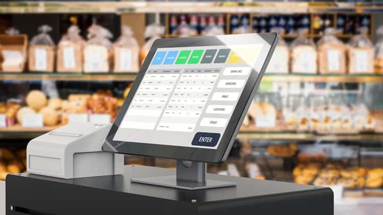
Point of sale (POS) systems are used by cashiers in shops to process orders and to check out customers. Everyone knows how frustrating it is to have to wait in line if the shopkeeper is slow. However, that pales in comparison to the anxiety experienced by shopkeepers when queues form.
POS Systems are Different From Regular Apps
In the design of POS systems, engineers must be aware that they differ from other more typical applications in at least one crucial way: while the user goal in a standard web or mobile app is achieved within the app, in a POS system, the goal is always offline. In a way, the software application only hampers the cashier in getting the good bagged, and the customer serviced.
For example, in a finance app, everything happens within the computer, from start to finish. Anything that goes on around the user, such as conversations in the room, is a distraction from the email process. The reverse is true for POS systems: the role of the cashiers is to engage with the purchased goods and be friendly to the customer, while the POS software is an unpleasant distraction, which must be dealt with for accounting purposes. The success of a transaction is not the final step in the user interface, but it is a happy customer leaving the store.
The implication is that designers of POS systems must take the complete context into account and they must see the software with a very critical eye. Ultimately, designers have to find ways to reduce the time of the average transaction and to reduce the time delays caused by unusual circumstances.
How Queues Form
The purpose of UX and systems designers dealing with a POS system is to ensure that users have a tool that supports them in being as fast and accurate as possible. In essence, this means reducing the main usability barriers. To achieve this goal, it is essential to understand how queues form in the first place: there are two ways, and each is a different take on the idea of capacity.
Firstly, it takes a certain amount of time to check out a customer; this is the average time spent per transaction. Each transaction involves a number of typical steps that the cashier has to go through. These are all mandatory and relatively standard. They can be optimised and a saving of one second can have an impact on the overall store performance. This process is very similar across stores too.
Secondly, there are unusual transactions or situations, where the typical process does not apply. These are exceptional cases, and they tend to be more specific to a store or chain. Further, these unusual situations tend to be very diverse, and they cause delays in a transaction. Whereas the saving in the average transaction can be a second, exceptional transactions take ten to thirty times more than the average one. Thus, designers can potentially shorten the delays from one or two minutes, to a few seconds.
The shop type and layout are a critical component that cannot be controlled by designers: they have to work around it. For example, some shops have only one cash register, so any fluctuation of customer numbers will have to be resolved at the level of a single register. Other shops have multiple cash registers, but they can only deploy staff based on a fixed schedule, such as on weekends. Bigger stores have developed a system whereby they can open new registers as and when they are needed.
This dimension affects the fundamental way in which a store can deal with a more significant flux of customers.
While designers cannot control all UX factors, these critical barriers can be mitigated from the outset of the design process of a POS system.
Slow System
While designers can be somewhat ignorant of hardware issues when they design for a smartphone, they have to be very mindful of the hardware POS users engage with. Fewer standards are in place in this industry, even if most stores transition to some touch screen tablet-type hardware system.
Slow systems can be caused by any number of issues, but some of the most common ones include:
Response time: Sometimes a system has to query a database which happens to be enormous. When the architecture of the system is cumbersome, these queries tend to take a long time. For example, some POS systems where the search is performed on a central server, have difficulties in retrieving product lists. Designers have to be mindful of this and work together with developers to find ways to reduce the load, especially for the average transaction. Waiting for one or two seconds for a query is just not acceptable.
Hardware: Stores may at times prefer a compromise regarding hardware costs. A low-performance tablet can be cheaper by $100 or $200 and multiplied by 200 cash registers, the saving amounts to $40K. The cost to the users is hidden in this calculation, and sometimes it is difficult to persuade a board to ignore a five digit figure for the sake of an unquantifiable user experience gain. Designers can try to put together estimates (even when they are based on basic assumptions) to quantify the user experience cost in terms of time. Taking a very long-term perspective can help.
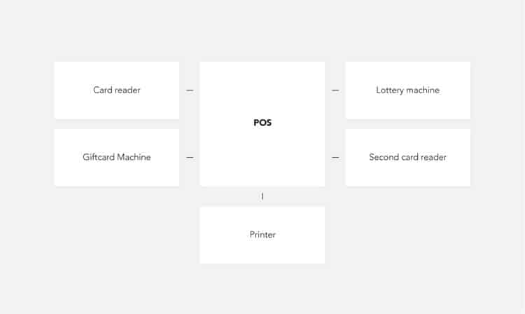
One of the significant issues falling into slow systems is when different devices have to communicate with each other. A common theme is tablet communication with a card reader or even with a scanner. Sometimes a delay of one or two seconds is caused. This may seem trivial, but it does affect the duration of every single transaction. In-store research will uncover any devices that are not integrated into the central POS. These cause additional delays and where possible they should be integrated with the main POS system smoothly.
Complicated Navigation
The basic task of scanning a product is simple and straightforward, but navigation is required to solve some tasks. For example, sometimes the standard flow involves searching for products; either by name or by something like a browse feature. Other situations include applying discounts, finding an old transaction or identifying a loyal customer.
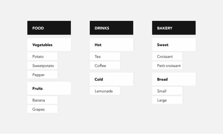
Whenever navigation is involved, things can get very complicated. Designers of POS systems have to deal with hierarchical structures, be they of products or customers. Neither too flat, nor too deep is good, but in real life, compromise resolves these issues, and that throws up challenges for solving navigation.
For example, navigating through a product hierarchy using a category-based menu can easily mean a few added taps for the cashier. This takes time, but when cashiers get lost because they do not know the right category, things escalate. What makes it worse, is that while the cashier does deal with this, they cannot focus on the customer. Now factor in that they may have more than one such product to deal with.
On the other hand, search for products by name is not an ideal solution either: it is not just that typing a name on a tablet is cumbersome, but the cashier may not know the correct name of the product or the system may have a misspelt name in the database. In this scenario, the product would never be found.
Navigation is the second most significant barrier to the usability of POS systems, and unfortunately, there is no easy way to solve it. Designers have to factor in results from user research, considerations around the system constraints and the product offering of the store they work for to arrive at the best compromise.
Labels
Knowing what is what is a fundamental requirement for a usable digital product. Unfortunately, designers of POS systems have to deal with many challenges that translate into significant usability hurdles.
In the context of this article, labels can be verbal (text, names) or visual (icons and images). Each can pose challenges to the user.
- Text labels hinder the user experience when they are displayed incomplete or when abbreviations are used. Sometimes they are too long, and they may include one word to differentiate very similar products, such as “Caspian Deluxe Beer Promo 0,3L” and “Caspian Deluxe Beer Promo 0,5L”.
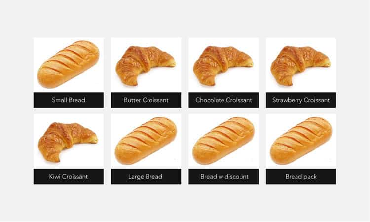
- Labels can be confusing, for example when it comes to category names. Think: “Small bread” vs. “Large bread”. Where is the cut-off?
- One of the biggest challenges is when the name in the system differs from the name of the product, for example: “Heineken Beer” vs “Alc. Bvg 0,4%”
Visual labels may seem like a brilliant solution, but things are not so simple either, and sometimes they can actually cause more confusion. For example, many products look very similar when the images are small. Alternatively, they may not be recognisable at all, considering that many POS systems have very small screens. However, images pose more problems: the image library has to be maintained and kept current as label designs change. Even if most products can come from a database, some products will be made in the store, and they will require a photographer.
Information Overload
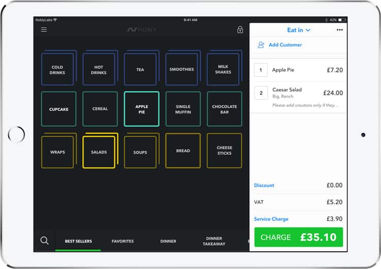
In the typical use of a POS system, cashiers are confronted with information overload: they have to be attentive to the customer, handle the products with care, check items in the POS and also be aware of everything else that is going on in the store.
The complexity of the interface causes interference with any attention resources the cashier may have. The more options they have to deal with at any given time, the harder the challenge.
This is particularly true for cashiers who have little experience. They are faced with a learning task and the more complex the interface they have to learn, the more time it will take. Most often cashiers work only part-time and for short periods of time (one year or less). The experience of a learning agent is thus essential.
Besides the complexity of any single screen, barriers come up when processes differ from each other and cashiers have to perform mental actions to adjust to an anomaly. Fatigue that creeps up towards the end of the shift will further reduce performance.
Errors
Errors are bound to happen in the process of checking out customers. Solving a mistake can be a significant barrier when it takes much time. Most often the process to resolve an error involves a number of steps that are rooted in the store policy. Pretended mistakes can and will be used as a way to defraud the business.
Designers can make a difference by coming up with creative ways to prevent fraud but also reduce the time it takes to solve each type of mistake.
Conclusions
This article is an overview of the most significant barriers that affect the proficiency of cashiers when using a POS system. By integrating sound design principles into their work, designers can lessen the burden on users by finding ways to speed up system performance, reducing complexity, finding clear ways to label entities in the system and making errors less taxing.
Although none of the issues can be solved entirely, because they are all inherent to the POS challenge, by reducing their impact on the user even by a percentage, designers can improve the real-life situation POS users operate in.
Want to learn more?
Are you interested in the intersection between UX and UI Design? The online courses on UI Design Patterns for Successful Software and Design Thinking: The Beginner’s Guide can teach you skills you need. If you take a course, you will earn an industry-recognized course certificate to advance your career. On the other hand, if you want to brush up on the basics of UX and Usability, try the online course on User Experience (or another design topic). Good luck on your learning journey!
(Lead image: Depositphotos – affiliate link)
