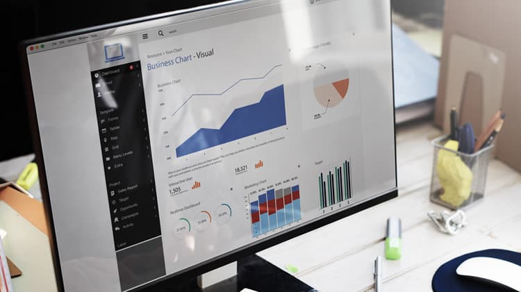
Systems are becoming more integrated and able to relay back qualitative, and more often quantitative, data at various degrees of frequency and complexity. In this scenario, information visualisation becomes even more important.
Simply stated, information visualisation involves graphically representing abstract data in such a way that the user can understand the data itself as well as its underlying relationships.
The Designer and Information Visualisation
The role of the designer is to represent data in a user-friendly manner. This does come with its challenges and constraints, namely the restriction in the available screen real estate to represent such data.
If the designer fails to make data user-friendly, then the user consuming such data will be impeded from extracting the meaning underlying the graphics, numbers or text. Worse still, the user will end up sifting mindlessly through such data, trying to make sense of it – not much different than they would have done had they been presented with raw data. Therefore, proper information visualisation leads to fast and accurate data consumption, which in turn can be used to make comparisons, draw conclusions and take decisions.
A crucial mantra to keep in mind is that while technology has rapidly evolved, this has not been met with a parallel evolution of the human being. In this regard, the dashboard designer must understand and support the nature and limitations of human perception.
Dashboards and Businesses
Business Intelligence Dashboards make it possible for business owners, managers, team leaders and any other stakeholder who has access to them to monitor and forecast the performance at individual, department or company level – depending on their type of access. In this regard, business dashboards can be used to monitor something – from the generic, such as an overall company performance, to the specific, such as the sales performance of a particular product.
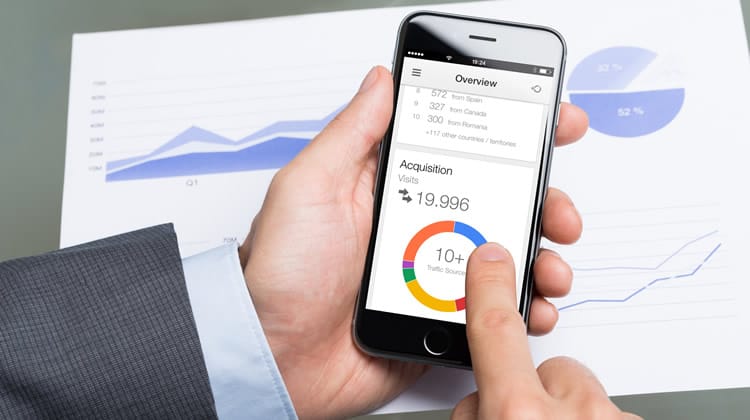
A dashboard designed to offer a great UX will not only make it possible to monitor all aspects relevant to the health and stability of the business but it will also have a direct impact on employees’ productivity.
Dashboard Design Guidelines
Dashboards should:
- Reside on a single screen: Dashboards are typically web-based, and hence they will be viewed through a web browser.
- Support the aims and objectives of the intended user: The terminology and complexity of the dashboard should match that of the intended user. The user’s attention must be drawn to particular elements of interest through the use of highlighting and notifications.
- Show what the underlying data means: The user must immediately understand what the data being presented means. This can be done through adequate labelling, logical grouping of related visualisations and the use of clear statistical and verbal descriptions.
- Summarise data: The dashboard designer must ensure that the most relevant information is instantly available to the user as soon as they access the dashboard. Ideally, this should be presented in the form of an overview.
- Provide a means to dig deeper into the data: The user must have a seamless means to further investigate any points of interest shown in the summarised data. This will help them understand the data better and examine the reasons behind anomalies (a sudden drop in sales for instance).
- Make optimal use of the available space: Adhering to point 1 does not automatically mean that the available screen real estate is being optimally used. This is because one can just reduce the size of the visualisations and cram everything on a single screen. However this is not good practice. Any non-data-carrying elements such as frivolous images should be removed.
Dashboard Design – Best Practices
Use an intuitive layout
There is a consensus among information visualisation experts that a dashboard should be divided into 5 distinct regions, based on their eye-catching properties. These regions can be seen in the diagram below:
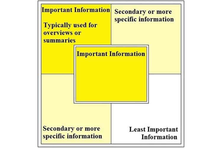
As can be seen in the above screenshot, important information should be placed in the top left-hand corner or at the centre of the dashboard design (depending on what type of information you are showing). Secondary information should reside in the top right or bottom left, while the least important information should be in the bottom right-hand side of the screen. Related to this point, also consider the size of the display that the dashboard will be viewed on as that has an effect on the size of each section.
Group related pieces of information
The law of proximity states that humans perceive items that are physically located next to each other as grouped. Conversely, items far apart are seen as disassociated and unrelated. This should be a guiding principle when deciding where each dashboard item should be located, even within a section of the layout.
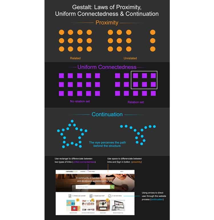
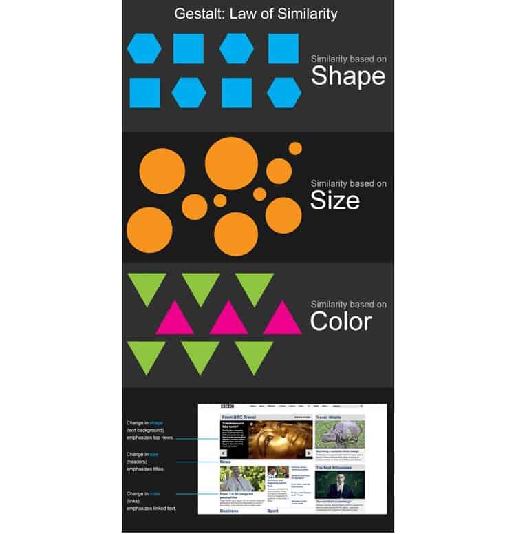
Users will also perceive similar items (such as those having similar colours, shapes, size and orientation) as being grouped – even if they are not physically located next to each other. This phenomenon is explained via the law of similarity which, like the law of proximity is another Gestalt grouping principle.
Remember the limits of human cognition
Although strictly-speaking, one can display an unlimited number of different graphics, statistics and various other types of information, there is one crucial constraint, and that is human cognition. Human cognition encompasses attention, memory, learning, reasoning, producing and understanding language, problem-solving and decision-making. Therefore, do not overdo it with the number of charts used. Also, use charts that make it simple for the user to analyse and identify trends. In short, restrict the number of items that the user must retain in the short-term memory when navigating and using the information shown on the dashboard.
Remove any unnecessary representations
Every pixel used on a dashboard design must have a purpose – whether to show information or (to a lesser extent) to serve as navigation. If it is there just for an aesthetical reason (e.g. that pixel is part of a decorative image), then remove it. A handy check is the use of Edward Tufte’s Data-Ink ratio which states that “A large share of ink on a graphic should present data-information, the ink changing as the data change”. The objective here is to maximise the data-ink ratio, with the perfect design achieving a 1:1 ratio of data to pixels in graphical displays.
Make appropriate use of colour
Colours can make or break the user experience of the dashboard. Appropriate use of colour draws attention and can help the user understand the data, while making it easier for them to identify patterns and trends.
However, relying on colour alone is not recommended since some users may encounter difficulty due to various colour vision deficits. In this regard, you should also avoid using colour combinations that a number of humans find difficult in perceiving, such as reddish-green and yellowish-blue, and some that are difficult to distinguish, such as different shades of the same colour.
Opponent colours should not be used in the same region, as one effectively ‘cancels’ the other out, restricting our ability to perceive the represented areas in the way originally intended.
Choosing an Appropriate Information Visualisation
Choosing the most appropriate form of visualisation is key in dashboard design. The following are some of the main representations that can be used:
Bar Graphs

These are ideal for promoting an immediate understanding of categorical data. In fact, the different heights of the bars (especially if they are in colour), make it easier for the user to perceive and compare the data.
Line Charts

Line charts are used to show how data changes over time. Typically, the value is represented on the Y-axis while time is shown on the X-axis. They are a great addition to a dashboard since users can easily identify patterns and trends by following the continuous line.
Scatter Plots

Scatter plots show values for two variables of a particular set of data.This data is plotted on the graph using points or spheres. The position of the points is established by the variables on both the horizontal and vertical axis.
Tables

Tables come in handy when you want to show your users a list of data in a way that affords instant identification and comparison. Although they are not essentially the most digestible methods of showing information, they may be necessary at times if the user wants to see detail. Still, they are more digestible than raw data, and their ease of use can be further facilitated through the use of colour.
Pie Charts

Although pie charts are common and aesthetically pleasing, they are not a recommended method for visually representing data on a dashboard. Indeed, pie charts tend to force users to remember colour-information pairs to be able to interpret them (information as shown in the legend) or else they have to continually switch their attention between the pie chart and the legend, causing unnecessary memory strain. Additionally, humans are not good at comparing two-dimensional areas or angles very accurately. In this regard, users will take longer comparing the angles on a pie chart to compare the data being represented. This is further complicated if the pie chart has several sections. In this regard, it is recommended to avoid having pie charts in dashboard designs.
Spatial Maps

Spatial maps are typically used to chart geospatial data. The chart is mostly a 2-dimensional cellular array where cells can have regular or irregular boundaries. As these cells are used to represent existing physical space (e.g. a state or a country), the perimeter of each cell directly corresponds to the shape of its real-world counterpart. Colour intensity (choropleth) can be used to make it easier to compare data across a spatial map. However, one should not use a broad spectrum of intensities (not more than 7) as that would exceed the limits of the short-term memory and make it increasingly difficult for the user to compare.
Dials

Use dials with caution. While they can be good to represent certain data, such as targets, they can be very limiting when used to represent other forms of data. Their limiting nature mostly comes from the fact that they are skeuomorphic, meaning they represent a real-life dial and hence the designer must remain faithful to the real-life representation in the digital counterpart.
Icons
![]()
Icons can be very useful for representing states and alerts as they can direct the user’s attention to the part where action is needed. However, overcomplicated states (e.g. 10 different states) can cause a delay in the interpretation. In this regard, it is recommended to use icons sparingly and restrict their use to only show the most important events in a dashboard.
Overcoming Space Limitations
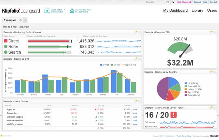
Adhering to the above guidelines will improve the optimal use of screen real estate but may not necessarily result in resolving the problem of showing all of the important information. You may end up with a number of data representations that are essential to show and if you show them all, you will clutter the dashboard design and/or make it difficult for your users to digest the information being shown. This is where some advanced techniques come into play:
Show summaries or condensed views
Instead of showing the full data set, try and group information. This can also be combined with an assessment of who the dashboard is being designed for. For example, while the sales manager would require a detailed grid of data showing sales figures for each region, that same data set can be displayed as one number for the dashboard design being used by the managing director.
Only show changes
Repeat visitors are generally interested in new information. Showing what has changed and just highlighting it can considerably reduce the clutter in the design and make it easier for users to digest the information that is showing.
Only show warnings / unusual patterns
Similar to the above technique, if you just show warnings instead of an entire data set, then you can do away with displaying certain data. For example, if sales levels between 100 to 200 items a day are considered as being healthy, you can just show a warning when sales levels fall under 100 or spike above the 200 items on that day. This will save you a lot of space that you would have used to show, say a bar chart showing daily values.
Replace text with graphics (where possible)
When appropriately used, charts grab the user’s attention and make it easier for them to digest the data being shown as well as identify similarities, differences and general trends. However, graphical representations that require conscious analysis to understand what is being represented affect the viewing experience and can impede insightfulness.
Where Can I Learn More?
While I have tried to cover the most important areas in dashboard design, this article is by no means exhaustive. It is rather an introduction to a fascinating world that draws a lot of knowledge from the fields of psychology and interaction design. There are of course several resources on the subject.
From my experience, however, I would recommend the Interaction Design Foundation‘s course entitled “Information Visualization: Getting Dashboards Right“. I have personally undertaken this course and it covers all of the material presented in this article and so much more. If you need a second opinion, take a look at the Interaction Design Foundation review over at TheUXBlog.
If you are interested in this course, the Interaction Design Foundation is offering 3 FREE months of UX Design Courses for all UsabilityGeek readers!
Conclusion
The success of a dashboard should be evaluated in terms of the user’s ability to identify and understand the individual figures, patterns and trends bound to the data being represented.
This can only be achieved as a result of various design considerations that go beyond the aesthetic nature. Busyness, ambiguous or incongruous graphics, and text lacking clarity or meaningfulness, can render even the most attractive display useless as the viewer is forced into lengthy decryption to gain an understanding of the represented data.
Thus, a dashboard is only as effective as the quality of its design. Improve the design, increase the user experience.
Want to learn more?
If you’d like to become an expert in UX Design, Design Thinking, UI Design, or another related design topic, then consider to take an online UX course from the Interaction Design Foundation. For example, Design Thinking, Become a UX Designer from Scratch, Conducting Usability Testing or User Research – Methods and Best Practices. Good luck on your learning journey!
