For a long time, the strongest resistance to car applications was the law. Using your phone while driving is considered a primary offense and warrants a traffic stop for distracted driving.
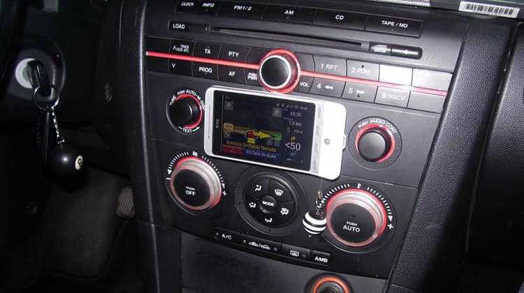
According to the Governors Highway Safety Association, use of handheld cellphones while driving is prohibited in 14 states in the U.S. (plus Washington DC). At the same time, Android Auto and Apple CarPlay are legal in all 50 states as long as you touch your stereo head unit instead of your phone.
Despite this opportunity, smart cars pose a unique set of design challenges, because the automotive context is somewhat new for traditional app designers and UXD’s.
What is the Purpose of Linking Cars and Phones?
It is important to remember that the concept of a smart car arose out of a need to minimize the amount of time that drivers spend looking at their stereo in addition to their phone. For this reason, Android Auto originally disabled your phone upon connection to the head unit.
Of course, it was not long before users figured out ways around Android Auto disabling their phone, leading Google to eventually remove the deterrent. The update also allowed Android Auto to take a giant step ahead of Apple CarPlay.
At the outset of car applications, a touch screen stereo was a prerequisite for car apps regardless of your phone’s operating system. You may have noticed a conflict of interest here. Disabling the phone was meant to eliminate the temptation for a driver to touch their phone (and commit a traffic violation).
In the wake of various workarounds being posted online, Android switched lanes and embraced the phone as a platform for Android Auto. This opened the market to vehicles with older stereo systems and vehicles that do not have stereos at all.

When designing the minimum viable product (MVP) for an Android Auto application, be aware that some people will launch the app from their phone while others will launch it via their stereo head unit.
Of course, if you are designing for iOS and Apple Car Play, you only have to worry about the stereo platform for the time being.
The Phone-Car Connection
On both Apple CarPlay and Android Auto, the stereo communicates with the phone device through a USB connection, not unlike a personal computer. Although critics have been calling for bluetooth connection, battery constraints make the USB connection necessary.
GPS Navigation is for most users the biggest appeal of Android Auto / Apple CarPlay. Although designers are working to optimize Google Maps for minimal battery drain, mapping software takes a toll on the phone processor.
According to Google Engineer Robert Lowe,
GPS is a very slow communication channel because you need to communicate with three or four satellites for an extended duration. Mobile devices achieve their battery life by quickly jumping between sleep and active states. GPS apps prevent this.
When designing (or porting) applications for Android Auto / Apple CarPlay, understand that the processor (and battery power) will likely be preoccupied with GPS Navigation apps. Minimizing the strain on the phone’s processor is always important in app design, but it is even more important when you consider the fact that users will likely be pairing your app with other power-hungry apps.
Automatic Launch
One of the fundamental goals of car app design is to minimize the amount of input required from the user.
By implementing an auto-launch functionality, initial user input required to open your app can be bypassed. If your app is of the music or navigation variety, it would not be a bad idea to give users the option to cue the app startup upon USB connection to the stereo head unit.
If your app is not an app that would be useful to a driver (Categories: navigation, music, and possibly weather), auto-launching your app upon stereo connection might be interpreted as spammy and distracting. Be sure to include an option to disable automatic launch.
Receiving Input From the User
There are currently three ways for your car app to receive input from users. Two of the three methods are dependent on the car and the stereo system specifics:
Physical Buttons
Many modern cars have physical buttons on the steering wheel, and there are many more with third party attachments that allow the user to control the stereo without removing either hand from the wheel.

By designing your app to accept input from these physical buttons, you can make it more accessible to the driver. In order to maximize compatibility, your app needs to be able to accept input from a wide variety of different controllers.
If you are feeling overwhelmed by the task of understanding all the different types of controllers to accommodate for in your app, refer back to the Nintendo Classic controller.

The eight buttons on the Nintendo controller pictured above are a solid minimum viable product model of the controls commonly found on modern steering wheels. If you design a car app with input from this controller in mind, it will be compatible with most inputs.
Stereo Head Unit
The second source of input is the stereo head unit. Most stereo units compatible with Android Auto / Apple CarPlay have a touch screen display. If you are already designing apps for phones and tablets, you will find that the touch screen operating systems on stereo head units are not unlike the Apple iOS and Android platforms.
Be aware that the stereo head units are often less powerful than the phones that they are linked to. Perhaps the best option for receiving input is to mirror the phone version of the app through the USB link and onto the stereo touch screen.
Once again, remember that the purpose of car apps is to minimize user input. User input through the stereo head unit might not be a primary traffic offense like texting and driving, but that does not mean it is not a potential distraction from the road.
Voice Commands
Perhaps the safest (and most frustrating) way of receiving input is via voice commands. Voice command input allows the user to keep their hands on the wheel and still feed input to your app.
Whether or not voice commands can interpret between “play White Water” and “play Right Rudder” is still up for debate. Regardless, through Android Auto, Google’s voice commands allow drivers to make calls, set destinations, send messages, and select different songs (as long as they speak clearly).
If you have not designed an app that accepts voice command input, here is the Android developer web page on voice command guidelines.
Conclusion: Car Stereos are not Cell Phones
Designing applications for Android Auto and Apple CarPlay is similar to designing apps for a phone. However, designing car applications comes with a unique set of challenges.
Remember that simply touching your phone is enough to get you pulled over in most places, so design your car app accordingly. The only form of input should come from either the remote buttons on the steering wheel, the stereo head unit, or voice command integration.
Even within these limited options, there is a hierarchy of usability. If you are working with a powerful voice recognition integration algorithm, then voice commands can easily be the most usable solution for input. Steering wheel controls come in at a close second, followed by the touchscreen on the user’s head unit (which can be highly distracting on the road).
Remember to keep in mind the unique challenges presented in this article when designing an automotive application for your client.
Want to learn more?
Want to get an industry-recognized Course Certificate in UX Design, Design Thinking, UI Design, or another related design topic? Online UX courses from the Interaction Design Foundation can provide you with industry-relevant skills to advance your UX career. For example, Design Thinking, Become a UX Designer from Scratch, Conducting Usability Testing or User Research – Methods and Best Practices are some of the most popular courses. Good luck on your learning journey!
(Lead image: Squarespace via Pixabay)
