
The results are starting to come in, and it appears the Cyber Monday numbers have exceeded projections and shattered sales records once again. For eCommerce departments, the rest of the week will be spent counting the spoils and measuring the success of their Black Friday / Cyber Monday (BF/CM) campaigns. For consumers, the final days of November serve as a well-deserved break from holidays, both regular and retail (though maybe not without opening the wallet one more time for the much-needed Giving Tuesday).
For UX designers working in-house (or at a digital agency that serves eCommerce clientele such as the agency I work in, Codal) the aftermath of Cyber Monday will almost certainly mean a meeting with an eCommerce manager or sales team leader to debrief on the holiday. No doubt you had a hand in prepping their online store to provide an optimal Cyber Monday experience to the customer.
What design tweaks worked? Was the customer service team swamped with queries about a process or issue that UX design could have quickly resolved? How satisfied were shoppers with the overall customer experience?
These are the questions that are going to be asked, and we can gain insight on their answers by looking at how leading online retailers designed their site for Cyber Monday.
The following are the design trends Codal’s UXers saw on the busiest online shopping event of the year.
Streamlining Customer Flow
This is standard practice for any online store that is about to experience periods of high traffic, whether that is a flash sale or the highly anticipated (and limited) release of a new product. But this year, that principle has been extended to even further extremes.
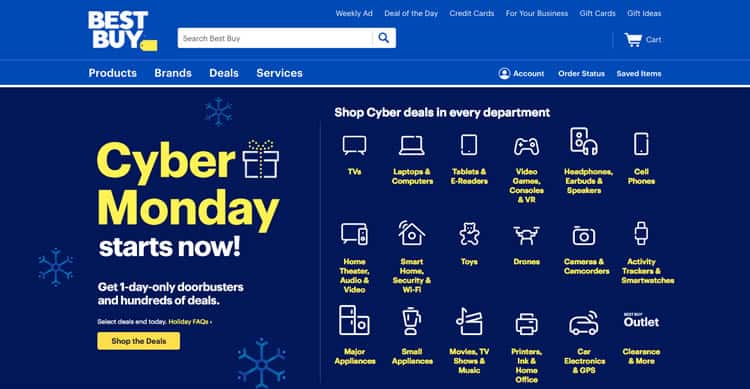
Take Best Buy, which has dumped its entire hero image for what is mostly an expanded version of its navigation bar. What was once allotted just a drop down menu now takes up a majority of the page’s real estate, and the navbar has been replaced with a Cyber Monday-specific one – deals literally has its own option.
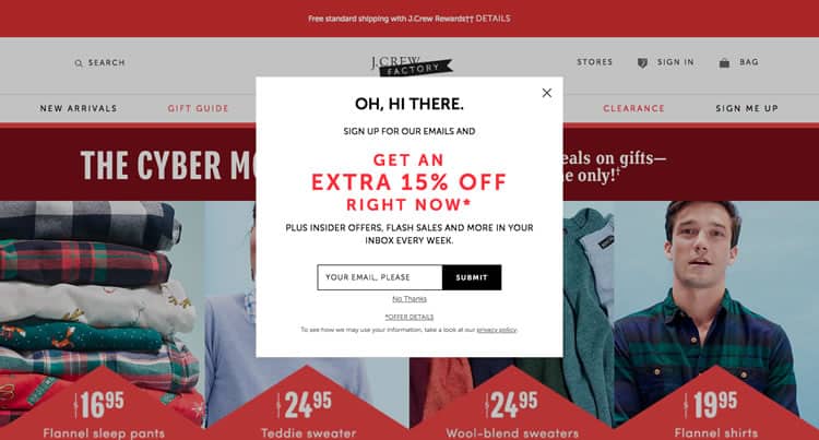
J Crew takes it a step further. Their hero image is just four product collections and their discounted prices. J. Crew’s market research department has likely done their due diligence on what products make for quick, impulsive purchases. The result is navigation and customer preferences taking a backseat to the more urgent snap decision of seeing a bargain and whipping out the credit card.
Interestingly, J. Crew has paired this buy-now strategy with a pop up asking for the customer’s email. I would be very curious to see how the conversion on this CTA was. Typically, requesting an email address immediately is a UX faux pas as you want to demonstrate value to the user before the ask. So, on Cyber Monday particularly, I cannot see too many users taking the time to fill this out. (Then again, maybe that fifteen per cent discount is too good to pass up).
Revving Up The Urgency
J. Crew’s Cyber Monday strategy indicates a larger marketing trend during the retail holiday: catering to the trigger-happy shopper, rather than the one takes their time navigating and comparing before checking out.
One of the easiest (and cheapest) ways to do this is to instil a sense of urgency into the user. Again, this is relatively common in standard eCommerce practice: it is every checkout timer, every ‘low stock’ indicator, every ‘X other users are viewing this listing’.
However, Cyber Monday has that sense of urgency, that pressure already baked into the holiday. So many deals, limited supplies, so little time. Many companies this year leaned into stoking that fire, and probably few have done it better than eBay.
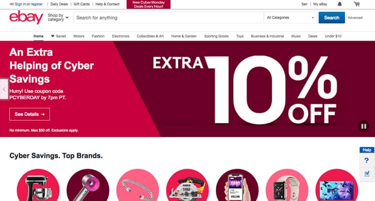
It makes sense for an online marketplace that relies so heavily on timed transactions to employ this strategy for Cyber Monday, and it acts as a testament to the impact copywriting has on user experience. These frantic, hurried call-to-actions – beat the clock, new deals every hour – these get the ‘buy now’ impulse itching.
If you are still not convinced this falls into the user experience realm, take a look at the colour eBay’s web designers have painted their hero image with alarming shades of red to accentuate the copy. (Sometimes you cannot get go wrong with a classic bright-red sales tag).
Total Color Upheaval
Also, while we are on the subject of colour, consider Walmart‘s UX strategy for Cyber Monday. Walmart’s style guide is likely comprised of different shades of blues, perhaps with a few orange-yellows and off-whites thrown in, to flesh out the scheme.
However, on the busiest retail holiday of the year, Walmart ditched all of that in favour of a green-heavy palette.
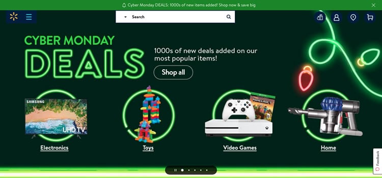
Why the change? Well for starters, green evokes the winter holidays, specifically the hyper-commercialised Christmas. It also acts as an attention-grabber for those who regularly shop at Wal-Mart’s online presence. If a user does most of their online shopping at Walmart.com, this stark contrast is going to grab the attention of their most loyal customers.
The retail giant is sacrificing some of their branding for this interface, but for Walmart, the tradeoff is worth it.
If It Ain’t Broke, Don’t Fix It
Interestingly, another titan of the eCommerce industry decided to employ a strategy that is almost diametrically-opposed to Walmart’s. Take a look at Amazon‘s home page during Cyber Monday.
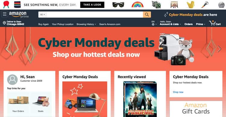
This is not far-off from Amazon’s standard homepage at all. Sure, you have got your basic Cyber Monday marketing fare: a banner and a few cards dedicated to the holiday. However, for the most part, this is the same Amazon interface that myself and millions of other customers are familiar with, making it easier for us to navigate and more comfortable to shop.
Moreover, unlike J.Crew or Best Buy, which are merely shoving discounted products in your face and hoping you will bite, Amazon continues to emphasise personalisation. Note the card that reads ‘recently viewed’ still has real estate above the fold. This design tells us that Amazon is betting that Cyber Monday is going to be the day you finally buy that product you have been looking at, even if it is not on sale.
Another curiosity about this design strategy: it is the polar opposite of Amazon’s site design during the corporation’s personal retail holiday, Prime Day. On Prime Day, Amazon revamped their entire interface, recalibrating the site’s focus to be centred almost entirely on timed-deals, rather than pure product searches.
What Is Next For Cyber Monday?
Companies have a calendar year to start preparing for Cyber Monday 2019, and it is likely they are already doing just that. For us designers, our job continues to keep our finger on the pulse of the design trends that emerge during this time.
After all, Cyber Monday really kicks off the much broader shopping season. Companies will soon be rolling out customer experiences explicitly designed for the holidays- and when they do, we will be sure to keep a look out for what is coming next in the UX design world.
Want to learn more?
Are you interested in the managerial and strategic aspects of UX? The online course on UX Management and Strategy can teach you the necessary skills on the subject and earn you an industry-recognized course certificate to advance your career. If, on the other hand, you want to brush up on the basics of UX and Usability, the online course on User Experience might be a better fit for you (or another design topic). Good luck on your learning journey!
(Lead image: Depositphotos. All other photos in this article are screenshots taken when visiting the respective websites. They are being shown in this article for explanation purposes.)
