If you have ever run a user testing study before, you may have experienced a scenario where you have observed a user do something completely unexpected. It can sometimes be difficult to fathom observed user behaviour. In this article we decode an unexpected user testing result with the help of some basic neuroscience principles.
During user testing studies it is important that researchers approach the study with an open mind and are ready to expect the unexpected.
It is not uncommon for user testing studies to clarify themes and observations that had already been identified through other data sources. Other data points such as web analytics, heatmaps or session recordings may have identified problem areas and user testing can be deployed to further explore the theme and add in a layer of qualitative user insights.
Yet, it is important that researchers don’t commence studies with the sole aim of generating specific findings to validate research already completed. It’s intellectually dishonest to run a study in this way and it introduces a considerable element of bias into the study. And perhaps an even greater risk to the study is that by focussing the study on the issues that the team suspect already exist, it becomes easy to miss other key insights that may emerge from unexpected results.
It is the unexpected findings that often drive the real added value from a user testing study.
Some unexpected findings that arise from user testing studies require a little decoding – since they are unlikely to be supported by data points from other sources. In this article we untangle a particularly interesting insight generated from a user testing study with the help of some basic neuroscience principles.
The unexpected finding
Here we delve into an unexpected result that occured in a user testing study run by User Fountain. It was unexpected because the resulting insight was not something that other data points had identified as being a problem area. But also because the user behaviour captured in the study was quite astounding. The user was looking for a filter element on the page – the filter existed and was in a prominent position but the user simply did not see it.
To explain in a little more detail, as part of the user testing study, users were asked to find an office space on the test website that was within a particular price range. To do that effectively, they needed to make use of the filter that was on the page.
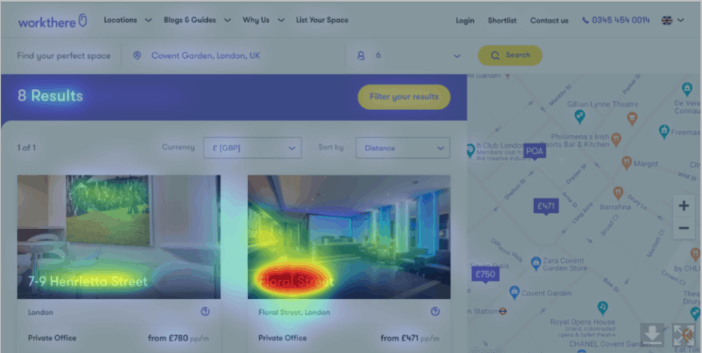
The filter was behind a well sized button that was yellow and placed centrally on the page, as illustrated in the screenshot below.
However, after over 1 minute of searching the user could not find the filter.
‘We need some filters really for price’
‘Well that’s a bit of a pain, I wanted to use some filters actually’
It’s fascinating watching how the user’s mouse navigates within millimeters of the filter button yet the user does not register that there is a filter option available – it is simply not seen.
This particular study didn’t include eyetracking biometric analysis – it would have been interesting to analyse if the filter button came into the users central vision throughout the exercise or whether it remained in their peripheral vision only.
We can however retrospectively put the page through a predictive eye tracking tool which uses an algorithm to assess the visibility of different areas on the page. Figure 1 shows that the majority of visual attention goes to the tiles showing the office space and name and the visual attention to the filter button is low. The regions of interest analysis which analyses the visibility of the filter button shows that the button has an average level of visibility compared to the other elements on the page.
So our predictive eye tracking analysis has suggested that although the filter is not the element with the highest level of visual attention on the page – it does get an average share of visual attention. So it is still surprising that the user is not able to see the filter.
Decoding this result with a little neuroscience
So what exactly is going on here? The button is big, yellow and placed centrally on the page – yet the user doesn’t see it.
To explain this we can use the following neuroscience principle: people identify objects by recognising patterns
In psychology and cognitive neuroscience, pattern recognition describes a cognitive process that matches information from a stimulus with information retrieved from memory.
Recognising patterns means that the brain can quickly make sense of the sensory input being delivered to it every second. And this means that the brain wants to make sense of what it sees through use of pattern.
In figure 2 – there are 8 dots shown on the page. The brain immediately interprets the space, or lack of it between the dots as a pattern and communicates back that there are 4 sets of 2 dots rather than 8 individual dots. And that’s because your brain inherently wants to see patterns.
A further phenomena is that the brain can create patterns out of what it expects to see – even if what it expects to see isn’t actually there.
Take figure 3 as an example – this is an optical illusion known as Kanizsa Triangle. The brain interprets the shapes on the page to reveal a triangle shape in the middle. Yet there is no triangle drawing in the illustration, just a series of lines and incomplete circles. The brain reveals the triangle shape after assimilating the shapes around it and concluding that the triangle is the pattern it would expect to see in the middle.
The ‘phantom edge phenomena’ where you see an outline that is not actually there is due to neural cells detecting breaks in lines or shapes, and if given no further input, they will assume that there is a figure in front of the lines, thus completing it.
So we see again – the brain turns what it sees, only if it is just half a pattern, into a full pattern in order to make sense of it.
So – bringing this back to our user testing example where the user did not see the filter button on the page – we can use some of these neuroscience principles to explain what’s going on.
The user did not see the filter because it didn’t exist in the form of the pattern that the user expected. Most websites don’t hide filters behind a button – they are typically found directly on the page – with facets visible, as illustrated in figure 4.
So in the user testing example, a button simply wasn’t the pattern that the user was expecting to see.
To conclude
In the words of Steve Krug, ‘Don’t make me think’ is the approach that needs to be applied to the online experience. If components, such as a filter aren’t typically found behind a button in a standard web design – that is not how the user would expect to find it. They are looking for a filter mechanism not a button. So when the filter is put behind a button, they simply can’t see it. The user can’t complete their task, driving frustration and potentially damaging conversion rates.
In your next user testing study ensure that the study is constructed in a way that facilitates the collation of unexpected findings – rather than solely focusing on validating insights and themes that have already been identified. And if an unexpected finding is uncovered, consider what simple neuroscience principles can be applied to decode the finding and put it into context.
Want to learn more?
Want to get an industry-recognized Course Certificate in UX Design, Design Thinking, UI Design, or another related design topic? Online UX courses from the Interaction Design Foundation can provide you with industry-relevant skills to advance your UX career. For example, Design Thinking, Become a UX Designer from Scratch, Conducting Usability Testing or User Research – Methods and Best Practices are some of the most popular courses. Good luck on your learning journey!


