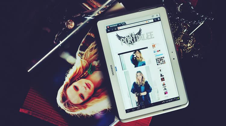
When a user makes a purchase on your website, there are many factors which contribute to a successful conversion. To name just a few, there is trust, design, speed and usability. It would be simplistic to narrow the reason down to just one such factor.
Assuming that your site’s design, speed, usability, and trustworthiness have brought the customer as far as your product page, one of the major selling points are the product images.
Indeed, product images are among the final pieces of the conversion puzzle. Here is how you can ensure that you are getting the most from your product imagery.
1. Don’t Skimp on the Images
It is important that your eCommerce site has as many images as it needs in order to show what the product looks like. As you build up your product image catalogue, you must also remember not to upload redundant imagery. Images should be of a high quality, yet optimized for the web (a Content Delivery Network can come in handy here to serve high-res images). Without high quality photos, users may not be able to make a purchase decision and will steer away from your website.
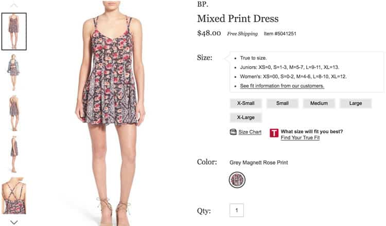
The Urban Outfitters site does a great job of this. In the above screenshot, the images show what the dress looks like from multiple angles, showing all of the details in the process. The 2nd image even shows what the item looks like with another product, suggesting another way to wear the dress.
2. Make Your Images Dynamic with 360° Views
A 360 degree product view allows your customers to move the product around and see it from every angle. With a 360 degree view, your eCommerce site will need far less imagery.
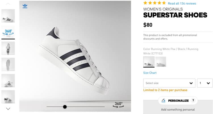
This technique attempts to replicate the experience of physically going into the store and touching and moving a product.
When DueMaternity.com added a 360 degree view to its products, they saw an increase of 27% in their converstion rate, and when Golfsmith.com added 360 degree views to certain products, they saw that their conversion rates were 30 – 40% higher than the ones with regular imagery.
3. Contextualize Your Product Images
Put your product into context. An image that shows the target audience using the product will clarify exactly what the product is, how it is used, and who is likely to use it. It also gives the user a sense of the product in the real world.
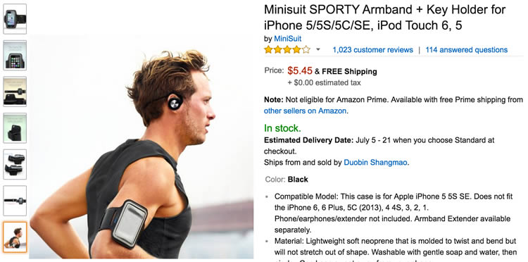
Today, a lot of marketing is about selling an experience, and not just a product. Putting your product into context does just that.
4. Find the Perfect Zoom
Zoom is all about finding balance. Too little zoom can be useless, while too much zoom can put the product out of perspective. The image should zoom in enough for the user to see every relevant detail, mimicking the way a potential customer sees the product in a real, brick and mortar store.

The right balance of zoom functionality will give a better experience to the shopper. Remember that when a potential customer is in-store, they can pick the item up and look at it closely. The right zoom balance will make them feel more confident about their purchase.
5. Show the Product Texture
For certain products, texture is important. This can be problematic since it can be difficult to get a feel for the texture of a product via a digital image. This may unfortunately mislead a customer, making them unhappy with their purchase, apart from potentially writing a (justifiable) bad review about your product. This, not to mention the additional cost that needs to be dedicated by your company’s support staff to handle a client complaint and replacing such product (depending on what your returns policy is).
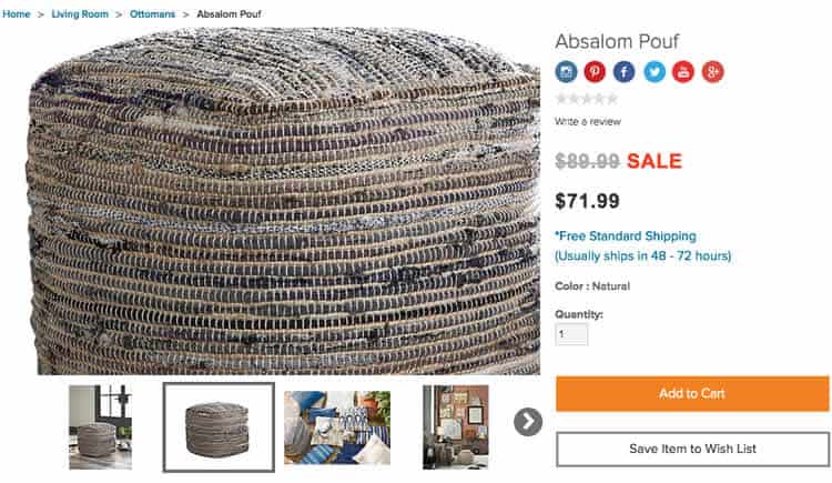
In some cases where a product has a distinct texture, it is okay to violate the ‘perfect zoom’ rule so that the texture of an item can be shown. Zooming in extremely closely will help show the texture.
Texture tends to be most important in the furnishing industry. In the image above from Ashley Furniture, the level of zoom allows you to see the unique texture of the product. For some customers, this may be the selling point and you may be losing out on sales if your customers are unable to see that texture.
6. Show a Picture for Each Variation in Color or Style
How many times have you bought something online only to find that it was not the exact shade of color that you expected? Simply put, if your product has 12 different colors, you should have 12 different images showing the product in each color.
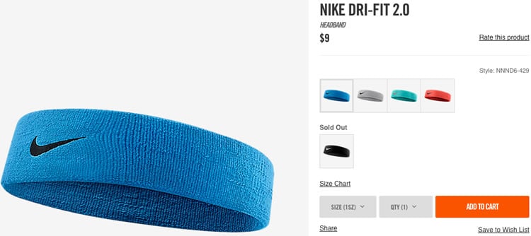
Instead of just listing the colors, you should show the product in each available color. This can be done in 2 different ways:
- List the color options in the catalogue product page. When a color is clicked, it updates that page with the bigger image showing the product with the color chosen.
- Show multiple photos of the product in different colors. Each color would have its own image in the list of product images.
The first option confines a product that has multiple styles/colors into one product page and is more usable for customers.
7. Show the Size of Your Product
Showing the size of your product can be necessary in order for your customers to understand its actual size. If your product is small, you can put something small (that potential customers can identify with) next to it, so that they can easily compare. The same reasoning applies for long or high products.
Many stores do this (if the product is small enough) by writing “actual size” next to the image. Starbucks sometimes does this to show the size of their drinks on a chalk board. This mechanism can be used in more than just online retail stores.
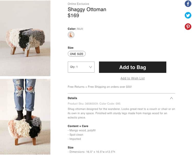
Typically, product images have a white background, instead of being in a real-world setting. When you need to show scale, the white background may not be enough. Putting the product in a real setting, such as a living room, kitchen, on a deck, etc. will help put the product into context and show the real size.
The product page above shows both the product alone, and the product with a person’s feet on it. This helps give the customer a sense of scale by showing that it is large enough to rest your feet on and that it is even sturdy enough to stand on.
8. Are there any Hidden Features?
Some products have hidden features or compartments in places that you would not expect. Instead of having your customer surprised to find out that there is a hidden drawer in the bed frame they purchased, the product image ought to showcase exactly that (and use it as a selling point over similar competitor products).
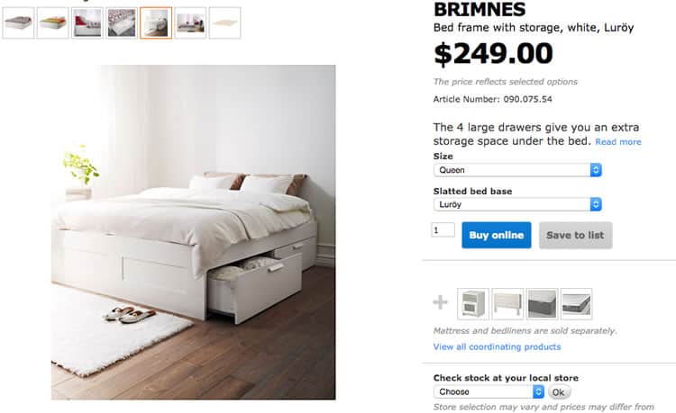
It is important to have an image where you can clearly see every aspect of a product. Displaying the features that make the product stand out will help it sell.
9. Use Videos to Better Convey what the Product Looks like in Real Life
The point of a product video is to show the product in use, help people understand the product and to provide potential customers with as much information as possible. Unlike photos, a video has the ability to convey a lot of information, in a very short amount of time.
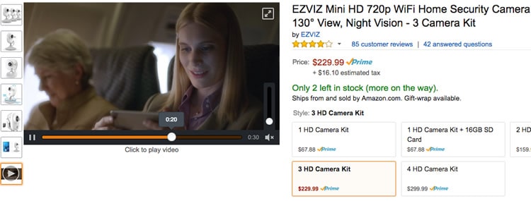
How do people hold it? What does it look like in different lighting? How do you use it? What is a different way this can be used?
Videos are far more effective than photos alone, at communicating multiple details about a product.
10. Conserve the Customers’ Clicks
To maximize usability on a product page, have all of the variations of a product in the same product page so the user can click between options without leaving the page. The screenshot below from Urban Outfitters does this with both the type of frame and the size.
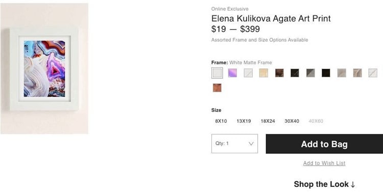
Going to the search bar and searching a different version, or going back to the search results just to see an image of the alternate version of the product is simply a waste of time for the user.
Want to learn more?
Are you interested in the intersection between UX and UI Design? The online courses on UI Design Patterns for Successful Software and Design Thinking: The Beginner’s Guide can teach you skills you need. If you take a course, you will earn an industry-recognized course certificate to advance your career. On the other hand, if you want to brush up on the basics of UX and Usability, try the online course on User Experience (or another design topic). Good luck on your learning journey!
(Lead image source: kaboompics via Pexels.com – Creative Commons CC0 License)
