
e-Commerce websites are increasing at an incredibly fast rate. There are no boundaries and any geographical restrictions have long disappeared, allowing shopping enthusiasts to shop at their convenience. In spite of these advantages, most e-Commerce websites are performing poorly. e-Commerce websites often fail in their primary objective of making purchasing easy for customers. This article explains common pitfalls and provides a set of e-commerce usability guidelines that can help you make your site more usable.
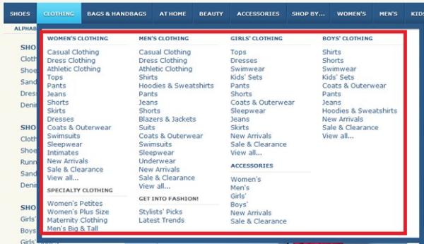
1. Navigation: Keep it simple. Don’t confuse your customer
Is your navigation structure a complex maze hidden under complicated series of clicks? If yes, this is the biggest strategic blunder in an e-Commerce website. A neat navigation structure will allow smooth and effortless browsing, which ultimately encourages visitors to continue explore the site and turn them into regular site visitors. You need to give tactical thought to the navigation structure of your website to ensure that customers are able to locate information, compare products, and make payment with minimum clicks. To improve the navigation of your e-commerce website, you can head over to this article.
2. Homepage: Get it right the first time
Your homepage often creates first impression on the minds of visitors – at least for those who have commenced browsing your site by going through the door. It is imperative that site visitor must find exactly what they’re looking for the moment they arrive. e-Commerce websites need to display numerous product offerings rather than just displaying one or two products on homepage. By displaying very few products on homepage, you are narrowing down customer’s choice from the word go.

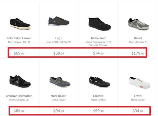
3. Product Page Font Visibility: Grab visitor’s attention
Right color combination, font size, and font color ensures that visitors do not have any problem viewing product details and that they find relevant information they are looking for in the shortest possible time. So, every element should be designed to achieve this goal.
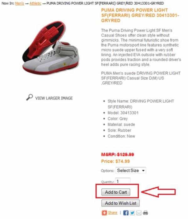
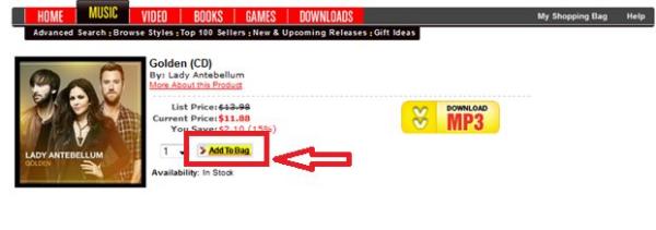
4. Add to Cart Button: Final action just a click away
Very often, the ‘Add to Cart’, the final action button in an e-Commerce website is either not well designed or strategically placed to grab prospective buyer’s action. The selection of shape, color, font typography, and button content all trigger the final action. Make sure the ‘Add to Cart’ button is obvious, bright, and prominent in comparison to other features on product page such as wishlists, view product, email to friend, or check out buttons. Less important functions should be lighter colored buttons or simple text links.
5. Font Visibility: A Costly mistake
Another often overlooked e-commerce usability guideline is selecting right typography. Deciding on what font type, font size, and font color to use can be very tricky. You may spend thousands and thousands of dollars on cutting-edge e-Commerce platform and hire most expensive developers for its robust performance, but your site just won’t work if this very basic and crucial aspect of website designing is neglected.
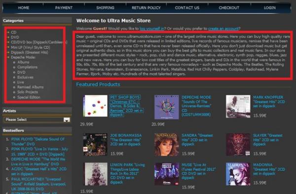
6. Primary Navigation: Quick access guaranteed
It is equally important to have an intuitive and engaging primary navigation so that users can find information they are looking for quickly with minimal clicks. For those who are not aware, primary navigation controls are present in a sidebar to the left, right, or top of a page on inner pages. These controls allow users to surf effortlessly on the site. The easier and interesting you make it for your audience, the more likely they are to stay on your site, buy the product they are looking for, and return to your site in future. Dull and mundane primary navigation just won’t work.
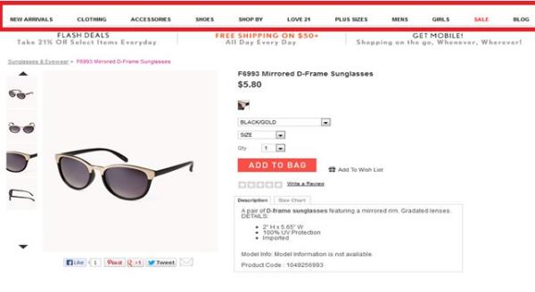
7. Trust: Key lies in winning customer’s trust
e-Commerce websites run on the fundamental principle of trust. In order to win customer’s trust it is very important that you study customer psychology. Lack of secure site (https) or lack of a certification by an Internet trust organization can prevent customers from buying from your store. Online businesses must provide security against misuse of confidential information and clearly display privacy policies. Providing guarantees as will client testimonials of actual clients (fake testimonials will hurt you more) will help in improving credibility of your site. It is equally important that you mention details for contacting your organization such as physical address and phone number.

8. Special offers: Don’t save best offers for last
Customers are looking for special offers, discounts, or best deals. Don’t shy away in flaunting such offers at the home page. It is most likely that customer will review special offers and it will strike a chord on the first attempt. Remember the goal of e-Commerce website is not just better user experience, but also to increase sales and improve bottom-line results.

9. Breadcrumbs: Where am I?
What is a breadcrumb? It is text-based navigation that shows your current location in the site hierarchy. If your existing e-Commerce site does not have breadcrumbs, it might result in customer discomfort. Customer might feel lost in the maze of product links and rattled if unable to find exact location in site. Highly time-effective, breadcrumbs help in reducing site abandonment and prevent consumer from going off track while placing an order.
Please see an example of breadcrumb below:
Home>>Brands >>Women>>J. Renee
Not only does it give your location within the site, but it also provides shortcuts within the site hierarchy. It is a standard navigational element in most of the robust and successful e-Commerce websites.

Conclusion
Success of e-Commerce websites lies in improving user experience, keeping it simple, and winning client’s trust. This will not only result in converting potential clicks into final transaction payment, but also strongly influence the customer to revisit your website in future.
Want to learn more?
If you’re interested in the intersection between UX and UI Design, then consider to take the online course UI Design Patterns for Successful Software and alternatively Design Thinking: The Beginner’s Guide. If, on the other hand, you want to brush up on the basics of UX and Usability, you might take the online course on User Experience (or another design topic). Good luck on your learning journey!
(Lead image: Depositphotos)
