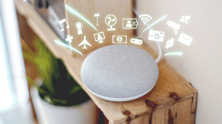
From dictating addresses to Waze to asking personal assistants such as Siri to do tasks for you, more and more products and services are migrating to the cloud, and being controlled by voice. Hila Yonatan is discussing this new trend from a UX perspective, and what does it say about the next product/feature we’re going to work with?
When Apple first launched Siri, they probably have planned on changing the world – but they might not have anticipated the extent of the shift in our perspective towards technological devices. It’s true, much of the hype surrounding Siri is a direct derivative of the fact that it’s an Apple flagship product (if you can call Siri “a product”), but even a harsh critic would have a tough time overlooking the importance of the new & shiny personal assistant, on which Jobs had all his chips on. Countless people had uploaded videos of them interacting with Siri. BuzzFeed lists of the “20 of the funniest Siri reactions” were published, and even a dramatized version of the topic was immortalized in the movie “Her”, starring Scarlett Johansson as Siri-not-Siri.
From there, voice user interfaces were pushed to the center of the stage. What is it about this technology, which allows us to talk to our home appliances, that changes the world in front of our eyes? How does it affect the products we’ll use in the future? From a professional standpoint: what does it say about the upcoming interfaces, and to what extent the people who design them will have to adjust their way of thinking?

How do we actually use this thing?
The more we learn about automation, and the devices around us get smarter – we see a larger array of voice user interfaces in various products. When I first learned about the feature to dictate where “I’m going to” on Waze or Google Maps, or set a reminder without typing keys, I assumed we’d see an increasing number of such activities in apps.
If we talked about IoT (the “Internet of Things”, a concept that claims that every device is a network-based entity) a few years back, nowadays we see that it’s no longer a sci-fi idea, but a factual reality. This trend had come to pass with the help of two planes that had grown one towards the other.
The first – the fact that there’s “an app for everything”. Most electric appliances, in one way or another, are being controlled with an app. It’s starting with internet-connected light bulbs, via printers and smart TV sets, up until the ability to lock your front door by clicking a large, clear button in a dedicated app.
The second – smart assistants. A few years ago this was a science fiction scenario, but today we can see that everyone’s onboard on this. It had started with Siri, made its way to the Amazon Echo devices featuring Alexa, Google also joined the bandwagon with their Assistant (I wonder why they’ve decided not to give their persona a human name) and even Microsoft had pulled Cortana from the videogame world into reality.
All of these are connected to your accounts, are able to remind you of an important meeting or set a timer for boiling an egg, but the potential that these applications have is much more than just helping a user do or remember stuff!
Recently, we’ve seen those two vectors merge into one product. So, if you could have hired a real personal assistants, who could do many of your activities (aside of non-defined activities, such as “pick up from the floor” or “pack a bag”), what would you ask them to do, and when?
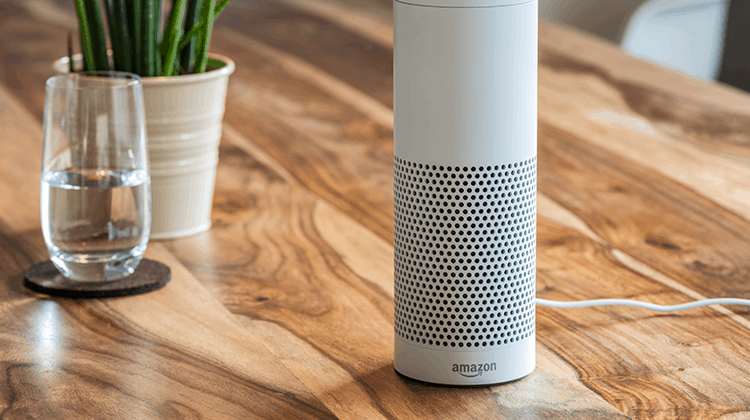
Managing your day from the cloud
As far as daily routine goes – connecting my phone to my wireless car speaker allows me to say “Hey Google, good morning!” – a phrase that would make sure my curtains at home are shut, the air conditioner is off, the lights are dimmed, will update me on upcoming traffic in my route, read out loud items from my daily agenda – and maybe even will top it all with launching my “driving” Spotify playlist. By saying exactly 4 words, I get a complete suite of actions, with a large portion of delight.
The sheer amount of products that are pre-based on voice, or offer such components, is on the rise. Scratching the surface, I can mention the Philips and Xiaomi lightbulbs that are voice controlled and offer a gallery of moods and scenarios. More notable solutions include the infrared-based RM-Pro device that controls an array of devices, products that control your water heater and AC, refrigerators, autonomic vacuums, blindfolds, power sockets and more – the sky’s the limit.

Above all these, we have control apps such as Google Home that act as conductors to this orchestra – by creating rituals, while being seamlessly connected to the Assistant. It means that our entire house can be online and controlled on request, and more importantly – after an initial setup, some of the applicative interfaces can be deemed irrelevant once “plugged” into your Assistant. In terms of accessibility, these capabilities also help us welcome new and untapped audiences that require the extra attention (such as the visually-impaired). So – alongside visual interfaces and their benefits, VUI (voice-user-interfaces) open the door to new interaction possibilities to us all.
If that’s not enough, invest a moment of your day and watch this proof of concept, which recently became a reality:
Even if this clip is slightly “doctored” – I’m sure that Google are heading there, if only to retain their stock value 🙂
The post-screen and user experience era
Voice and speech-based interfaces are examples of pure man-machine interaction, as conceived by various senses. There isn’t a visual interface, with near-zero screens. A (hopefully short) on-boarding process takes place, with an obvious need to plan it right. We expect the average user to be able to operate the product, to connect it to the web using a simple app – and from this point on start talking to it with no further thought.
Being a UX planner, I aim for my target audience’s intuition. I’m sure that most of us already invest time and thought into planning, researching and implementing the takeaways learned from our users’ behavior, all with the intention to be able to accomplish the central action in the most convenient and transparent manner. Taking it a step forward: the ability of your system to have a conversation with your users is crucial, think about how difficult it is to generate intuitive engagement – and add to that the fact that you’re required not to use visual aids.
We see a paradigm shift, from our perspective as interface and experience designers. We had focused on screens, appearance, micro-interactions (all of these are still important) – now we have a new world to chart, that includes: conversation trees, immediate endpoints, tone of voice, data sources, conversation topics, analysis in real time and much more.
Trust me, conducting a qualitative user research for such a thing requires a change of perspective. We have to consider everything from checking what’s the most basic way to phrase a question (in order for it to get a short and accurate response) and up to the creation of an experience that’s not too robotic or creepy 🙂
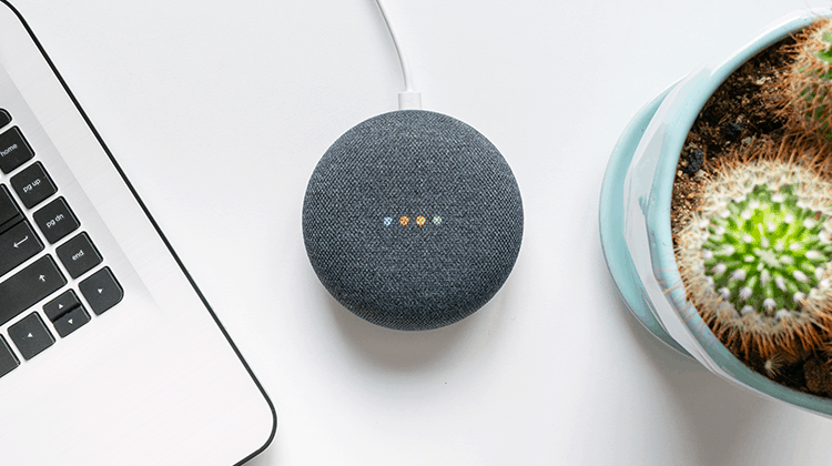
Conversations with colleagues in parallel areas confirm that further adjustments are required, apart from user experience. The content must be clear and focused enough to be deemed a worthy answer to a spoken question. I’m referring to technical preparation that affects Google’s (and other companies’) ability to scan and interpret the text. In case there are marketing efforts taking place – it’s crucial for them to be in line with the new experience we’re trying to generate engagement with. Those are no longer just algorithms, but virtual systems that seamlessly connect to physical appliances, while negating the need for “official apps”. Therefore, the role of UXers in the development stage of products that include (or based on) voice components, is more crucial and central.
Next time you say “Hey Google, tell me a joke” or “make the light turquoise” or “count sheep before I doze off” (please :)) – and get a light, informative or useful response that suits all and offend none – remember that there are user experience professionals that invest time and thought into engineering this entire thing.
Adjusting ourselves
I had assembled several topics for you to refer to when you think about designing a voice interface. Let’s look at the way we humans talk with each other and see if can deduce from that how a voice interface should sound and feel.
1. Addressing attention, intuition and continuance
When we have a conversation with another person, we actually need all three of the above. The process requires attention from the person we are speaking to, followed by some kind of intuition as to how the response might be and then be prepared to continue a conversation based on that response. A speech based system should be inspired by those aspects.
The definition of a successful speech-based system largely depends on the user’s ability to interact smoothly with it. Stuttering, misunderstanding or irrelevance will deepen the conceptual gap and remind the person the fundamental truth – that they’re talking to a piece of software. In order for us to create the perfect illusion, we must aim for the most fluent experience possible. When we reach a stage in which the user is being able to have a complete conversation with the product (several sentences, in contrast to a single query), we can assume that every other factor checks out.
It’s important to remember that when addressing people’s attention span, the interaction should be even more intuitive than usual, in order for us to reach a point where we have a verbal conversation with what’s essentially an algorithm. If the Turing test examines the ability of a computer to sound reliable to a human tester – in my opinion, the voice assistants are well past this point, up until the fact that the lines are fuzzy (sometimes, there’s a need to make the voice slightly “machine-like”, to avoid a dissonance).
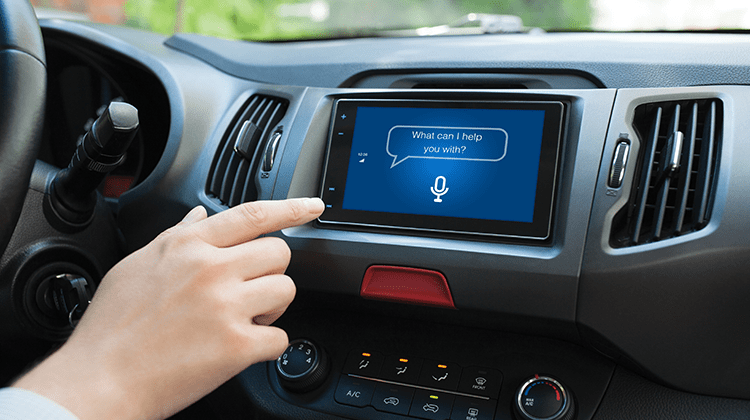
2. Scenario trees
Let’s take a look at a relatively basic process – scheduling a brunch with a friend, with all of the implications, by ourselves. We have to adjust to each other around our free time, to confirm, to make a note in the calendar (with the specific time – for a reminder, and place – for clickable navigation). It’s easy to see how this chain of actions could stump a program, and how many scenario trees this trivial action requires. A major part of creating voice-based interfaces is dictated by the need to create detailed scenario trees. You get bonus points for making your system “learn” and generate new scenarios by itself – which leads to the popular “machine learning” buzzword.
For example, when I speak with Google Assistant, I tend to add “thank you” at the end of our vocal exchange. For me, as a UXer, it can mean that the experience was successful (and the conclusion of the scenario had been reached). When the primary user input is voice, and a user adds the “extra” touch of thanking the system – this means that the goal was reached. The SMS and Story culture lead us to creating abbreviated content and immediate actions. In the perspective of language, voice interfaces “re-train” us in conversation skills, with complete and clear sentences, and even a bit of politeness 🙂 You’re welcome to try it yourselves…

3. Measurements and user research
For those of you engaged in the development of voice interfaces (or components), I’d suggest thinking about quantitative user research, as early in the product’s life as possible. At some point, you’ll have to be able to measure the system’s performance – which originates in setting specific KPIs.
The “obvious” metric is the number of actions that were accomplished successfully, but personally, I consider a fluent conversation also a success. Meaning: the system’s ability to have a session that includes more than one action within the same context, while retaining the ability to collect big-data, in favor of improving the algorithm.
In the field of voice-based system research, there are two general approaches: qualitative user research, and quantitative data.
Let’s address the verbal aspect first. Qualitative user research is pretty much straightforward. Best case is speaking with the users themselves, listening to an average conversation structure. Slightly-less best case is a textual transcript of conversations. The purpose here is to identify when the process was completed successfully, and whether the exchange was positive or not.
Quantitative research is not that simple. Generally speaking, UX research in this context requires the initial development of proprietary tools, or at least heavily customizing existing tools. We have to teach a system what “success” and “failure” are, to identify pain points within the process, and even abandonment. In the absence of data, there could be a state in which the process wasn’t successful at all, but as far as the system sees it – it was. The system was able to find the song you asked for, in response to asking for a chocolate chip cookies recipe (there are several explanations for this outcome).
In short, expect to go over many, many flowcharts (yay :)).

The “coming soon” part
If the vision of the market leaders will be manifested, we’ll be able to choose whether to conduct ourselves without screens, via cloud, very soon – with everything connected: schedules, electric appliances, smart cars and routines that tend to our every need. Where does this leave us, user experience architects? We must start to think if and where we should integrate a voice user interface (or component), assuming it serves the purpose. When you are able to offer the right solution at the right moment – you have a killer feature in your grasp.
Amazon’s Alexa is constantly expanding its ecosystem, by making itself more compatible, by improving the AI and leaving enough space for external “skills” to enhance Alexa’s knowledge and abilities. Each skill is a microcosmos of user experiences, wrapped in the same, familiar voice.
If all of the aforementioned is executed flawlessly and doesn’t require attendance and fixes in “crucial” moments like in the example above – we have an excellent usage experience, that crosses platforms, runs in the background and is subjected to quantification and measurement. On top of it all: if all of this sums up to happy users that got what they wanted, and we were able to spare them from more actions and more screens to look at – we’re gold. That’s what we’re all here for, isn’t it? 🙂

Want to learn more?
If you’d like to get an industry-recognized Course Certificate in UX Design, Design Thinking, UI Design, or another related design topic, then consider to take an online UX course from the Interaction Design Foundation. For example, Design Thinking, Become a UX Designer from Scratch, Conducting Usability Testing or User Research – Methods and Best Practices. Good luck on your learning journey!
