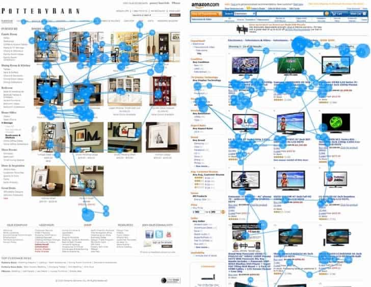
According to the Nielsen Norman Group, the average person spends less than a minute on a webpage. Many users only take 10-20 seconds to decide whether to stay on the website or explore the depth of the internet even further. That means you have very little time to capture the attention of your reader.
The internet is filled with millions of different blogs on every type of subject, each with their own stiff competition. If your blog is an unreadable mess, the viewer has plenty of other options to obtaining the same information, therefore, it’s up to you to keep the reader on your blog, long enough to read the entire post. Satisfied readers will be much more likely to return to your blog in the future.
This is not as insurmountable as it may seem. Readers don’t ask for much. You already have the writing skills. Now, all you need is a guarantee of readability on your blog. Here are a few easy tips to make your blog more readable:
1. Cater the Post Length to the Reader
When it comes to informational blog posts, readers are looking for short, concise posts. That means 400-600 words. I would advise against sticking to the 300-word minimum as set by Google for SEO purposes. For whatever reason, if your post needs to be longer, it is important to make short paragraphs, 2-4 sentences long.
It is a good idea to break up the paragraphs in a manageable way. Readers are very likely to skim, so you want them to find what they need quickly. Use bullet points, numbered lists, or bold headlines for this purpose. For example notice how this article on the americasaves website goes directly to the point by providing 4 answers to how couples can reach their financial goals.
2. The Importance of Good Typography
Do not let anyone tell you that size does not matter– at least, not when it comes to your blog’s font. While there are hundreds of fun and interesting fonts, simplicity is best. Fonts like Arial and Times New Roman (especially for headings) are staples because they are easy to read. There are various typography guidelines to make your blog more readable so be sure to check them out.
Your introduction paragraph should have a slightly bigger font than the rest of the blog to catch the eye. However, you do not want it to be too big because it will take up more space than needed on the page, making it more difficult to read.
3. Light Background
Building a blog from the ground up can be exciting. There are so many options in terms of style and color. Simplicity is key. A background that is either too dark or has a distracting pattern will be too difficult to read clearly and easily. You will want complementary font and background color, with the font being many shades darker. Also, try to remember which colors clash and the psychological effects that different colors have on readers.

4. Easy Navigation
When a viewer is looking for additional posts on your blog, they shouldn’t have to dig for longer than 5 minutes to find what they want. If a reader is spending too much time finding a relevant post, that reader will likely move on to the next blog.
Use easily definable tags on every blog posts so that people can navigate with ease. Don’t hide the tag search either, because it might become the best, most used function on your blog.
5. A Liberal Use of Images
Nobody wants to read a wall of text. For particularly larger posts, adding pictures is a great way to break up the text and make your blog more usable, thereby making it easier on the eyes to read. It can also help the organization of the post.

A relevant looking picture can draw the eye to the blog, making it more interesting to continue on. Remember, it’s all about keeping a reader on the page for as long as possible. An upsetting picture is a surefire way to ensure the viewer clicks away from your blog.
6. Stay Away From Too Many Numbers
Statistics can add a lot of gravitas to a blog post. They back up facts and show that you did your research, but they are not generally easy to read. Too many numbers in a post can make a reader impatient. Present the facts as simply as possible and maybe stick to one number fact per blog post.
7. Keep it Natural
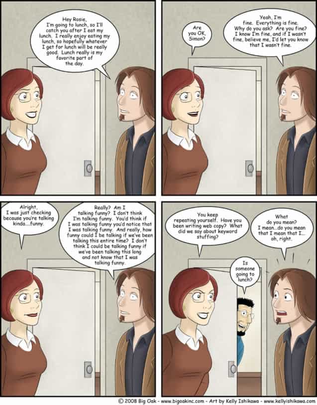
Your readers are smart (they chose to read your blog after all), so treat them like it. If it looks like a blog was written solely for SEO purposes, a reader will know. Bogging down a post with too many keywords will be overall harmful to your entire blog. Write as naturally as you can; your reader will appreciate it.

8. Understand Your Audience
Before starting to write a new blog post, ask yourself: What sort of reader would be interested in this? A blog about agricultural affairs probably is not going to have many readers interested in the latest gossip about a teen pop star. On the same train of thought, there is certain content that a user would expect to find on a specific page. For example when reading an article about airline credit card offers, the reader would expect a comparison showing the pros and cons of different credit cards that are available. It’s your blog and you can write whatever you wish, but try to write for your readers.
9. Unnecessary Extras
Inexperienced bloggers want to do it all. They want their website to be the coolest on the internet. There are tons of gadgets, widgets and plugins that can be added to any site. However, just because they can be added, it does not mean they should. Be careful as to how many widgets you add as these will inevitably slow your website. Ask yourself: will the user benefit from this widget?

A website that automatically starts music or a video will be closed in a matter of seconds. Gifs make readers with slow internet take longer to load your site. Making the mouse look different on your webpage can be more annoying than fun. These are all aspects of the internet that went out of fashion years ago. People should want to be on your site for the content, so that should be your main focus.
Conclusion
As you can see, there are several ways to make your blog more readable. These are what I personally think as being the most effective but I am sure you have your own.
Want to learn more?
Are you interested in the intersection between UX and UI Design? The online courses on UI Design Patterns for Successful Software and Design Thinking: The Beginner’s Guide can teach you skills you need. If you take a course, you will earn an industry-recognized course certificate to advance your career. On the other hand, if you want to brush up on the basics of UX and Usability, try the online course on User Experience (or another design topic). Good luck on your learning journey!
(Lead image: Depositphotos)
