Often, the best way to explain the difference between user experience and user interface to the unfamiliar is through a more relatable analogy. If UI is how the car looks, UX is how it drives. If UI is a dating profile, UX is how the date goes. These comparisons illustrate the differences well, but sometimes underplays the complexity of user interfaces.
UI is much more than a coat of paint or a Tinder profile. It is an entire environment, a multi-faceted construct where every single pixel counts. Colour theory, layout, typography, font selection – these small elements we rarely consider for more than a few seconds when using a platform are painstakingly chosen to optimise the entire experience.
So when clients ask us a question like ‘what’s better, a light-based user interface or a darker one?‘, the answer is not so simple. Countless factors should influence a design decision as crucial as the foundation of your platform’s UI.
However, we are a UX design agency at heart, so today we are going to view the question through a lens of pure usability. That is not to say there are no other essential criteria: would a dark or light interface align with your existing brand, or would it seem incongruous? Darker interfaces are currently ‘trendy’ – is it important your platform looks hip? Instead, we want to hone in one of the critical factors: whether or not it will improve usability.
Readability
Whether it is a light UI or a dark one, your choice will impact one pillar of usability more than any other: readability. That is because readability is so dependent on contrast – specifically the juxtaposition between text and background. You obviously would not want to pair similar colours of font and backdrop together, but even diametric opposites such as black-on-white or white-on-black have their pros and cons.
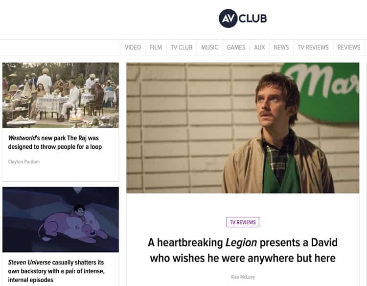
For most cases, black text on a light UI remains the most readable. It is why nearly all blogs, newspapers, and other online publications (like UsabilityGeek for instance), employ a white or off-white background with simple, black text.

However, while this is the most readable, it also can fatigue the user’s eyes for long periods of time. I am sure you have experienced writing a long document in Microsoft Word or Google Docs and eventually felt your eyes start to tire.
That is why text-heavy interfaces where the user will be reading for extended periods of time often opt for a dark background with light text. It is still readable, but it will not strain the eyes as much as its inverse. You often see this technique utilised by programmers. When coding for hours at a time, they need a UI that will not cause fatigue and allows their vision to stay sharp.
User Environment
When we talk about the user’s environment, we are not only referring to where the user is interfacing with the platform but also when. For the purposes of the light vs dark debate, that ‘when’ can be simplified to day or night.
As you would probably expect, dark interfaces are ideal for nighttime or evening environments, whereas lighter ones are suited for the daytime. The harsh bright light of a smartphone can cause discomfort when viewed in a dark room, and the muted aesthetic of a dark UI will not show up as well in a brightly lit area.

Again, the most obvious example here is to look at websites like the New York Times or AV Club, who publish articles and features for their readers to digest throughout the day. In contrast, interfaces like Netflix, Steam, or Spotify are being used after the work day, when the sun has gone down, and its users are cuddling up for a movie or video game.

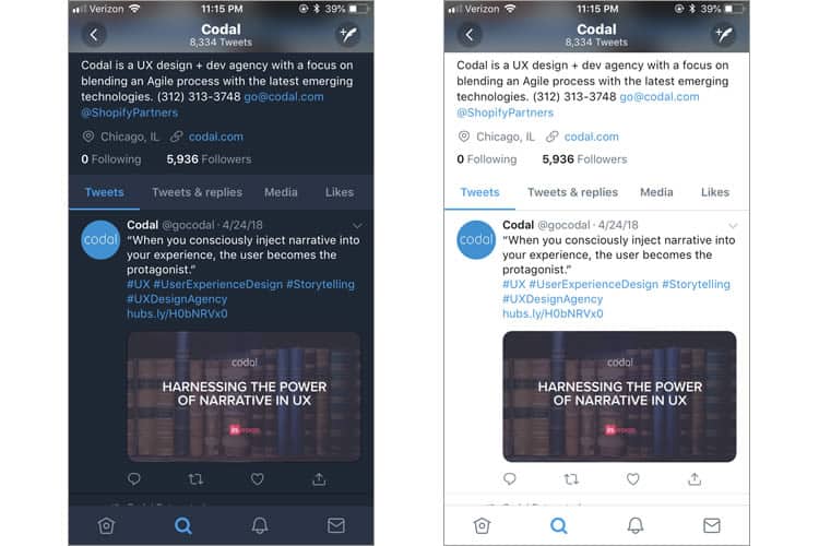
Platforms that are used throughout the entire day, like GroupMe and Twitter, offer their interfaces in both light and dark, branding the latter as ‘night mode’. Also, Google Maps will automatically adjust its UI based on local time, to provide their users with a more accessible navigating experience.

Emphasis
What elements do you want to draw the user’s eyes to on your platform? Is it one, centralised component, like a contact form? Alternatively, is your content more varied (like a product page)? The answers to questions like these should also factor into your decision between a light or a dark UI.
Let us revisit the Spotify example – its darker interface allows for more comfortable viewing in more dimly lit locales, such as a party or a dinner. So why does its primary competitor, Apple Music, utilise a different technique?
The first reason may be purely brand-related (Apple loves crisp white interfaces), but there is a usability factor as well. Apple’s UXers want to emphasise the platforms’ diverse colour elements, namely, the album art.

When you scroll through Apple Music, the cover art of your favourite records pop off the screen, as well as the profile photos of each artist. By using a white background instead of a darker one, Apple puts the user’s music in the spotlight by highlighting their apps varying colour-based elements: the album art.
On the other hand, a darker interface is ideal for when there is less visual elements on the page. Think of a stage, the kind you might see at a local theatre: it is all black. Same goes for the Mercedes website, which wants you to look at one thing and one thing only.

Dark or Light?
A simple question with a much more difficult answer. The factors covered in this article are crucial, but they are still only from a usability perspective. There are other lenses to view the issue with too – I am sure your marketing team has an opinion on the matter as well!
User interface design is one of the most creative, artistic aspects of the entire UX process. Moreover, in art, rules are meant to be broken. So do not take the advice given here as definite rules, but rather guidelines to help you or your UI design agency make the choice that’s best for your users.
Want to learn more?
If you’d like to…
- learn all the details of Usability Testing
- get easy-to-use templates
- learn how to properly quantify the usability of a system/service/product/app/etc
- learn how to communicate the result to your management
… then consider to take the online course Conducting Usability Testing.
If, on the other hand, you want to brush up on the basics of UX and Usability, then consider to take the online course on User Experience. Good luck on your learning journey!
(Lead image: Depositphotos)
