Minimalism has been an increasingly popular trend in the web design world. Designers may be tempted by bolder, feature-rich design because it might seem like the best way to engage user attention. Research, however, suggests that this is not the case. In fact, the same research suggests that visual complexity affects a user’s perception of the site within 50 milliseconds of exposure. Understanding this fact about first impressions can guide you to making the most of that time.
Users are most attracted to sites that have a clean design. Moreover, people are increasingly aware of a site’s usability. Modern users tend to favor designs that focus on necessary components and eschew distracting bells and whistles. While it may sound counterintuitive, minimalist design can offer higher user engagement, better usability, and appeal that is more aesthetic.
A Short History of Minimalist Design
Some web designers mistakenly regard minimalism as a primarily aesthetic choice. They neglect the fact that the ultimate goals of minimalism are usability and economy – the ability to do more with less. To avoid the pitfall of focusing only on aesthetics, it is important to understand the roots of minimalist design. While it may be a newer trend in web design, the underlying ideas have been around for much longer.
When discussing minimalist design, one of the first things people may think of is Japanese traditional culture. Because of cultural values that favor balance and simplicity, Japanese architecture, interior design, and graphic design have long employed minimalist aspects. The emphasis is on simple colors and design choices that promote functionality and a sense of calm.
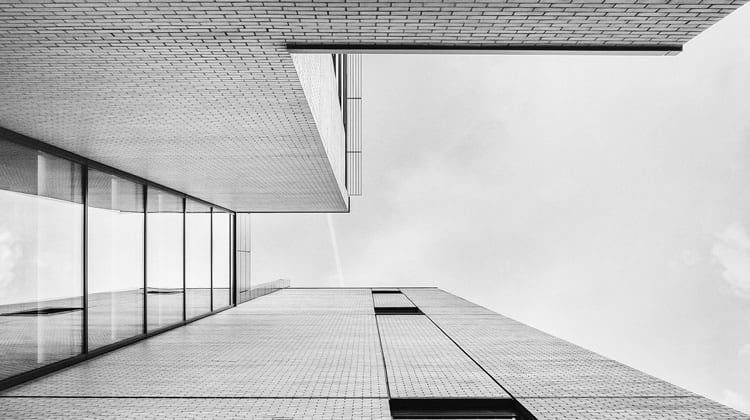
As a Western movement, minimalism began early in the 20th century. Influenced by the introduction of modern materials, such as glass and steel as well as new building technologies, architects such as Mies van der Rohe began to employ minimalist designs in their buildings. Interestingly, Van der Rohe is credited with first applying the phrase “less is more” to design, making him an icon in the minimalist movement that shaped much of the modern era.
The less-is-more attitude quickly moved from architecture to other arts and industries – interior and industrial design, painting, and music. The central idea was to do away with any element that didn’t significantly contribute to the deeper purpose or function. As a preference for simplicity developed, so too did consumer products that employed the concept. Mid-century modern furniture did away with excess ornamentation and focused on clean lines. This carried through to the present with furniture manufacturers like IKEA offering simple, easy-to-use designs.
Minimalist web design began as a natural application of these principles in reaction to a trend of increasing complexity in web design. Unnecessary animations and Flash intros bogged down the user experience, and some web designers decided that it was time to return to the less-is-more mentality.
Minimalist Web Design
Minimalism was applied to web design first in the early 2000s but has recently seen a flurry of interest. The popularity of these designs is evident in the success of such sites as Squarespace and the demand for minimalist-inspired WordPress themes.
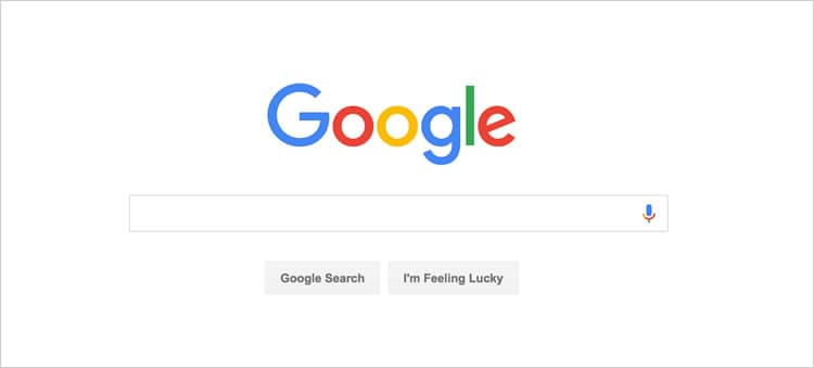
Even Google, the most popular website in the world, demonstrates minimalist principles:

The Google homepage is designed entirely around its central search function. Anything unnecessary to the function, other than branding, was eliminated. Branding is even more prominent. Not only is it one of the few visual elements on the page, but because the page remains uncluttered; it’s not distracting. Google’s minimalist philosophy is a great one to follow to improve user experience and promote engagement.
Minimalist Components
Consider the following important applications of minimalist web design to maximize the effectiveness of an interface.
Use of Negative Spaces: In this context, negative is a positive. Negative space is just the empty space between visual elements. More empty space means more emphasis on existing elements. In the above example of the Google homepage, it’s impossible for users to have trouble finding the search function. Negative space helps prevent information from overwhelming users.
By removing anything that isn’t necessary to the page’s goal, designers ensure that users have a less stressful and more engaging experience. The most challenging aspect of executing proper use of negative space is in not removing so much that users have to search unnecessarily for the features they need – that would defeat the purpose of minimalist design. While negative space is often also called white space, it doesn’t have to be white. Some sites use full-color backgrounds to energize empty space.
Contrast: Employing a simple high-contrast palette gives a site a fresh, modern look. When there are fewer visual elements on a page, the palette can have a greater impact. Moreover, high contrast can help make a site more readable and can direct users to important information or potential actions. As the goal of minimalist design is ease of use and efficiency, high contrast is good choice for many sites.
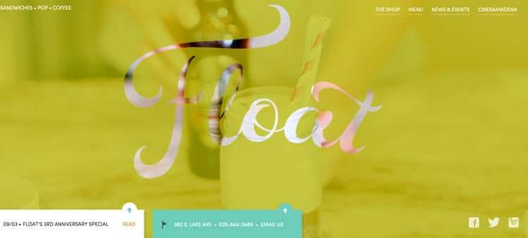
Dramatic Typography: Whether employing minimalist principles or not, typography is a key to successful web design. In minimalist design, however, dramatic use of typography becomes even more influential, because there are fewer elements on a page. This places more emphasis on typographical decisions and can be employed to great effect.

Designers should be cautious when using dramatic typography, however. Use ornate fonts sparingly and as central design elements. Choose content with care to be sure that the emphasized message or action is the right one.
Simplicity: Simplicity is, ironically, a little more complex to define in the context of web design. It’s not just about the way a site looks; it’s about the user’s overall experience interacting with the site.
One thing that simplifies a user’s experience is the ability to accomplish tasks easily and without distraction. The biggest contributing factor to this kind of simplicity is intuitive page navigation. “Simple” designs don’t confuse or distract users from accomplishing their goals. Rather, they blend into the user’s experience, so that the user can focus.
Another way to simplify design is to cut unnecessary decorative elements, such as Flash animations. While Flash was popular for several years, it tends to create problems on a page and doesn’t add anything in the way of functionality. Under the principles of minimalist design, it’s just not a good idea.
Be Simple, But Clear
As with appropriate execution of negative space, designers should be careful not to eliminate necessary features while trying to simplify a site. An example of this problem is the popular hamburger menu, where central navigation is collapsed under a single menu icon.
There are instances where the hamburger menu is an appropriate choice but for many sites, a visible central menu will better engage users. If a site’s goal is to expose users to new information or products, taking away the menu function in the interest of simplicity actually works against minimalist goals.
Minimalism for a Successful User Experience
In web design, it might be most accurate to revise the less is more adage. Less is more if less does more. As the web design field focuses more and more on user experience, designers need to create the most usable and attractive sites possible. Carefully applied, minimalist principles can help designers make attractive and effective sites with fewer elements, simplifying and improving users’ online interactions.
Want to learn more?
If you’re interested in the intersection between UX and UI Design, then consider to take the online course UI Design Patterns for Successful Software and alternatively Design Thinking: The Beginner’s Guide. If, on the other hand, you want to brush up on the basics of UX and Usability, you might take the online course on User Experience (or another design topic). Good luck on your learning journey!
(Lead image source: Foundry – Creative Commons License)
