
You are probably already familiar with fixed navigation, the design mechanic where a navigation bar aka navbar (or some of its elements) remain visible on the screen as the user scrolls.
Sometimes referred to as ‘sticky navigation‘, this UX design trend has lived up to its name for the first fixed navigation bars began appearing in the early 2010s, and have since stuck around to become a tentpole feature of modern web design. That is a long time to remain in vogue, especially in the fickle world of UX trends.
Moreover, fixed navigation does not seem to be falling out of style anytime soon either, as it is a feature shared by some of the most cutting-edge desktop experiences on the web today. Take a look at the site rater Awwwards.com’s recent Site of the Day winners, and you will see just how popular sticky navigation is.
Despite its prevalence, implementing a fixed navigation bar can be a difficult needle to thread, and it is not without its drawbacks. I asked some of the architects at the UX design agency I work for, Codal, to describe some of the best practices and things to keep in mind when implementing fixed navigation. Here is when to use it, when to avoid it, and how to get the most of that persistent little navigation bar.
Does The Site Need One?
Before we figure out the best way to insert a sticky navigation bar, let us pump the brakes and ask ourselves if one is even necessary. To discover one indicator that a fixed navigation bar could be the right call, all you have to do is look back at its origin.
Back in the early days of web design, desktop experiences often had convoluted sitemaps, with different functionalities or features scattered across multiple pages. It was easy for users to go down rabbit holes or in circles, searching in vain for what they were looking for.
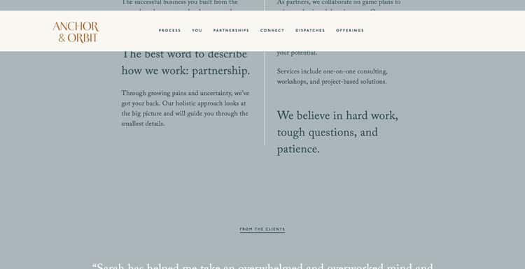
To address this, they opted to consolidate the website into as few pages as possible to keep things simple. Some sites took this to the extreme and placed everything on a single, scrollable page.
The result of this was longer web pages and longer scrolling times. Users would get all the way to the bottom of a page, decide they should have clicked on a navigation bar item instead, and then scroll all the way back up. The solution? A navigation bar that follows you down the page.
So if the project you are designing has longer pages without any sort of quick mechanic to get users up and down the page, fixed navigation may be the answer.
Looking at it from an industry perspective, fixed navigation is perhaps most common in retail and eCommerce sites, where research has found them to be extremely useful in curbing cart abandonment. In one study, an online marquee retailer implemented fixed navigation and saw a conversion uptick of nearly three per cent. Next time you are designing an online store, consider keeping that navigation bar visible as the shopper scrolls.
That same study also looked into how different user types responded to sticky navigation. They found it resonated with older adults and much younger users – the two extremes of the age demographic. Clicktale posited this was due to lower confidence levels of these user groups in navigating the digital world. Sticky navigation is a useful crutch to ensure the user does not feel overwhelmed, which is something to keep in mind next time you are designing an interface.
The ‘Back To Top’ Tradeoff
Fixed navigation‘s critics claim the design trend is too intrusive, and that its persistent motion can distract the user from the actual content on the page.
These detractors instead suggest a simple alternative: a fixed ‘Back to Top’ button. After all, it is subtler, less distracting, and takes up less real estate than a bar spanning the entire length of the screen. Plus, it can be tough to translate fixed desktop navigation to mobile (though there are ways around this!)
This is all true! However, as with everything else in UX, there is a tradeoff. While ‘back to top’ buttons are less intrusive and (potentially) easier to implement, they are also forcing the user to do in two clicks what they could do in one. If the user has scrolled through the page, then wants to click the navigation bar, they will need to hit ‘Back to Top’, and then their desired option.
It does not seem like much, but UX design agencies and usability researchers spend much time poring over how to make the user experience as streamlined as possible. One extra click is significant, especially in the eCommerce world.
Additionally, usability studies have found fixed navigations are empirically faster to navigate – the results of the study found that a fixed navigation bar shaved thirty-six seconds off a five-minute visit to a website.
If you are not impressed by that number, try this one: of the forty participants in this usability study, one hundred per cent of them preferred a fixed navigation bar to one that remained at the top of the page.
Best Practices For Sticky Navigation
Now that we have touched on when and why to implement fixed navigation let us get down to brass tax. Here are some things to keep in mind when designing your scrolling navigation bar:
Not all of it has to move!
If you are concerned that dropping the entire navigation bar down as the user scrolls might be a tad too distracting, remember that sticky navigation can take significant portions of the bar, and leave the rest on top. Take a look at this example. From HopDeco:
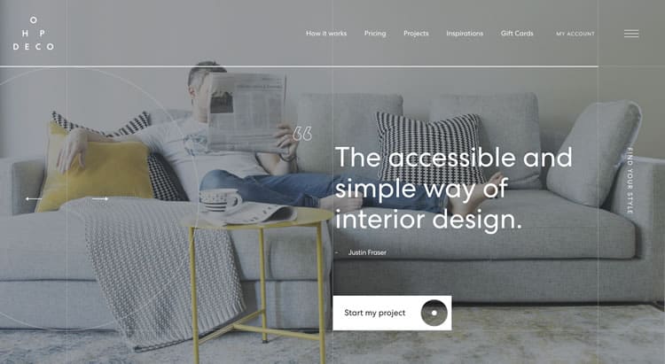
Note the navigation bar and side navigation nestled in the top-right corner of the page. Now let us scroll.
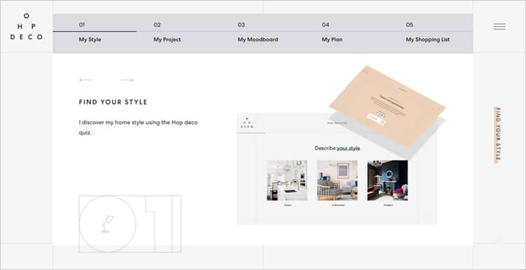
The upper navigation bar disappears, and the side navigation remains. If you select the hamburger icon, a menu fills up the entire screen – including the options that comprise the navigation bar at the top of the page.
Be Careful With Colors (Or Stick To The Basics)
Unless you have got an entirely monochromatic page, it is crucial to avoid colour clashing between the sticky navigation and the content it is accompanying. Incompatible colours are not just about causing an eyesore – they can severely impact the page’s readability as well. At the same time, you might not want your navigation bar changing colours every time the user scrolls.
Here is how Ocean School did it and did it well.

This relatively sparse navigation bar has just a handful of options, making it a solid candidate for fixed navigation. However, Ocean School’s website is extremely colourful, featuring several different blues, greens, and purples.
So instead of changing the navigation bar with every new section, Ocean School drops in a white background as soon as the user starts scrolling as can be seen in the screenshot below. That way, there is never any conflict between navigation bar and content.
Navigation, Fixed
Fixed navigation is an extremely versatile tool for designers to keep in their arsenal. It is dynamic, it adds another layer of interaction to the desktop experience, and best of all, it is not too difficult to design out. If you have not already, you might want to try implementing a fixed navigation bar in your next design – they seem to be sticking around for the long haul.
Want to learn more?
Are you interested in the intersection between UX and UI Design? The online courses on UI Design Patterns for Successful Software and Design Thinking: The Beginner’s Guide can teach you skills you need. If you take a course, you will earn an industry-recognized course certificate to advance your career. On the other hand, if you want to brush up on the basics of UX and Usability, try the online course on User Experience (or another design topic). Good luck on your learning journey!
(Lead image: Fancycrave.com via Pexels. All other photos in this article are screenshots taken when visiting the respective websites. They are being shown in this article for explanation purposes.)

