Most UX and UI designers already understand the nuts and bolts of typography. They can tell you the difference between ‘font’ and ‘typeface’, between ‘mean line’ and ‘baseline’. They might fret over the tracking of a particular font, or cringe at subtle kerning miscues that an untrained eye would gloss over.
However, fewer designers grasp how these mechanics translate to the business decision of selecting a typeface. It is more than opting for a font family that is inoffensive to the reader’s eyes – you are choosing a fundamental unit of the user interface, the vehicle for a company’s voice. How do you capture a mission, a style, a business’s entire essence within a set of characters?
Of course, if you are working for an enterprise UX design agency such as the company I work for, Codal, you might not need to grapple with the answer very often as your clientele will consist of businesses who already have standardised fonts in their branding or style guides.
However, when you are tasked to select a typeface yourself, or even design one from scratch, your client will not care about your knowledge of serifs and ligatures. They will want to know the typeface’s impact on their website, why this specific typeface was chosen, and how it will help further their business goals.
Here is how you can answer.
Understand The Broader Strategy
Before you can begin scanning font libraries, you need a complete grasp of the larger purpose and mission of the experience you are crafting. The message you are conveying should inform the typeface you select, not the other way around.
Often, clients will offer this information upfront or at least a vague idea of it. “We want something that commands attention, that screams hip, unique, original – unmistakable from anything out there!”.
Whether your client offers something as unformed as that or provides a detailed outline of their company’s voice, it is not a bad idea to jot down a few descriptors that summarise their vision to act as a guideline when selecting a typeface. Is the company’s ethos playful? Luxurious? Brash and bold? Identifying these characteristics will help you intuit which typeface matches the overarching aesthetic. For example, an ornamented serif typeface might exude elegance and class, whereas a sans option could elicit a more casual and accessible feel.
Consider The Environment
After identifying the characteristics your typeface should embody, the next step is to consider the environ your typeface will exist in. We know we are dealing with digital experience here, not print, so we need to consider the likelihood that your reader will be browsing on a mobile device.
That means choosing a typeface that will remain legible on smaller screen sizes, without imposing a strain on the user’s eyes. I highly recommend testing on a variety of mobile devices to ensure the font is suitable for all displays.
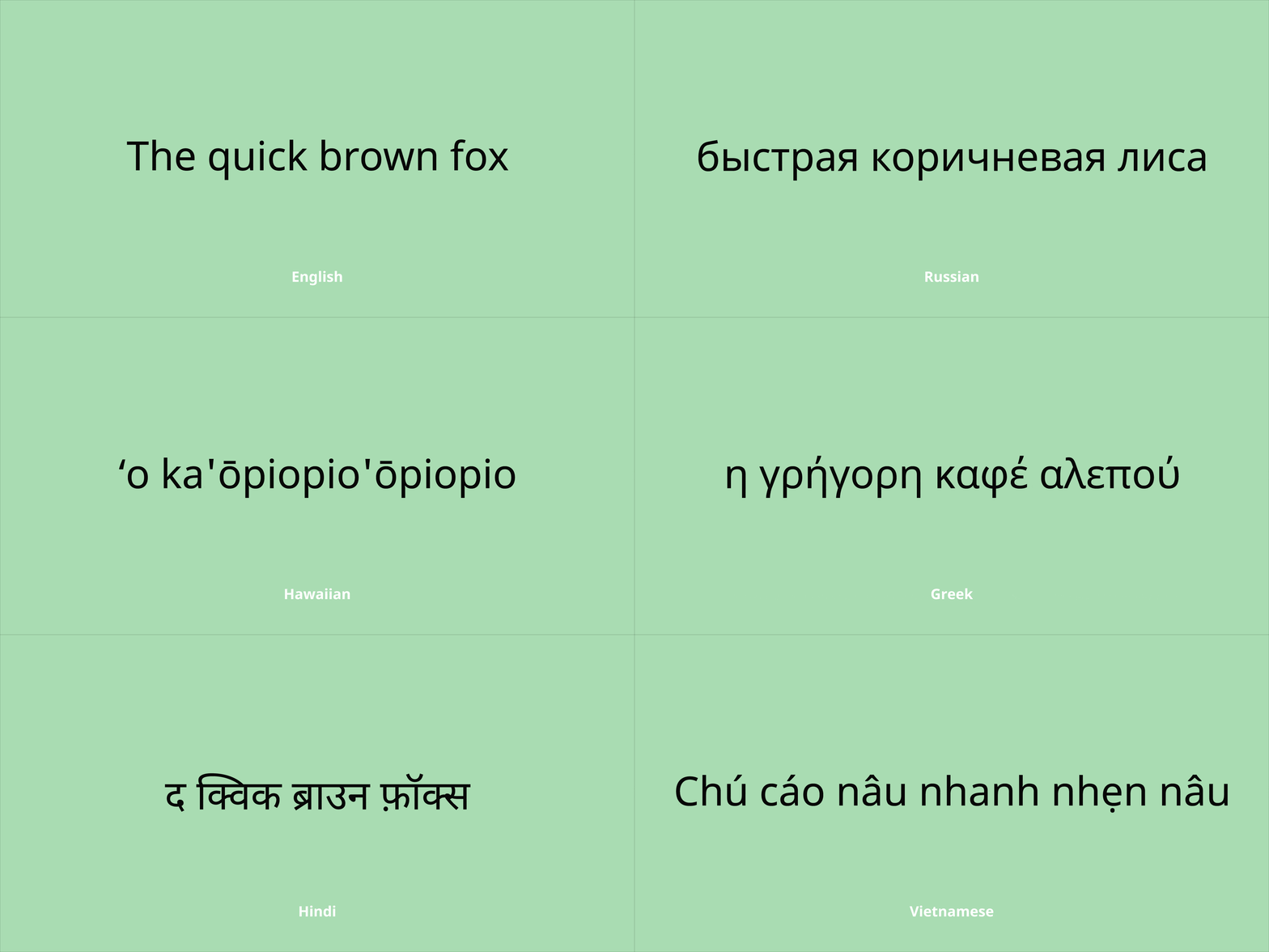
One oft-forgotten consideration when selecting a typeface is how the text may look when translated to a different language. If your website will be available across the globe and localised, you want to ensure your typeface looks just as good in French, German, Swahili and Russian as it does in English.

That is why your font selection should include characters that exist outside most Western alphabets. This probably will not limit the scope of your options as many typefaces support multilingual text, but it is essential to double check. If you do not, it is likely the translator will take over, and replace your precious font with a particular character of its own choice.
Legibility, Readability, Versatility
These are the three key criteria your typeface must meet, and all of them add up to a single dogma you should be familiar with: usability. Set aside the aesthetic, the voice, the style of the typeface for just a moment, and examine it purely from a utility perspective.
Legibility
Legibility and readability are likely interchangeable to the layperson, but for UI designers and typographers they represent two distinctly different properties of text. I like Userzoom’s definition of legibility the best: a measure of how easily a reader can distinguish individual characters of text.
A line of text’s legibility is determined by a slew of different factors – contrast, kerning, uppercase or lowercase – but there are a few general guidelines as well. As a distinguishing character feature, serif typefaces are often considered more legible than sans serif, and UX designer Becca Kennedy cites a Carnegie Mellon University study to argue that upright fonts, rather than italic or slanted ones, are usually more legible.
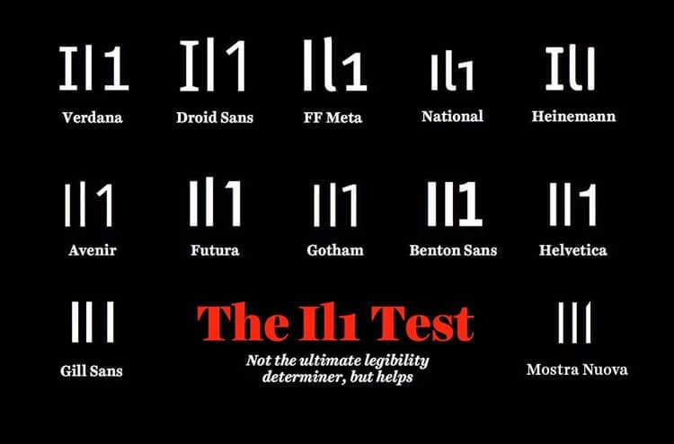
Again, these are rules of thumbs, not commandments. If you would like a more accurate legibility barometer, I would recommend the I/l/1 test. Just type a capital I, a lowercase l, and the number one. If you cannot tell the difference between the three, you may have a problem.

Readability
Like legibility, readability is a measure of how well a user can discern the text on the screen. However, readability describes the overall digestibility and comprehension of the content, rather than the individual elements of that text. Essentially, legibility is more granular, whereas readability is a big picture.
Choosing a readable font has its own set of considerations – unjustified is more readable than justified, and research suggests that users prefer line lengths of about four inches – but you do not need an analogue of the I/I/1 litmus test to determine readability. It is likely you can conduct some guerilla usability testing, pulling subjects from the hallway or conference room to see if they can read your typeface without strain.
Versatility
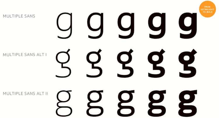
Typefaces are often referred to as a family of fonts, and some families are larger and more diverse than others. The website you are designing will have a visual hierarchy, and your typeface needs to be able to match it with different weights and styles.
You are probably already familiar with the most versatile typefaces out there. Sometimes referred to as ‘workhorse fonts’, these include Georgia, Arial, Franklin Gothic, Roboto, and more. They are useful for experiences that are heavy in content but are not going to win your web design any awards for creativity.

If you are already stuck in a situation where you have to use a less flexible typeface, you can experiment with combining different ones in your experience. Melding different typefaces can produce some interesting and unique aesthetics, but you should exercise caution to avoid a clashing or incongruous look. Without hard and fast rules, you will have to rely on your instinct and experience to pull it off.
A Familiar Ending
If you are a longtime reader of UsabilityGeek (or Codal’s user experience design blog for that matter), you will notice a common thread between how-to articles like this. The short answer in UX design, almost always, is ‘it depends’.
It would be nice to offer a typography cheat sheet, to disclose quick and easy formulas for selecting a client’s typeface, but user experience design is not that simple. There are few axioms in this industry, no ‘always use X for eCommerce sites, and Y for marketing pages’.
What this article can offer you instead is a foundation, a starting point to think about the impact of the design choices you make – like which typeface to use, for instance. By entering this headspace, and thinking about typography in this way, you will be better prepared to defend your design choices.
So when your client asks ‘why did you pick this font?’, you will have an answer.
Want to learn more?
If you’re interested in the intersection between UX and UI Design, then consider to take the online course UI Design Patterns for Successful Software and alternatively Design Thinking: The Beginner’s Guide. If, on the other hand, you want to brush up on the basics of UX and Usability, you might take the online course on User Experience (or another design topic). Good luck on your learning journey!
(Lead image: Florian Pircher via Pixabay)
