In user interface (UI) design, it’s important to pay attention to even the minutest of details so that the experience for the user is pleasurable and memorable. Here, you will learn how to use the principle of error prevention to create an awesome user experience (UX). So, if you are interested in going that extra mile for your user, creating an awesome UX and becoming a better UX designer, then read on.
Error prevention is one of the 10 usability heuristics proposed by Jakob Nielsen. To put it in Nielsen’s words, error prevention includes the following:
“ Even better than good error messages is a careful design which prevents a problem from occurring in the first place. Either eliminate error-prone conditions or check for them and present users with a confirmation option before they commit to the action”.
Essentially, it involves alerting a user when they’re making an error, with the intention to make it easy for them to do whatever it is they are doing without making a mistake. The main reason this principle of error prevention is important is that we humans are prone to- and will always make mistakes. From a UX standpoint, it becomes even more important as:
- In today’s age of information overload, a user is always burdened with tons of information and can be easily distracted. So, the chances of making mistakes are even higher. Consequently:
- People don’t always see or read everything on the screen.
- People make mistakes when typing, clicking etc.
So, the burden falls on us as responsible UX designers to be able to prevent users from making these mistakes as often as possible without interrupting their workflow.
To put this in context, let’s take an example of Mailchimp, a leading American email marketing service, which allows its users to automate sending their emails at particular intervals. Now, Mailchimp knows that its service is used by businesses all over the globe to communicate all sorts of information to their customers such as newsletters and/or other updates. Due to the sensitive nature of the service and the fact that Mailchimp does not want its users to either delete or send a particular email by mistake, it has the necessary safeguards in place. For instance, if I have set up an email to subscribers of my website to be sent out for a particular date and I wish to delete that email campaign, it will ask me to confirm my actions as shown in the figure below:
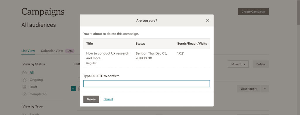
As you can see from the image above, unless I type DELETE, I would not be able to delete the batch of emails which I had scheduled to send out to my subscribers.
Mailchimp follows a similar strategy when I want to send emails to my subscribers. To prevent me from accidentally making an error and sending out emails when I should not be, they have the following safeguards in place:

As you can see from the image above, before I can send out an email to my subscribers, there is another pop-up which asks me to confirm my actions. By repeatedly asking me to confirm my actions (and not being intrusive when doing so as you should not bore your users by asking them to confirm their actions repeatedly), Mailchimp is demonstrating the principle of error prevention exceptionally well, thereby making a user feel secure and creating an overall good UX.
Now let’s look at some examples which demonstrate bad design in this regard- i.e., no error prevention and compare them with services which demonstrate good design- i.e., excellent error prevention.
Bad design: Bitly
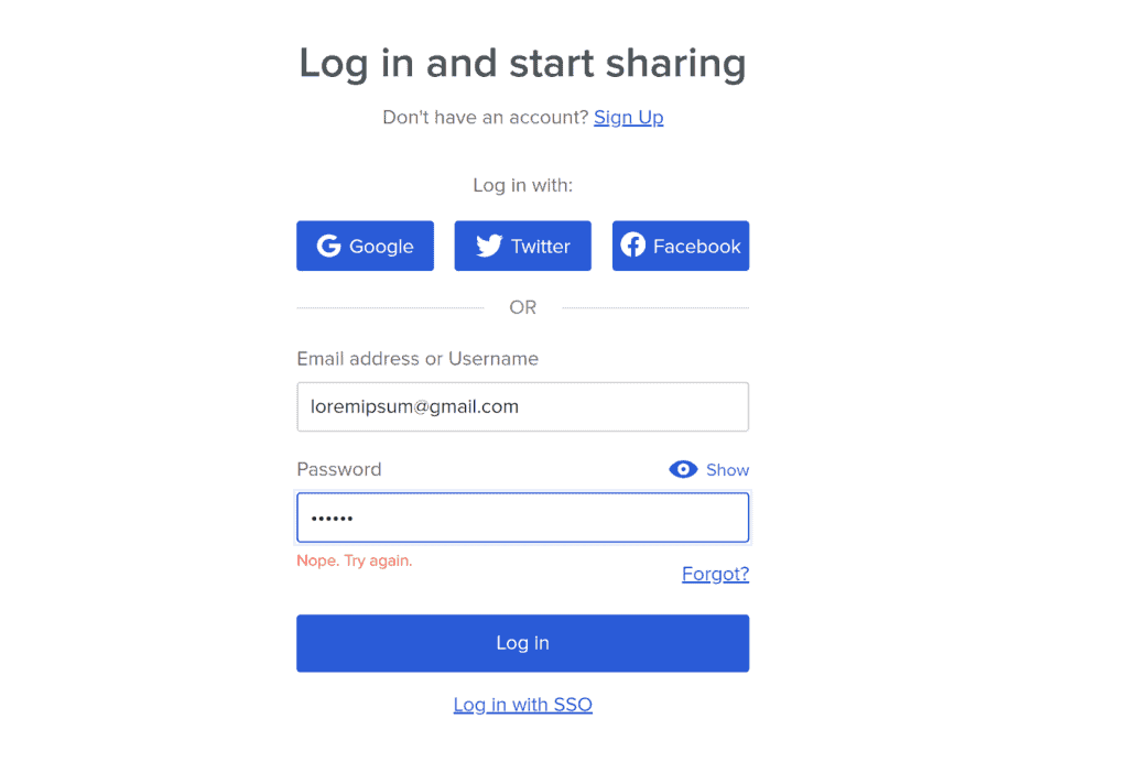
Recently, I used Bitly, a URL shortening service. I followed the usual process- registered my user name and created an account.
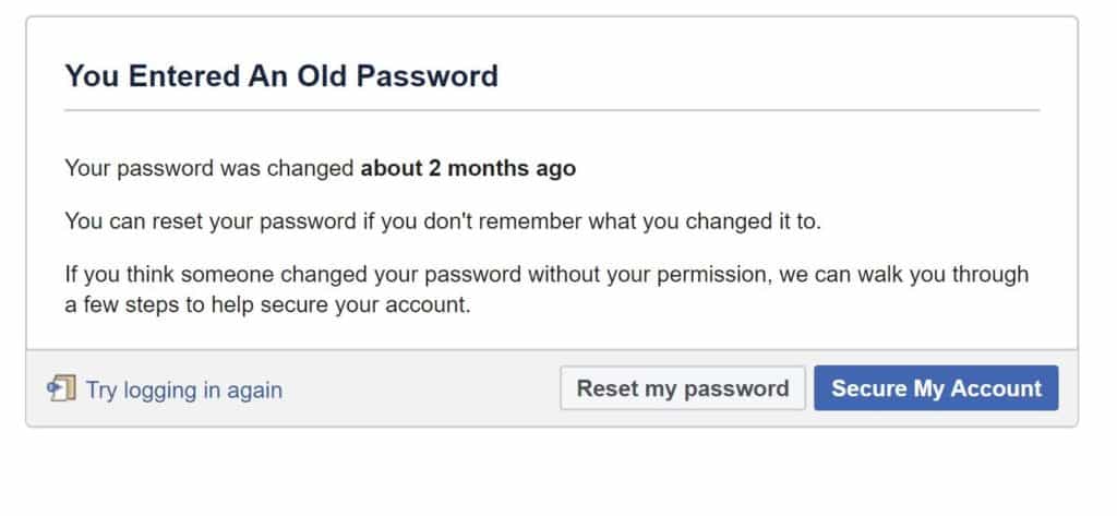
However, when I tried to login, I was unable to and the only message I received was “Nope. Try again.” But such an error message does not tell me where exactly I am going wrong. I am perplexed as to what I entered wrong: Was it the user name or password or both? To top it all, the “Nope” also sounds a bit condescending to me- as if Bitly were mocking me on my mistake. As I will demonstrate later when discussing Facebook, a good error-prevention strategy would clearly demarcate errors- i.e., tell if a user-name or a password is entered wrong. Facebook does wonderfully, even going one step further by telling you that you have entered an old password if you happen to make such a mistake.
Another bad design: ProtonMail
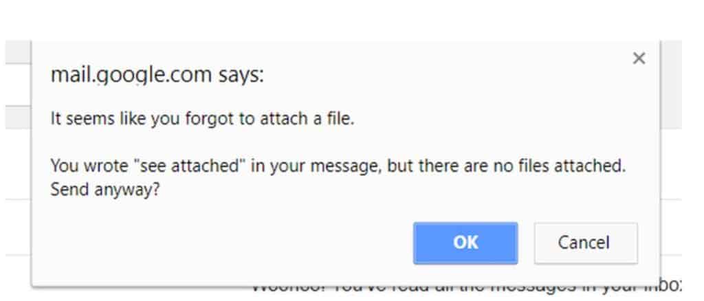
I use ProtonMail, a privacy-conscious Swiss-based email provider. Generally, I am delighted with their service and I still am. However, recently I observed that ProtonMail also demonstrates bad design when it comes to error prevention. When sending an email, if I write “attach” in the main body of the email and forget to actually attach a file, it still allows me to send the email without any confirmation dialog popping up to warn me that I have forgotten to attach a file. As we’ll see in a moment, Gmail safeguards users from this problem.
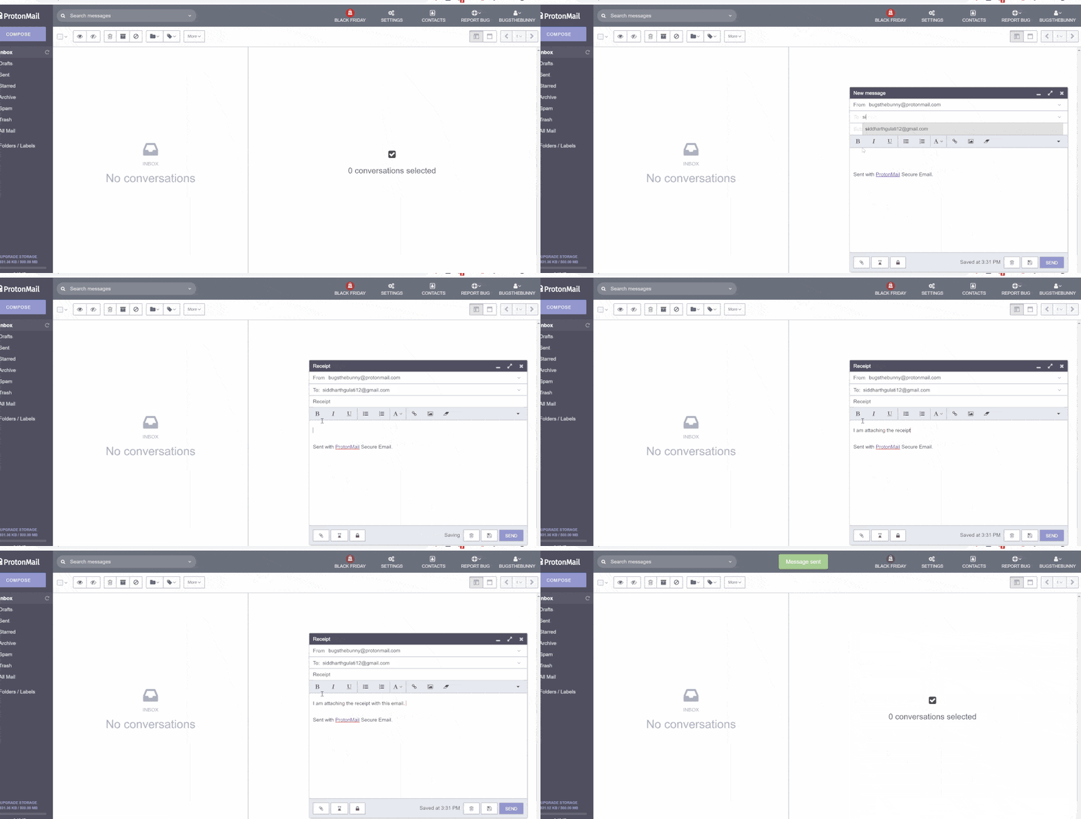
And what a problem it can be: For instance, imagine you are applying for a job via email. You’ve spent hours corralling your thoughts to craft the perfect message and put every ounce of yourself into coming across as the most eligible candidate. Great! However, because you were so heavily engrossed in the task, you’ve gone ahead and pressed the Send button… only to realize later that you didn’t actually attach your resume. Now you’re in the embarrassing position of having to decide if you should try for that awkward explainer email—this time with the resume attached—or call it a day and look elsewhere for work… or just hope the email manages to entice them enough to come back and ask you to send over your resume anyway (unlikely). You could kick yourself for that mistake, but it is also a bad example of error prevention in UX design.
It would be as if….
Let me use an analogy to explain the importance of error prevention in UX design. Imagine you are at a coffee shop, ordering coffee. You ask the waiter, “Hey, could I have some coffee please?” The waiter’s response to you simply is— “No.” Confused, you ask him, “Are you sure? I smell coffee, and I see other people having coffee in the restaurant.” This time, he does not respond at all. After speaking to other people at the next table, you find out that you have to tell the waiter WHICH TYPE of coffee you would like; otherwise, your order won’t be fulfilled. So, if you order “Cafe Latte”, he will help you. Would it not have been nice to have a sign somewhere up in the restaurant which said “Please tell us what coffee you would like in order for us to fulfill your order”? After sitting through such an experience, would you go back to that coffee shop again?
Enter Good Design: The case of Facebook
If you recall, earlier I gave an example of Bitly- which does not tell the user if they made an error in entering a wrong username or password. Facebook, on the other hand, tells me exactly what errors I have made. For instance, see the image below. Facebook flags the exact errors I made by warning me- very visibly- that I’ve entered a wrong password. Not only does such real- time feedback reduce cognitive load on my part, but it also helps create an overall good UX for me as I know that I’ll always be told what errors I make and I can rectify them easily.

Facebook even goes one step further and also tells me if I have entered an old password. For instance, if you see the image below, I entered an old password by mistake and Facebook reminded me of this. Such an approach to error prevention by gently guiding me about my mistakes has created an overall good UX for me when using Facebook.
Another good design: Gmail
If you recall earlier, I used ProtonMail as an example of bad design in error prevention as it does not alert me when I make any mistakes. Gmail, on the other hand, proves it has my best interests in mind. If I write a sentence in the main body of my email with the word “attached” and I forget to attach a file, Gmail serves me with a confirmation dialog to double-check my actions. The dialog box is shown in the image below. As you can see, Gmail warns me that I have not attached the file. By providing this ability, not only does Gmail help me feel more secure and more confident while using the system, but it also makes a positive impact on its usability.
What can we learn from this?
The key takeaway here is that users will always make mistakes. Therefore, a good UX strategy would be to:
- Prevent unconscious errors by offering suggestions as users are often distracted from the task at hand.
- Use design patterns that communicate how they work to users, encourage users to double-check their work (especially before deleting), and warn before mistakes are made. These simple guidelines can help enable lower rates of user errors, and ultimately improve usability.
When you design conscientiously like this, you can stay one step ahead of your users and prove your brand’s empathy with them and the realities they face every day—a world of applying for jobs, checking for updates while worrying about people and things they care about, and all the rest of what being a human being involves.
Want to learn more?
If you’d like to become an expert in UX Design, Design Thinking, UI Design, or another related design topic, then consider taking online UX design courses from the Interaction Design Foundation: for example, Design Thinking, Become a UX Designer from Scratch, Conducting Usability Testing or User Research – Methods and Best Practices. Good luck on your learning journey!
References
- https://www.nngroup.com/articles/slips/
- https://www.nngroup.com/articles/user-mistakes/
- https://www.nngroup.com/articles/confirmation-dialog/
- https://www.nngroup.com/articles/ten-usability-heuristics/
- https://dev.to/izzet/error-prevention-one-of-the-usability-heuristics-2l4b
- https://medium.com/@digitalofthings/ux-principle-7-reduce-cognitive-load-through-error-prevention-aada2960b12e
- https://uxgorilla.com/error-prevention/
