The “Aardvark Theory” of product – “Fake it till you make it” could be well followed as a design guideline for organizations. To develop a successful product or an app, we first create a prototype and keep improving on it till the time we get what we expect. An idea has no value unless it can be communicated and the value of a prototype is the vision of what the final outcome would be. Eventually, the goal of effective rapid prototyping is to convince oneself and others of an idea.
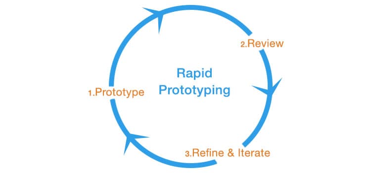
As a designer, my job is not just to design beautiful applications, but also to analyze and experiment on different ways to do “effective” rapid prototyping. I am emphasizing more on the word “effective” since it’s not just about what prototypes we create, but how we create them and what techniques or processes we follow to create these prototypes. In this article, I am going to share some of the tools, tips and techniques that I have successfully applied on my projects. But before I go into the techniques, let’s throw some light in understanding the rapid prototyping process. Personally I call it the PR²I process.
The PR²I Process
Prototype → Review → Refine & Iterate
The process generally starts off with an initial rough sketch of the vital areas. With multiple iterations of the whole process, it then grows into a more detailed and refined prototype.
- Step 1 – Prototype: In prototyping it is essential to understand the user requirements and expectations from the client in 2 to 3 meetings. After gathering all the requirements, convert them into mock ups. Mock ups could be in the form of sketches or low-fidelity wireframes depending on the project demand. While mocking up, it is important to take into account the user experience standards and the best practices.
- Step 2 – Review: In this step, share the wireframes or prototypes with the client and other stakeholders to check whether these are up to their expectations and that everything that they require is incorporated in the prototype.
- Step 3- Refine & Iterate: Depending on the feedback received from the client in step 2, pitch on the key areas that need refinement and clarity. Finally iterate the whole prototyping process until you get what the client expects. This whole process could take multiple iterations until the prototype is finalized.

The Proto‘types’ (Low, Medium & High Fidelity)
During design process, we always come across the terms, “wireframes” and “prototypes”. Unfortunately, many tend to substitute one with the other. But do both of them really mean the same? The answer is a straight ‘No’ and its explanation can be achieved in terms of ‘fidelity’.
Fidelity refers to how closely a wireframe or prototype resembles the final product. There are 3 dimensions of fidelity: low, medium and high. Both wireframes and prototypes lie on the fidelity spectrum. Depending on the stage of the design process, it is critical to choose the appropriate fidelity before staring to create the prototypes.
Wireframes (Low to Medium Fidelity)
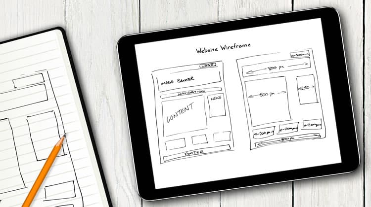
A wireframe is a low fidelity representation of the product. It represents the layout of a webpage that demonstrates what interface elements will exist on key pages. It generally covers the 3 basic questions in the design process – What, Where & How.
- What are the main key elements of the layout? e.g. carousel, widget, left nav, hero space.
- Where are the elements going to be placed in the layout. e.g. top, bottom, left, right or middle section.
- How are they going to be placed.? e.g. in the form of a navigation, blocks of text, visual representation.
Tools & Techniques
- Sketching (Low Fidelity): The fastest and easiest way to start creating a wireframe is to sketch it out. Sketching is faster and is often done in the very early stages of a design process, particularly during brainstorming sessions to understand client requirements and get early feedback from them.
- Creating Wireframes Using Online Tools (Medium Fidelity): There are many tools available on the web to create medium fidelity wireframes. To mention just a few, there are Mockflow, Axure, Balasmiq and Mocking Bird. As we start using these tools, the fidelity of a design increases in most areas. Medium fidelity designs give a more formal and polished look. A medium fidelity design helps users to understand the behavior of an application giving less importance to the aesthetics and look & feel. Interactivity is also incorporated in such designs, but limited to some extent. One common interactive feature at this stage is linking pages/screens with one another to understand the navigation of an application.
Prototypes (Medium to High Fidelity)
A prototype is a middle to high representation of the final product. It typically simulates the user interface interaction. A prototype allows the user to test the app for different interactions, which would be very similar to the interactions with the final product.
They could be very useful during usability testing of an application. The results of usability testing can help identify and resolve problem areas that may occur during the final stage of development. While it may be a little expensive and time-consuming to create such prototypes, it is always better to create them in such a way where the code could be reused during development stage.
Tools & Techniques
- Design in the Browser: This technique generally starts as a medium fidelity and ends in a high fidelity prototype. Design in the browser is a technique where, after creating few sketches, you start coding straight into the browser by using CSS & HTML or frameworks like Bootstrap. The basic goal of this technique should be to start coding the basic layout with minimum functionalities and enhance it as and when you receive user feedback. If done correctly, this technique could save you a lot of time and effort since the code (CSS and HTML) could be reused during the actual development. See more benefits of this technique in this article.
- Click-through Prototype of Static Images: These prototypes are a series of static images stitched together with each other by creating hotspots over clickable areas on the images to simulate the final product. These prototypes are rich in visuals and other aesthetics such as images and typography. Below are some of the tools you could use to create these prototypes.
- POP (Prototyping on Paper): This is one of the best free tools I’ve come across to create a clickable prototype for mobile apps. All you have to do is create sketches, take pictures from your smart phone, upload them on POP and create hotspots over the sketches to create navigation. You could also upload high fidelity static images created using design tools such as Photoshop. It further allows you to share the prototype with other team members.
- InvisionApp: This tool also allows you to create a click-through prototype for both web and mobile. Typically you upload the high fidelity designs created on Photoshop or any other design tool and start creating hotspots using Invision to stitch them all together. This tool offers many features such as selecting a background theme and choosing the desired platform for your prototype. You can do a live share of the prototype with your team members or clients on which they can give feedback.
- FluidUI: This is also a great online tool for creating mobile, iPad and web prototypes. The tool offers a nice drag and drop feature and a number of UI elements to choose from for different devices and platforms. You can also give different gestures and transitions between screens to create an authentic mobile experience.
- Keynote: This is also a very powerful tool that offers mobile testing, mobile/web monitoring and analytic solution to ensure a high quality performance. The tool offers 30 Apple-designed themes to give your prototypes a beautiful start. You can also create data visualizations by adding charts, shapes, videos and photos and give it life by adding different effects and transitions to the prototypes.
- Adobe Photoshop (to create high fidelity design) & Adobe Dreamweaver (to create hotspots on static images): These tools can prove to be quite handy in situations where you haven’t really used online tools. You don’t necessarily need to code anything. Just embed your images in HTML and create hotspots over areas you want the user to click. You don’t really have to code to create hotspots. In the design view of Dreamweaver, just select the “pointer hotspot tool” to create rectangular, circular or polygon shaped hotspots and the code automatically gets generated in the code view.
Summing it up
There are several tools on the web that you can explore at your own ease. It is more a matter of trying out trials and choosing one that you think could be the best fit for your projects.
An important thing to keep in mind while doing rapid prototyping is to let your users / clients know the objective of the prototype. It is also very important to explain to them that ultimately, the prototype is not the actual solution. This avoids confusions and encourages feedback from the clients. The other thing to keep in mind is, it is not necessary to prototype every single feature of the application. Analyze the application carefully in breadth and depth and make a list of the features that you feel users will use the most and then prioritize the features that needs to be prototyped.
Want to learn more?
Want to get an industry-recognized Course Certificate in UX Design, Design Thinking, UI Design, or another related design topic? Online UX courses from the Interaction Design Foundation can provide you with industry-relevant skills to advance your UX career. For example, Design Thinking, Become a UX Designer from Scratch, Conducting Usability Testing or User Research – Methods and Best Practices are some of the most popular courses. Good luck on your learning journey!
(Lead image: Depositphotos)
