When I look for inspiration for digital products, my first instinct is to look at architecture. Far from the world of digital design, architecture set many of the precedents that designers must consider when building new design.
Although painting, sculpting, and other art forms are often a source of inspiration, a line must be drawn between art and design. While art can be a problem solving technique, design must be. The crux of architecture lies in its creativity in solving specific design problems. As a result, architecture has a wealth of design principles that can lead to originality in digital design including consideration of context, organizational flow, and the structure of elements in space.
Context and The Kunsthaus
Before a sketch is even drawn, architects must understand the ins-and-outs of the plots of land where their building will stand. This includes the surrounding areas and the materials from those areas, as well as the buildings or natural landscapes surrounding the building.
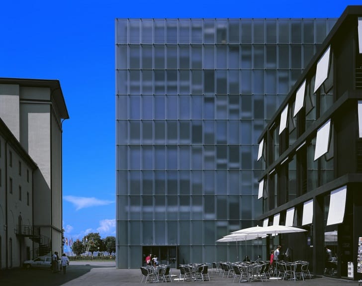
Just as we consider the context of users and their purposes in a digital design project, so too do architects consider the purpose of a space in terms of those people who will live in the building. One example of the deep consideration between a space and its purpose is in Pritzker Prize winning Swiss architect Peter Zumthor’s Kunsthaus Bregenz in Austria.

The building is an art gallery that is on a lake and surrounded by classical European buildings. Zumthor had the option to create vast promenades to feature the lake or to mimic the European style of the surrounding buildings, but instead he made two key design choices that led to this building’s international acclaim.
First, like a user experience designer, Zumthor considered that since the building would house art, allowing visitors to the art gallery to stare out at the lake was not the purpose of the building. Instead, he focused the attention inward to the art on the building’s wall by avoiding windows that would give views to the lake.
Secondly, Zumthor considered the exterior view of the building as much as the interior view much as designers must consider the place of a digital product in the overall picture of a product’s lifecycle and various touch points. Zumthor chose an exterior that would reflect the light and, in turn, put emphasis on the nature as well as the building itself. These two considerations of context, both interior and exterior, can provide inspiration in digital design, and the building itself is breathtakingly beautiful.
Diversity and Cohesion
Architects, like digital designers, consider both organization and flow. For an architect this may mean the flow of people from an entryway to an exit and from room to room, while for a digital designer this may refer to the informational flow or a user’s flow from, for example, a home page through a purchase. Information architecture and user flow drive movement and business goals. Buildings also drive movement and have goals, and it’s not a mistake that we refer to informational organization as ‘architecture’.
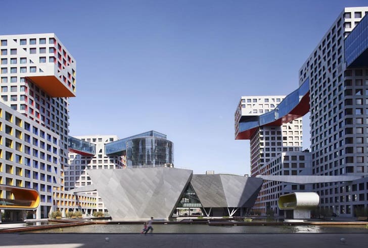
Organization and movement are two design elements that are both explicitly imaginative and ingeniously crafted by architect Steven Holl. Nowhere are these elements so clear than in Holl’s prize winning Linked-Hybrid buildings in Beijing China. The concept behind the Linked-Hybrid building was to create a series of functional, all-encompassing buildings where urban spaces and residences could co-exist. Linked-Hybrid is connected from underneath by parking garages and from above by bridges that connect the complex’s buildings. The space at the center of the complex is green and visitors and residents are funneled inward by the inviting spaces and large open gates.

Just as a digital designer’s success might hinge on a user’s ability to follow a specific flow toward a product, so to was the consideration of movement in Holl’s Linked-Hybrid paramount to the complex’s success. In digital design, there are often multiple goals for a website or application, and these goals require a solution that is both diverse and cohesive. The Linked-Hybrid complex exhibits this diversity and cohesion with grace.
Resources and Constraints
While architects and digital designers work with completely different materials, they must both take them into consideration. For digital designers this means considering the constraints of technology, CMS platform, and the tools with which the site will be designed – from Axure and Photoshop to WordPress or Wix.
Vernacular architecture is a style that is based on buildings that are composed of elements found nearby. In many cases, vernacular architecture is the most ancient form of architecture because people built with what they had. Log cabins, Mongolian yurt tents, igloos, and tipis are all examples of vernacular architecture. In each of these cases, the architects and builders (often one in the same) had to consider only what elements were on hand and build within those confines.
Digital designers are often inclined to over-reach or try to innovate rather than building complexity in to the framework they are provided. Considering the economic constraints as well as the technological constraints and fitting a digital design in to those constraints will help a project progress smoothly.
Buildings as Inspiration
Inspiration has no bounds. Digital designers are free to draw inspiration from places far and wide. For me, architecture is the ultimate parallel because, despite the differing medium, we are both filling space for users. The effect can be a success or failure, but it will always be a beautiful merger of art and science. The way that architects and digital designers consider their contexts, frameworks, flows, constrains, users, and elements make them fellow travelers on the path toward a better world.
Want to learn more?
If you’re interested in the intersection between UX and UI Design, then consider to take the online course UI Design Patterns for Successful Software and alternatively Design Thinking: The Beginner’s Guide. If, on the other hand, you want to brush up on the basics of UX and Usability, you might take the online course on User Experience (or another design topic). Good luck on your learning journey!
(Lead image: Depositphotos)
