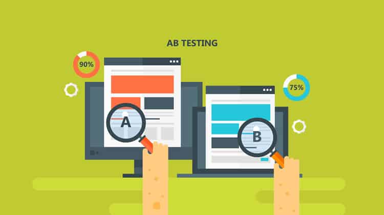
Which font do you like more: Font A, or Font B? While this is a straightforward question, a data-backed answer to it has saved many companies millions of dollars.
So how can you go from being a UX Designer to everyone’s favourite person? By conducting A/B testing!
What is A/B Testing?
An A/B test is a study of the impact of an independent variable on a dependent variable
In the example above, the independent variable is the style of font. A dependent variable could be the amount of satisfaction that people get from looking at each font.
So, is A/B testing just about playing with fonts? No… well, sort of.
A/B testing is about learning how your users want to communicate. So yes, to see how different fonts impact a dependent variable, you will want to play with font size, colour, and style. However, A/B testing is not limited to fonts … and it can be fun!
Have you ever gone to a bar and had the ‘drink of the day’? Often, bartenders and restaurateurs use daily specials to see if customers enjoy certain menu items over others. If a bartender makes you a ‘daily special’, with one added ingredient more than your typical margarita, they are conducting an A/B test.
So if the restaurateur notices more sales of the ‘daily special’, compared to the typical margarita, you will likely see a new drink on the menu soon.
Ways to Conduct an A/B Test
While there are many ways to conduct an A/B test, all successful A/B tests start with a hypothesis. If you do not have a hypothesis, your A/B test can become unorganised, and often inconclusive.
However, do not worry. A hypothesis is easy to write. All you have to do is say what variable you are manipulating in your A/B test, and how you think that variable is going to impact a chosen, dependent variable.
For example, let us say you want to know what the impact of having large click targets, compared to small click targets, has upon the total number of target clicks for your website. Your hypothesis may read: “If we change the click targets from small to large, then the number of target clicks will increase.”
Here is another example. Let us say you want to know what the impact to the number of website conversions will be if you use a homepage slider video, compared to a homepage slider image. Your hypothesis may read “If we change the homepage slider from an image to a video, then website conversions will decrease”.
Other dependent variables you could analyse to assess the impact of independent variables are click-through rate, likes, shares, backlinks, time on page, etc.
Using A/B Testing To Optimize UX

UX can steer someone away from a website, or keep someone coming back to a page. What is a better feeling than going to a site, and feeling like it was made for especially for you? To deliver that ‘feel-good’ value to users, you have to A/B test.
You can spend years doing UX research before bringing an application, or website, live, but that is not always a cost-effective option.
Not every company has the financial backing of Microsoft and can conduct expensive, environmental testing before bringing a product to market.
So what if you want to improve a website that has already been developed? You can only do that with A/B testing.
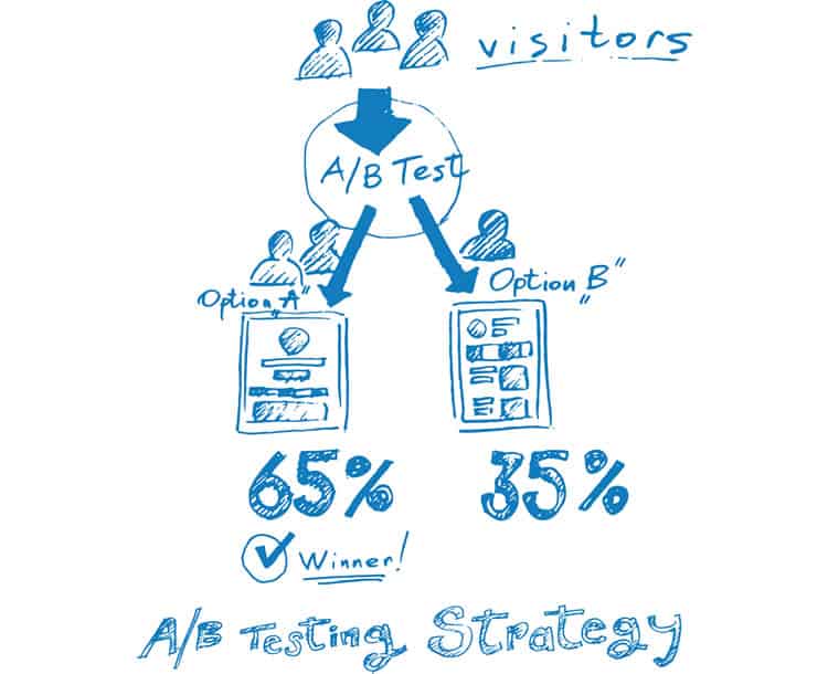
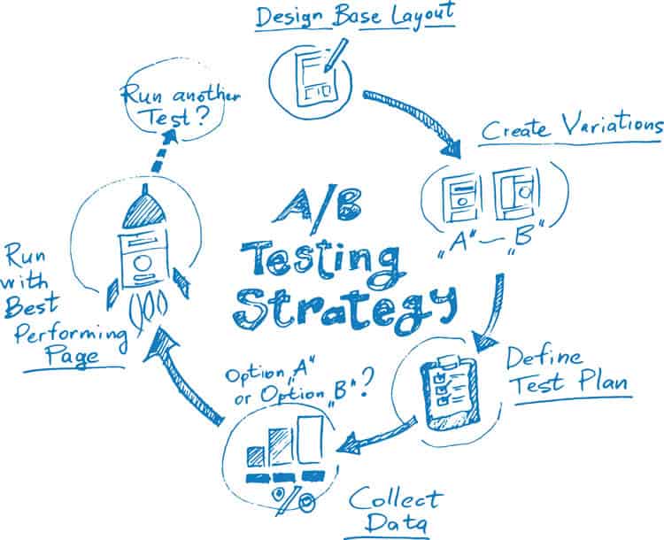
To conduct an A/B test that will allow you to conclude, you will need a hypothesis, a controlled test, and an altered test.
The controlled test is often called ‘Test A’ and that will give you data to compare your altered test against. The altered test is often called ‘Test B’ and this is the test where you implement whatever change you think will be impactful.
By setting up an A/B test in this manner, you will be able to conclude a hypothesis. Over time, your conclusions will allow you to understand better what users like and do not like. In this way, you will obtain valuable data with limited risk. Then, of course, you can use this information to optimise UX.
Examples of Successful A/B Testing

A/B testing is being conducted on you, every day, whether you are aware of it or not. Salespersons are sending you emails, and sending slightly different emails to ‘similar’ leads, trying to see what words get the results they desire.
However, being the subject of someone else’s study is not always a bad thing. Thanks to the efforts of other testers, you can now find A/B test case studies online, and study users without having to spend your own money just yet.
One case study that you can learn from is a case study about a non-profit, called Kiva. Kiva helps less-fortunate people acquire a business loan through the help of donations. In 2014, Kiva conducted a case study to test the impact that a FAQ section would have upon on their landing page conversion rate. The result: Kiva found that by adding a FAQ section to their landing page, increased their conversion rate by 11.5%.
What you can take away from that case study, as a UX Designer, is that certain websites need more information than others. When it comes to non-profits, it can be hard to know whom to trust, so having more information can be better.
In an even more impactful case study, an eCommerce company, called Unveil, tested the impact that pricing information had upon their number of email sign-ups. Unveil found that by removing their pricing information from their website, their number of email signups increased by 31%.
What you can take away from this case study, as a UX Designer, is that people are more interested in value than cost. As a UX Designer, you should be less concerned with telling users what you need from them, and more concerned with showing users what value you can bring to them.
UX Takeaways: An A/B Testing Overview
A/B testing works to optimise UX, and you should not be scared of trying.
You have been successfully A/B testing your whole life (whether you were aware of it or not), and you are probably not half-bad!
If you have ever asked a group of friends to help you move, you have A/B tested.
If you have ever asked one parent if you could borrow the car keys, and then asked the other parent to borrow the car keys in a different tone, you have definitely A/B tested. Also, depending upon the results of your efforts to get your parents to let you drive their car, or to get your friends to help you move, you have had to adjust your rhetoric.
In UX Design, rhetoric must be tested continuously to weed out any weaknesses. What makes a user love a website today, may be the reason that they do not like it tomorrow.
So how can you figure out if you have the most optimised design that represents what users want from their experience if you are not A/B testing?
You cannot.
Want to learn more?
If you’d like to…
- get an industry-recognized Course Certificate in Usability Testing
- advance your career
- learn all the details of Usability Testing
- get easy-to-use templates
- learn how to properly quantify the usability of a system/service/product/app/etc
- learn how to communicate the result to your management
… then consider taking the online course Conducting Usability Testing.
If, on the other hand, you want to brush up on the basics of UX and Usability, then consider to take the online course on User Experience. Good luck on your learning journey!
(Lead image: Depositphotos)
