
As the title of this article implies, this is a case study that illustrates how the development team at the company I co-founded, Fuzzy Math, applied user-centered design principles to help revamp the web presence of Wonderlic – a company that has been operating for the past seventy five years. This implementation has helped them achieve a conversion rate of 20% of qualified SaaS leads – double the 10% goal they had set.
According to Userfocus, user-centered design (UCD) consists of several underlying principles. The actual design is based upon an explicit understanding of users, tasks, and environments; is driven and refined by user-centered evaluation; and addresses the whole user experience.
The Task at Hand
For decades, our client, Wonderlic, has provided businesses and schools with a comprehensive library of highly-regarded cognitive ability, motivation and personality assessments to aid the hiring selection process. Its scientifically-validated collection of tools, aimed to help make informed hiring selection decisions and avoid costly regrets, needed enhanced cohesion and focus. While effective, the existing system had grown over time without the incorporation of a comprehensive UX strategy that could keep it grounded. This was resulting in experiences that sometimes were overly complicated or challenging for customers to utilize.
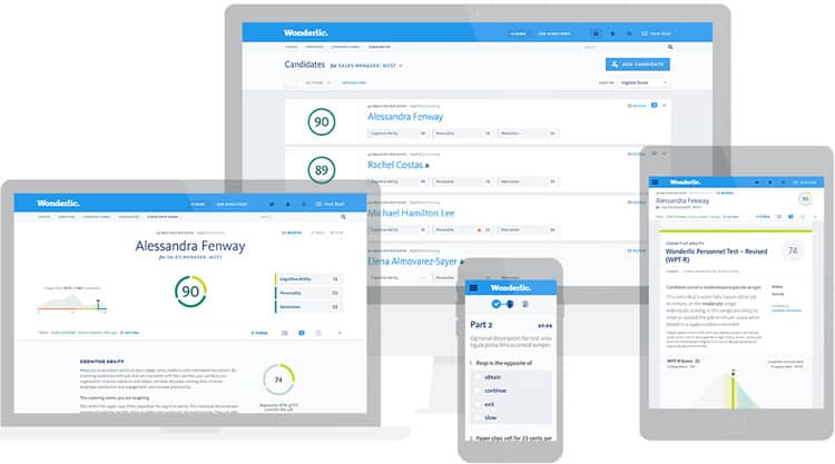
Our team at worked closely with Wonderlic’s team to try to better understand what their tool offered, what problems users faced, and where any UX disconnects or roadblocks stood. As the result of eight months of research and teamwork, Fuzzy Math and Wonderlic designed WonScore™ : a unified, scalable platform providing a simple candidate assessment experience. In addition, some members of our team took it upon themselves to publish a case study, which elucidates the palate and functionalities added to the new design of WonScore.
Applying the User-Centered Design Process
To understand Wonderlic as a company and the unique challenges it faced, the team implemented a standard, proven user-centered design process over the course of eight months.
In any user-centered design (UCD) design program, participants learn that the fundamentals of UX design always revolve around research, empathy, usability and actionability. Indeed, the general phases of the user-centered design process consists of 4 phases:
- Specify the context of use
- Specify requirements
- Create design solutions
- Evaluate designs
Phase 1: Specifying the Context of Use
The user-centered design process started with a fixed duration discovery phase followed by a series of repeatable, overlapping interface design sprints. The discovery process started by pairing primary research with Wonderlic’s customers and an expert analysis of the usability of the existing platform. So what does this entail? Basically, we conducted a series of structured one-on-one interviews with Wonderlic’s customers followed by a cognitive walkthrough of their usage of the existing tool covering: usage patterns, goals, pain points, and needs.
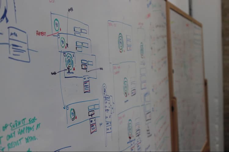
The team then performed a heuristic review of Wonderlic’s existing platform, applications and processes. We assessed the trust and credibility, considered their existing site structure and navigation, how their application allowed users to flow through processes, and the extent to which their site experience rich interactions.
Finally, we took a look at page focuses, any online forms they had, and how they were preventing errors for their users. This expert review also included our review of any existing traffic data, metrics, and conversion goals to better understand Wonderlic’s usage patterns.
If you thought that is where our evaluation ended, think again. To fully understand everything, we needed to know before creating a product with and for Wonderlic, we analyzed their competitors’ application features, site organization, brand voice, engagement techniques, and user experience by identifying the strengths, weakness, and gaps in their offerings compared with their objectives and goals. After all of this was complete, we wrapped-up all our findings, framing the package as an initial set of areas for design opportunities in the next phase: concepting.
Phase 2: Specifying the Requirements
We synthesized our findings into a series of goal-directed personas and journey maps, and we identified key themes such as the need for better group and personal decision making features, rapid understanding of information data, and contextual guidance within the interface for exploration during concepting. As always, we had a fun time discovering and playing around with various potential user personas during this phase of the process.
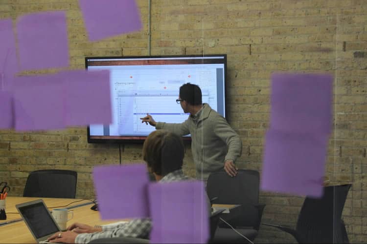
Utilizing the results of our multiple rounds of user research (Who uses this tool? How might individuals respond to some of the features we’ve implemented? Will users find this iteration intuitive or difficult to follow?), we identified three distinct types of users and created personas for them. As WonScore is a human resources tool, we played make-believe and pretended there were 5-20 applicants for one job, and their scores determined their fit for the position. For Wonderlic, this was a palpable experience; they were, for the first time, able to observe how their new tool would function and appear to users.

Phase 3: Creating Design Solutions
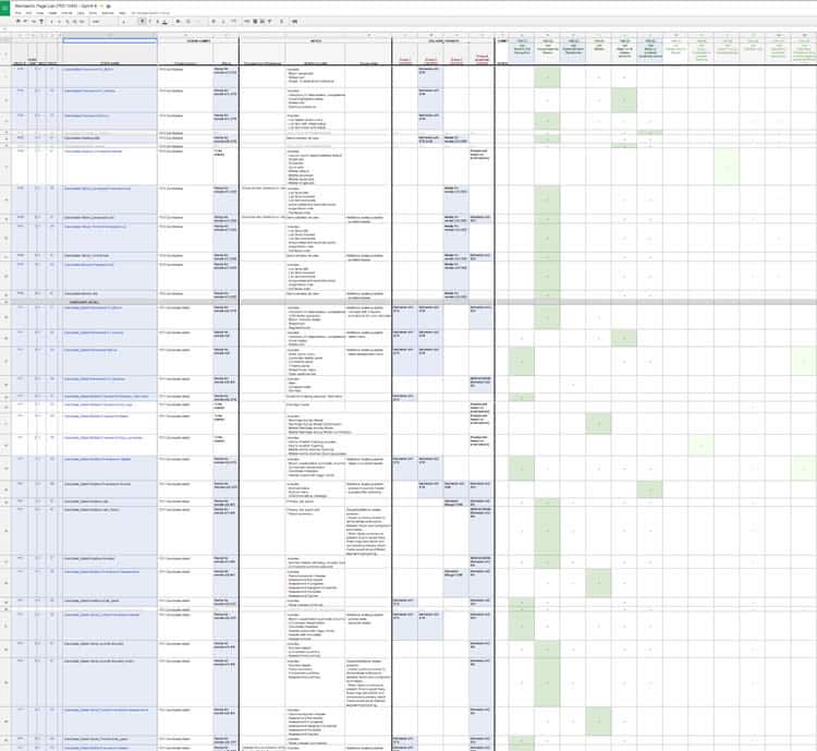
Following concepting, we created a UX strategy roadmap that mapped the people, process, and feature-set of the future-state platform. This would allow us to organize the workstream for four overlapping design sprints that each led to Agile development sprints. Each design sprint was a repeatable set of services, which included the following:
- Information design
- Wireframing / prototyping
- Visual design compositions
- User validation research
- Front-end responsive code
The iterative nature of our design process allowed us to be flexible in our approach and make adjustments between sprints.
Phase 4: What We Learned From Design Evaluations
Throughout this process, we worked closely with the Wonderlic team, meshing our design expertise with their existing product, market and customer knowledge. Through collaborative sketching, stakeholder interviews and joint prioritization exercises, we gained a deep understanding of Wonderlic’s shared goals, processes and culture. We spoke directly with many of Wonderlic’s existing users, and this helped our team to realize some crucial insights about the people and companies using these tools and the work they do.
This in-depth analysis also opened Wonderlic’s eyes and helped extend their internal knowledge to new sets of end user needs. These explorations laid a foundation for the product we had been designing, and ensured that the end result would be a useful tool for the people whom it was intended, as well as an excellent addition to the already-impressive suite of Wonderlic products and services.
As no process is complete without a few “aha!” moments, we wanted to share with you some of ours.
1. Do not assume: Your users cannot know things just because you will them to
As with most projects, we faced a number of unique challenges for shifting the user mindset and improving the overall user experience. At the most basic level, our takeaway from primary user research was this: users (i.e. hiring managers) needed a lot more knowledge than what we provided them with in order to be able to understand the assessments and results. Why? Because most people who hire others are not experts at evaluating personality and cognitive skills assessment results. In order for someone to make a decision about a candidate in the existing system, they would have needed to implicitly learn Wonderlic’s formats, terminology and system.
In other words, the functionality was somewhat complex, and users needed a certain amount of existing knowledge to comprehend and make use of what was offered. Wonderlic knew they wanted to create an easy-to-use SaaS offering that would provide insight to users without significant training or expertise on the software. Thankfully, they were aware of this challenge and were willing to face it. They wanted Fuzzy Math to help find the right methods for amplifying the “voice of the customer,” and to deliver an improved user experience. For this reason, we continuously incorporated user research throughout the project, ensuring decisions could be tied back to real customer needs.

2. Improve information clarity and usability
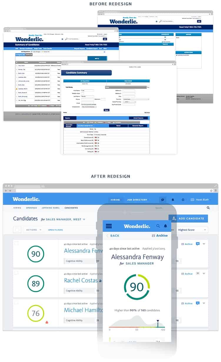
We learned through user research that to achieve greater user adoption we need to ensure the assessment results were simple and clear but also usable and actionable. To improve the clarity of the assessment results, we placed a priority on abstracting the science away to focus on the core, common sense concepts. We distilled the assessment results content down to the most valuable information for the task at hand and used plain English to keep it simple and non-technical (hence focusing on clarity).
We then needed a single, simple visual representation of Wonderlic’s recent development of a single score for each candidate regardless of the number or type of assessments. To do this, we focused on providing single summary results (i.e. a personality fit rating from 1-100, with 100 being the closest match to the recruited position, and one being the least) that would standardize the Wonderlic results experience into a consistent, engaging, easy-to-maintain format.
Next, we applied everything we learned about the people using this tool to determinine how we would display the assessment results to users that enabled decision making. Group decision making was supported through new commenting and a shared tagging scheme. Individual decision making was supported through comparison of multiple candidates and the self-guided progressive disclosure of multiple layers of assessment results.
3. Exchange the tried-and-true for something new
We wanted to make the applicant assessment results received more accessible to a larger audience. With the previous version of Wonderlic, hiring managers would receive a PDF of the assessment results that they could print-out. On this, there were paragraphs and complex visuals outlining the strengths and weaknesses, as determined by the assessment algorithms. In order to update what was a tried-and-true, but in an offline process, we harnessed the power of Web 2.0 capabilities rather than sticking with paper metaphors such as PDFs and new windows chock-full of information.
To better showcase the value and insights of assessment results, we came up with highly visual, interactive score bundles. If a user wanted to know more about why he or she received a certain score, that person could click on that section of the interactive score and it would expand to show a brief explanation. This allowed us to place a much greater emphasis on graphics over words, reducing the cognitive load users would have to take on, and allowing the user to more easily digest the data. Finally, this modern delivery format put more control in users’ hands, trusting that they would ask for further details only if and when they wanted them.
Final Word
It is easy to run a standard design process consisting of upfront, primary research and synthesis, followed shortly after by the design phase. Likewise, while working on long, complex projects, it can be easy to forget about those takeaways you learn early on about customers and simply ignore the “why” and “who” of an application. Massive projects like this can take loads of brain power and are undoubtedly exhausting to get from start, or pre-start, to finish (and then follow-up).
When in doubt, the advice we would like to share from one UX design firm to another (or to you lone-wolf designers – experienced or novice) is to:
- Continually step back from the problem at hand,
- Look well beyond sales and business development teams, and
- Re-focus your users (the non-experts)
When we did this, our happy client Wonderlic told us, “WonScore is seeing a conversion rate of about 20% of qualified SaaS leads. This is above our expectations and above the 10% goal we set for the product. The usability and clarity of the solution is a key factor in WonScore’s stellar performance to date.”
We were ecstatic, although we had a good feeling based on continual feedback while working with them, to know that our client was pleased, and the users (Wonderlic’s customers) were seamlessly utilizing a product we created.
Want to learn more?
Are you interested in the managerial and strategic aspects of UX? The online course on UX Management and Strategy can teach you the necessary skills on the subject and earn you an industry-recognized course certificate to advance your career. If, on the other hand, you want to brush up on the basics of UX and Usability, the online course on User Experience might be a better fit for you (or another design topic). Good luck on your learning journey!
(Lead image: Depositphotos)
