For e-commerce companies, there is no metric more important than the checkout process conversion rate. This is the page that brings in your actual revenue. Even a miniscule increase of 1% in conversion rate can add thousands of dollars in real money to your business.
Checkout process conversion rate is even more important for another reason: shopping cart abandonment. According to Baynard Institute, the average shopping cart abandonment rate for e-commerce stores hovers around 68.63% (as at January 2016). This means that 7 out of 10 people leave your site after committing to the purchase process.
While there are many ideas you can try to increase an ecommerce site conversion rate, cutting down the cart abandonment rate will definitely have a big impact on your bottom-line. Creating a smooth checkout process can go a long way towards pushing customers to finish their purchases.
In this article, we’ll take a look at some simple actionable tips you can use right now to improve conversion rate for your checkout pages.
Why Do Customers Abandon Shopping Carts?
First, a couple of definitions:
- Shopping cart abandonment: When customers put items in a cart but leave the site before buying, the cart is said to be ‘abandoned’.
- Shopping cart abandonment rate: The percentage of people who abandon a shopping cart. If 100 people put items in their carts, but only 30 buy, you have a shopping cart abandonment rate of 70%.
- Checkout process: The process for buying a product after a customer puts an item into the shopping cart. This includes filling in shipping information, payment information, coupon codes (if any), confirming the order and making the payment.
Now let’s take a look at some of the reasons why customers abandon shopping carts.
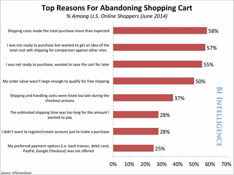
According to data gathered by Business Insider, most customers abandon shopping carts due to price or usability issues:
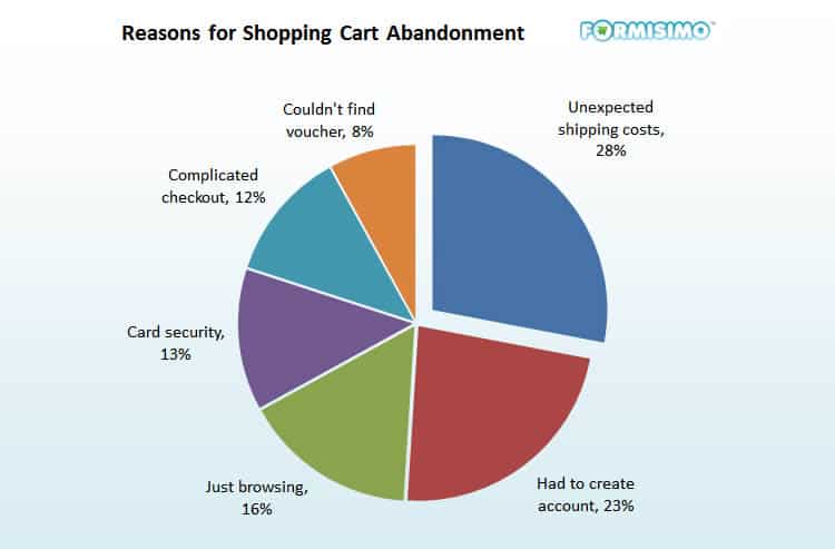
Another study revealed that the top reasons for cart abandonment include complicated checkout processes, security, and account creation problems.
In terms of exact stats, here are some of the biggest reasons why customers abandon shopping carts:
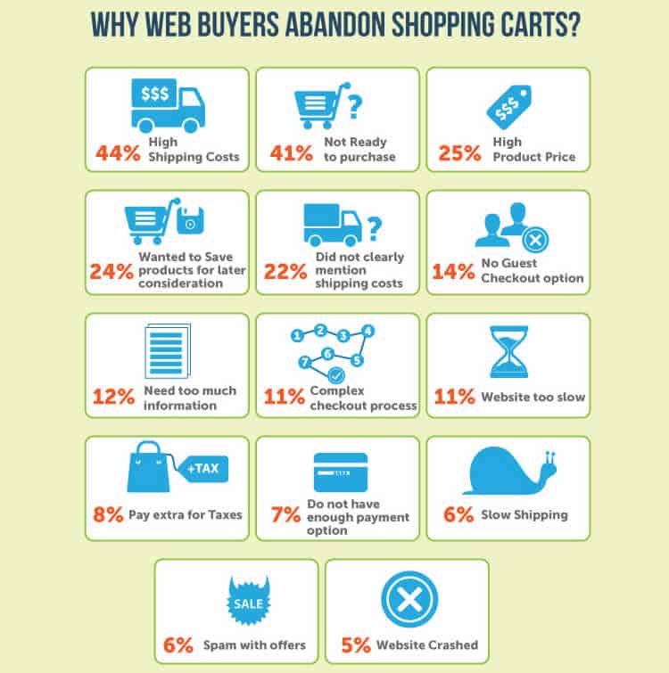
As you can see, most of these issues can be readily addressed through better design. By split testing different checkout process designs, you can make your checkout process safer, faster, and easier.
We’ll take a look at five such optimization ideas below.
1. Experiment with a Single-Page Checkout Process
There’s a lot of debates among CROs whether single-page or multi-page checkouts convert better. The truth is that there is no absolute answer to this question. In some cases, a single-page checkout process works well. In others, a multi-page checkout will do better.
For example, we conducted tests for a furniture retailer with a high AOV (above $2,000) where a multi-page checkout converted 38% higher than a single-page checkout process.
At the same time, Elastic Path’s A/B test case study from 2010 found that a single-page checkout for the 2010 Vancouver Olympic Store converted at 21.8% higher than a similar multi-page checkout. Invesp multistep checkout process generated a 32% increase in conversions when ran against a single step checkout.
Most retailers, however, stick to a multi-page checkout process and never even try to experiment with a single-page alternative.
In theory, a single-page checkout process offers several benefits:
- They appear shorter and give customers an incentive to complete the transaction.
- They have all the fields on the same page, avoiding unnecessary complications from users.
- They require fewer clicks. Behavioral research shows that the fewer the number of clicks required to complete an action, the higher the conversion rate.
- Since there are fewer clicks required, customers have less of an incentive to skip off to another tab or do comparison shopping.
Single-page checkouts work particularly well if your average order value is low or if you’re selling impulse purchases. If your dominant customer persona is falls into the “Impulsive” category, you might benefit from a single-page checkout process.
Just make sure to keep a few things in mind when designing your checkout page:
- De-clutter the page and limit the amount of information you ask from the user.
- Use smart forms that pull in city, state information, etc. from the zip code.
- Leverage Google auto-fill in forms to help users checkout faster.
- Auto-detect credit card type (Visa/Mastercard/AmEx) from the card’s first four digits.
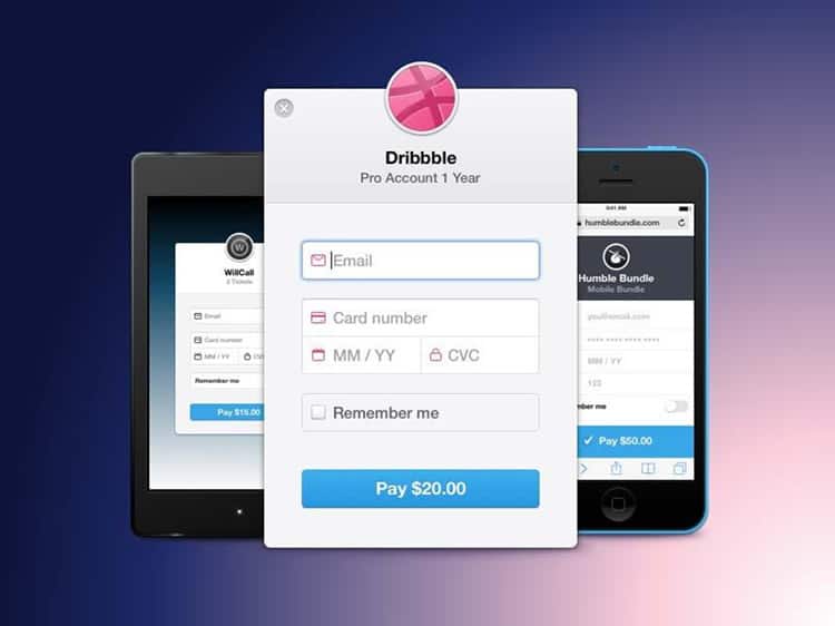
For example, design portfolio site Dribble has one of the fastest checkout screens around. Since the products are digital, Dribble can do away with address requirements.
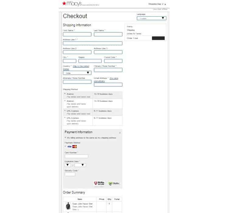
Macys has a single-page checkout as well. Note the form flow and how Macys manages to fit in so much information on a single page.
2. Skip the Mandatory Sign-up
Your customers today are more and more wary of sharing their private information with your site. They may like your products enough to buy them, but few of them actually want to create an account and start a relationship with you.
Yet, so many e-commerce stores continue to push mandatory sign-ups onto users. This has a disastrous impact on conversion rates since customers would rather skip buying altogether than deal with newsletters, promotional offers and upsells.
For example, removing mandatory login requirements on one retailer’s site led to a massive $300M increase in revenue.
Another usability study found that 30% of users abandoned their carts when asked to sign-up before checkout.
Of course, you ideally want users to sign-up for your site. Here are two ways you can do this without getting in the way of the purchase process:
- Create a user account automatically when they make a purchase, assign a random password and send the information with the order receipt in their mailbox.
- Ask users to sign-up on the ‘Thank You’ page that appears after they make a purchase. At this stage, users would have already entered most of the information you need and all they need to do to sign-up is to choose a password.
Even if users choose not to register, you still want them to buy your products or services. So don’t ever force a sign-up on the checkout page.
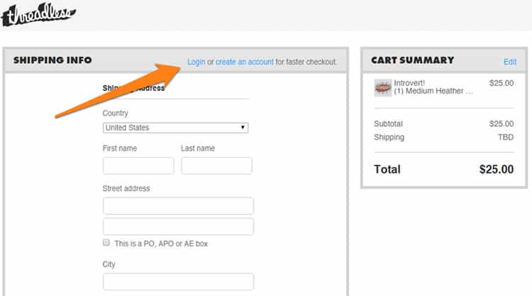
For example, Threadless offers users an option to sign-up on the checkout page with the promise of faster checkout. Users can still checkout without creating an account.
Retailer Toms, on the other hand, gives users multiple login options. Users can login with their email, Gmail, Twitter or Facebook. They can also skip signing up altogether and checkout as guests.
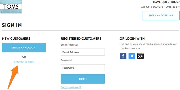
You can experiment with both these tactics – removing all sign-up requirements, or offering guest checkouts – and measure the results.
3. Play up Free Shipping, Free Returns and Secure Payment Gateways
Your customers have reason to be apprehensive when they enter their credit cards into your checkout forms. After all, they’ve heard countless stories of established retailers losing their private information (remember the Target credit card fiasco?).
If you can assure your customers that their payment and personal information is completely secure and impregnable, you’ll give them a big push to go ahead with the transactions.
Similarly, easy process to return the products gives customers assurance that they can reverse a poor decision.
Even more important for conversions, however, is the promise of free shipping. For example, NuFace, an online store that sells anti-aging skin care products, saw a whopping increase of 90% on orders it received after adding ‘Free Shipping above $75’ right above the ‘Shop NuFace’ button!
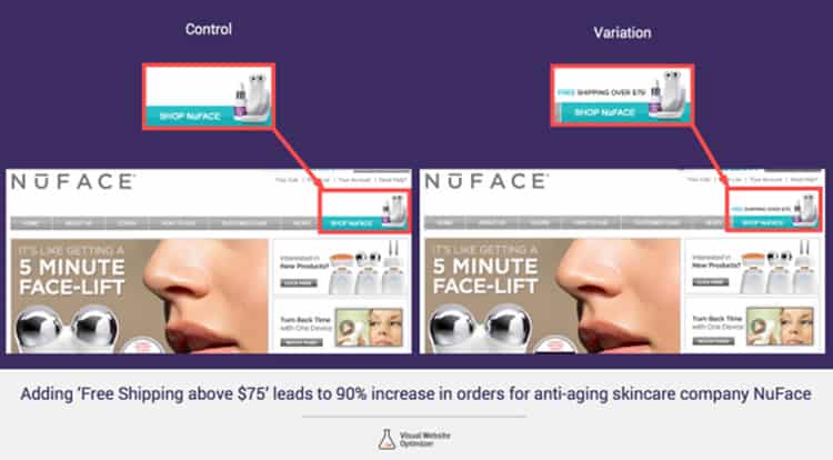
Dr David Bell from the Wharton Business School found that about 60% online retailers say that ‘Free Shipping’ as one of their most successful marketing tool – even when there is a certain threshold order value attached to the benefit. He says:
For some reason, a Free Shipping offer worth $6.99 seems more appealing to a customer than a $10 discount on the same product
In another study by Forrester found that 61% of customers prefer shopping with a store that offers free shipping.
In fact, free shipping is one reason why Amazon Prime has seen rapid growth to 47M subscribers since launch.
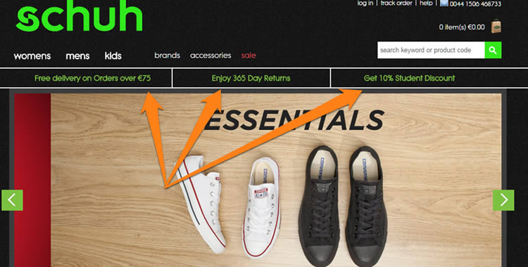
Retailer Schuh.eu, for example, advertises its free shipping and returns prominently on its homepage:
ASOS goes one step further and advertises its returns and shipping not only on the homepage, but also the checkout page:

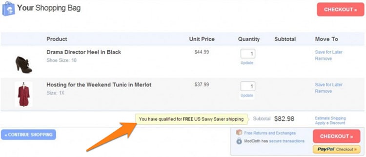
Meanwhile, ModCloth shows customers when their order value qualifies for free shipping:
Try experimenting with similar tactics and measure your conversion rate.
4. Make Your Forms Quick and Easy to Fill
A complicated or cluttered form can make your users feel frustrated – definitely something you don’t want to do to your users when they are sitting with their credit cards in their hands.
You should strive to make your forms as easy to fill as possible. Ask only for information that is absolutely necessary (in some jurisdictions, such as Europe, it’s actually illegal to ask for information that isn’t necessary to complete the purchase).
Here are a few tactics you can use to improve your forms:
1. Take Advantage of Google Autofill
A large number of your users will be using Chrome or Android. In this case, they will likely have their personal information already saved with Google.
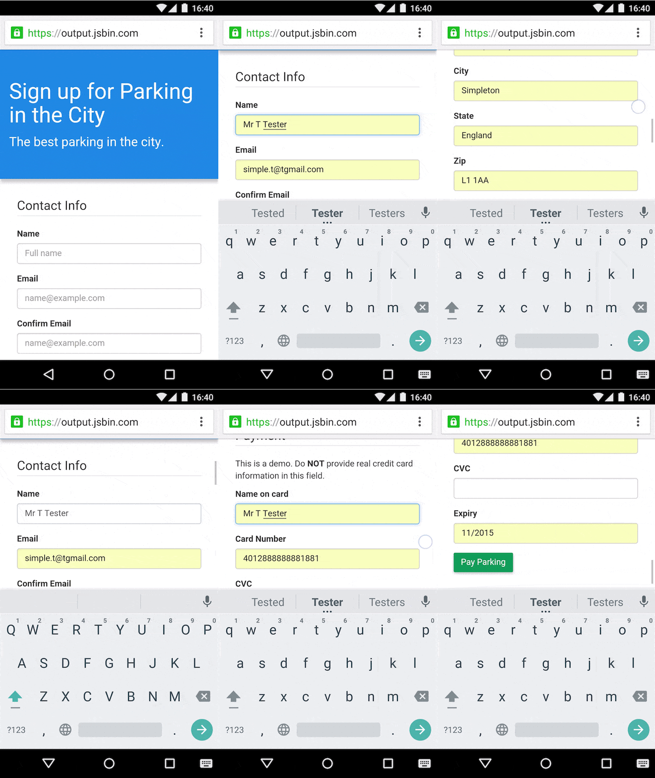
You can use this to your advantage by using Google Autofill in your forms. Implementation is very easy and it’s supported by the biggest mobile and desktop browser around – Chrome.
Here’s a GIF showing autofill in action:
2. Use Mobile-First Design
With smartphone users in the US topping 125M and with m-commerce US sales topping 51 billion in 2015, mobile is now the default Mobile is now the default shopping platform for an increasingly larger percentage of your customers. Focusing on increasing your mobile site conversion rate should be a top priority.
Designing a form that works on smaller screens, thus, should be a top priority.
Try some of these tactics on your forms:
- Use larger, ‘tappable’ buttons.
- Vertically align form fields to make navigation easier.
- Remove menus and complicated multi-step checkouts.
- Make date selection easier by using the phone’s native date selection UI.
- Reduce the number of images to make form faster to load on mobile connections.
- Leverage mobile UI elements such as increment selectors or buttons instead of drop down menu to select quantity.
3. Ask for Payment Information at the Very End
Your customers will be understandably queasy about entering their credit card information. Asking for payment info too early in the form can cause customer apprehensions.
The solution is to leave payment information as the last field customers have to fill in the form. It also helps to offer alternative payment options such as Paypal.
5. Optimize the Shopping Cart Experience
Micro-interactions between your site and the user can make or break your business. And your checkout process actually starts and ends with your shopping cart. Yet few businesses optimize it for a better experience.
Let’s take a look at some shopping cart optimizations you can implement with the help of examples from AliExpress – one of China’s largest e-commerce stores:
1. Offer Customers a Chance to Buy Immediately or Continue Shopping
On AliExpress, when a user lands on a product page, he or she can either buy the product immediately (i.e. move to the checkout page), or add the product to the cart and continue shopping.
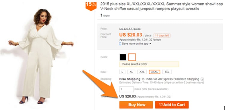
Doing this will help you get the best of both worlds – shoppers who’ve got what they wanted and just want to checkout, as well as browsers who want to look at other offerings.
2. Tell Customers when they’ve Added a Product to the Cart
As soon as a customer adds a product to the shopping cart, he or she should be immediately shown what’s in his cart. This is also a great time to upsell by showing product recommendations.
See how Aliexpress does it:
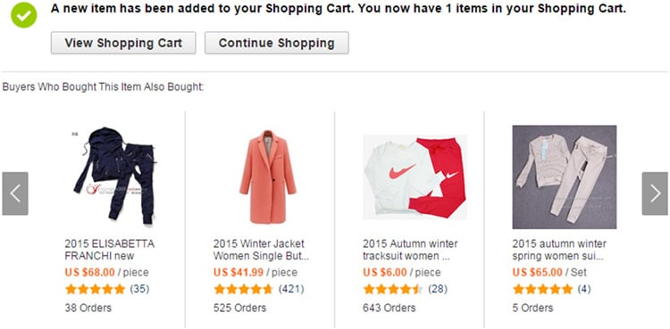
Customers should also have an option to proceed to the checkout page in just a click at all times.
3. Use Perpetual Shopping Carts
Remember your user’s choices forever, even if they abandon their checkout process midway. When they come back, their earlier cart should be waiting for them.
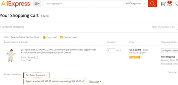
Users feel special if you remember their choices the next time they come back to your site. It allows them to pick up from where they left off.
This is especially useful in cases where users left mid-way because they wanted to research the products or prices some more. Subtle persuasion to finish their transactions (such as a coupon) can increase your conversion rates considerably.
4. Assist Customers with Discounts
You want your customers to feel that you have their best interests at heart. Telling them that they can get a discount if they increase their order value is not only good for your bottom-line, but also good customer service.
AliExpress, for example, tells shoppers exactly how much extra they need to spend to get better discounts:

6. Bring back Customers with Retargeting
Average conversion rates for e-commerce stores hovers around 3% globally. This means that for every 100 customers on your site, 97 bounce off without buying.
These are people you’ve already spent money to acquire. They are familiar with your brand and your offering. Some of them (10%, according to average ‘Add to Cart’ rate) have even added some of your products to their carts before abandoning your site.
As you can imagine, it’s far easier to sell to these people than to completely fresh visitors.
Thanks to retargeting, you now have an easy way to target the 97% customers who leave your site without buying.
How retargeting for e-commerce stores works
I’ve covered retargeting to bring back customers in detail earlier, but in a nutshell, there are two ways to use retargeting in your e-commerce store:
- Retargeting with advertising: With this method, you add a ‘pixel’ or a Javascript tag to your site. You can then use this to track non-purchasing visitors across the web. When these visitors search for a keyword similar to yours, your banner or PPC ad will appear.
- Retargeting with email: This method is the same as above – you add a pixel to your site which helps track visitors across the web. However, instead of showing them ads, you target them through an email reminder (something like “You have unchecked items in your cart”).
According to a study by comScore and ValueClick, retargeted ads are twice as effective other methods to get users to search for a brand. Another study by eCommerceFuel reported monthly recovery rates between 3 and 11% for a retargeted email campaign.
In other words, retargeting works. When you target people who’ve already familiar with your brand, your customer acquisition rates are lower and your chances of converting them to buyers increases. One study even says that retargeted customers are 70% more likely to convert. 26% of retargeted users are also likely to come back to complete their purchase.
Try a retargeting campaign for your e-commerce store – the difference in your conversion rate with be substantial.
7. Use Shopping Cart Recovery Emails
Sometimes, all it takes to convert abandoning visitors into lifelong customers is a little push.
Shopping cart recovery emails help you do exactly that. These emails are usually sent after a visitor has added products to his/her cart, but abandoned the checkout process halfway through. A typical shopping cart recovery email looks something like this:
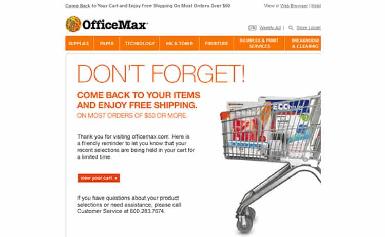
As you can see, this is simply a reminder that the customer has some items in his/her shopping cart. To increase chances of conversion, the email also emphasizes the free shipping for orders above $50.
Shopping cart recovery emails are extremely effective. Data shows that 46.1% of all such emails are opened (mean open rate for all emails varies from 10-25% across industries). 1 out of 8 such emails are clicked, and a third of these clicks lead to a sale.
Overall, every cart recovery email sent adds $5 to a store’s bottom-line on average.
A successful shopping cart recovery email taps the customer when the lead is still “warm”. Typically these emails are sent 1-3 hours after the abandonment (longer for purchases that demand more research) when your brand and your product is still fresh in the visitor’s mind.
On the whole, a good shopping cart recovery email should:
- Remind the customer about the abandoned item(s).
- Be sent within 1-3 hours of the abandonment. Wait longer if your product requires more research on the customer’s part (such as mattresses or high-end electronics).
- Include an incentive to complete the purchase such as free shipping, a coupon code or a discount.
It’s also a good idea to reserve the item in the customer’s cart – you don’t want to drive back the customer only to run out of stock. Urgency or scarcity based incentives work quite well too (such as reminding the customer that you have only 2-3 items left in stock).
Key Takeaways
There are plenty of ways to improve your checkout page conversion rates. Some just require more effort than others. Try these seven tactics to start with to get your checkout page up to speed. You should be able to implement some of these within minutes (such as Google Autofill), while others might require more effort.
Here’s what you can takeaway from this article:
- Single-page checkouts often get better conversion rates than multi-page checkouts.
- The shorter the form, the better it is for your conversion rate.
- Optimize your shopping cart experience by helping customers get discounts and checkout whenever they want.
- Skip mandatory sign-up on checkout pages.
- Emphasize free shipping, returns and security features.
- Use shopping cart recovery emails and retargetting to convert abandoning visitors
Want to learn more?
If you’re interested in the intersection between UX and UI Design, then consider to take the online course UI Design Patterns for Successful Software and alternatively Design Thinking: The Beginner’s Guide. If, on the other hand, you want to brush up on the basics of UX and Usability, then consider to take the online course on User Experience (or another design topic). Good luck on your learning journey!
