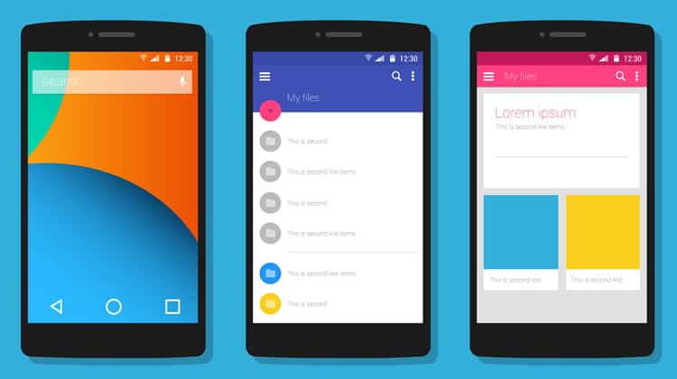
In June of 2014 at the Google I/O conference, Material Design was introduced. This new and innovative design language is also known as the code name, “Quantum Paper.” The lively, feature-filled user interface of this new design quickly became popular on all platforms that are run by Google.
According to Google’s Vice President of Design, Matías Duarte, this interface is based on the simple look of ink on paper, although it does allow for much more flexibility in imagination. He even states that “unlike real paper, our digital material can expand and reform intelligently. Material has physical surfaces and edges. Seams and shadows provide meaning about what you can touch.”
Material uses edges, surfaces and shadow effects in order for it to appeal as a realistic looking design. The features appear to be substantial and physical by touch, which makes it simple for users to understand how the interface works, and makes for a smooth user experience. Material design also makes use of different lighting to set certain features, such as a button, to appear more lifelike. Material has a lot in common with flat design, but allows for more depth than a simple flat concept.
Overall, Material Design creates for great usability and an extremely friendly UX (user experience). The bright colors give a welcoming feel, while the tangible features and fascinating animation effects make it feel more lively.

Material Design’s Big Year: 2015
In 2015, material designed applications started popping up everywhere, not only in Google-run platforms. Majority of the new applications that come out are Material based, while older apps are slowly migrating to the new design. Most web developers have taken inspiration, and started implementing Material in their websites as well.
The transformation to Google’s Material design has been very large-scale. Websites, mobile apps, and even wallpapers and posters have transitioned to Material. It is an inspirational and modern concept that has already overtaken many older design guidelines.
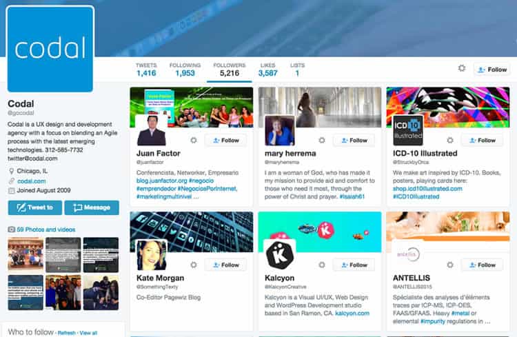
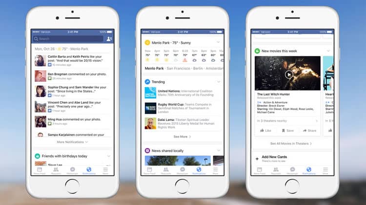
The ‘card’ concept of Material became specifically popular in 2015, and will continue to be in 2016 (and dare we say, the years to come?). Even parts of iOS have adopted the card concept of Material Design. The card concept provides a layered approach, uses white space, some animations, and shadows. This style is great for grouping bits of information, or actions together. Many globally used, high-traffic websites use the card-style in some aspect of their interface, such as Twitter, and Facebook.
Twitter uses the card-style to give you a bit of information on the user’s followers. The card-style format lists the user, their profile & cover photo, and their bio, to give an amplified idea of who the user is. Twitter is grouping information about one user, into one card to create a seamless user experience:

Facebook recently started using card-style in their notifications design. The goal of the card’s is to provide a personalized experience of relevant pieces of information:

Material design is going to continue being adopted by old and new websites to keep uptodate with current trends of functionality and features
Should You Follow The Trend?
Many designers may not want to use Material Design because they don’t want to appear to be a lazy designer, and believe that all websites that follow this concept look the same. However, there are ways to use Material that will make you stand out amongst the crowd. Here at Codal, we think it’s great to hold to the concept of Material, but it’s even better to break some of the rules.
What does that mean?
- Use only a few aspects of Material in your design concept. Use only Material rules for animation, or only the use of cards.
- Expand your color pallette. Instead of getting stuck on using bright colors that are typically used, explore using darker or lighter shades.
- Create custom icons that don’t come from a prepackaged set, but still follow basic design guidelines.
Want to learn more?
Are you interested in the intersection between UX and UI Design? The online courses on UI Design Patterns for Successful Software and Design Thinking: The Beginner’s Guide can teach you skills you need. If you take a course, you will earn an industry-recognized course certificate to advance your career. On the other hand, if you want to brush up on the basics of UX and Usability, try the online course on User Experience (or another design topic). Good luck on your learning journey!
(Lead image: Depositphotos)
