No matter the size of a company, usability testing can be viewed as a luxury that all too often gets scrapped off the agenda as deadlines start to loom.
In my experience of working in the young and vibrant e-commerce startup Mallzee, this issue crops up more than it should. When every penny counts, it’s hard to convince managing roles to invest time and money in user testing as it is pretty much impossible to foresee what you’ll get back for the investment.
However, letting the above sway you from taking the time to actually watch people use your products is ultimately damaging to your business. As UX designers it is our job to also remember the cost of not doing market research and make sure we are building the right products for our users. With that in mind here are 5 tips to help you get started -or back into- setting up a usability study on a budget.
1. Pick your ally
You could, quite simply, go blue in the face trying to convince your whole company of the value of user testing with little to no results. So rather than trying to convert the whole church, look for the individual or individuals who would most benefit from getting an understanding of your customers. More often than not these people are on the customer care or marketing side of the business, they will give you a hand as anything that makes the customers happy or feel engaged will make their job easier. Recruit them as your ally as they will already have an insight into user pain points, as well as access to useful channels for communicating with your target market.
2. Figure out what you need to answer
Before you even start working on prototypes to test, sit down with your new ally and locate the areas of your product you are most in the dark about. Figure out what you want to learn before you decide what you want to ask your users. This is an important subtlety that will direct the study and avoid you getting lost in asking about absolutely everything.
3. Recruiting Users – You only need 5
This is usually the most costly element of outsourcing a user test. However, recruiting users doesn’t have to be a headache and doing it yourself has many benefits.
Firstly, you have much more say in choosing who you want to interview and secondly, all the relationships that you create will be yours to keep. So if for example, one of the users you interviewed was so insightful that you would like to involve them in further testing you would be able to keep their details and get back in touch later down the line.
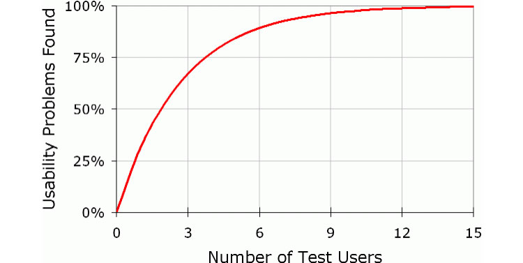
The opposite happens if you find them through a recruiting agency, where they “own” the relationship. Still, recruiting users can be a daunting task but our trusty Jakob Nielsen comes to the rescue and proves that speaking to 5 users will uncover 85% of the usability problems. His advice is to test on no more than 5 users, make the changes and then repeating this process as much as you can afford.

Additionally, here is some great advice on writing a screener to make sure you are recruiting relevant users for your test. Once written up, we found that posting the screener to our social media channels worked most effectively. Besides this, we also tried putting up posters in places our target market would likely see them but with little to no result as far as recruiting users was concerned so now we stick to, less costly, online promotion.
4. Incentivise Creatively
Being a startup, money can be tight, so the next biggest hurdle is finding an incentive to attract unbiased users (you can only use and abuse friends and family’s patience so much). Hard cash was out of the question as we simply didn’t have any.
We therefore, decide that offering an “experience” would be a) more affordable and b) more engaging for our user. Mallzee’s main target market is young women between the age of 18-25 who own a smart phone and shop online.
We therefore looked for an incentive that would fit into their lifestyle. Ultimately we got in touch with a trendy 1930’s cinema we had previously worked with and struck up a deal for cinema tickets in exchange for free promotion of their business on our blog and twitter. As an added bonus, the cinema even provided the venue for our user test. The lesson here is that incentivising does not have to be cash but something that works with your brand message and speaks to the lifestyle of your customers.
5. Arm yourself with (awesome and affordable) tools
The final hurdle is figuring out what tools to use to run your user study. Fortunately there are a number of really useful (and often free) tools out there. Here are the three main ones we used to build our prototypes, test and record our usability study.
-
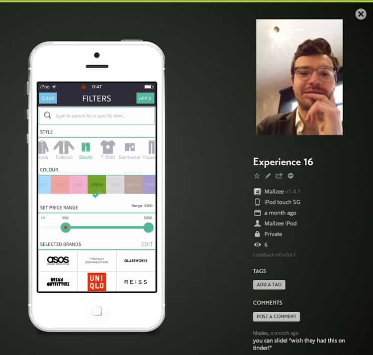
- To test our live app we used Lookback, a brilliant piece of software that captures the user’s interactions with your app as well as recording their facial expressions and voice. Lookback is currently free while in public beta mode.

-
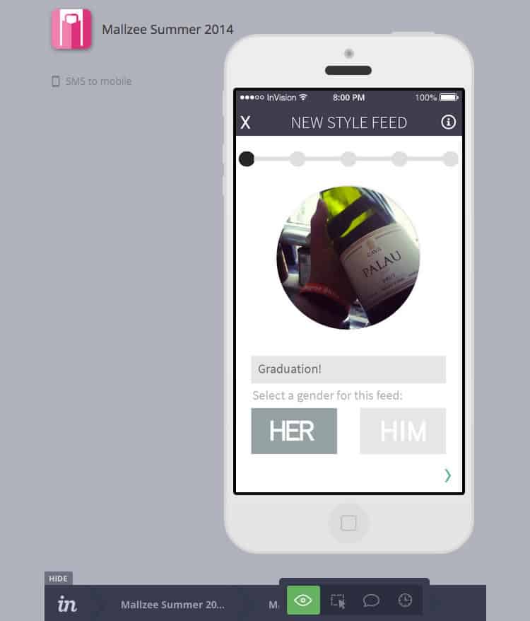
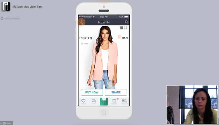
- We used InVision, the design and prototyping collaboration tool that lets you create convincing mobile and desktop apps without having to write a single line of code, to test and explore future ideas that, before the test, had only been shared with a handful of people. Invision has very reasonable price plans and one project free for life.

-
- Finally we used Silverback to capture user’s interactions on a desktop and record face and voice. Silverback has a nifty feature where if you pair it with an apple remote you can stealthily add bookmarks while testing on a user, so after the test it’s easy to find the important moments rather than strolling through the entire video. Silverback has a free trial of 15 days and a one time cost of $70.

There is no perfect recipe and I’d love to hear your own tips and tricks for setting up a usability study on a budget. However I hope that the above can help any UXer overcome the initial technical hurdles as well as make the whole experience seem less daunting. For more information on actually running the study on the day, I found Google Venture’s “User Research, Quick and Dirty” very insightful. Writing this post is also a stark reminder that however many data points you are tracking there is no substitute for watching someone engage with your product.
The more you watch users carefully and listen to them articulate their intentions, motivations, and thought processes, the more you realize that their individual reactions to Web pages are based on so many variables that attempts to describe users in terms of one-dimensional likes and dislikes are futile and counter-productive. Good design, on the other hand, takes this complexity into account.”
Steve Krug, Don’t Make Me Think: A Common Sense Approach to Web Usability.
Designing in the dark and making snap decisions based on your gut because you don’t have enough user data can be incredibly frustrating. So go forth and gather user insights to sink your design teeth into so as to make your life easier, your users more engaged and your business happier.
Want to learn more?
If you’d like to…
- get an industry-recognized Course Certificate in Usability Testing
- advance your career
- learn all the details of Usability Testing
- get easy-to-use templates
- learn how to properly quantify the usability of a system/service/product/app/etc
- learn how to communicate the result to your management
… then consider taking the online course Conducting Usability Testing.
If, on the other hand, you want to brush up on the basics of UX and Usability, then consider to take the online course on User Experience. Good luck on your learning journey!
(Lead image: Depositphotos)
