It seems that everyone and their brother today is talking about conversion rate optimization. Site owners large and small are leveraging conversion rate optimization software programs to test every button, link, and widget on their landing pages. Most of these site owners have adopted the practice to have a blog for various reasons – including (but not limited to) establish themselves as an authority within a sector for which they are providing a product or a service and provide a reason for users to keep visiting their site.
And while optimizing the pages to convert website visitors into customers is itself not a bad thing (after all users visit your site to achieve an objective too), this can be problematic if these site owners ignoring the place that users spend most of their time: the blog!
How many times have you landed on a site with a beautifully designed homepage … only to end up on a blog area that is ugly, hard to read, and clearly under-performing in the user experience department. This is something I run into almost every day with my SEO clients that haphazardly attach a blog to their corporate site.
And the irony of it all?
Some of the content in these ugly blogs are damn good!
So if you’re not getting the readership, the social shares, backlinks and comments your blog’s content deserves, first ensure that you know your readers and that you are writing usable blog posts for them. If you need some help with writing great content, then do check out our articles about writing for the web.
On the other hand, if your content is great, but traffic and popularity of your blog is low, then consider tapping into these tested strategies.
#1: Increase Font Size
Yes, I’m really putting font size #1 on the list.
Font size is one of those little details that makes a HUGE difference in how people consume your content. In fact, some people won’t even read a blog post if the typography is too small or hard to read.
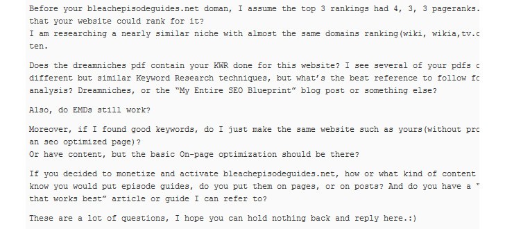
I mean, would you read a 1,000-word article with font like this?

I wouldn’t either.
There’s no golden rule for font size, but Derek Halpern of Social Triggers has a mountain of research showing that font sizes of at least 12 perform best. And you may even want to experiment with 16.
#2: Increase Your Page Margins
Again, this is a web design fundamental that many bloggers completely ignore.
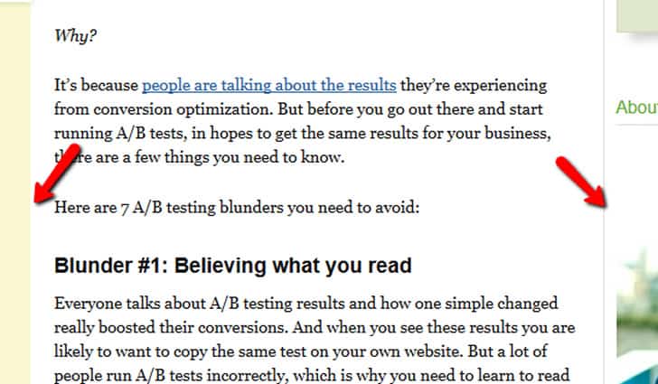
If you want people to read every single word you write, your words need to be smushed between two huge margins.
This is especially important for posts with 1,000 words or more. Small margins make your eyes work harder to read (they have to travel a larger distance when going back and forth). And with the attention span most internet users have, you can’t make them work hard to read your stuff…or else they’ll hop over to another site.
An example of a site that rocks massive margins is QuickSprout.com:

When you read a post at Neil’s site is almost feels like you’re browser is on rails: the thin margins keep you scrolling, and scrolling, and scrolling until — before you know it — you’ve read a 1,500-word post.
If your blog posts have wide margins, consider cutting them down by 10% to see if they’re easier to read. If they are, cut another 10%. Continue this process until you feel that your content is “on rails.”
#3: Add (Functional) Design Elements
When it comes to livening up a dense blog post, nothing beats pretty (yet functional) design elements. And I’m not talking about the usual suspects of images and embedded YouTube videos (although those are nice, too).
I mean design elements that make your content easier to consume and take action on.
For example, check out this post at Backlinko:

In this post I discuss 5 lessons that I’ve picked up over my SEO career.
I knew that there would be a certain segment of my readers that would pour over every single word.
But I also knew that most would skim the article to try to glean the most important points.
To make that easier for the second group I placed each takeway point in a yellow box.
Is this a huge design element that’s going to make or break a site? Of course not. But it’s one of those little things that makes your content easier to consume (and it’s also something that your competition probably isn’t doing).
#4: Cut Down on Options
This is a CRO (Conversion Rate Optimization) / UX (User Experience) one-two punch. No one likes to see busy pages with a thousand and one banners and links.
Remember: as much as it’s important to convert your traffic, it’s much easier to do so if they’ve read your stuff.
And the fastest way to alienate people from your content is to overwhelm them with options (“Like me on Facebook”, “Follow me on Pinterest”, “Sign Up for My Newsletter”).
Otherwise it’s very easy to create a cluttered design that simply doesn’t convert.
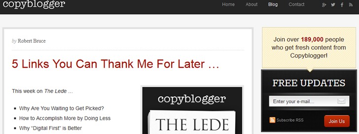
A blog that does a great job of placing the focus on content and conversions is CopyBlogger:

When you hit the page you’re presented with two options: read the latest post or sign up for free updates.
When it comes to conversions, think of the ONE thing that your users want to achieve when they visit your blog (usability) … and think of that ONE thing that you want users to do when they land on your blog (conversion). Very often, you will find that they are closely aligned. Then tailor your blog’s design around your content and that ONE thing.
For example, suppose you develop software that is used to conduct website usability testing. You would have a website that provides information about that software (including features, available subscription models etc.) and a blog in which you write about usability. The objective of users visiting your blog will be to learn about usability or inform themselves about usability testing software. Your objective would be to sell that software. If the content on your blog is written and styled for the reader, then conversion of a site visitor from a reader to a customer is greatly facilitated.
#5: Space Things Out
This is a general rule of thumb for any page with lots of text: add as much space as you possibly can!
Space between sentences
Space between design elements
Even consider adding space between your letters!
When people read your content they want to be able to sit back, relax, and read away.
But it’s hard to do that if you have a jumble of text and images in every post.
To see what I’m talking about, check out the posts from the Thesis Theme blog:

That’s a lot of white space!
As you can see every word, sentence, and paragraph has more white pace than the average blog. This makes their content much more inviting.
Conclusion
I hope that through these 5 tips served to highlight that blog user experience should never be underestimated. Overselling your products or services by blatantly stating that “our company is the best” and “we have the best products” simply doesn’t work.
Establishing yourself and/or your company as an expert in the field via a blog is a lengthy and time consuming process. However, it is one that is truly rewarding. The sheer commitment is what keeps some companies (and probably your competitors) away from seriously investing in their corporate blog. This is also why you need to seize the opportunity and take that competitive edge.
Want to learn more?
Want to get an industry-recognized Course Certificate in UX Design, Design Thinking, UI Design, or another related design topic? Online UX courses from the Interaction Design Foundation can provide you with industry-relevant skills to advance your UX career. For example, Design Thinking, Become a UX Designer from Scratch, Conducting Usability Testing or User Research – Methods and Best Practices are some of the most popular courses. Good luck on your learning journey!
(Lead image: Depositphotos)
