When starting a paid search campaign, whether you are using Google AdWords or another popular platform, you will always want to make sure that consideration is given towards on-site usability first and foremost.
There is no use in paying for site traffic when your visitors could struggle to find the information they are looking for or find it difficult to convert. Therefore there are many things you should consider with regards to site usability before setting a paid campaign live. By considering the following tips, you can make sure that you get the most from your paid visits while also improving the overall usability of the site.
Before Paid Search – Questions to ask yourself
1. Does your website fulfill the search?
Does the page your visitors are directed to satisfy the users search query? This is the first question you will want to ask yourself, because you are likely to find that searchers will not hang around for long before they return back to the search engine to continue their search.
![]()
If you already have a paid search campaign running, check your bounce rates and the number of clicks compared to the number of conversions, if bounce rate is high or conversions are low you should think about whether the on-page elements satisfy the search.
Perhaps the most effective method to implement in order to improve conversion rates is the Conversion Rate Experts’ Method. However. there are several simpler guidelines available on how to improve your conversion rate.
2. What do you want your users to do?
This should be an easy question to answer. Typically you will want your visitors to either purchase something, subscribe, sign-up or make contact. This is the primary objective of your website as viewed from your end. Are you making it easy for visitors to achieve this objective when visiting your website?
On-Page Elements
Here is a list of on-page elements that can help improve the user experience from paid search visitors.
1. Use clear headlines
Headlines capture attention; they help persuade people to continue reading the page. An effective headline should be relevant to the search and provoke intrigue. The more information you can get a user to read through, the more likely you are to convert them.
Too many headlines could create a confusing and inefficient design which can make it difficult for the user to find what they are looking for. People are generally impatient online and this may cause users to go elsewhere for the information they need.
2. Text content
Text content is essential to keep your visitors on the page and to aid in turning those visitors into customers. You will need to find that fine balance of text, to give enough information to the user but not too much that it could potentially lose that visit.
Text content placement is also an important consideration. You do not want to hide the copy way down the page where people are unlikely to find it; you want it to be one of the first elements they set their eyes on so you are presenting the information they are likely to be interested in immediately.
3. Make sure you have a clear navigation
Navigation is hugely important, quite often this is the basis for a paid campaign to help websites create a well-targeted and easily manageable account structure.
It is also important to have a clean and structured navigation so a visitor can find their way to the information they need if it is not on the page they land on. This is true for many Ecommerce websites, quite often people will purchase more than one item and therefore will need to utilise the navigation to find the products they are interested in.
Users should also be able to easily find important information such as terms & conditions, shipping details, payment options, contact information and anything else relevant to your specific website.
Here are a number of elements to consider when designing and optimising your navigation for a paid search visitor:
- Position the navigation near the top of the page
- Use a clear top level page navigation
- Include a link to the page where people can make contact easily should they wish to
- Group related and similar pages
- Use drop-down menus when you have lots of pages
- Utilise breadcrumb links so users can backtrack should they want to (more relevant for Ecommerce websites)
- Include an easily accessible Sitemap page with a list of pages and categories
4. Calls to action
Calls to action are valuable tools in the route to conversion. If you are not actively highlighting the page elements that enable users to purchase, sign-up and convert – you are likely to miss out on many conversions.

Place these call to actions so that they stand out, but prevent them from obstructing other important information on the page.
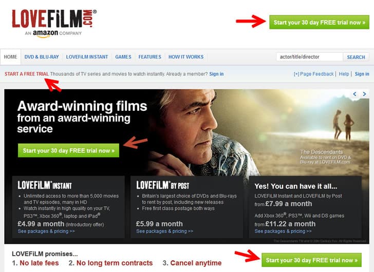
Love Film does this well by including a number of call to actions on the Home page that are clear, are placed to capture attention but to not obstruct the other information a user is presented with.
5. Above the fold
The most important information on the page should be visible ‘above the fold’; this ensures that any elements present to capture the attention of a visitor are visible without the need to scroll. The quicker you can capture the attention of a visitor, the better – keeping them on page is important initially and the other elements should help convert the visitor.
At the very least, the information above the fold should persuade the visitor to keep reading or navigating through the site.
6. Allow for easy contact
Briefly mentioned above, there should be an easy method of contact for anyone who chooses to. You might be surprised at the number of people who like to enquire without reading anything.
Here are some ways to make it easier for people to contact you:
- Include the contact information on the landing page or a clear link in the navigation
- Always have a contact page on the site
- Include a variety of contact methods including a contact form, an email and a phone number
- Restrict the amount of information someone needs to enter to complete the form
7. Easy route to conversion
Make the route to conversion as simple as possible; this can be achieved by optimising the structure of the path and by shortening it where possible. This goes back to the point about patience online; people don’t have a lot of it so a long route to conversion can easily put someone off.
If you want someone to simply sign up to a newsletter or register for an account on your site, make it simple and allow them just to enter their email, pick a password (if relevant) and away they go. Additional information can be gathered once they have created an account.
8. Form usage
Forms can be a great way of receiving useful leads, these are easily recognisable and are very simple for visitors to fill in and submit. If you just have an email, this requires a user to load up their email client, copy across the email or fill in subject line information. This is a hugely long winded approach to what should be a relatively simple process.
Restricting the number of fields within a form can also improve the number of people who choose to make contact. Even if some are not compulsory, the sheer number of fields could be enough to prevent that initial contact.
9. Site trustworthiness
Trustworthiness is an important consideration for many websites if you are selling products or simply collecting an email. If the visitors are unlikely to trust the security of their information or don’t believe their personal details will be safe, they are very unlikely to convert.
Follow the tips below to improve the trustworthiness of your website:
- Include accreditations on the website where people can see them
- Add a privacy policy
- On giving their email, make sure to highlight that their details will be secure and not shared with third parties (unless it is in which case explain why)
- Include secure payment badges (such as VeriSign)
10. The problem with the homepage
When people set-up paid campaigns, they usually set all ads to send users to the Home page of the website. This may work for some websites who specialise in one particular thing relevant to all target keywords; however, these are generally few and far between.
Ideally each group of keyword targets should send visitors to the relevant sections or pages of the site. This ensures the user lands on a page that is most relevant to their search, if the other on-page elements (as discussed above) are in place, it can significantly improve the rate of conversion.
Part 2
Part 2 of this article includes guidelines for paid search being accessed via mobile devices. In addition the article contains practical guidelines on optimizing landing pages and e-commerce websites. Since Google AdWords is synonymous with paid search, there is also be an explanation of its terminology and its paid search advertising options. So head over to the 2nd part of this article for more guidelines on how you can optimize your website for Google AdWords and any other paid search campaign.
Want to learn more?
If you’d like to…
- get an industry-recognized Course Certificate in Usability Testing
- advance your career
- learn all the details of Usability Testing
- get easy-to-use templates
- learn how to properly quantify the usability of a system/service/product/app/etc
- learn how to communicate the result to your management
… then consider taking the online course Conducting Usability Testing.
If, on the other hand, you want to brush up on the basics of UX and Usability, then consider to take the online course on User Experience. Good luck on your learning journey!
(Lead image: Depositphotos)
