
The web is not an art gallery. And before all the art aficionados and web designers, take umbrage, let me clarify by stating that the web appreciates and requires usability. Keeping things simple and usable not only makes way for easier goal achievement but it also leads to higher conversion rates.
Website owners and designers put in a lot of effort and money, to develop, promote and maintain a website. Hence it makes sense to invest in its usability, that is, the ease with which the user can achieve his or her goals within that website.
Usability has far reaching ramifications on business than goal achievement – it improves the objective of visitor convertibility. For example, when a website makes use of Pay Per Click (PPC) advertising, usability helps in improving the quality score and conversion, thus improving the overall customer acquisition cost. It also helps improve the action rate as the customer understands the website, product, service or content. For more reasons as on why website usability is important for any company, I advise reading the article entitled “Why Web Site Usability Is Important For A Company” which was published in this blog.
But what makes a site the cynosure of all eyes and at the same time a usable one? In this article I will be proposing a number of guidelines which I believe do just that:
1. Good User Interface

Websites need to be designed with the target audience in mind. If your website is about fashion, you may opt to introduce more creative elements – which would perhaps not be the case if you are designing a corporate business to business website.
At the same time the same website will not appear the same when it is accessed via different devices and browsers. Since there are various device-operating system-browser combinations one can resort to online testing tools such as Browsershots to visualize how the same website will appear across a number of web browsers. Similarly, there exist a number of emulators for devices such as iPhones and iPads. Whilst these emulators are sometimes slightly unreliable, they can present a relatively accurate and cost effective rendering.
2. Navigation Usability
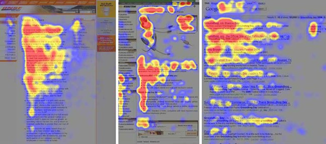
Poor navigation will always remain one of the top reasons why users leave a website. Pay attention to where you place your navigation elements, how you name them and how you distinguish between primary, secondary and utility navigation. These guidelines should also extend to link usability and breadcrumb usability. Empathize and work out how your user will navigate from through your site and remember that the way you view your organizational structure is generally not the same as how your user sees it!
Research has pointed out that generally users read web pages in an f-shaped pattern. Thus, it makes sense to put in all the important information such as the site logo, and primary navigation on the left hand side. For larger websites, a good technique would be to show the inner pages / categories in the left sidebar. For some examples of what is good as well as bad navigation, a good place to start would be this article on Smashing Magazine. However, one can find various good resources, even via a simple Google search
3. Search Functionality
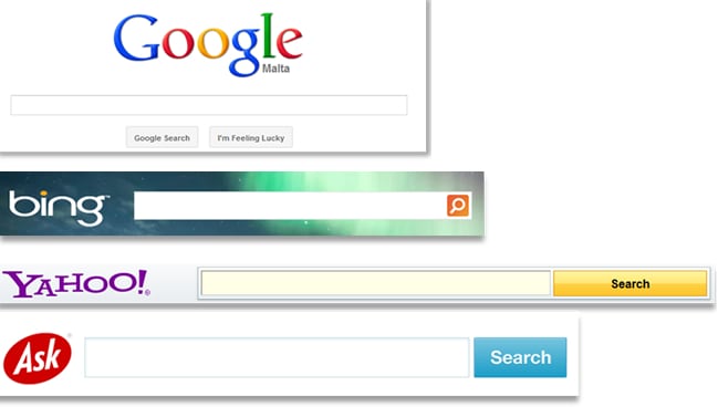
While some argue that navigation usability is more important than search usability, search usability must not be underestimated. This is because users tend to resort to search if they cannot locate the content they are looking for. Additionally, users will use the search functionality if they are looking for a particular product in e-commerce websites.
In fact, for large e-commerce websites it is recommended that apart from the traditional search mechanism, an advanced search option is also made available so as to allow visitors to refine their search queries through the selection of parameters such as price, brand names and reviews. For a full set of guidelines on how to make your search interface usable, you should read the article “10 Usability Guidelines For Designing The Search Interface“.
4. Content Usability
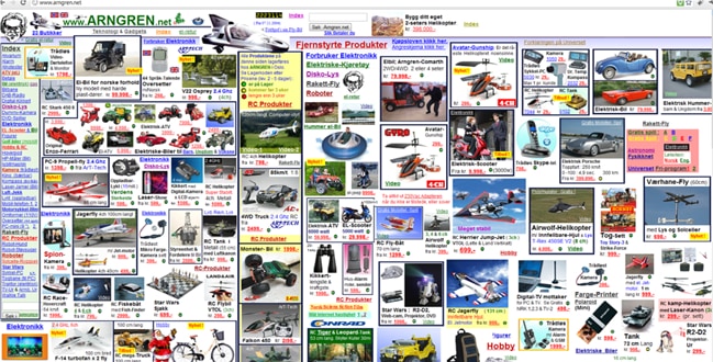
Website owners need to carefully balance graphics and content in the right combinations depending on their target audience. As a matter of fact, content that is authentic and to the point increases the trust quotient of the website that contains it. Content should be clear, precise and well formatted. At the same time, one might have a lot to share and not all content fits in on one page. In this case, content can be split over a number of pages and linked to from the main article – just as I am doing myself in this very article. And, speaking of best guidelines for content, I would advise reading “10 Guidelines for Writing Usable and SEO Friendly Content“.
5. Images to Support Content
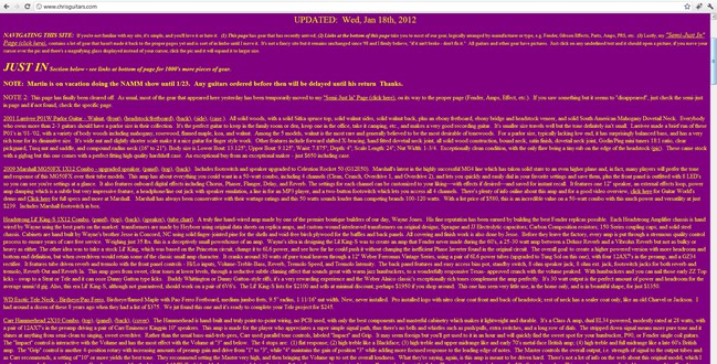
Although this point could have been included under content or user interface, I am listing it separately because of its importance. Images play a very important role in supporting content and can provide a means to enable the user to quickly skim through an article. As the cliché goes, an image speaks a 1000 words so it can be very handy to overcome the need to write long web articles.
6. Videos to Enhance Content
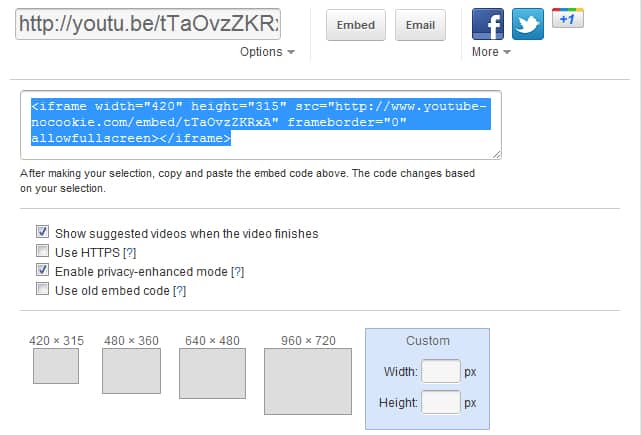
Users typically spend between 10 and 20 seconds on a web page unless the content grabs their attention. Apart from having good content and imagery, another way to grab their attention is by supporting your content with videos. Like images, videos can be used to support the content or emphasize a particular point.
7. Fast Loading Web Pages
As mentioned in the above point, users quickly leave pages if they are not captivated by their content. Now imagine how quickly users will leave a web page if that content takes very long to load! Such is the importance of fast loading web pages that Google have introduced site speed in their search ranking algorithm. This is because their studies confirmed that “faster sites create happy users” and “when a site responds slowly, visitors spend less time there”. In order to evaluate the speed of your website, you can make use of tools such as Google PageSpeed, Yahoo! YSlow and WebPageTest.
Final Words
As a general rule, always remember to put yourself in your users’ shoes before taking any decision related to your website. The chances of you tripping with these shoes are indeed very low! Well, these are my top 7 guidelines to improve website usability. What are yours?
Want to learn more?
If you’d like to…
- learn all the details of Usability Testing
- get easy-to-use templates
- learn how to properly quantify the usability of a system/service/product/app/etc
- learn how to communicate the result to your management
… then consider to take the online course Conducting Usability Testing.
If, on the other hand, you want to brush up on the basics of UX and Usability, then consider to take the online course on User Experience. Good luck on your learning journey!
(Lead image: Adrianna Calvo via Pexels)
