With each and every passing day, the World Wide Web (WWW) is becoming more and more advanced. It has also established itself as one of the most vital and powerful resource of information, and a source abound with exciting possibilities. Sites have become the easiest and convenient forms of information exchange, surpassing most of the traditional media channels like the radio and television.
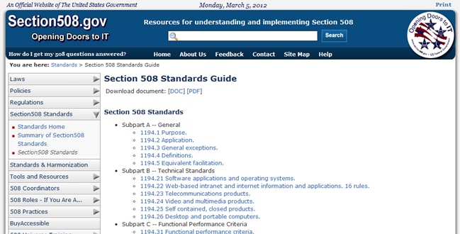
It is quite unfortunate that the adaptability and the power of WWW is sometimes not utilised properly or fully to become usable for users with special needs. In fact, the first ever global web accessibility survey, which was conducted by Nomensa on behalf of the United Nations in 2006 concluded that from the 100 leading web site home pages from 20 countries, 97% did not even achieve the Single-A accessibility level – the basic accessibility rating of the W3C Web Content Accessibility Guidelines (WCAG). From both the ethical and commercial perspectives, organizations cannot really afford not to cater for users with special needs.
This article contains 5 simple, yet practical guidelines, which, in my opinion will improve your website’s accessibility. Indeed, implementing these guidelines will improve the overall accessibility for all users.
1. Colour

First thing you need to consider is the colour of the website. In the United States alone, there are approximately 10.5 million men and 0.6 million women suffering from colour blindness of some form or other. Deuteranopia and Protanopia are the common types of colour blindness, and people who have such problems face difficulty in distinguishing between green, red and similar colours. Thus while coding and designing your site, you should keep this factor in mind.
A simple way of diminishing this problem would be to test your site using some of the free utilities that can be found online. Sites such as Color Filter, Sim Daltonism, Etre and VisCheck will help you by providing different filters that will simply mimic how a colour blind person will perceive your website.
Maintaining a high colour contrast can also be one of the smart ideas. This guideline is not only for the colour blind people, but it also will be of great benefit for regular users too. The Web Accessibility Guidelines suggest maintaining 4:5:1 as the minimum contrast ratio. For standard sized text the ideal ratio would be 7:1. Ideally, text needs to be in black and the background white.
2. Links

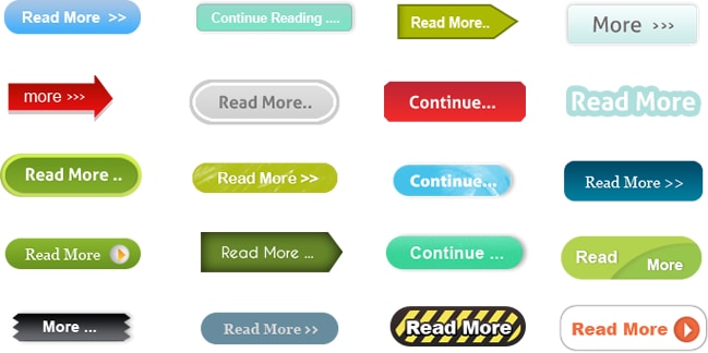
Make sure that the contextual links in your website are more descriptive. Several people with special needs make use of screen readers. Most screen readers today offer their users the option to navigate a web page by jumping through the links in order to find something that they are interested in. For all the text links, the user will only hear the text link word or phrase, no matter what content it leads to. Thus it becomes quite useless if all the user hears is “more” or “click here” as this does not provide enough information regarding where they are directed to or navigated to.
A website will be more accessible for special needs if it contains descriptive links such as “click here to know more about this article” or “Learn more about the article”. For a full set of guidelines on how to make your links both usable and accessible, I suggest reading the article
15 Usability Guidelines For Designing Web Site Links
3. Alternative Content
Provide alternative content. One of the most important principles of web accessibility is to provide content that is available for everyone irrespective of what special needs they have. There are several techniques to achieve this.
Perhaps, one of the simplest, yet important ways of doing it is to provide text for non text content (using the HTML alt attribute) and vice versa. You could introduce the ability for users to select larger fonts and higher contrast when viewing your site.
4. Navigation
It is always advisable to create a web page which is logically structured and intuitive to navigate through. Also important is the introduction of additional hierarchical cues that indicate the varying degree of importance in content through the use of adequate styling. This helps the user differentiate between content, subheadings and main headings. Through proper use of HTML markup and (if necessary) CSS styling this can be very easily achieved.
Another, often forgotten is the use of tabindex to facilitate the flow of form filling. This can be particularly useful for fine motor special need users as they require precise movements over the radio buttons and check boxes.
5. Testing

Testing the accessibility of your website against such a wide array of users with special needs is an incredible feat. As with all forms of testing, nothing is better than real user testing. However, there are automated tools that can help in identifying accessibility issues by analyzing your website’s code. We have issued a list of 10 Free Web Based Accessibility Tools in another article on this blog.
Conclusion
When discussing accessibility, it is always worth remembering the difference and
relationship between usability and accessibility. For a website to be usable, it needs to be accessible. This is why, implementing accessibility measures in your website such as the ones recommended in this article will be beneficial to all your users, irrespective or not they have special needs.
Want to learn more?
If you’d like to brush up on Accessibility and get practical skills on the subject, then consider to take the online course on Accessibility. If, on the other hand, you want to go over the basics of UX and Usability, you could take the online course on User Experience. Good luck on your learning journey!
(Lead image: Depositphotos)
