In January 2012, The UK government launched a BETA version of the new website Gov.uk to replace the existing direct.gov.uk site. This is the latest attempt by the government to provide access to all their information in one place. The new interface is essentially a search engine with a simple user interface which is similar to that of Google search; a box to ask a question and a few ‘popular’ links. Is this the UX direction all sites should be taking? How could this affect search engine rankings?
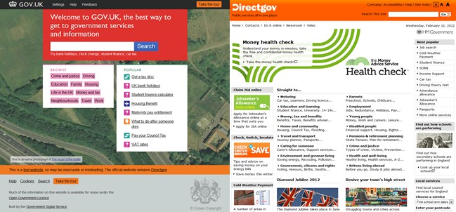
The main aim of the site is to act as a portal to all the different services the government provides. Gov.uk is a complete departure not only from the previous site but most information portals in general. Here’s how the two sites compare:

The old site is very much a traditional design – heavy text, sparse images and an abundance of links. This type of site is designed with the goal of getting as much information on one page as possible. This is the landing page for everybody so there should be a link to everything, right? Not if the new site designers have anything to say about it.
Traditional Web Design Practice
While the old site may be good for search engines – with everything on one page and several links – for a user it is very unwieldy. If I were an elderly visitor to the site and wanted to learn about pensions I would have to sift through a large chunk of text before I stood a chance to find what I was looking for. It is generally accepted that users read web pages from the top left (like a book) downwards and to the right. Users are also drawn to images and contrasting shapes.
As there are so few images standing out on the old site, you can presume that to find ‘Pensions & retirement planning’ one would have to skim over 20 links. The ‘Straight to…’ links aren’t even in alphabetical order!
Designing for User Experience
The new site works on the premise that you land on the page and just type to locate what you want to know. There are also a few ‘popular’ links so that they can guide you in case you are not sure what you are looking for, and a ‘browse’ section if you are unfussed about what you read. However, the average user of the site knows what they are looking for already and can find it by searching.
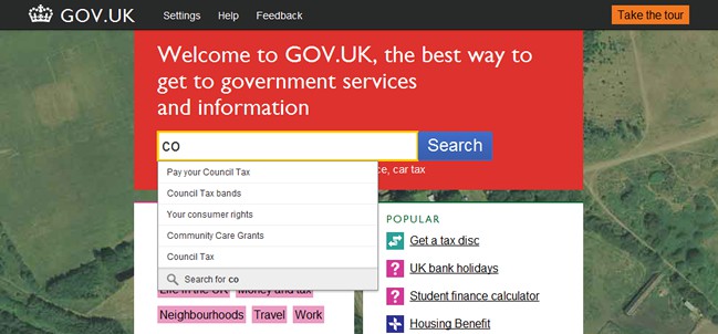
The bold red search box stands out on the background and draws your attention to it immediately. Once you start typing in the search box, a number of suggestions appear – a feature that really is about matching users and information as quickly as possible.

SEO Implications
Having a landing page devoid of links and text seems to go against every SEO rule in the book. However, as a portal, the site wants to direct you to relevant pages. If you search Google for ‘UK bank holidays’ you want to land on the correct page within the Gov.uk site rather than on the home page where you have to search again. By optimising internal pages and leaving the home page sparse, the website is again ensuring that users always get to the most relevant information as quickly as possible.
The page designs themselves are also delightful. Less text but nicely styled, easy navigation through a small number of related links and the constant presence of the search bar, all improve the overall user experience
Relevant Results
One of the most interesting parts of the site is the ‘settings’ tab. How many websites have settings? As well as an ‘Easier reading’ option for dyslexic users, there is also the opportunity to set a location, making results relevant to where you live. This is perfect for a government portal as you can receive results from your council instead of one from the other side of the country.
This takes a note out of Google’s book – search results relevant to what users want and not what website owners think users want. After all, user experience is all about the user!
Want to learn more?
If you’re interested in the intersection between UX and UI Design, then consider to take the online course UI Design Patterns for Successful Software and alternatively Design Thinking: The Beginner’s Guide. If, on the other hand, you want to brush up on the basics of UX and Usability, you might take the online course on User Experience (or another design topic). Good luck on your learning journey!
(Lead image: Depositphotos)
