Back in the time when eCommerce was nascent and dial-up internet was still the only option for many, online stores weren’t all that great, and sellers didn’t need to obsess over design. The competition just wasn’t there. When you’re the only merchant around offering a particular selection of products, your target shoppers simply have to accept the flaws of your website.
Things have changed since then. Things have really changed. The internet of the present day would seem barely recognizable to someone from the early 2000s, even if they were well versed in technological advancements. So what happened? Well, there are various developments we need to take into account, including the following:
- Performance, reliability and affordability skyrocketed. Dial-up gave way to ADSL which was gradually replaced with today’s commonplace fiber-optic broadband. The internet is now a de facto utility throughout the world, used on a 24/7 basis and expected to respond quickly and consistently when we need it.
- Smartphones brought eCommerce to the masses. The arrival of the iPhone radically changed how computers were viewed, eventually sending internet access into the hands of people who would previously have avoided modern technology (since then, of course, accessibility has become a core concern for web design). The resulting smartphone market also made internet-capable technology vastly cheaper.
- Design sophistication kept incrementally improving. With touchscreen tech widespread and browsers embracing new features, the design process had nowhere to go but up. Given room to experiment, designers worked to figure out how to master online conversions, and they made immense progress.
The growth of the internet made things much tougher for sellers, but it also provided opportunities that budding entrepreneurs greatly desired — so competition started to flood the online marketplace. Soon enough, that idea of being the only merchant around for a given product selection became farcical. There are always alternatives out there.
And then the COVID-19 pandemic came along to cut short a lot of careers and send frustrated professionals into self-employment. They naturally headed into eCommerce, an industry that was booming while others were struggling: in the UK, per the Business Data Group, the pre-lockdown figure of 500 new eCommerce startups per week rose to almost 1300 per week after five weeks of lockdown, demonstrating a massive rise in entrepreneurship.
With more people trying to sell online, margins grew even slimmer, and this resulted in an intense pressure to excel from a UX standpoint. Any store that can’t compete as far as general experience goes will inevitably slide towards failure.
If you want your store to succeed, then, you need to start by ensuring that you’re following the best practices and offering what shoppers expect from 2021 ecommerce. Here are five that are particularly worthy of your attention:
Use a mobile-first design ethos
Most people understand now that it’s essential for an online store to be mobile-responsive: in other words, to be capable of realigning to suit the dimensions and functions of a smartphone screen. If a store looks great on desktop screens but doesn’t scale down, mobile users will find the site unusable and never return — and since mobile shopping is now incredibly common, that isn’t something you can allow to happen.
But you shouldn’t settle for responsiveness, because you can do more. You can fully adopt a mobile-first ethos. This means making mobile design the default. By starting with a mobile layout, making that work perfectly, then expanding it to use the extra space available in a desktop view, you can end up with a slick site that works perfectly on everything.

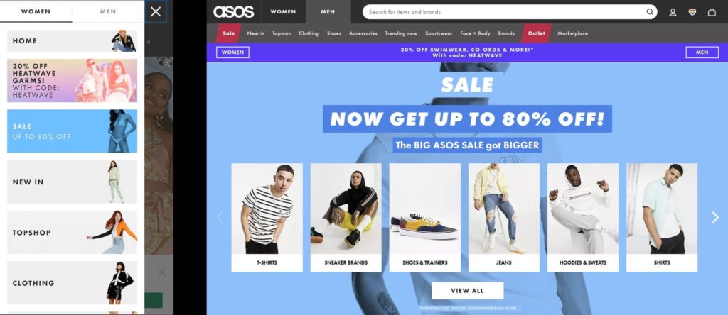
ASOS offers a great example of this, as evidenced above (the mobile view is on the left, with the desktop view on the right). Note how good the mobile menu is. It looks significantly more graceful than the desktop equivalent. And everything on the site is built around tiles that fit perfectly on mobile, making the mobile-first approach abundantly clear.
Offer more than just a store
Yes, the people visiting your store will obviously want to engage in the business of eCommerce (to find and purchase products that interest them), but that’s not all they’ll expect from you. It’s become completely normal for online sellers to build larger brands that also provide advice, entertainment, and curated content in line with their overarching goals. You should follow suit.
The main thing you need to do here is to provide a regularly updated blog. In addition to being great for UX by giving visitors useful information, it will help you with your SEO efforts: writing blog posts covering top search terms can bring in a lot of free organic traffic. This can be tricky, depending on your CMS (some platforms, like Volusion, don’t support native blogs), but you can always find a guide online to walk you through using a third-party solution if necessary.
You should also commit to using social media effectively, posting regularly and showing some notable personality. When your company name gets mentioned, you want your target audience to react in ways that don’t entirely revolve around your products and service: if you can reach the point of being viewed positively for your overall brand, you’ll have a big advantage.
Provide robust search options
Through rich supply lines and fulfillment options like dropshipping, stores today often have massive product ranges, and shoppers understandably want to pick through them carefully to find the things they’re looking for. This makes internal search a mission-critical concern. Take an area like furniture, for instance: someone looking for a chest of drawers might want a particular color, or a design style, or a material. You need to cater to their preferences as best you can.
An excellent set of search options will allow shoppers to look for specific items or relevant keywords, find suggestions based on things they’ve searched for before, and filter and sort the results in myriad ways. If they want to see the cheapest items first, or just view what’s currently in stock, failing to accommodate these requirements will likely push them away.

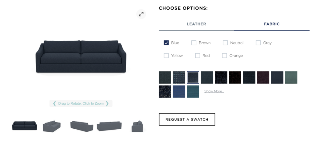
Some sites don’t really need search options because the available configurations are applicable everywhere. I’m thinking specifically of furniture sites where, for instance, every couch might be available in every material and every color. When that’s the case, it’s good to make it clear through obvious customization options. Above, you can see these options for American Leather’s sofa selector: allowing visitors to preview their preferred choices is a strong move.
Allow guest or social logins
How many user accounts do you have? Think carefully about all the websites that have tasked you with providing your personal details. It could be hundreds by now, and this can be rather frustrating. Yes, it’s true that gathering data is a good move for online sellers because they can use that data to glean insight into what people want and why, but tasking people with creating accounts before they can buy from you can work against you on occasion.
This is partially due to the spur-of-the-moment nature of many eCommerce buys. In the middle of the night, someone can have the sudden urge to buy something, find a suitable item online, and be prepared to buy it — only to find that they need to create an account, something they can’t muster up the effort to do. So what’s the solution?
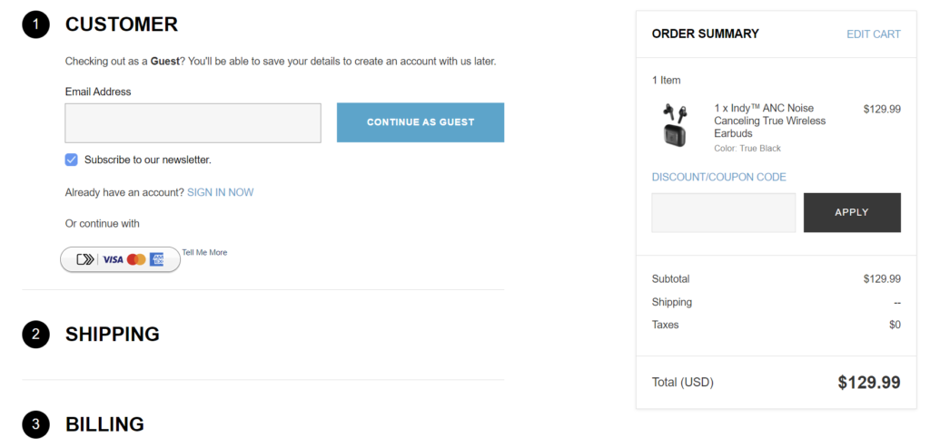
Well, it’s actually quite easy. By allowing users to log in using their social media accounts using a service like Auth0 (logging in with a Google or Facebook account is hugely convenient, particularly on a smartphone) you can hurry things along — and for those who don’t want to create full accounts, you can allow guest accounts that only need their email addresses.

Skullcandy does just this (see above). The order will be associated with the email address so you can easily create a full account at a later date. Note that it doesn’t allow social logins, however: if it did, it would be even stronger.
Make the checkout process clear
Lastly, something else that can end up sabotaging a conversion opportunity is an unclear checkout process. It’s often necessary to take a buyer through various pages while checking out: choose a payment method, set a billing address, set a shipping address, confirm shipping preferences, add any additional details, consider additional products, double-check the selected item/items, then provide the final confirmation.
There isn’t anything inherently wrong with that — if the steps are necessary, you can’t skip them — but it can prove frustrating if it’s unclear how the process works. Thankfully, it isn’t too onerous a task to make it clear. You largely need to include an obvious breadcrumb trail so the user knows where they’ve been (and where they’re going), make it easy to amend previous entries without losing progress, and check that every feature works perfectly (just one minor error due to something like data validation can utterly sour a buying experience).
Where To Learn More
To learn more about how to design successful products and interfaces that customers will use, check out the following online courses:
If you are just beginning your journey into UX design, consider taking the course Become a UX Designer from Scratch. You can also access the world’s largest open-source library of UX literature here.
Happy learning!
Lead image: Needpix
