
There are plenty of reasons why some e-commerce sites rake in the big bucks, while others do not. The reasons could be anything ranging from bad quality products to an unbearably long registration process and from lack of responsiveness to an inability of the web property to exude trust and credibility.
But one of the biggest causes of e-commerce sites failing to deliver the returns expected from them is bad user experience. The purpose of any site selling products and/or services is to attract customers and increase sales. This can only happen if the user experience of the site engages customers and persuades them to buy from a site. There is no doubt that the quality of the UX can make or break the purchase process and has a huge role to play in website success or for that matter, its failure.
Bad UX results in customers exiting critical landing pages because they do not get the frictionless user experience they’ve come to expect from e-commerce sites. The fact that visitors are not spending a lot of time on these pages and the site in general, results in a nose diving conversion ratio; and it is difficult to arrest this fall without taking the site through extended re-design to include the user experience features, the absence of which, were affecting the site’s performance.
You can only right the wrongs of your site after identifying the pain points of a customer vis-à-vis the UX. So, here’s taking a look at four user experience fails that impact an e-commerce site’s conversion ratio:
1. Absence of Product Page Videos
You might want to think your e-commerce site comes good on the engagement quotient, but take a close hard look at it. Is it really engaging? Do the product pages hold the attention of visitors? Do they have videos?
Videos! What videos? Well, there you have it. One big UX fail – not leveraging the immense potential of videos on your site! Videos also play a huge role in your content marketing strategy. What videos do is they persuade a visitor to spend a little longer time on the product page.
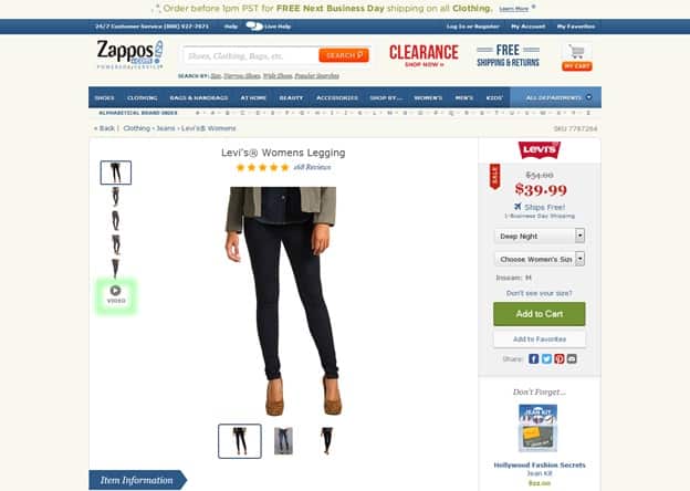
According to a study by Anagard, the average time spent by a user on a particular site is just six seconds, yes it’s that short. Your UX must therefore be designed to convince users they need to spend more time on the site. This is why using a video is absolutely crucial for your efforts.
How Retailers can Use Video for E-Commerce is a must read if you want to optimize the use of videos on your e-commerce site. There is no doubt the absence of videos is a huge user experience fail but you must be able to use these videos in the right way to maximize their use. Just implementing videos is not enough. So make sure you use videos, but use them in a way that creates maximum impact.
2. Insufficient Product Information
Do you know what is turning online shoppers away from your site? It’s want of product description. The fact is 42% shoppers’ abandon an online purchase because of limited product information. Product information is one of the most critical components of your site’s UX. The reason why some sites have a better reputation on the market than others is because the former offer a truckload of product information (all relevant) to help shoppers make an informed buying decision.
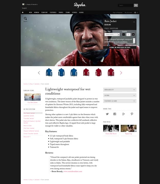
Rapha is an example of an e-commerce site that offers product description the way it is supposed to be.
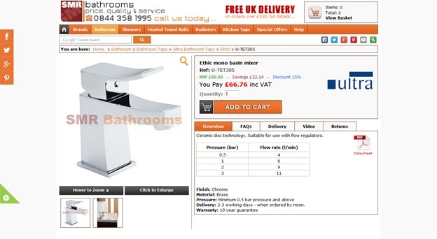
The product descriptions on this particular site can definitely be taken up a few notches higher. Visitors would definitely appreciate some extra information, which can lead to better conversions.
There is no need to write a product treatise, but it’s important to make sure that the description offers information about the benefits of the product, its features, material used and measurements. And you need to put across this information in a really interesting manner. The idea is to convince people that the product is just what the doctor ordered for them.
3. Product Images
Our computer screens are getting bigger, their resolution is also getting better; we are also seeing the emergence of visual designs that are making good use of the larger screen real estate available to them. The use of responsive web design is also becoming prevalent, which ensures a website renders effectively on all screen sizes.
This has allowed web designers to think big, both literally and figuratively; we are seeing a reflection of this thinking on some of the top e-commerce sites that are using larger product images than they earlier were; unfortunately, there are still sites that are using low quality, tiny product images on their product pages. Result – this impacts the experience of customers who want to view a larger product picture to get a clearer idea of what they want to buy.
Online shoppers don’t have the benefit of physically handling products to know what they feel and look like. Your job as an online merchant is to recreate and if possible, improve upon this particular aspect of in-store experience. One of the ways you can do this is through larger product images.
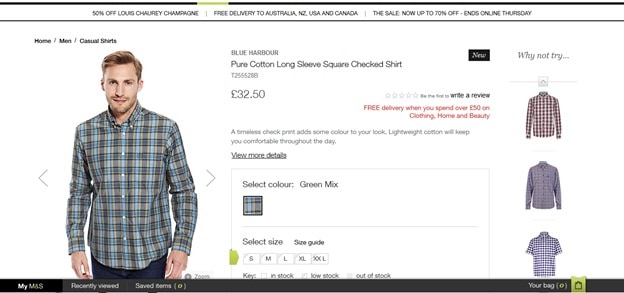
Marks and Spencer makes great use of its product pages by offering tons of information about the product. A user can also click on the product image to view a larger version of the image; coupled with all other information on the page, the user can make an informed buying decision regarding the product in question.
4. Poor Customer Service Pages
For many online merchants the UX of a website begins and ends with the product pages on their site and a quick and convenient shopping cycle. What they fail to understand is that a serious shopper will go through plenty of other pages on the site to make a buying decision. I for example like to go through the ‘Returns Policy’, ‘Shipping Delivery’, ‘Payment Pages’, and ‘Customer Service’ pages of a site and am majorly put off if a site doesn’t have them or just comes up with such pages for the heck of it; in such cases I am forced to believe these websites aren’t really concerned about offering more information about the business and its policies to its target customers. Know what takes a hit in this case – its credibility.
This is another huge mistake made by e-commerce merchants. The customer service area of their site is either non-existent; even if it is there; it gives out a feeling that the merchant couldn’t be bothered about customer service.
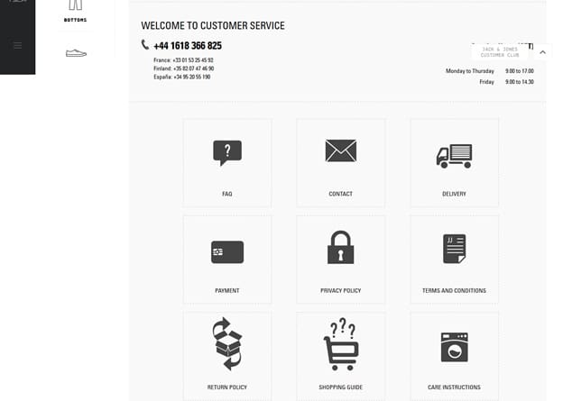
Jack Jones has an absolutely fantastic customer service page that gives prospective shoppers all information that they might need to make better buying decisions. What’s more, the page is extremely well-designed and delivers a terrific user experience. If you don’t know how customer service pages should look like, do what this website has done. You won’t go wrong.
Final Thoughts
Building e-commerce sites that users will love boils down to the kind of user experience your website can deliver and does deliver. If it is unable to offer shoppers a satisfying user experience, it will fail to do its job and that is becoming a sales generation machine. You don’t want that to happen do you?
Want to learn more?
Want to get an industry-recognized Course Certificate in UX Design, Design Thinking, UI Design, or another related design topic? Online UX courses from the Interaction Design Foundation can provide you with industry-relevant skills to advance your UX career. For example, Design Thinking, Become a UX Designer from Scratch, Conducting Usability Testing or User Research – Methods and Best Practices are some of the most popular courses. Good luck on your learning journey!
(Lead image: Depositphotos)
