When it comes to usability, ease-of-navigation should be a top priority for web developers. The number one most annoying feature of a website is improper or confusing navigation, leaving users lost and wondering what to do next. If you’re lucky enough, some users just might scour through the website to accomplish their purpose of visiting the website. However, most users simply pop-out and add more numbers to the website bounce rate — and we all want to avoid that!
So, what makes website navigation easy and usable? Follow these simple guidelines to ensure that your site navigation is a user-friendly one.
1. Embrace Predictability
Being creative with your website is nice, but don’t practice this in areas where predictability may be preferred over uniqueness. This is particularly true for website navigation menus that visitors are going to use simply to get from one page to another. Creating unconventional navigation will only make it confusing – and confused users are less likely to stay on your page any longer.

2. Keep it Simple
In a way, this goes hand-in-hand with predictability, except here you avoid making your navigation extremely difficult to comprehend. For example, you may have a predictable design, but if it is full of cluttered menus and submenus in a disorganized fashion, you’re far from making it easy for users to navigate through your website.
3. Don’t Overdo Minimalism
Recently minimalism has caught on and everyone seems to be reducing content, promoting “white space”, and simplifying typography. This is great because nowadays internet users are more concerned about getting work done as fast as possible through mobile devices on-the-go, rather than viewing fancy pages that may take forever to download. However, some designers over-do minimalism, rendering clear and proper navigation useless. This is a big mistake!

4. Keep it Consistent
It’s always good to keep the theme and structure of your pages consistent. The first time a user visits your website, he/she is going to make sense of it in just a matter of seconds (shouldn’t take longer). After that, your user is going to expect all the pages to be similar in terms of structure and design. Having an entirely different navigation system page by page will only frustrate the user because the “making sense of it all” process will have to repeated unnecessarily every time.
5. Clear Hierarchical Structure
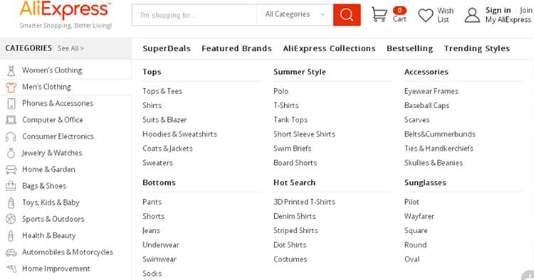
Navigation menus should have a clear hierarchical structure with every category and clickable sub categories included in the menu. It’s okay if your parent categories are extensive, so long as all the available subcategories are listed in order. This gives the user a clear idea of what you can offer without having to go through several pages to find what they are looking for. This is particularly important for websites that offer a wide array of products and services.

6. Make it Manageable
Clear navigation in your user interface is highly usable when it tells visitors where they have come from, where they are currently, and where they can go from their current location. This obviously requires a breadcrumb trail on your website, allowing users to keep track of their location, making navigation more manageable and under their control. Remember that not all users will start visiting your site from the home page. Many will land on an inner page after clicking a link from another site or from the Search Engine Results Page.
7. Link the Logo to the Homepage
A good practice is to link the homepage from the website’s logo (which should appear on every page at the same spot). Users have a tendency to start all over by going back to the home page and redoing the search process from there. Furthermore, many users are highly likely to search up your website using a search engine which could lead them to a specific page deep within your website. Users are going to want to click on your homepage from there so they can explore more of your website.
8. Include a Sitemap
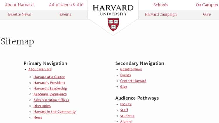
Sitemaps are crucial for a usable navigation system. Any lost user will resort to a sitemap that has links to all pages (or the main pages) of a website. The site map will list down the pages of your site in a clear, hierarchical order giving a plain overview of your website. Bear in mind that the sitemap should be concise without extraneous details on every single topic.

9. Provide More than One Navigation Menu
It’s not uncommon to provide the user with more than one navigation menu or option. This is to ensure that the users are easily able to navigate through the website from anywhere in case they have missed a certain navigation type.
For example, you can provide a drop-down or fly-out menu on the side along with a footer global navigation option at the bottom of every webpage. Different users may prefer different types of navigation option so be sure to include more than one “type” to cater to every user’s needs. For example, this logo design service website provides navigation menu both on header and footer.

10. Always Include a Search Bar
Always, always, always include a search bar. Search bars are extremely necessary for making your website’s search interface more usable. This is another way to navigate through your website without having to go through navigation menus and other options. Today’s internet users are prone to search bars/boxes to find the information they are looking for—and find it fast! Large websites that have surplus content are incomplete without search bars which would save a user a lot of time. Also, the search option should search your complete website based on keywords instead of leading users to someone else’s website.
In Conclusion
Make sure you keep all the above points in mind while deciding on your website’s navigation capabilities. A clear and comprehensible navigation system is a key component to providing online visitors with a usable web-interface, one that keeps them engaged until they’ve achieved their purpose — and we’ve increased conversion rates rather than bounce rates.
Want to learn more?
If you’d like to…
- learn all the details of Usability Testing
- get easy-to-use templates
- learn how to properly quantify the usability of
a system/service/product/app/etc - learn how to communicate the result to your
management
… then consider to take the online course Conducting Usability Testing.
If, on the other hand, you want to brush up on the basics of UX and Usability, then consider to take the online course on User Experience. Good luck on your learning journey!
(Lead image: Depositphotos)
