Do you know what’s the difference between the biggest and the most profitable companies in the world and the ones that belong to the same domain and yet are not as successful, in spite of their best efforts? The answer lies in two words, or a single phrase, whichever way you want to put it – User Experience.
The companies that are literally and figuratively, “owning their niche” are focused on creating products that deliver a world-class user experience to their customers. The success of companies like Amazon, Google and Apple is fuelled by user experience design, something that their competitors’ must emulate if they want to have any chance of competing against them.
These ‘big boys’ are continuously thinking of newer ways to change the status quo and are consistently implementing changes in their products that radically up the ante on their user experience.
As a business, if you want make a mark in your niche, and even think about competing, you cannot and must not ignore user experience. But the importance of user experience (UX in short) is not limited to product design alone. You must incorporate it in everything that your company does – from development down to adapting your entire company structure so as to make sure that every customer touch point delivers the best user experience possible. Needless to say, this also includes your website.
Your website is one of the most important branding weapons you’ve got in your armory. It’s got unlimited potential and you’ll see that quite a number of brands have a branding strategy that revolves around their website alone. It is the pivot of their marketing and sales efforts. Unfortunately, there are a number of brands, both big and small, that seem to get the UX of their website terribly wrong. Rather than attracting their target audience, the kind of UX that they put in front of them repels visitors.
According to an E-consultancy report, 78% of client-side respondents said their company wanted to deliver the best online user experience to its customers. This is good news, but the bad news is that 55% companies said they weren’t conducting any user experience testing.
This means there is scope for errors, which can take down the UX of a site. You need to avoid them at all costs; but in order to avoid them; you must know what they are. Let’s take a look at 10 characteristics, any one of which can negatively impact the user experience of your online property:
1. Slow-loading sites
You must have come across websites that take their own sweet time to load. This must have been a frustrating experience, more so, because you were actually interested in knowing more about the products and/or services on the site. In the end, you might have actually ended up waiting for the site to load, but in your mind, the site’s UX already had one big strike against it.
This isn’t a route you must take.
There are plenty of ways you can speed up your website irrespective of the fact whether you are packing it with images and multimedia or are making it insanely creative. So, why not speed it up?
2. Frustrating user experience
I have come across plenty of sites that offer a frustrating UX. This can take many forms starting with the home page looking like it has been hit by a tornado, when it still is one of the best pages for conversion. The layout is a jumbled up mess and it seems like all design elements have just one task – getting in the way of users accomplishing the task they’ve set out to complete. Everything on the website seems to get in the way. Another UX error to avoid.
3. Stock photos

Well, here is one that does not usually make it in these types of lists. If you think nothing of using stock photos on your site, beware! You are throwing the doors open for bad user experience, such photos are not good news for user experience. Stock photos that mean something are not entirely a bad option, but some are so generic and commonly used across different websites that they can damage the perception of your business.
Think about it for a minute. If you are marketing your business as a seller of premium products and services and then proceed to use a collection of stock photos on your site, how is that going to look?
The photos you pick aren’t there to fill up the space on your website. Visitors like you and me are going to look at them. If they are unique, relevant and have emotive appeal, they will give the UX more heft. In the absence of these qualities, they are just one more design element that impacts the website’s UX.
4. Good user experience is never enforced
This mistake is commonly made by e-commerce sites. For instance, you must have come across plenty of sites that ask you to register before you checkout. I am sure 9 times out of ten you must have abandoned such sites. Most potential shoppers see registration as a barrier to checkout so why not take steps to attract registrations without creating a barrier to checkout.
The idea is to not enforce a particular user experience on anybody. Allow your site visitors to make a choice and make every effort to make their experience as frictionless as possible.
5. Unnecessary complexity
If you can go from point A to B directly why take a detour that will just add to the time you take to reach your destination? Makes sense doesn’t it? Now juxtapose this thinking to the design of your site. Still makes sense?
The problem is some website owners/designers don’t think so.
In an effort to be extraordinarily creative, they pile on design elements on their sites. What they fail to consider is that each additional design element that is not absolute unnecessary for the website to make its point, actually piles on the misery for the user. Instead of making information more accessible, these ‘creative’ sites actually make it more difficult for users to get the information they are looking for.
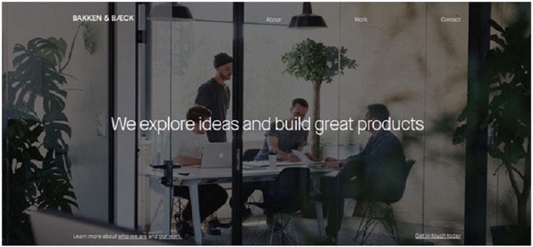
Something that you need to avoid; avoiding this error is what Bakken & Baeck does extremely well.

The site is as simple and straightforward as they come and looks good to boot. The design doesn’t lose sight of the website’s purpose and focuses visitor attention on the information that they need and expect to see.
No, I can think of multiple ways some “enterprising designer” can destroy this site’s UX by trying to boost the site’s creative appeal thinking he is doing the site and its intended user a big favor. This is the sort of thinking that needs to be avoided.
6. Lack of engagement
When people land up on your site, they are there for a purpose and that purpose is to interact with your brand, engage with it on a one-on-one level. Communication shouldn’t be one-way traffic on your website. In fact, it should be a dialogue between you and your intended audience. A lack of dialogue is what can kill user experience.
One of the ways you can improve user engagement on your site is investing in social media. Using social media plugins like social share buttons, social logins and social comments allows you to blend social media experiences with your site. This helps trigger personal interactions on your site. But don’t limit your attempts to increase visitor engagement to social media. Think of newer and innovative way of making this happen.
Whether it is integrating a blog with your site or focusing on the use of emotive images or something else, you must do everything possible to nurture interaction with your target audience.
7. Boring
Boring websites don’t work. Even if your brand belongs to a business domain that can be classified as ‘corporate’ or ‘boring’, it can still be turned into a fun website that users will love going through. This is why we have covered how industries such as banking and the financial services sector can improve with user experience. Nobody, I repeat nobody likes a boring site. This is why you will find plenty of service-oriented websites offering fun user experiences to visitors.

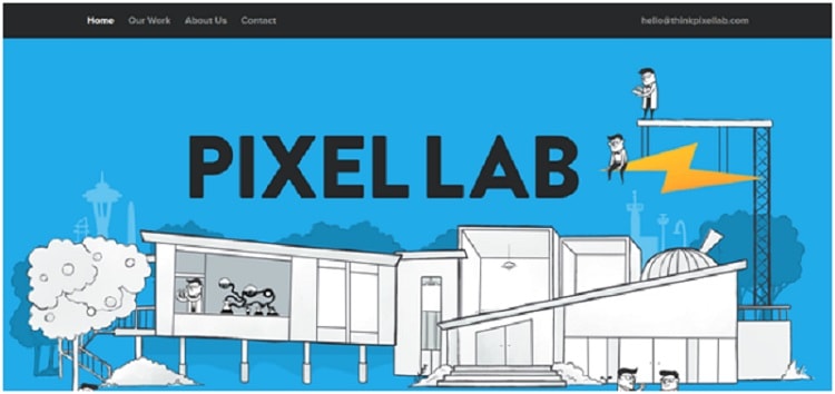
A case in point is Pixel Lab. It’s a firm offering design and development services and specializes in HTML5 and JavaScript (Boring?). The UX it has designed is fun, engaging and purposeful; this is a welcome change from the websites of other design and development firms.
8. Lack of contact information
Here’s a situation for you. You end up on a site that is offering the products/services you are looking for. You go through the product/services information and believe they satisfy your needs and requirements perfectly. But, here’s the thing, when you look for the business’s contact information, it isn’t there. There is no form to fill, no phone number, no physical address, nothing. This brings down the UX crashing down.
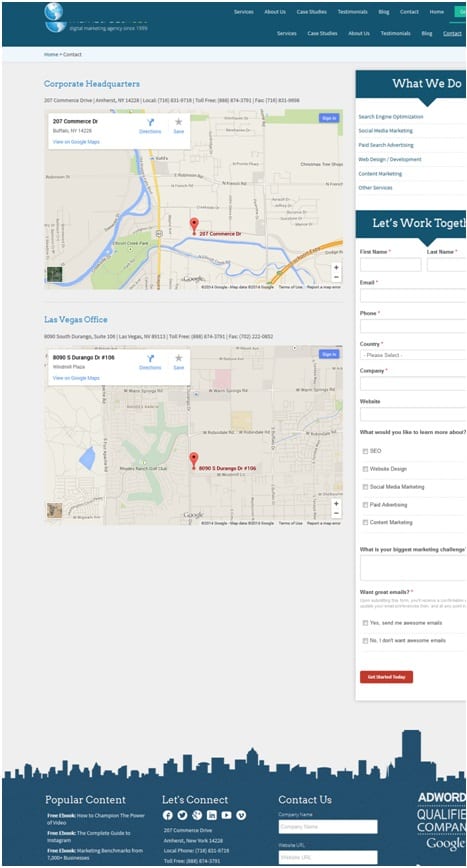
A satisfying UX is one that offers a truckload of contact information about your business, yes even information about its Twitter handle.
This is something that Mainstreethost does really very well.

9. Infrequently updated content
A website that doesn’t look fresh is waiting to be skewered by users. But the question to ask is this – ‘how do you keep things fresh for the users?’. At some point in time the website will look dated! Yes, it will; but the trick is to use elements that can be changed periodically. For example you can always change images on your site, the blog can be updated regularly. You could add new product videos or run a contest or something else. If you don’t keep making changes, your website won’t prosper. As simple as that!
10. Only about sales
Yes, your website is all about sales and marketing. But, the idea is to design a site that offers information rather than makes a strong pitch for selling. Don’t overwhelm users with a sales pitch throughout your site. If you do, the user experience will fall flat. What you are essentially doing is designing a website for the user. The user needs information and must feel that the website is designed to address their needs and nobody else’s. You can’t do this if your approach is ‘salesy’.
Think of the website as a product you are offering users. And these users must enjoy the whole experience of using the product. If you get this thinking right, you’ll be able to deliver the best sort of user experience that will help you and your users achieve the goals for which your website stands.
Want to learn more?
If you’d like to become an expert in UX Design, Design Thinking, UI Design, or another related design topic, then consider to take an online UX course from the Interaction Design Foundation. For example, Design Thinking, Become a UX Designer from Scratch, Conducting Usability Testing or User Research – Methods and Best Practices. Good luck on your learning journey!
(Lead image: Depositphotos)
