The UX industry needs to shape up. How many sidebars must we create before we collectively realize how badly we need to ditch them.
In an industry where the exchange of information is so crucial, it comes as no surprise that the sidebar has flourished. At its core, the sidebar is merely a collection of links – a hub, if you will, where additional information can be found.
Here is the truth, and do not hate me for being the one to say it: UX designers rely far too much on the sidebar. I implore you to ask a UX designer to defend their decision to use sidebars in their design work, and see how long it takes them to come up with an answer.
But Yona, what do you have against the humble sidebar?
Sidebars Are Just Useless
It is not that every sidebar is useless … but most are indeed useless. What distinguishes a useful sidebar from a useless sidebar? Purpose.
Ask yourself: “what am I going to put in the sidebar ?” If your answer is “links”, then be more specific. Is it navigation links?, suggested content?
Not all links are created equal, and not all sidebars are useless. Navigational sidebars can be a great way of organizing within the Information Architecture (IA), as long as there is not already a menu in the header. Otherwise, your design becomes redundant.
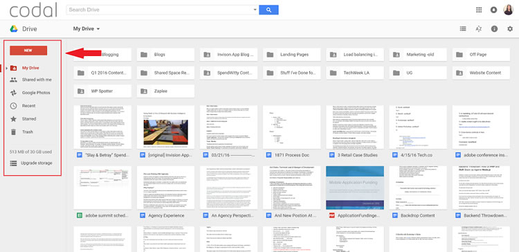
Consider the way in which Google Drive utilizes its sidebar.

Take note that Google Drive does not feature navigation links at the top of the page. Instead, it features navigational elements in a sidebar, to the left of the content. This is an example of a sidebar that has been done right.
Should you explore additional Google products, you will likely notice that this trend continues, from Drive, to Gmail, to Contacts.
So what does a useless sidebar look like?
Look no further than the online news industry.
You may be thinking to yourself, “the news? How could they get something wrong?” Well, many of their sidebars are simply overkill.
Consider Fox News.

Fox News has decided to use their sidebar for suggested content, dubbed More from Fox News. In theory, this ought to be a good move – you want to keep your users from leaving your site, after all.
If that is case, then someone please explain to me why, according to Amazon’s Alexa, Fox News has a 52% bounce rate, with an average of 2.69 pageviews per visitor? The mystery does not end there.

If you scroll down the page just a little bit, you will find three parallel sections, titled Sponsored Stories You May Like, More from Fox News, and Sponsored Stories, which continue to bombard the user with suggested content.
In this case, Fox News attempts to differentiate the sidebar content from the various types of suggested content below the article by giving the sections confusing names. In practice, this comes off as a bit overwhelming and it clearly does not help Fox’s bounce rate.
2016 is The Year of Minimalism
Google, Apple, and all of the big players in the tech industry, have designed their website with a minimalist approach to design, such as employing a “flat design” approach.
Why is this the case, you ask?
Because minimalism forces the user to absorb the message that is on the website. When it comes to UX and visual design, more often than not, less is more. A minimal design will highlight your call to action better, and keep the user focused on what is important.
Below is a Washington Post article exhibiting what I like to call sidebar clutter.

The main focus of the above page is the article content. Yet the user becomes readily distracted by all of the clutter in the sidebar, including an advertisement, suggested articles, eBook download link, and a newsletter signup CTA.
Avoiding sidebar clutter is about finding focus.
By avoiding the clutter that is often caused by sidebars, MSNBC (pictured below) has successfully kept focus on the content at hand, shattering the trend prevalent among most websites in the news industry, by adopting a minimalist approach to design.

Which would you rather read?
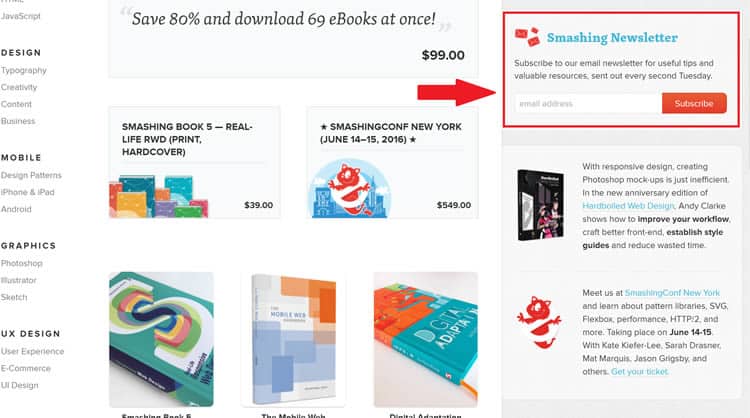
Sidebar clutter can also affect conversion rates. In the below image, it is apparent that Smashing Magazine aims to convert users with a newsletter call-to-action (CTA) in the sidebar of their eCommerce page.

While the above implementation has been done well, one must not be carried away by the notion that everything you put in the sidebar, converts. According to VideoFruit, users only click on the sidebar 0.3% of the time. That is three out of every thousand users.
VideoFruit enjoyed a 26% increase in newsletter conversion rates by removing the sidebar, and placing the CTA elsewhere. Similarly, ImpactBnD reported a startlingly 71% increase in the performance of their CTA when they removed it from the sidebar.
As you can see, sidebars do little-to-nothing for conversion rates. If anything, they appear to be a detriment.
Conclusion: Ditch the Sidebar, People
Is it possible to do the sidebar correctly?
Yes. However, I would not recommend it. The focus of your eCommerce page is your product lineup, and the focus of the portfolio page is your portfolio. The only exception to this rule is the blog page.
Blogs can successfully implement the sidebar, without using it purely for navigation, because a high bounce rate does not necessarily hurt the blog. Neither does clutter. Users that have landed on a particular article care about the content more than the organization of the page.
So, why clutter (non-blog) pages with things that do not matter? If you were hoping that your sidebar will aid in conversion rates, then the above statistics ought to deter you from that notion.
And do not forget that in 2016, most traffic is mobile, and sidebars do not even show up on mobile devices (or they show up after much vertical swiping). What are you hoping to achieve by implementing a sidebar for just a small portion of your traffic?
Face it: sidebars are an afterthought. They are the remnants of old, ineffective design theory and they need to go. If you are not using your sidebar as a primary means of navigation, then it is (probably) pretty close to being useless.
Want to learn more?
Are you interested in the intersection between UX and UI Design? The online courses on UI Design Patterns for Successful Software and Design Thinking: The Beginner’s Guide can teach you skills you need. If you take a course, you will earn an industry-recognized course certificate to advance your career. On the other hand, if you want to brush up on the basics of UX and Usability, try the online course on User Experience (or another design topic). Good luck on your learning journey!
(Lead image: Depositphotos)
