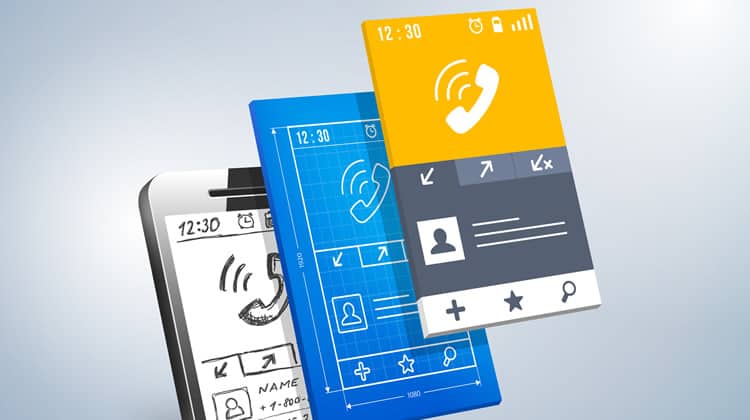
In July 2008 the Apple App Store went live. On launch day the marketplace featured 500 apps. Seven years and 75 billion downloads later there were more than 1.2 million different applications available in the App Store. By this stage Google had even launched its own marketplace.
As the app market has grown, trends governing good UI and UX design have emerged. Here I will take a look at four of the most successful apps to see how design has evolved over time and what we can learn from this.
Facebook was quick to launch a dedicated application for its service. The original Facebook app was a direct transplant from the website. The buttons were glossy, the navigation bar had a gradient and there were drop shadows.
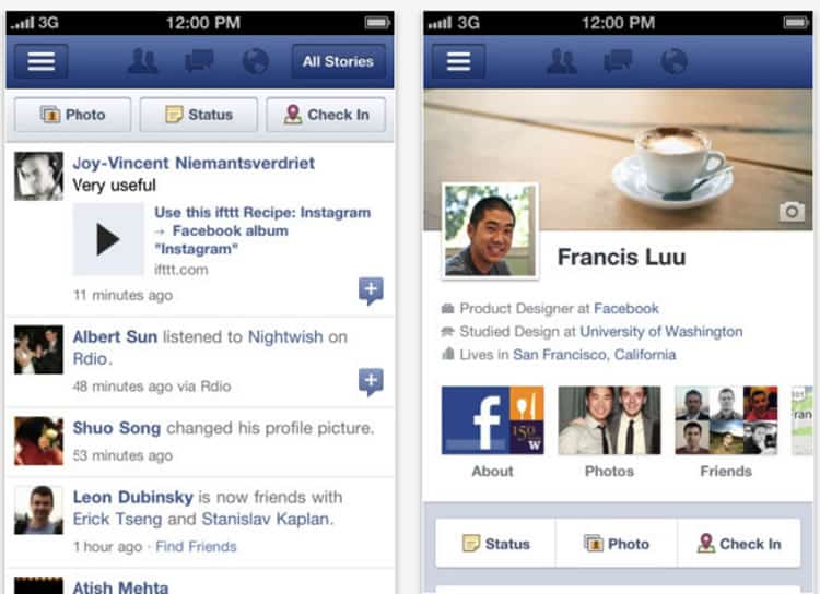
One of the first major innovations to the app was a move towards flat design. Simplified icons and single tone colors looked better on the small screens and reduced load times. To improve usability the navigation was streamlined with many options moved under drop down menus.
The result of the changes is an app that is easier to browse, read and navigate. It is definitely not perfect and there is room to simplify the UI and improve the UX, but it’s a big improvement.
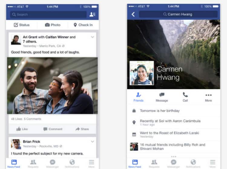
Since the launch of the app, Facebook has implemented a data-driven approach to design. Split testing is carried out before UI changes are implemented. Facebook is currently experimenting with material UI for its Android app. Watch out for changes later in the year.
If you like online magazines you will have heard of Flipboard. Launched in July 2010, the app was created specifically for the iPad. What makes it so remarkable is that a significant portion of the development was done before the founders even knew what the iPad would look like or how the operating system would work.
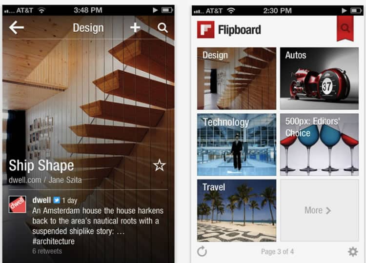
The original Flipboard app had a minimalist interface. The font was easy to read and there was a clear focus on images. However, despite the simple interface there were problems. These included poorly rendered images on the iPad and slow load times.
Over time many small changes have been made to the design of the app. For example the background was made lighter, thus making the content easier to read. The developers also optimized space and increased the size of the featured images. These developments work well with the larger screens and higher pixel resolutions of modern phones.
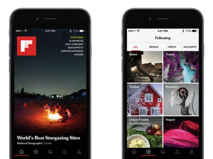
An interesting thing about Flipboard is that the company only launched a website in 2013 – three years after the launch of the original app. This could end up being a trend as the app market continues to grow.
Pinterest launched its first iOS app for the iPod touch and iPhone in May 2011. The original app had a three-column layout. The UI was attractive but the functionality was limited. The simple interface and limited functionality made the overall experience intuitive for a first time user.
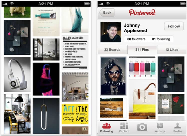
In 2012 Pinterest implemented a major overhaul of the app. It was optimized for the iPad while new features, like the two-column layout, were introduced to the iPhone app. A small text description along with a square profile image was also added to the pins.
While a lot of the updates to the UI were well-received and improved usability, other changes did not go well with the users. The level of criticism from the Pinterest audience explains why most companies prefer to make small design tweaks than implement major changes to an existing app.
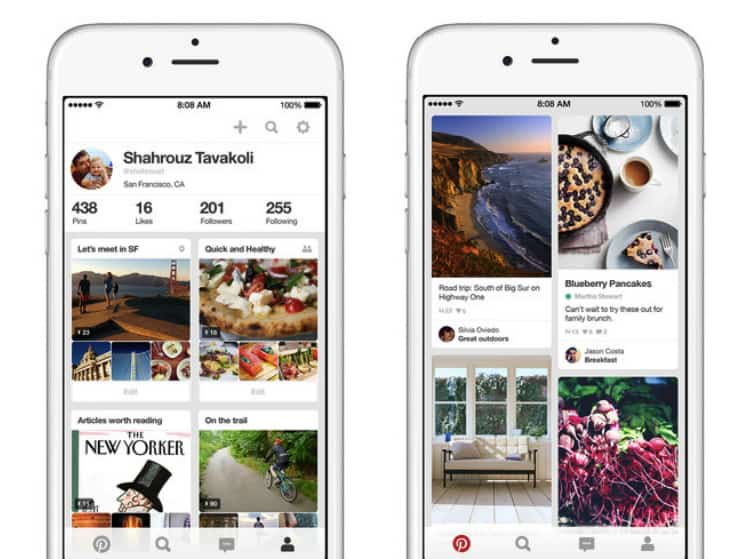
Since 2012 Pinterest has only made small changes to the user interface of the app. Changes include things like the move away from a square profile image to a circular profile image (something of a trend with apps for varied reasons).
Tinder
Tinder was first launched in 2012 and quickly gained popularity. By 2014 there were more than 50 million active monthly users. The app was also very addictive … so addictive that 80% of users return to the app each week and 65% use it daily.
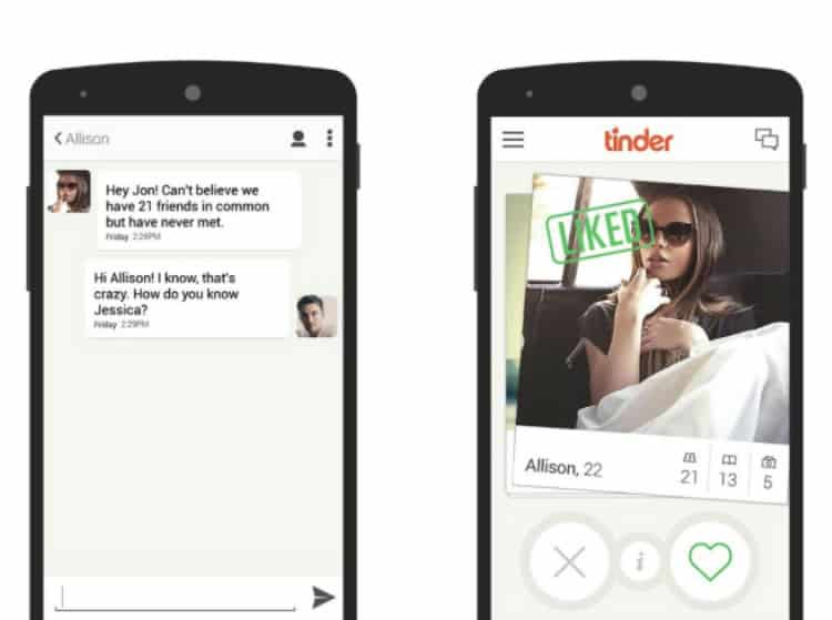
The first Tinder app had a very simple interface with limited functionality. To ensure Tinder was intuitive to use the developers emulated the functionality of popular apps. For example the chat function in Tinder is almost identical to iMessenger.
Critics highlighted an initial reliance on a limited number of actions within the app as a problem. For example the same action, swiping left and swiping right, is used for liking a person as well as accessing users photos. Other minor design flaws are highlighted in this article.
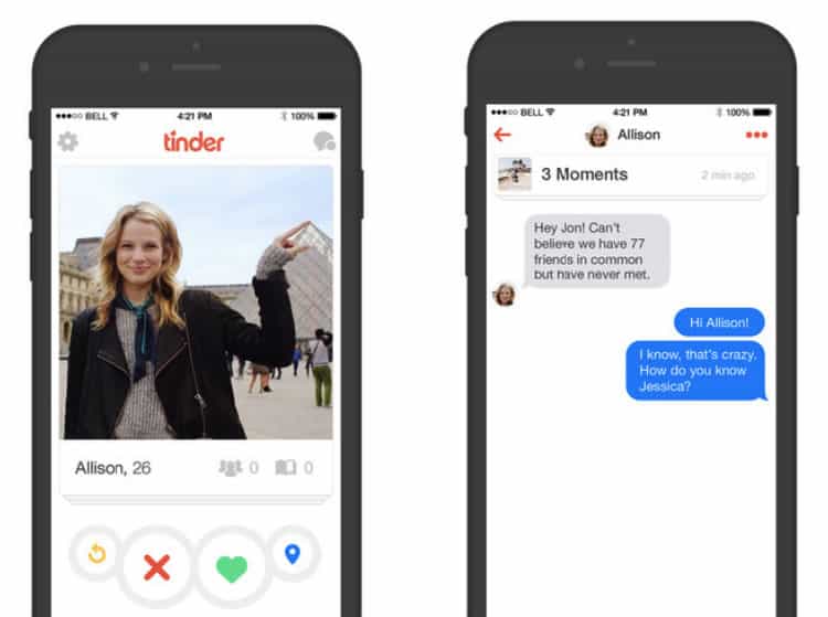
Despite the problems that critics highlighted, the UI remains almost unchanged since launch. Even when adding new features the developers have tried to restrict functionality. They have also continued to emulate the user experience of other popular apps.
Conclusion
Looking back at designs trends you often find yourself wondering how people got it so wrong (those seventies flairs come to mind). Yet the more important lesson is how little you need to change good design.
Given the difficulty of implementing a complete overhaul of an existing application, the importance of a good UI and an intuitive UX cannot be overstated. As these case studies highlight a simple interface, emulating existing user experience and limiting functionality are all key components of good design.
This goes in line with user experience and user interface trends for mobile applications which can be summed up as being an increased usage of:
- Tiled navigation
- Card and modular design (see Google Now and Pinterest)
- Flat UI (or actually somewhere in between skeuomorphic and flat if you consider Google’s Material design)
- Context-aware UX/UI (usage of sensors in phones to adapt the UX/UI accordingly)
- Seamless transition that replicates the same experience irrespective of the device is being used.
- The swiping gesture to reduce the number of steps for navigation or performin actions
- Thumb-focused interaction
- Minimalist approach
- Simple color schemes, clean typography and lean icons
- Layered interfaces
- Blur effects to easily identify which elements of an application are working
- The drag-down gesture to refresh the app
- Mobile onboarding for first time visitors or when launching new functionalities
- Hidden menus and less-frequently used options accessible via sliders, sidebars and drawers
Of course design is never static. New innovations like Material UI and the development of the Apple watch will result in changes in design. However, it is clear that focusing on what is important to the user will always win out in the end. The Evolution Of Mobile App Design
Want to learn more?
If you’re interested in mobile UX, then taking the course on Mobile User Experience, which includes templates you can use in your own projects. If, on the other hand, you’d like to…
- learn all the details of Usability Testing
- get easy-to-use templates
- learn how to properly quantify the usability of a system/service/product/app/etc
- learn how to communicate the result to your management
… then consider to take the online course Conducting Usability Testing. Lastly, if you want to brush up on the basics of UX and Usability, the online course on User Experience could provide you with the necessary knowledge. Good luck on your learning journey!
(Lead image: Depositphotos)
