When I was in college, if I wasn’t eating ramen, I was eating pork chops. They always tasted amazing with the right seasoning. Finding the right seasoning, however, was challenging. Little did I know at the time that with each grocery store quest for the perfect seasoning, I was learning a thing or two about my future love: User Experience. Let me explain.
Each time I’ve moved to a new town, one of the first things I would do was to invite some friends or family over for a pork chop dinner. On more than one occasion, I would stop by the local grocery store to pick up my ingredients and would be disappointed to find that they didn’t have any Pappy’s Choice Seasoning. Lame!
Being stubborn, I would typically choose not to ask any store associates and instead, would decide to go on a scavenger hunt for my beloved seasoning.
This leads me to the first point of what my story has to do with e-commerce user experience:
1. Not everyone categorizes things the same way
After about 20 minutes of bouncing from aisle on my first trip to a Fullerton, CA grocery store, I was able to find the seasoning I was looking for. It turned out that the seasoning wasn’t even in an aisle; it was on a shelf near the butcher’s block…because apparently the only thing you put Pappy’s on is meat.
The lesson I learned in retrospect was that the way I categorized things wasn’t necessarily the way someone else would do it. This is why it’s important to test your site’s categories with multiple people.
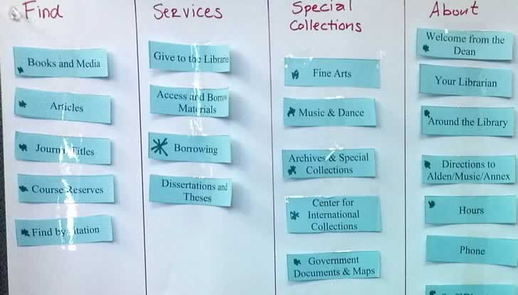
It’s easy to set up and you can literally gather four or five of your team members to run a few quick and dirty card sorting tests. It doesn’t even have to be high tech and all you would really need to get started is a pen and a few strips of paper.

If low-tech isn’t your cup of tea, there are more than a few web-based alternatives like Optimal Sort that do an excellent job of allowing you to set up and evaluate the results of your test.
As you’re gathering your results, you’ll begin to see trends and potential issues with your categorization. Take a proactive approach to resolving these issues by asking team members who organized items differently from the rest of the group how they made their decisions, and make adjustments based on their feedback if necessary.
It make take a few tests and refinements to get your categories just right, but with each revision you’re one step closer to laying out the most effective way to categorize your products.
So, back to my story about pork chops and seasoning. Had I asked a store associate where I could find the seasoning at this Fullerton, CA grocery store, I would’ve been on my way home 20 minutes sooner, which leads me to my next e-commerce user experience related point:
2. It’s easier to ask where you can find something
For those who aren’t as adventurous during their grocery store experiences, it’s a lot easier to flag down a store associate to point them in the right direction. In lieu of an easily accessible store associate, your online store has a handy dandy search that never gives your customers attitude for interrupting.

Studies have shown that e-commerce customers are equally likely to use the search function as they are to use the menu to find their products. One of the biggest factors in determining which method they use is the design of the site, and this is why it is absolutely imperative to test the placement of your search.
Take a look at some of the more popular e-commerce stores on the web and you’ll notice that search fields are a prominent part of their designs. Upon closer inspection, you’ll also notice that many of them allow you to also search by category to give you the most relevant items without having to filter your results page.
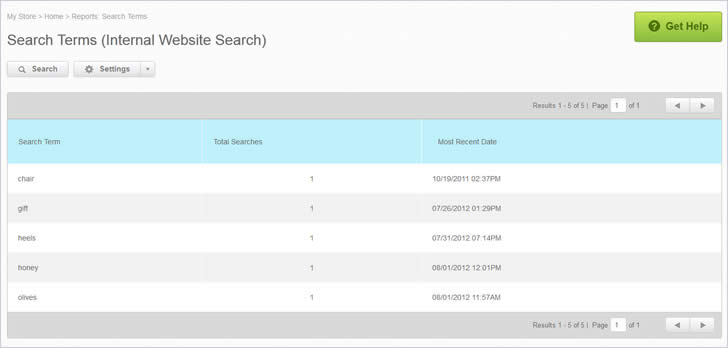
After you’ve tested the placement of your search field, don’t forget to make sure that keyword searches are pulling up the most relevant products. Do a quick audit of your most popular keywords through your e-commerce dashboard and see what your customers are searching for when they land on your site.

If your searches are pulling up unrelated products like an inexperienced store associate, hop into your dashboard and make any necessary adjustments. It’s work that’ll require a bit of time and elbow grease, but it’s all worth it in the end.
To some customers, the search feature on your site acts as a safety net if they can’t find what they want from your menu. Be sure it’s ready to catch them when they need it.
Okay, so let’s get back to my story…
I’m finally ready to roll my rickety cart over to the checkout stand and unload my wares on the conveyor belt. I place a divider behind the last of my products, whip out my wallet and hear the checkout associate ask me, “Got a rewards card?”
Being that I used to only shop at Albertsons and this store happened to be a Vons, I respond, “Nope, I just moved here. How do I sign up?” The associate then proceeds to plop a form in front of me, with two mini keychain cards and what seems like a bajillion fields.
Since I’m in the express checkout line, and I really do want to take advantage of their members only “buy 2 get one of my super deluxe premium butcher’s select pork chop packs free” deal, I reluctantly chicken scratch my way through the form.
I finally get my discount, but not without feeling the discomfort of knowing that the three people behind me were staring a hole through the back of my head because I decided to sign up for a rewards account in the only open express line. This brings me to my final point:
3. Customers don’t want to jump through hoops to check out
The great thing about buying items in a brick and mortar store is that I rarely have to share my personal information. The opposite seems to be true for e-commerce stores. Filling out my information to get a discount card was purely optional. The same cannot be said for many e-Commerce sites out there.
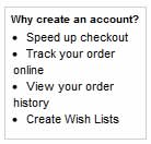
Our studies have found that one of the biggest reasons customers will abandon the checkout process is because of registration. Customers are worried about how their information will be used, whether or not they’ll be spammed with emails, or just plain don’t want to fill out another form.


Give customers the choice of checking out a guest with the option to register later. This way customers don’t feel like they’re filling out twice as many forms.
If you’re willing to take on a small fee to make checking out easier for customers, adding an option to use a virtual wallet is a great option and kills two birds with one stone; these services ease customer fears of their payment information being compromised, and allow them to checkout without having to retype their billing and shipping information.

So what did I learn about E-Commerce User Experience?
- Everyone categorizes things differently. Sure, you’ll find similarities in how other people sort things, but you’ll always find differences in logic and reasoning that can help you tighten up your categories.
- Internal search must be tested often. Your customers are just as likely to use the search as they are to navigate through the menu, so make sure it’s pulling up relevant results and don’t forget to keep a close eye on what they’re searching for.
- Checking out has to be simplified. It’s not a case of addition by subtraction, but rather adding features that make checking out easier. Allow your customers to checkout as guests, and give them more payment options to help them speed through the checkout process.
Remember, the easier it is for customers to find their products and check out, the more likely they are to convert. Even if they’re just window shopping, give them a positively memorable user experience on your site and you’ll be at the top of their list when they’re ready to buy.
Want to learn more?
If you’d like to…
- get an industry-recognized Course Certificate in Usability Testing
- advance your career
- learn all the details of Usability Testing
- get easy-to-use templates
- learn how to properly quantify the usability of a system/service/product/app/etc
- learn how to communicate the result to your management
… then consider taking the online course Conducting Usability Testing.
If, on the other hand, you want to brush up on the basics of UX and Usability, then consider to take the online course on User Experience. Good luck on your learning journey!
(Lead image: Depositphotos)
