What does e-commerce credibility mean to you? Or, let’s say, if you have two door-to-door salesmen standing in front of you, selling the same product, what is it that will make you buy it from Salesman A and not Salesman B? Probably the suited up look and the polite and friendly tone of Salesman A reeled you into a good conversation. He heard your concerns about the product in a friendly chit-chat and addressed those with a money back guarantee or something, eventually making a sale.
Now this is so unlike Salesman B on whose face you blatantly smashed the door because you were just not in a mood to hear the typical “sale-sy” pitch he started out with. And he sure as hell was not an eye candy. Come on! Had he been one, you would have at least waited before you close (and not smash) the door.
Anyway, the point is — you trusted Salesman A because he cared to listen to you and did not come across like a bandit, or a typical salesman who’s just bothered about making a sale, in any way possible.
Although the scenario is different, there is not much that difference when one stops and thinks about increasing sales or conversion rates. Has it? If you do not present your sites well and win the trust of your visitors, they will not hesitate in switching to your competing websites the next second. Some of your customers might feel a little guilty later about smashing the door in a real life scenario, but in the online world, they won’t care at all.
So if you manage an e-commerce website and you are lamenting about higher orphan cart rates, chances are that a big part of this puzzle actually belongs to the lack of trust and credibility of your site. Having admitted that, now if you are all pumped up to revamp the trust factor of your site and work on building some e-commerce credibility, here is what you can do:
1. Clutter-Free, Easy-to-Navigate, Intuitive Design
Be-fire anything else, it is the design that creates first impressions for your visitors. A study conducted by Google last year revealed that people can even form design opinions about a website even within 17 ms. The study also revealed some great insights, like users mostly love familiar and minimalist designs.
2. Make Your Contact Information Visible
Your contact number should be easily spotted on all the pages of your website. Show some care and be available to your customers when they need you in the buying process. You may even provide an online chat assistance feature.
Zivame prominently displays their contact number on the top of their home page.

3. Show Testimonials
Genuine testimonials (both positive and negative) and user rating contributed by real people are a BIG plus in showing transparency about custom products as well as your website. You are making it clear that you are not just concerned about the revenue figures, but actually want your visitors to spend their money right and are helping them make an informed decision. Provide honest reviews about the products they are interested in and see your trust factor working for you.
Don’t forget to add full names, photos of people submitting testimonials, or video testimonials to increase e-commerce credibility. After all, anyone can write testimonials these days. There should be something that tells your visitors that the testimonials or reviews on your website are genuine and not fake. You can check out this case study to see how Trust Pilot Widget increases sales for Express Watches by 58.29%.
4. Add Privacy Policy/Lines
Don’t make a privacy policy page just for the heck of it. Make it clear and concise. Explain what personal information you will need and why. If you will be collecting any sensitive data like user location, IP address, browser name and similar information, ensure that you mention it on this page; and again make it clear why you are collecting it, where it will be stored, and under what circumstances you might share it with a third party. Frank disclosures work the best.
You may even consider including the TRUSTe seal, which shows that your privacy policy meets higher standards. Do not forget to make sure that it is actually a verified and updated seal, if you plan to put it up on your website. And if after all of this, you still place your privacy policy somewhere in an obscure region of your website, rest assured that it is a wasted effort.
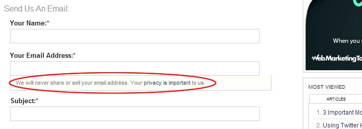
Adding privacy lines, like “we respect your policy” next to the form where you are collecting email address or any other personal information can go a long way in increasing the trust and credibility of your website. And who knows? It may even lift your conversions too!
Practical E-Commerce uses privacy line at their contact us page.

5. Display Security Badges
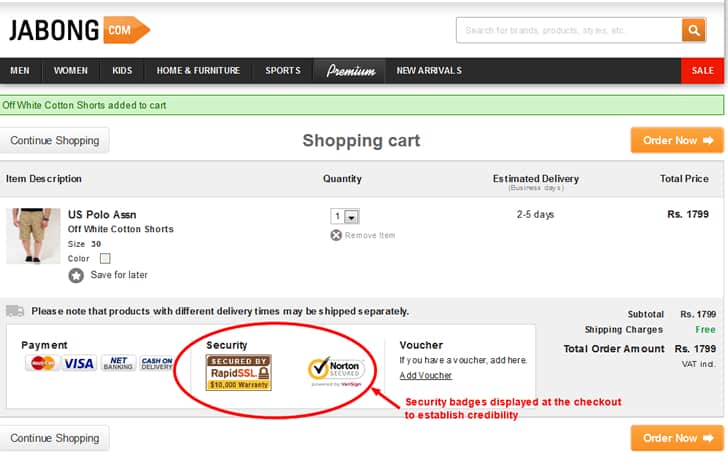
After hearing about so many credit card frauds online, even a kid would not submit his credit card details on any random site on the web. Show them the security badges, like Versign and others on your website to establish your e-commerce credibility. These are especially important for the checkout page.
But be sure not to go overboard about displaying too many trust badges as well. Fraudsters often love showing off too many of these trust seals only to dupe people. If you do the same, your site will reflect the opposite of the intentions you were trying to convey – you will look spammy at best.
Jabong.com shows trust badges on their checkout page.

6. Offer Guarantees
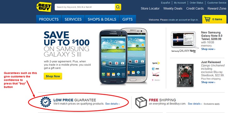
100% money back, cash back, lowest price guarantee, it doesn’t matter which one is it that you’re offering as long as you emphasize them well on your page. Be sure to place them well and contrast them to bring proper attention. Your customers should know that their risk of purchase is minimal. Guarantees convey that they can confidently buy from you, that they can count on you for a good deal.
Best Buy offers a low price guarantee on their homepage.

7. Exhibit Your Authority Dealer Certificates/Accolades
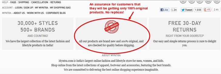
So you must be having an authority dealer seal or certification for the products you are selling on your website. Why not show them to assure your customers that they will not be sent any replicas but original branded product that they order? Read how Express Watches saw a percentage increase of 107% in their sales by including the Seiko Authority Dealer badge.
Myntra.com displays a 100% original products seal on their homepage footer.

Apart from this, if you have been honoured with any award or something in your industry, you can show off a little about it too for better credibility. Relax! There’s no need to discard modesty altogether. You may want to try out something like the Bag Servant website who was awarded with a rare WOW badge in the industry. This badge was later used by the Bag Servant on their homepage header to increase their conversions by 72.05%. You can read the case study.

8. Actionable Content with Zero Grammatical Errors
There’s nothing that kills credibility as typos and grammatical errors in the content of the website. Copywriters and proof-readers might seem like an expensive deal and with $1 per 100 word writers, it may seem easy to diverge and settle for substandard or less-than-perfect content. But this will definitely leave a huge black blot on the reputation of your business.
As we have stated in our list of top 5 e-Commerce trends for 2013, content continues to rule. Don’t provide sub-standard content to yourself and your customers! Make sure your content is top-notch and that it provides actionable insights and tips that your readers or customers can utilize in their everyday lives. Featuring interviews of industry experts in your site’s content that adds to the knowledge of your reader base is another great way you can add credibility to your website.
9. Display Social Sharing Buttons
If you have a good follower count and an active and engaging Facebook or G+ account, make sure that instead of plainly saying “Follow us on Twitter” or “Like us on Facebook,” you can boast about the number of your followers or likes to show that you are no fraudster and have an active community of people who are interested in knowing about what you have to offer on your website.
No matter which design element you choose, it is important that you place them and contrast them right on the page to get it the attention it deserves. Sometimes these very buttons when placed wrongly can prove to be a distraction and reduce your conversions, like it was happening with Open Mile.
Final Words
Finally, don’t forget to test each of these elements before you launch them on your website. You never know anything before you A/B test it. Sometimes testing can show results that are totally unexpected. You would not want to increase your site’s credibility at the cost of reducing your usability. Would you?
It’s time that you sign up for a reputed A/B testing software and start testing these elements to track conversion-driven results for yourself. Leverage your online reputation with appropriate designing skills to get the outcome you have always wanted to achieve. Good luck!
Want to learn more?
If you’re interested in the intersection between UX and UI Design, then consider to take the online course UI Design Patterns for Successful Software and alternatively Design Thinking: The Beginner’s Guide. If, on the other hand, you want to brush up on the basics of UX and Usability, you might take the online course on User Experience (or another design topic). Good luck on your learning journey!
(Lead image: Depositphotos)
