There’s plenty of material out there that will happily tell you that First-Time Use (FTU) is the most important part of app adoption. After all, it is a precarious time in your app’s usage lifecycle.
Exactly like everything else relying on the fickle human brain, first impressions count for a scary amount.
In fact, by reducing the friction during FTU we could stop the some of the average 40-60% of users from abandonment-at-first-sight — one of the less romantic effects of first impressions.
You’ve got a better chance of increasing your number of retained users by focusing on this than you do at getting something which no one wants to ever give anything: a second chance.
This could be because it takes 4 positive experiences to cancel a negative one, or that we remember negative experiences more vividly, but what it means for app designers is that you have to take your user from FTU to your Aha! moment with as little friction as possible.
First-Time Use – What We Know So Far
While user retention strategies like lifecycle emails have shown surprising results, I think everyone would rather feel like they’re delighting users, not clawing them back. And, as it goes to show from the cold, hard stats put together by the Harvard Business Review, a tiny increase in top-of-the-funnel conversions can have a massive effect on profit.
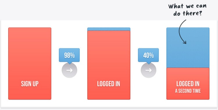
If we’re to go along with Patrick McKenzie‘s claim that 40-60% of users log in to apps only once, it’s obvious there’s a huge disconnect between expectation and reality. Users think your app will be better than it is. Your sales and marketing is better than your user onboarding.
There doesn’t seem to be a lot out there to prove how important the First-Time Use is apart from the wisdom of crowds, but it’s easy to forget that there are humans behind the data, and their reactions to your app can be proven by psychological research in other areas.
Firstly, research from 2006 by Observer concluded that “all it takes is a tenth of a second to form an impression of a stranger from their face, and that longer exposures don’t significantly alter those impressions“.
Yes, this is a slightly skewed assumption, but look at it this way — a human face has thousands more subtleties than an app’s UI. If there were to be research specifically about how long it takes a user to decide whether they like your app, there’d likely be a correlation.
Secondly, the amount of time people spend on web pages is parallel to the drop-off after FTU.
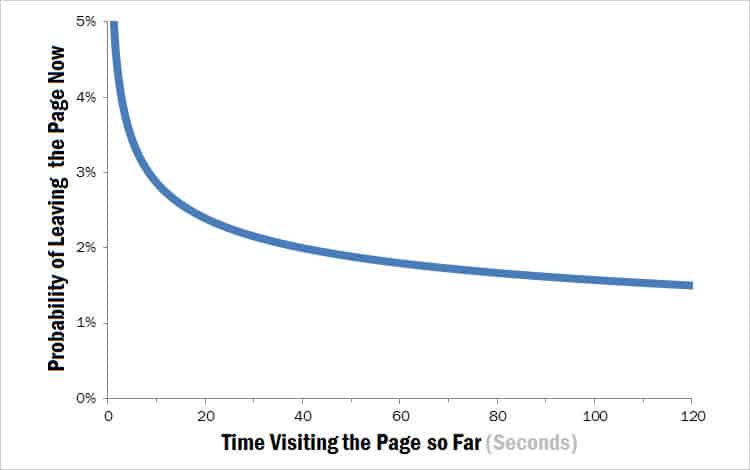
Users are twice as likely to leave a site immediately than they are after 20 seconds.
If they’ve stuck around for that long, it’s probably long enough to have hooked ’em in. But it’s the first few seconds that are the key moments when a user decides ‘is this useful to me?’. And the same goes for your app.
This data can help us plot a generic journey that your users are on when they find, download and open your app for the first time.
After reading the copy on your landing page or app store profile, they decide to give it a whirl. They see your onboarding tour, empty state or (hopefully not) registration form and instantly question whether it’s worth their time.
If there is any disconnect between the benefits of your copy and the features of your app, that’s where the problems start.
If you drag them through a long tour, they’ll rush it and churn out. If you ask for too much at once, you’re all take and no give. If your empty state is unhelpful, they’ll find one that isn’t.
Let’s look at this in more detail, and go through some ways you can avoid underselling your app during FTU, relying on ‘please come back to me’ emails and creating friction in the most vital stage of app adoption.
Get the User to Enjoy Making an ‘Investment’ Before Sign-Up
After that ruthlessly theoretical introduction, you’ll breathe a sigh of relief when I tell you that now it’s time for an example.
Flipboard‘s user onboarding process is beautiful. It’s frictionless, visually appealing, reinforces the value and asks users to talk about themselves before asking for sign-up.
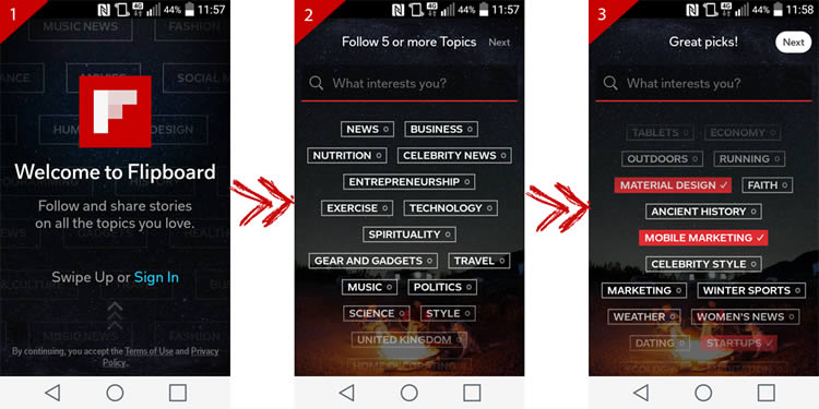
(A side-note on the programming at work here: things like ‘material design‘ and ‘mobile marketing‘ don’t just pop up on the off-chance I’d be interested. I selected ‘Mobile’ as one of my first interests and it figured me out towards the bottom of the screen.)
After I’ve revealed my innermost content desires, I’ve already invested time in the app and I’m ready to get started — now’s a pretty good time to ask for my email.
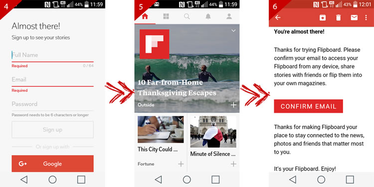
Flipboard’s design makes it self-explanatory from the start. You expect to see ‘stories on the topics you love’, and that’s what you get. What’s interesting here is that it doesn’t ask you to confirm your email until after you’ve done a couple of minutes of flipping, reducing friction and rushing you to that moment of first value.
How Can You Get Your Users to Enjoy Making This ‘Investment’?
When a customer starts using your app, they’re making some kind of investment. Whether it’s a financial one, their valuable time, or the space in their brain your app’s instructions will fill. Flipboard’s onboarding process makes this a gentle and enjoyable one by asking for nothing but giving you a chance for it to guess who you are and flatter you — like it’s just getting to know you on a first date.
For apps which aren’t Flipboard, here are some things you could try:
- Not asking for registration before offering value
- Not forcing email confirmation
- Letting users ‘make the app their own’ before making them jump through hoops
However, there are problems associated with this kind of gentleness.
Firstly, if you don’t prompt a user to sign up, then you’ve lost them anyway. Secondly, your app could need to link to a social network or email account for it to work at all. If this is the case, read on for a different approach.
Communicate the Bare Minimum of Features Necessary for Retention
What is the one thing your users need if want value from your app? This mystical one thing is different for every app, and often called the Aha! Moment.
Facebook’s Chamath Palihapitiya says that the secret to hitting 1 billion users was that they focussed their efforts on ensuring users make 7 friends in 10 days and that this was the best way to show users the full product value and get them onboarded.
Product lead for growth at Twitter, Josh Elman, said he found Twitter’s Aha! Moment and it’s pretty similar to Facebook’s.

It turned out that if you manually selected and followed at least 5-10 Twitter accounts in your first day on Twitter, you were much more likely to become a long term user, since you had chosen things that interested you. And if we helped someone you know follow you back, then even better. As we kept tweaking the features to focus on helping users achieve these things, our retention dramatically rose.
Josh Elman
So, when you sign up for Facebook, it is adamant that you connect with people you know because that’s how it sets you up for retention. See?
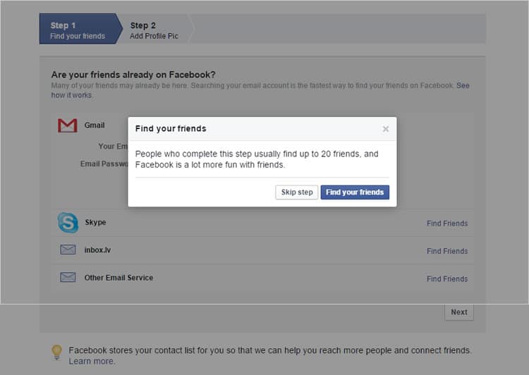
From the FTU of Facebook, there’s no need to know how to search for events in Norway, create a fan page for your cat or authorize an app to send you constant notifications. While these are all things that you could do on Facebook, they aren’t things that the growth team identified as useful for retention — you’ll find these when the time’s right.
What are the Components of Your App’s Aha! Moment?
To work out your app’s Aha! Moment you’ll need 2 things:
- A user journey map
- App usage data
If you’re using a similar tool to Google Analytics to measure a web app, or its mobile equivalents, you’ll be able to find an overwhelming user flow diagram by going to Audience ? User Flow. From there, to make it easier to digest, you’ll want to filter it to show only new users.
- What kinds of patterns can you see?
- Which interactions at which stages had the highest/lowest drop-off rate?
- What are the common elements of the early interactions today’s power users had with your app?
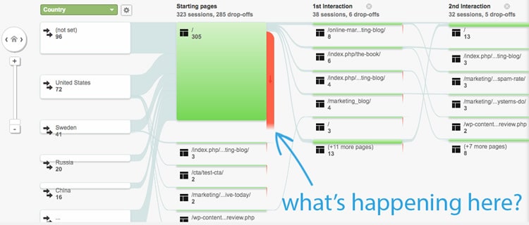
By comparing this data to your user journey map, you can get an idea of where you’ve not optimized to lead your user to their Aha! Moment and get ideas for your next redesign.
Design for the Empty State, Not the ’60’ State
At the risk of patronizing you, I’ll explain what empty states are.
An empty state is what the user sees when there is no data to display on the screen. This could be because:
- The user’s only just signed up
- The user’s cleared the data out themselves
- There’s been an error
In a webinar with InVision, author and UX expert Samuel Hulick explained onboarding is getting your users from 0-60 in as little time as possible. When building an app, designers focus heavily on the ’60’ state but ignore ‘0’ — the empty state.
Empty states give your users context. Your app isn’t supposed to look like a series of blank pages, and your users don’t want that either. By providing helpful messages when there’s nothing else to display, you can show your users how they can get value from your app. Here’s an example from Process Street:
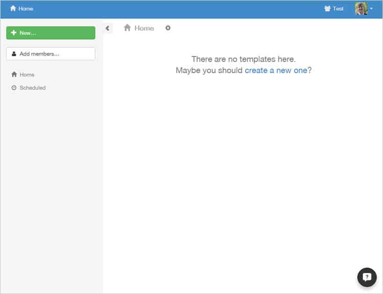
This tells you why you’re seeing it (there are no templates here), and how you can fix it to get full value (create a new one).
By examining this, and the huge array of empty state examples you can find here, I’ve broken down the components of the perfect empty state.
A useful empty state tells you what it’s for, why you’re seeing it, and how you can fill it up. When users are seeing an empty state, they are in a precarious situation and often need to be re-engaged.
I’ve written an entire article the size of this one dedicated to empty states which is extremely visual with lots of examples — too many screenshots here could start to clutter things up. Read it here.
A Helpful Summary Concludes the Rambling
I realize that the percentage of readers who make it to the end of an article is minuscule. It’s probably similar to the drop-off we’ve looked at so far. If you’ve skipped through, I want to make sure that I can still offer you something of worth for your busy schedule.
- Ask for as little as possible before you’ve proven your app to be of worth or had the user make some sort of ‘investment’
- Plan out your user’s journey to their Aha! Moment.
- If you don’t know what it is that makes users stick, theorize and lead them there (or snoop on the FTU of today’s power users with an analytics platform).
- Make sure your empty states are helpful and show users how to make it to a ’60’ state.
User retention is a key component of customer success. To make customers happy and keep them that way, they’ll need to realize your app is the best fit for them. Otherwise, it’s like writing the best book in the world with the worst title — it’ll never be discovered.
Want to learn more?
If you’d like to…
- get an industry-recognized Course Certificate in Usability Testing
- advance your career
- learn all the details of Usability Testing
- get easy-to-use templates
- learn how to properly quantify the usability of a system/service/product/app/etc
- learn how to communicate the result to your management
… then consider taking the online course Conducting Usability Testing.
If, on the other hand, you want to brush up on the basics of UX and Usability, then consider to take the online course on User Experience. Good luck on your learning journey!
(Lead image: Depositphotos)
