
class=”aligncenter size-full wp-image-6616″ />
When you run an eCommerce business, it’s natural to invest a lot of time and attention in the elements of the site that attract purchasers. Home pages are essential for drawing people in, while product pages are vital when it comes to encouraging users to become customers. But focusing on the pages that attract customers can sometimes lead to companies neglecting the pages that help retain customers. And what’s the use of a streamlined navigation or a tempting product page if your viewers become frustrated by a clunky checkout and fail to make the purchase?
According to recent data on eCommerce sites, the current checkout abandonment rate is upwards of 67%. It’s clear that there’s room for improvement, and fortunately, it’s also pretty clear what can be done to greatly improve these rates. There are several major reasons why customers abandon their carts. By addressing them one by one, you’ll see that each of them have manageable, if not surprisingly easy, solutions that will set you well on your way to a sophisticated and streamlined checkout system.
1. Hidden Charges That Are Only Revealed at Checkout
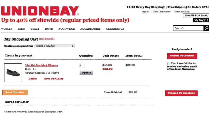
One of the most disagreeable things you can do to your customers is to keep extra fees (usually associated with shipping) hidden until the very last minute. People want to be able to calculate the entire cost of their order from at least an early point in the checkout process, and at best, from the before they even put something in their cart. Amazon Webstore client Unionbay provides a good example of their transparent shipping fee policy, by using a small banner in the header that’s visible from every page.
2. Being Forced to Register Before Buying
One of the most established ways to improve to checkout process is to make sure that customers don’t need to register for an account before they continue on. Make sure to respect the preference for guest checkouts, or go a step above and also allow them to use their social credentials to sign in, like Saturday. If you want to encourage registration, offer to save your customers’ details after they’ve made a purchase.
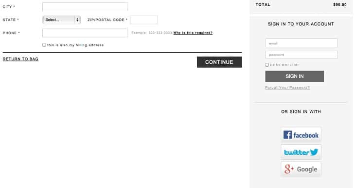
Another major reason why customers are hesitant to register with your site is because they assume that they’ll be forced to receive your newsletters. And with good reason; according to a survey of the top 100 eCommerce sites, a measly 8% actually ask their customers if they’d like to sign up.
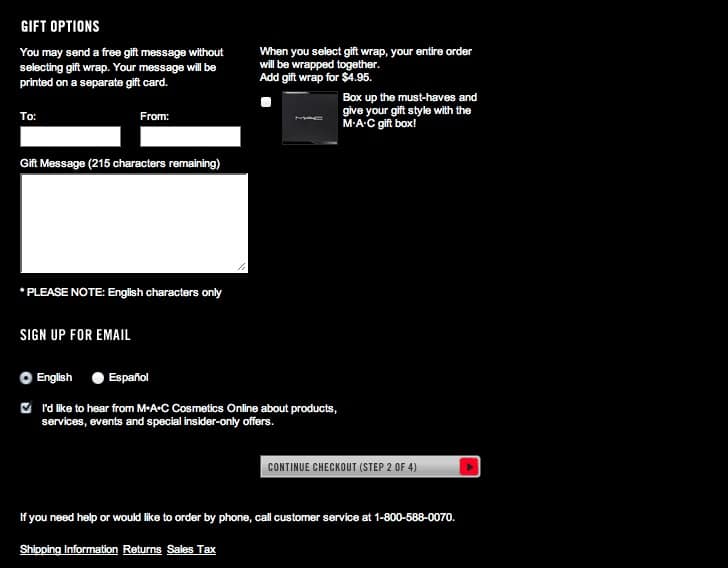
Another 11% don’t offer sign-ups in the checkout process at all. But the vast majority either present their customers with a pre-checked signup or worse, they don’t even clearly inform you that you’re being signed up.
On the one hand, this behavior discourages users from finishing their purchase. But on the other, newsletters have been shown to be effective in encouraging repeat purchasers. So while it’s easy to say that you should just get rid of a pre-checked signup, in reality it’s often worth it to merely give it more visual emphasis. This way, customers will be more likely to notice it and won’t feel tricked when they start receiving emails.
3. A Lengthy or Redundant Checkout Process
The average length of a checkout process is a little over 5 steps; so it’s a good rule of thumb to try not to exceed 5 steps on your site. That being said, it’s more important to focus on what your customers actually have to do in each step. An astonishing 50% of eCommerce sites ask for the same information twice in their checkout processes; try to eliminate this redundancy by eliminated by pre-filling fields.
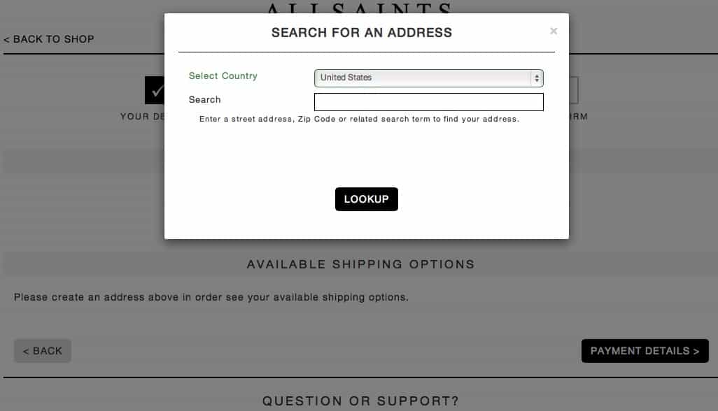
Look to large eCommerce sites for inspiration on how they streamline the process. Most sites, for example, allow you to enter your shipping address, and then simply check a box if the billing address is the same. This saves customers the extra step of entering in a redundant address. Even better, many other sites save every address you use for either category, and allow you to effortlessly toggle between them each time you purchase. Some sites like AllSaints even allow customers to enter their address on one line, and then pre-populate the regular form, saving them the hassle of clicking into each separate field.
4. Insufficient Contact Information or Help
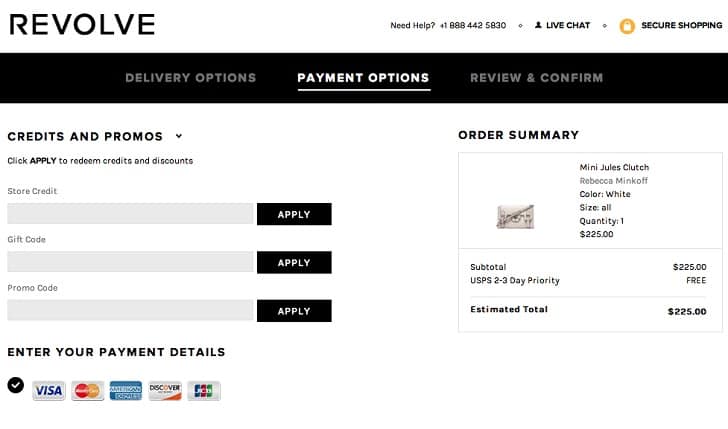
Most of the questions that your customers have pertain to the checkout process; after all, it is by far the most confusing aspect of the online shopping experience. So when a customer runs into problems and can’t immediately find the help they need, they’re likely to abandon their cart out of sheer frustration. The best way to avoid this is to keep your contact information clearly visible at every step in the process. Revolve does a great job of this by providing their phone number and a link to their Live Chat system right at the top of the webpage.
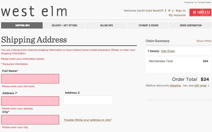
On the same note, it’s important to try and minimize the number of errors that your customers can make in the first place, so they don’t even have to reach out to you for help. Adding explanations of each input field can be a big help, as well as making sure that your layout is extremely clear and organized. Try sticking to one-column forms, as many people tend to pay less attention to the right-hand side of a two-column form, increasing their likelihood of making errors. And lastly, emulate form designs like West Elm’s, which makes error messages obvious by clearly indicating the invalid field as well as the nature of the error.
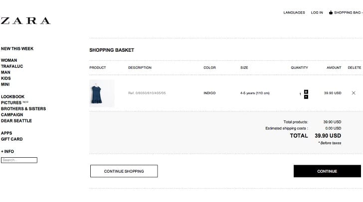
After you’ve covered all the basics, it’s still worth it to go further and make sure your checkout system in its entirety is as clear and simple as it can be. Don’t overlook small details, because the smallest ambiguity can be bewildering to the inexperienced web user. And confusion leads to frustration, which leads to abandoned carts. A checkout button like the one above that just says “Continue”, rather than “Checkout” might not seem like it’s too hard to figure out, but small tweaks in phrasing can add up to make a big difference. And once you’ve added up all these minor changes into a fast, easy and reliable checkout process, the result will be an eCommerce site that performs better on a major scale.
Want to learn more?
Are you interested in the intersection between UX and UI Design? The online courses on UI Design Patterns for Successful Software and Design Thinking: The Beginner’s Guide can teach you skills you need. If you take a course, you will earn an industry-recognized course certificate to advance your career. On the other hand, if you want to brush up on the basics of UX and Usability, try the online course on User Experience (or another design topic). Good luck on your learning journey!
(Lead image: Depositphotos)
