![]()
Incorporating the needs of users for a feature that has not explicitly been developed or used is a tough endeavor. Designing and developing the needs that surround beacon optimization comes from a contextual understanding of their function and the user’s needs. Yeah, it is kind of a hard one to wrap your brain around. A contextual understanding of a user’s needs is all about anticipation. Asking yourself, as a designer or developer, what a user ought to expect without expecting it, is key in contextual development.
Take for instance Google Calendar integration into Android. It prompts the user when he or she ought to leave for a meeting based on real time traffic and commuting preferences (by car, train, and even walking). It is automated and helps orient the user when they need to be oriented (in retrospect being prompted to leave for a meeting and arriving on time is usually a good thing).
The same goes for integrating context into beacon enabled or featured mobile applications. How should the user feel after a notification has been sent as a result of the user’s proximity to an actionable beacon? They should feel like the prompt was worth it in retrospect.
What are these Beacons anyway?
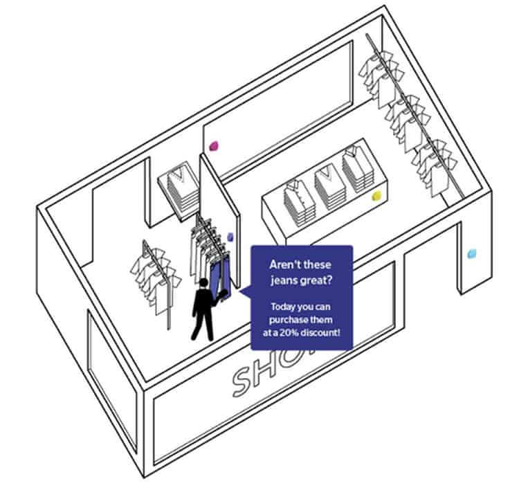
A Bluetooth-enabled beacon is a device that can send information and alerts to users based on proximity in a closed space. Grocery and retail stores can serve as a good case study. Say a user downloads his or her local grocery store application and the store itself has beacons enabled on the sales floor. As users walk by a certain aisle, they may be prompted that a particular brand of coffee has a ‘buy one get one free’ offer, and it was only prompted because they purchase this product regularly. This way the grocery store can help move inventory and the customer received a deal on a product they have proved to like before.
Beacons can deliver content to a mobile device based on user analytics, proximity marketing, indoor navigation, contactless payments, etc.
The beacon serves as somewhat of an in-location GPS. It’s dynamic in the sense that it can send information to a specific user based on where they are (in this case a store) and send this information based on prior user history.
Where they will be Used (for now)?
Just like in the example above, it is initially being marketed in retail locations. Companies like IKEA, Walgreens, and CVS who have very robust and feature-rich mobile applications have addressed the unique experience users might encounter in a store. Providing resources for those users when they shop, breeds brand loyalty and all that marketing value.
Those developers had to consider the problems an IKEA shopper may encounter, one of which is navigation. Each location is massive and often multi-floor facilities confuse shoppers. IKEA then included a floor plan in their app to help address this navigation issue. Google took it one step further and optimized in-store real time maps.
Google uses the GPS receiver in the mobile device to determine where the user is (as shown in the lead image of this article). This can be a bit of problem if there is no signal. A beacon solves this problem by creating zones (or trilateration for you usability geeks) and measuring the enter and exit logs from zone to zone. One moment the app shows ‘you are here,’ in bedding, and demonstrates where the pre-defined ‘kitchenware’ is on the map.
The beacon also works to send information to the user, unlike indoor GPS, like a coupon.

How Beacons will move Beyond Retailers
Prior to building an application, the research and discovery phase will begin to address if beacons are something to be added to the feature list. Industries that may take an interest in beacons include security, transportation, and even education. In the case of transportation, beacon-like tech has been integrated into key FOBs. So when a driver has it in his or her pocket and they approach their vehicle, the doors unlock. The context of this removes a step from operation that arguably improves the user experience.
Defining the context of a user experience could motivate libraries to integrate beacons to help direct visitors to their reference material. At last, Bluetooth beacons might be the answer to navigating the Dewey Decimal System.
But why Mobile?
Beacons can be stationary or can be taken with a user. The stationary receivers tend to be much bigger and have replaceable batteries that last a lot longer.

This piece of hardware has a larger range to work with, which is something that needs to be considered in the development phase. How will the user be sure to operate within a zone where they’re receiving information from? Sending a coupon for kitchenware needs to be limited to the kitchenware section, not bedding. Considering questions like this is central to the usability of such a soon-to-be-integrated feature in mobile applications.
The smaller version of the beacon fits on a key-chain. It can be programmed to work as a regular RFID card, but also connect to an app that displays all the various information about enter and exit times. Employees who clock in or out just wave the reader and that information goes right to the payroll department.

Start Research Now
Identifying how users will and can behave with beacon integration will enable better innovation and idealization. Using a contextual reference point for situations, a beacon prompt might be needed, be it for a calendar appointment, unlocking a car door, or clocking in for work, can improve the user experience of general applications greatly.
Want to learn more?
Want to get an industry-recognized Course Certificate in UX Design, Design Thinking, UI Design, or another related design topic? Online UX courses from the Interaction Design Foundation can provide you with industry-relevant skills to advance your UX career. For example, Design Thinking, Become a UX Designer from Scratch, Conducting Usability Testing or User Research – Methods and Best Practices are some of the most popular courses. Good luck on your learning journey!
(Lead image: Depositphotos)
