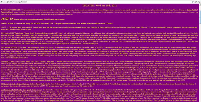
Web site usability is based on the factors that make it easy for a visitor to your website to accomplish his goals. For example, if someone wants to find your customer service contact information then a website maximized for usability will allow that information to be found in as few clicks as possible.
The average visitor to your website will spend less than one minute trying to find information. If it takes longer than a minute for your page to load, or it takes more than one minute’s worth of clicks to find what that person is looking for, then the visitor will leave your site and head off to a competitor’s website.
As you analyze your website, there are ways you can tell if your website is not maximized for usability. Paying attention to the mechanics of your website will help improve the amount of time people spend looking at the sales copy on your website.
Here are some key signs that your web site’s usability is not optimal:
1. Bad First Impression
For obvious reasons, one of the most critical aspects of web site usability is how your website loads and the way you structure your front page.
Your background color should be subdued and easy to look at. Your text color should always mix well with the background to make text easy to read.
Only use animated graphics where necessary. A user can become distracted by animated graphics and could find it difficult to navigate your site.
Many website use front page animation or embedded movies to add flair to the presentation. But if those elements take longer than a few seconds to load, then visitors will click away from your website.
If your website intro takes longer than five seconds to load on a high-speed connection using a standard PC configuration, then you need to change it.
2. Poorly Structured Links
If you link to web pages that are not on your website, then check your links at least once a week to make sure they are still functional. Broken links frustrate visitors and discourage people from coming back to your site.
Your menus should be limited to seven items. Any more than seven items will cause the visitor to become frustrated and assume that she will not be able to find what she is looking for.
3. Excessive Website Text

Look at your website text and see if you are using concise sentences that get right to the point. One of the ways that you can get people to stay on your site longer than 60 seconds is to offer facts and information in a compact format that is easy to read.
If your sentences are too long and your paragraphs are more than two or three sentences, then your content is not concise. Do not make the text format confusing for visitors.
When people see an underlined word on the Internet, they assume it is a link.
Use bold or italics for emphasis in your text and avoid using underlining for anything other than links.
Make sure that any important content is in the upper-half of the website. This will catch the reader’s eye and help to get your point across easier.
4. Lack of Consistency

If the colors, fonts, graphics and information are not consistent throughout your website, users will think they have gone to a different site. Create a page template that will allow you to give a consistent presentation and let users know they are on your website.
Another element of consistency that is sometimes ignored is information format. If you prefer to use an acronym to identify your company, then use it throughout the entire site.
If you include the mailing zip code for your company address on some of your website’s pages, then include the zip code each time you display the address.
When you get visitors’ used to seeing certain kind of information, then it can get confusing if you use different information formats throughout the site.
5. Complicated Navigation

Your website pages should be able to explain themselves and visitors should be able to access any main directory page in three website clicks or less.
The links on your pages should be easy to find and the link names should make sense. Use common terms such as “contact” and “about” so that visitors can find the information they are looking for.
Focusing on website usability helps to maintain and grow your web traffic. When you attend to the basic elements of a functional website, you increase the revenue that your website can generate.
Want to learn more?
Are you interested in the intersection between UX and UI Design? The online courses on UI Design Patterns for Successful Software and Design Thinking: The Beginner’s Guide can teach you skills you need. If you take a course, you will earn an industry-recognized course certificate to advance your career. On the other hand, if you want to brush up on the basics of UX and Usability, try the online course on User Experience (or another design topic). Good luck on your learning journey!
(Lead image: Valentin Antonucci via Pexels)
