
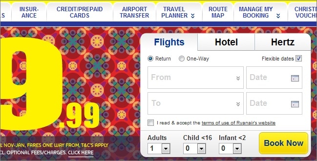
Tabs have long been used to show alternative views of the same group of information tabs in software. Known as “module tabs”, these are still used today in web sites. For instance, airline companies such as Ryanair, easyJet and AirMalta use module tabs to enable the user to switch between bookings for flights, hotels and car hire.
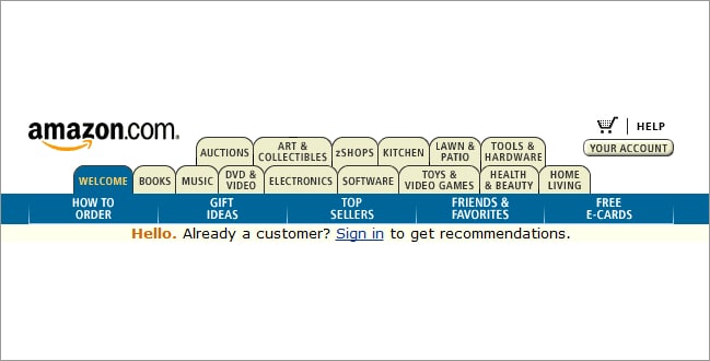
With the emergence of web sites, tabs started being used for navigation purposes. This technique was first popularized by Amazon in 1998. Although Amazon eventually dropped tab navigation in 2007, there are some excellent and creative uses of tabs in web sites for both modules as well as navigation. In this post I will be providing a list of 14 guidelines that you can use as a checklist to ensure that tabs on your web site are usable.
Why tabs are good for usability
When used and implemented correctly, tabs are considered to be an excellent User Interface (UI) control that contribute towards improving usability. This is because tabs:
-
- Are excellent metaphors: In UI terminology, metaphors are ideas or objects that are used to facilitate the familiarity between the user and the application. The use of tabs in the UI is an excellent metaphor since they look like real-world tab dividers in files or tabs on folders in a file drawer. Thus, it is more intuitive for users to know that these tabs are dividing content into sections and just like in real life, reaching for the tab (emulated on the web by clicking on a tab) will show the respective content.

-
- Improve content organization: Tabs divide content into meaningful sections which occupies less screen space. In this regard, users can easily access the content that they are interested in (rather than having all the content in paragraphs).
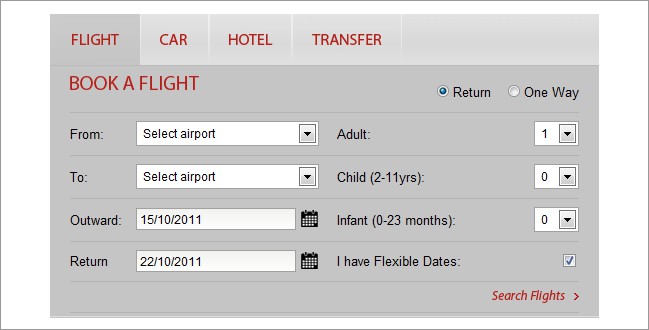
- Are visually pleasing: Implemented correctly, tabs can improve the visual aspect of a website. Due to their shape and functionality, they add an interesting UI element which is intuitive to use and also very hard to miss by users.
Usability Guidelines for tabs
I have compiled the following list of guidelines from various sources and through my own personal experience. Whilst there may be other guidelines and recommendations, I consider this list of 14 guidelines as being the most effective for ensuring tab usability.
-
- Tabs must look and behave like tabs: Users have have pre-conceptions of how tabs should look like and behave. These are a result of experiencing tabs both in the real world as well as online. Thus, any deviation from these pre-conceptions will naturally confuse them.
-
- Place navigation tabs at the top of the page: If tabs are being used for navigation purposes, it is best to place them in the topmost part of your web page. This is the where users expect to find them. Conversely, placing tabs at the bottom, on the sides or worse still, below the fold of your web page increases the likelihood that users will not see them. Remember that users will start ‘searching’ a page even before the actual content and layout of that page is loaded. Thus, they will focus on the top left segment of your web page, even before this has loaded because there they expect to find your site ID and primary navigation.

-
- Only have 1 row of tabs: Stacking tabs on top of each other, complicates the UI and makes it harder for the user to navigate. This guideline specifically refers to having two or more sets of tabs and does not include double tab navigation. The latter is in fact considered a good convention to introduce hierarchy within tabs.
-
- Always have one of the tabs pre-selected: This adds more impact to the tab, which is vital especially within the first few seconds.
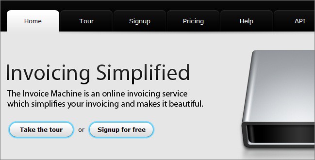
- Clearly indicate which tab is currently active: This can be done through the use of colour, by making the it larger than inactive tabs, by making its label bold and by making it appear in front of the inactive tabs. Also, ensure that the label of the active tab is clearly visible and readable.
- Clearly indicate which tabs are currently inactive: Ensure that inactive tabs are dimmed and/or faded. At the same time, make sure that they are still visible and their labels readable so that users can still see them and select them.
-
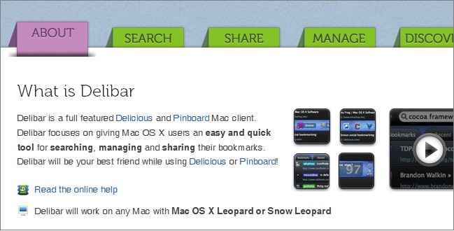
- The active tab should appear connected to the content area: So as to reinforce the real-life tab metaphor, you must make the active tab appear as being connected with the page containing its content. This is what users would expect with a filing cabinet.
-
- Arrange tab labels in an order that makes sense for your users: You should determine if there is an order in which your tabs should be presented so as to facilitate the use of your site. When carrying out this exercise it is important to adopt an outward looking view and place yourself in the shoes of your user. Thus, it is your user’s logic that should prevail rather than yours.
- Tab labels should be written in plain language: This makes it easier for users to scan and understand the tabs. In this it will be easier for them to predict the type of content that clicking on each tab will lead to.
- Tab labels should consist of 1 – 2 words: Labels on tabs should clearly describe their function or destination within 2 words at most. This ensures the likelihood that users understand the meaning of the tab, thus resulting in an error-free selection. Constraining yourself to 1 – 2 words will also help you in thinking more about selecting the best words for your tab labels.
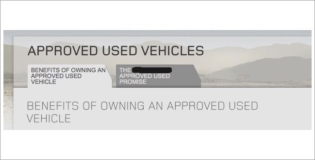
- Use title style capitalization: Tab labels should be written in title-case, that is, only the first character of each word should be written in uppercase. As with all text on web sites, it is not advisable to write the tab labels in all caps since this makes them difficult to read (although the negative effect in this case is less since tab labels should consist of just 1 or 2 words).
-
- Ensure fast response time: Users expect content to show up faster when clicking a tab (typically less than 0.1s), rather than when clicking a link. This can be achieved using AJAX by loading content in the background and making it visible on tab click. However, you can use any technique as long as the end result gives users the impression that a physical connection exists between their mouse click on the tab and the content that is loaded.
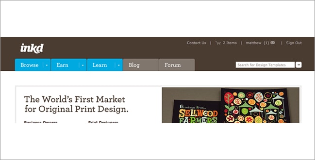
- Consider “grouping” related tabs: If you have several tabs you may want to group related tabs. In such cases, the use of additional cues such as color can come handy. However, as always, never rely on color alone as a cue. This is because up to 10% of users have some form of colour blindness whilst a percentage of users will still fail to perceive the reason why you used color.
-
- Do not use tabs to replace breadcrumbs: Although tabs can be used to explain where you are and where you can go within a web site, they should never be used as a replacement to breadcrumbs. Breadcrumbs show a site’s hierarchy – something which is impossible to render if your site is more than 2 levels deep (i.e. Home > Level1 > Level2). Users recognize both tabs and breadcrumbs when they see them and they know how they should behave. Using one to replace the other will negatively affect your site’s usability.

Useful Resources & Inspiration for this Post
- Module Tabs in Web Design: Best Practices and Solutions by Jacob Gube
- Showcase Of Well-Designed Tabbed Navigation by Matt Cronin
- Tabs, Used Right by Jakob Nielsen
- The History of Amazon’s Tab Navigation by Luke Wroblewski
Want to learn more?
Are you interested in the intersection between UX and UI Design? The online courses on UI Design Patterns for Successful Software and Design Thinking: The Beginner’s Guide can teach you skills you need. If you take a course, you will earn an industry-recognized course certificate to advance your career. On the other hand, if you want to brush up on the basics of UX and Usability, try the online course on User Experience (or another design topic). Good luck on your learning journey!
(Lead image: Depositphotos)
