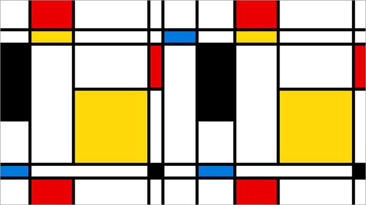
Barring a freshly cleaned whiteboard or the latest version of Sketch, one of the most invaluable tools in a user experience designer’s toolbox is the grid layout. Ancient as design itself, grid theory is both the first line item on the Design 101 syllabus and the first diagram a seasoned UX vet sketches out.
Its utility is evidenced not just by its ubiquity, but its efficiency. Grid layouts have formed the foundation for clean and consistent interfaces since the printing press. They are not only effective at organising information but are so commonplace in both print and digital design that the user instinctively knows how to navigate interfaces that adhere to them.
However, because of their popularity, grid-based designs can sometimes appear uninspired, or even boilerplate. Critics claim they can stifle creativity and impede more innovative design techniques, citing the (literal) boundaries they impose.
As such, one of the ways UXers like to inject some novelty and flair into their designs is by breaking the grid layout. Done correctly, this result can be an eye-catching, visually breathtaking UI design. Done haphazardly, and you have thrown a wrench into your interface. In this article, we cover four different techniques you can use to break the grid the right way and create an innovative user experience.
Using Containers
Just because you are fragmenting your grid layout does not mean you have to sacrifice the organisation of the page’s content and information. By grouping elements into containers, you can break out of the grid while preserving a clean structure, and potentially even keep symmetry.

Take a look at Canatal, a steel fabrication and installation company that repurposes its margins to act as containers, as well as two large boxes layered atop each other. It is easy to see how this could have been a much plainer design, but just by breaking the grid, Canatal injects visual interest.
Careful Layering
Similar to containers, layering is another effective way to ignore the grid and preserve cohesiveness by grouping elements together. Unlike containers, however, more care needs to be taken with layering – it is more than just slapping a square border around components and calling it grouped.
Layering can be tricky, but it is still a fairly common technique in modern web design. Awwwards‘ esteemed Site Of The Day, a daily spotlight of masterful UX/UI design, is littered with examples of sites using prudent layering. My favourite of the bunch is Cure Nails.

It may not be the most effortlessly usable experience, but the layering of soft pastel colours with high-res photography makes for a stunning aesthetic. Like perfectly manicured nails, what it lacks in utility it more than makes up for in beauty.

Playing With Whitespace
If your grid-busting design is looking too unbalanced, consider adding some whitespace into the design. By changing the amount and placement of whitespace, you can drastically emphasise, or even change, the focus point.
This technique is especially useful for online retailers and other eCommerce sites, especially when they want to highlight the colour or appearance of their product. Here is an example from shoe company Volta which does precisely that:

The New York Times’ collaboration with Google Cloud offers a much more ambitious use of whitespace, pairing it with floating black and white images and a simple thesis statement, centred in bold.

Gutters And The Masonry Effect
In grid theory, ‘gutters’ refer to the spaces in between the cards, tiles, or whatever objects are populating the grid. Their role is to provide breathing room, acting as a buffer between components and ensuring the design does not feel cramped or clogged.
However, it has been increasingly popular for designers to mess with the gutters to break the grid and add some freshness to the experience, with some even doing away with it entirely. Take a look at the Polish site Randstad, a quiz that tests the user’s ‘profession fulfilment’.

When you eliminate gutters, it is essential to clearly define the elements as to avoid clutter and user confusion. Randstad accomplishes this with highly contrasting bright colors – the boundary between elements is unmistakable.
Another method for messing with gutters is the aptly named masonry effect, which positions elements in a way that resembles brickwork. Popularised by Pinterest, this grid-defying layout maintains the organisation of the grid, while delivering something a bit more eye-catching.

Grasping The Grid
There are other ways to break free from the constraints of the grid. The four techniques discussed here are to get you started. To review, you can deviate from the grid layout by:
- Grouping design elements into containers
- Creating different layering combinations
- Using whitespace
- Adjusting (or removing!) gutters
However, before you attempt any of them, you should have a thorough and firm understanding of grid-based design.
You need to learn and understand the rules before you can break them.
Want to learn more?
If you’re interested in the intersection between UX and UI Design, then consider to take the online course UI Design Patterns for Successful Software and alternatively Design Thinking: The Beginner’s Guide. If, on the other hand, you want to brush up on the basics of UX and Usability, you might take the online course on User Experience (or another design topic). Good luck on your learning journey!
(Lead image: Depositphotos. All other photos in this article are screenshots taken when visiting the respective websites. They are being shown in this article for explanation purposes.)
