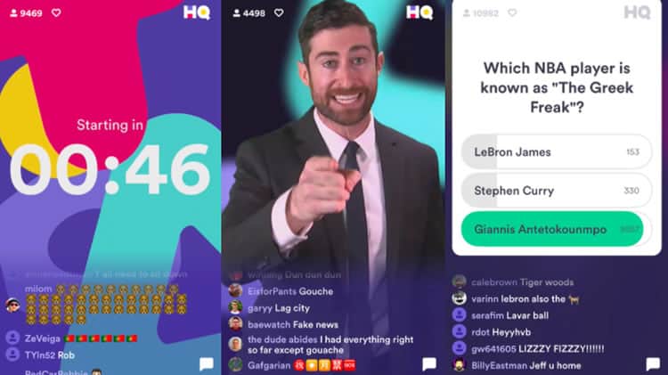
Dear reader, I am sad to report that I have been dragged back in. At first, I had dismissed it as a fad, another Flappy Bird or Trivia Crack. Then, after tentatively dipping my toe in its waters, I found myself hopelessly addicted. This lasted for about two weeks, before sheer ineptitude, both from myself and from the app, managed to break me from my trance. So now, the mobile trivia app simply known as HQ Trivia has me in its clutches again.
If you have yet to be indoctrinated as an HQ Trivia fanatic, or, using host Scott Rogowsky’s term, an ‘HQutie’, the premise of the game is simple: correctly answer twelve multiple-choice trivia questions in a row and win money. It is the tried-and-true Who Wants To Be A Millionaire model, but HQ Trivia’s cribbed game show format does not stop there; HQ Trivia games are aired live, twice a day, mostly acting as a television program that users tune in to and actively participate.

The HQ Trivia model has crafted a new blueprint for mobile platforms, one that has taken the popular live streaming experiences found in apps like Periscope, Instagram, and Facebook, and followed it to its extreme: an application with a user experience that exists entirely in real time.
With just a handful of screens and only one basic user flow, the HQ Trivia app makes an especially intriguing example for app developers looking to replicate its success. As a UX design agency, we at Codal will be taking a step back to examine what HQ Trivia’s unique user experience means for the industry landscape as a whole, and how the revolutionary gameshow app still has a few UX kinks to work out of its own.
UX Beyond The Designer
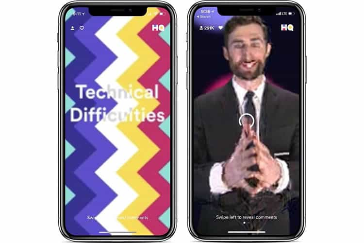
HQ Trivia recently celebrated a significant milestone in its takeover, hosting its inaugural sponsored games by partnering with Nike and Warner Bros. Brokering multi-millionaire dollar deals with these marquee enterprises heralds a bright future for HQ Trivia, but the app continues to struggle with technical difficulties and scalability issues.
In its nascent stages, with players numbering just a few thousand, games would regularly run without a hitch. However, the audience grew faster than HQ Trivia could handle, and the app paid for it dearly when it advertised games with its most substantial cash prizes ever, only to experience delays, bugs, glitches and lagging that made it all but impossible for players to join.
It is likely that the onus of these technical difficulties lies on HQ Trivia’s development team, but they result in poor user experience for the trivia app. The issues plaguing HQ Trivia serve as an excellent reminder that quality UX goes beyond the designer.

This may seem self-evident, but because UX design and development are often separated into two distinct processes, it is easy to forget just how intertwined the two are. It is part of the reason so many companies choose to build their digital products at a full-stack agency – to avoid the issues that arise from entirely disparate design and development teams.
But even when design and dev are housed under the same roof, project handoff between the two teams can still be a complex affair. It requires complete transparency, meticulous documentation, and a constant channel of communication.
This is not to say HQ Trivia suffered from a poor handoff procedure, but the app’s technical difficulties are weighing down its overall experience is an excellent reminder that we cannot divorce design and development as easily as we tell ourselves.
The Multi-Platform Release
“Do I release my app on iOS first, Android first, or both?”. It is a question we hear all the time at Codal, and a constant source of debate amongst entrepreneurs, developers, and designers alike. HQ Trivia’s emergence as a mobile app startup does not definitively answer the question, but it does add an interesting data point to the argument.
HQ Trivia was initially built for iOS devices only, with the Android version planned for release much later in the company’s business plan. However, after the exponential growth HQ Trivia experienced near the end of 2017, thousands of Android users vying to play the trivia game were disappointed to find out no counterpart to the iOS version existed.

This Android-sized hole in the market space, coupled with HQ Trivia’s in-game glitches and laggy live streaming, soon led to a groundswell of HQ Trivia competitors, including the Cash Show, Beat the Q, and perhaps most notably, The Q.
From its shoddy production value to an audience dwarfed by HQ Trivia’s user base, The Q has been classified as a knock-off. However, that does not mean it is harmless to the original mobile game show it is aping. The mere fact The Q exists is a testament to HQ Trivia’s failure to scale correctly. With a timelier release for Android, bargain bin copies like The Q may never have stolen a chunk of HQ Trivia’s users at all.
The Bottom Line
At the end of the day, all of the issues plaguing HQ Trivia – the glitches, the lagging, the late Android release — can be traced back to a single culprit: scalability. HQ Trivia embodies the problem of getting too big, too fast. It is indeed not a severe problem to have, but it is a problem nonetheless.
And not only does HQ Trivia demonstrate the extreme version of the growing pains every burgeoning business undergoes, but it also shows the impact these flaws have on the user experience. HQ Trivia is not a popular application because of its UX; it is popular in spite of it.
If HQ Trivia wants to continue its success, it is going to have to do more than keep raising the stakes with fatter cash prizes. It will need to ensure its technical difficulties do not scale with its booming user base, and it may need to bolster its user experience with more engaging functionality, whether it is growing a community through social features or even debuting different kinds of games.
That being said, whether HQ Trivia continues its meteoric rise, or eventually falters, we will be able to learn from its mistakes and its successes. Until then, you can find me torn between playing to win that cash prize and tuning out to avoid that clunky, choppy user experience.
Want to learn more?
If you’d like to become an expert in UX Design, Design Thinking, UI Design, or another related design topic, then consider to take an online UX course from the Interaction Design Foundation. For example, Design Thinking, Become a UX Designer from Scratch, Conducting Usability Testing or User Research – Methods and Best Practices. Good luck on your learning journey!
(Lead image: Depositphotos – affiliate link)
