Terrible puns aside, a website’s footer contributes much more to the user’s experience than most realise. Usually demoted to a last-minute afterthought in the design process, many web design agencies fail to leverage the oft-overlooked footer to its full potential.
However, that is a significant missed opportunity. Because a footer is not a bumper sticker to slap on the end of your website – it is a UX safety net. If a user scrolls through the entirety of your homepage, and still cannot find what they are looking for, your footer becomes a safety valve. It is the last chance to capture the user before they give up and take their clicks elsewhere.
So instead of watering down your footer to a cookie-cutter template, why not take full advantage of one of the most untapped resources in web design? Here are a few tips to ensure your footer remains optimised and operating at its full potential.
How Important Is The Footer?
Before we delve into the nuts and bolts of footer design, let us substantiate my claim that your footer holds much more power than you realise. Conventional wisdom says to prioritise your site’s content by placing the most important content above the fold; after all, that is where your visitors’ eyes are going to be on the most.
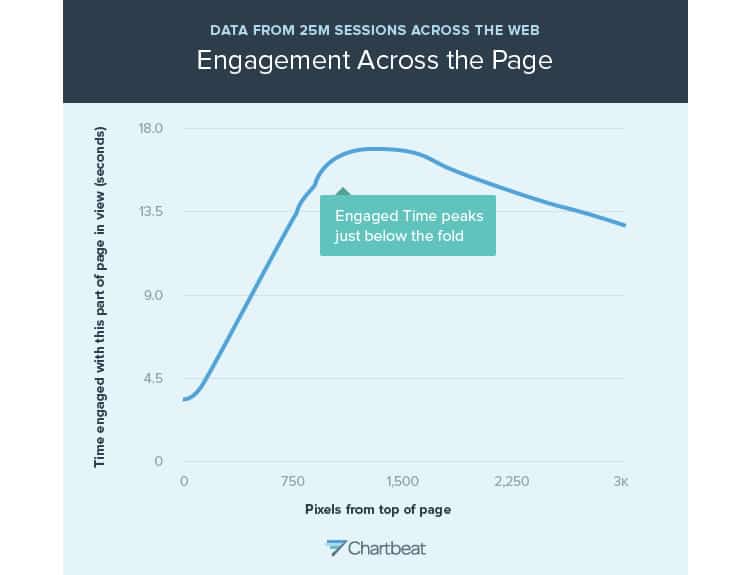
That is still true! However, that is not where users are spending the most time on your page, or even where they are engaging with it. Take a look at this figure from Chartbeat, which collected data from twenty-five million different web sessions and plotted engagement time against how far down the page the user was.

While admittedly counterintuitive, the data reveals that engagement actually peaks below the fold and that the engagement dropoff as the user scrolls is not as steep as you may think. In other words, the myth that a visitor on your website will not see the footer is just that: a myth.
Moreover, because the user’s eyeballs are trained on it, the footer suddenly gains some significant power. So much so in fact, that one study found that injecting a few call-to-actions in their footer resulted in a whopping 50% increase in conversion rate for those CTAs.
Armed with this knowledge, we can set off to design an optimal footer that enhances the website’s entire user experience.
Keeping Balance
We have already established the footer’s role as a kind of last resort for your site’s navigation, but that does not mean you should cram your entire sitemap into it. Instead, you should stick to two extremes: fundamental components of the site that everyone needs, and extraneous information relevant to only a small subsection of your visitors.
It is a strange combination, but it ensures your footer serves dual purposes: a place to stash essential, but not necessarily popular content (career pages, terms of service, a privacy policy), but also a hub for your site’s most core functionalities.
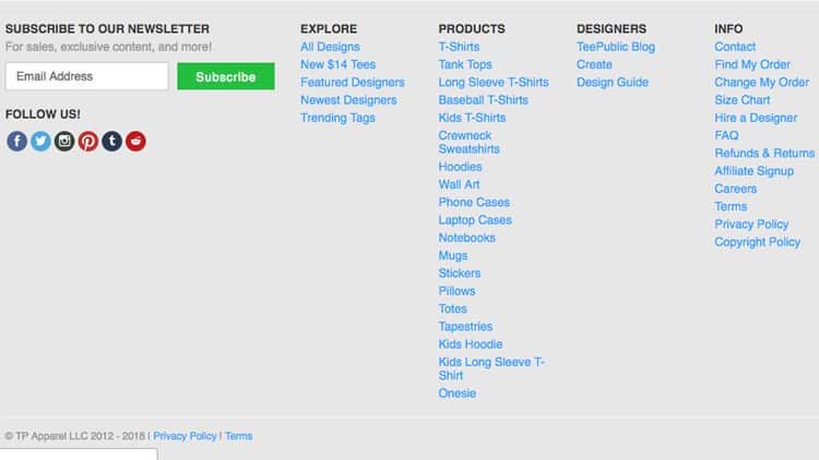
What you do not want to do is what TeePublic has done here: pack the footer with their entire product catalogue.

After whittling down the content to go in the footer, you will need to de-clutter it some more with some negative spacing. A conventional design technique, adding negative space to the footer is a quick way to increase the readability and overall aesthetic of the entire user experience.
Additional Content
Now that you have included both the essentials and the auxiliary content in your footer, it is time to boost its conversion capabilities with some prudent content strategy.
First, let us revisit the study that discovered an enormous increase in conversion by including a few prime CTAs in the footer. Calls-to-action here should not be related to your site’s primary goal, but it is an excellent opportunity to entice the user with secondary milestones in your marketing funnel, whether that is subscribing to a newsletter or entering contact information.
If you are going to be imploring the user to enter their email, or any other contact information, be sure to include some enticing copy, whether that is simple statistics (how many have subscribed), or what they will be receiving and how often they will be receiving it.
Also, we cannot talk footers without touching upon social media. There is a reason the icons linking to your company’s Twitter, Facebook, or LinkedIn are relegated to the bottom of the page. Once the visitor has clicked one of those social media time sucks, it is unlikely they will remember to return to your page.
Despite this, it is still necessary to include those social media icons somewhere on the page, and the industry consensus seems to be that the footer fits the bill. That is probably why OrbitMedia found that 72% of websites surveyed had their social media links at the bottom of the page.
Organise & Optimise
Now you have prioritised your footer content and determined what should and should not be included, how do you organise it?
The word of the day is columnise. A conventional technique used in footer design, organising your content links into columns helps to optimise space and create a logical hierarchy. The practice not only increases readability but also enhances your footer’s ability as a safety net.

Moreover, to further optimise your footer’s effectiveness, why not take the opportunity to strengthen your website’s search engine ranking? While the footer is decidedly not the place for keyword salad, one marketing firm in California found that footer links on the home page did boost their page rank.
Started From The Top And Now We Are Here
The idea of optimising the footer, a seemingly insignificant component of your website, might sound laughable. However, at Codal, we believe that user experience is holistic. We believe that every element, every line of copy and every pixel, adds up to more than just the sum of its parts.
The best user experiences are the ones where every piece of the website, from the header to the footer, are working together to serve the user. That alignment is what creates seamless experiences for your site’s visitor, and that is why, yes, even the footer is crucial.
Want to learn more?
Are you interested in the intersection between UX and UI Design? The online courses on UI Design Patterns for Successful Software and Design Thinking: The Beginner’s Guide can teach you skills you need. If you take a course, you will earn an industry-recognized course certificate to advance your career. On the other hand, if you want to brush up on the basics of UX and Usability, try the online course on User Experience (or another design topic). Good luck on your learning journey!
(Lead image: Depositphotos – affiliate link)
