Should you happen to ask your average UX designer to rank their favourite kinds of projects to work on, ‘digital financial services platform’ would probably not land in the top five. Perhaps, not even the top twenty, or even the top fifty.
Most designers do not get particularly excited about studying federal banking regulations or accounting for the complex bureaucracy that often accompanies fintech platforms. When you take a group of creatives and force them to learn about the minutiae of compliance standards or the intricacies of tax audits, you start to see their eyes glaze over.
Not only fintech is unglamorous, but it can also be challenging to design for. Project requirements are often meticulously detailed and riddled with industry jargon, and designers must strike a precarious balance between effortless usability and ensuring an errant tap does not leave the user in financial ruin.
So while designing for fintech may seem impossible or uninspiring, remember to think of it as a challenge, not an obstacle, and try to keep these four other tips in mind as well.
1. Factor In The Future
While generally good practice for any platform you are creating, factoring in the future is imperative when designing for fintech, primarily because the industry is in a near-constant state of flux.
We are in the midst of a digital revolution in the banking and investment sectors as they attempt to catch up to other, much more rapidly modernising spaces. Banks, credit unions, and financial institutions experience fast, and sometimes volatile change as their relationships to one another are reshaped by new technology.
What does this mean for your design? At a high-level, it means leaving ample room for future changes. A recent example: when the US government restructured its NAFTA deal, new tariffs were placed on specific items shipped between the U.S. Canada. This had significant complications for a project I had been working on. We needed new logic for tariffed items and even had to tweak the design to better explain and display the added cost to the buyer.
Granted, this was an eCommerce example – not precisely fintech. However, the principle is the same, and financial regulatory laws can get much more complicated than a simple tariff. Remember to stay up to date on the regulations relevant to the experience you are designing, and consider factoring in potential future changes as well.
2. Remember The Power Of Friction
Earlier this year, as part of Codal’s UX Case Study series with Usability Geek, I analysed the interface and user experience of the robo-investor Acorns, a popular fintech app. There is a lot to like about Acorns from a usability perspective, but one of their savvier design choices was intentionally making some of their processes harder to complete.
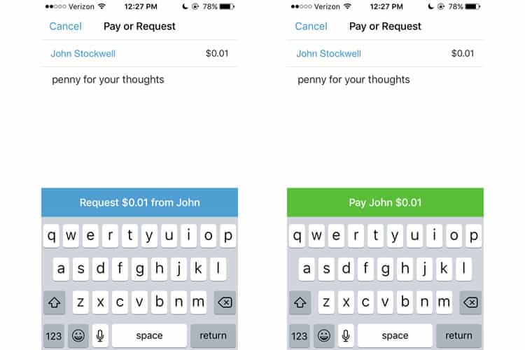
Increasing user friction for specific tasks is a pillar of fintech UX design. The inherent appeal of fintech is the ease of use, but it cannot be so effortless that it is easy for users to make mistakes with their money. We saw this in the Venmo case study as well. The payment app adds an extra step to sending money by forcing the user to confirm their action.

Design roadblocks like these help curb user mistakes and prevent disastrous errors. It impedes your users momentarily, but not their overall experience. Your users will thank you for making things a bit harder as they want to know their money is in safe, trustworthy hands.
3. Feedback, Feedback, Feedback
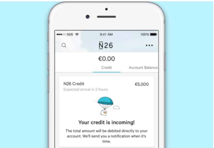
Another tenet of usability, providing responsive feedback to the user is crucial in nearly every permutation of UX design. However, for fintech, it is not just prudent – it is absolutely necessary, and for the same reasons, friction is so imperative in fintech design as well.

Users, especially ones who are not digital natives, are going to be much more reluctant to entrust an app with control over their finances. When interfacing with any financial services platform, whether it be banking, investing, budgeting, or anything in between, the user is going to require near constant reassurance and validation that their information is safe and that the tasks they are completing are in fact, achieved.
4. Facing FinTech
Designing digital experiences for the financial sector can be frustrating, and not always exciting, but it does offer a fantastic opportunity for designers to tackle challenging, real-world, and relevant UX problems.
When I asked the user experience designers at Codal, the UX design agency I work for, about the projects they learned the most working on, nearly all of them mentioned the web app we built for an enterprise financial services company just last year. The project featured everything we talked about in this article: complicated logic, tons of red tape, and a highly technical workflow that required some serious studying of financial workings.
However, in the end, our designers pulled off an engaging, user-friendly platform, and learned a lot in the process. So for your fourth and final thing to remember when designing fintech: do not forget it is making you a smarter, better designer.
Want to learn more?
Want to get an industry-recognized Course Certificate in UX Writing, UX Design, Design Thinking, UI Design, or another related design topic? Online UX courses from the Interaction Design Foundation can provide you with industry-relevant skills to advance your UX career. For example, Design Thinking, Become a UX Designer from Scratch, Conducting Usability Testing or User Research – Methods and Best Practices are some of the most popular courses. Good luck on your learning journey!
(Lead image: Depositphotos)
