
The fintech sector is a jam-packed market, flooded with tech companies vying to simplify an industry known for being a convoluted knot of regulations, bureaucratic protocol, and red tape.
Creating a quality fintech user experience can be a nightmare for designers, so much so that we recently felt the need to lay out specific design guidelines for it.
Social media is a digital arena that many have entered and few have conquered, a force so indelibly influential on humanity that in 3000 years historians may very well define our era by it, like the assembly line to the Industrial Revolution.
It is a tale of two industries in this instalment of UX Case Study, and a standout app from either one of these genres would make an excellent candidate for our UX dissection. Both present notoriously tricky and disparate challenges for user experience designers.
So instead of deciding between the two, I decided to cover an app that straddles both.
The Venmo App
You could measure the runaway popularity of Venmo by its enormous user base, or by the number of transactions it processes daily, but I think the most indicative benchmark of its success is an achievement most companies only dream of brand verbification.
“Just venmo me”. “I venmoed you the rent.” “I’m venmoing you now.” Venmo has ingrained itself into our cultural lexicon, so they are definitely doing something right. But is that something UX? To find out, I downloaded Venmo in iOS and dove into an app that combines two of the most infamous industries in the UX game.
Onboarding
Upon opening the app, we are greeted with one of the more intriguing sign-up screens I have come across. The interactions are conventional – there is an emphasised ‘Sign up with Facebook’ and a less encouraged ‘sign up with email’, but the majority of the screen is dedicated to what appears to be a live global feed of Venmo transactions.
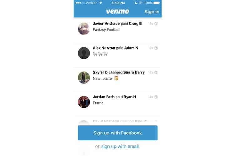
The actual purpose of this feed is not an uncommon strategy. It is mainly demonstrating the app’s value by showing its popular day-to-day use cases, but rarely is this done by broadcasting an actual feed. It is much more typical to see, say, a background video of someone using the app, like Bumble for instance.
Personally, I think this is rather cool. Though I have to imagine there has to be a sort of intensive screening process performed by some algorithm to ensure NSFW content does not flash across the signup screen.
The fact that users can sign up with Facebook is also significant. Like the global feed, it demonstrates Venmo’s desire to position itself as a social platform.
I do not think fintech apps would do this because they are more concerned with conveying the privacy and security of their users’ financial information, something a Facebook login option may not project. I would bet a majority of users would never conduct any financial business on Facebook, so I am not going to do it here. I tap “sign up with email”.
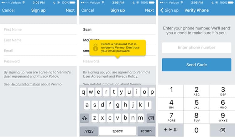
We have got some boilerplate form-filling here, nothing especially remarkable. When I go to complete the form, we see Venmo’s fintech side start to shine, utilising an overlay that asks us to select a secure password, and then following up with two-factor authentication via mobile.
And unfortunately, our onboarding process ends here. I attempt to enter my phone number, and am promptly rejected, with the app informing me that my phone number is already associated with another account (my personal one). So while a bit premature, I will skip ahead to the meat of the application.
Venmo’s Feed
Taking cues from social media UX principles, Venmo’s central interface employs a feed-centric layout, dedicating nearly all of the screen’s real estate to a stream of payments. Analogous to tweets or snaps, payments are the standard unit of Venmo’s content.
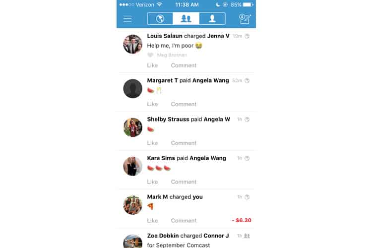
As a user, I can like or comment on Venmo payments, though I cannot view the transaction amount unless I am one of the involved parties. Those payments are clearly denoted with a dollar amount highlighted in either green or red.
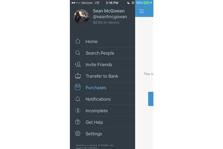
Venmo has also chosen to declutter their interface by using a singular navigation bar, located at the top of the screen. It tidies up the interface’s hub, but at a cost that becomes evident when you tap the hamburger menu on the top left – it looks like the designers crammed all miscellaneous functionalities into it.
For now, let us focus on the three icons centrally located in the navbar, ostensibly grouped together by a shared border. These three buttons toggle Venmo’s feed: the single silhouette on the far-right represents my payments, the centred one are my Facebook friends, and the leftmost globe represents, well, everyone else.
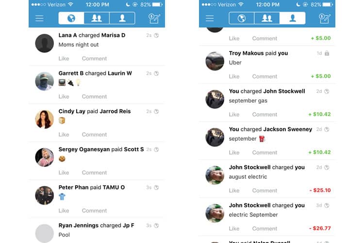
The iconography tracks, but to be honest, I do not see any value in viewing transactions that total strangers are completing. Venmo thinks itself a social platform, and that means forging connections between strangers. But the user content it offers is not relevant to me, and I do not see why anyone would care about it. (If I am missing something here, please let me know in the comments!)
In contrast, the ability to filter my feed to display only my payments is a great feature. It is especially useful for tracking monthly transactions between my roommates and I, such as rent or utilities.
Finally, it seems Venmo subscribes to the school of designers that believe the cornerstone feature of the application should be in the upper-right-hand corner, as that is where they have placed their function for completing or requesting payments.
Payments
As the foundation of their financial services, it is evident Venmo devoted a significant amount of time and effort into the process of sending and receiving payments, the starkest indicator being (in my opinion) an unconventional order of operations.
For starters, I think it is notable Venmo decided to combine both the pay and request functions in one feature. To me, this is counterintuitive. My first inclination would be to sequester those functions as much as possible, to avoid users mistakenly sending money they meant to request, or vice versa.
But Venmo not only couples those functions together, but they also make it the final option to toggle before the transaction. It is a strange choice, made stranger still because it works.
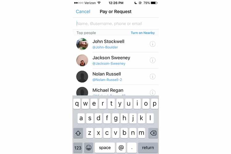
Transactions start by selecting a user to interact with, which Venmo expedites by:
- Leveraging the default text to inform the user they can find their friends in a myriad of ways: name, username, phone or email
- Offering a “top people” list, based on the users you interface with the most
- A “Turn On Nearby” feature, which harnesses the smartphone’s Bluetooth function to identify users based on proximity
Together, these features make it effortlessly easy to find the person you want to pay, though their prominence on the screen is a bit unbalanced. Manually searching only needs a text field, but the ‘top people’ function dominates the screen, relegating the “turn on nearby” feature to a small link that is easily overlooked (I honestly did not notice it until writing this case study).
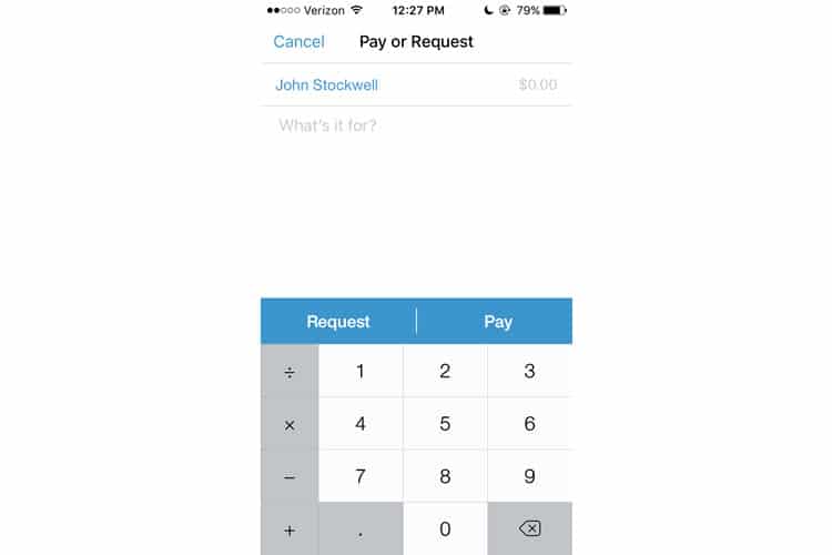
After selecting a user, Venmo continues to delay the choice between pay and request, instead of prompting us to enter a dollar amount and a reason for the transaction. Not much to discuss here, though the ‘replace with emoji’ feature is a nice touch.
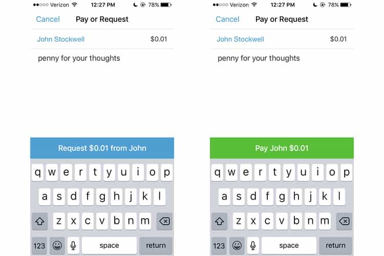
With all required fields completed, we finally get to choose if we are paying or requesting our money. Venmo has to strike a tricky balance here: this needs to be simple enough so that it does not confuse or inconvenience the user, but not so effortless that accidental transactions become a common issue.
Personally, I think Venmo manages to thread the needle. It requires two taps to complete a transaction, and while the “Pay” & “Request” buttons are adjacent, the buttons are large enough so that my sausage thumbs do not mistakenly hit either.
Once you select an option, the other choice disappears – the solitary versions of Pay & Request are different colours as well, which helps the user validate that they correctly chose their desired option.
Final Verdict
Venmo’s UX team cribs industry-standard techniques from both fintech and social media platforms. While some of their features are head-scratchers, especially an extremely prominent global feed, the application deftly delivers what it promises from the get-go: simple, hassle-free payments.
I would not say the user experience fits a description of the “fun” mobile application Venmo has tried to position itself as. Some of its aesthetics are obviously echoing Twitter, but it is certainly more engaging than your run-of-the-mill fintech apps.
It will be interesting to see how Venmo evolves, especially with Apple now integrating Venmo’s fundamental functionality into their iMessages in iOS 11. To combat the tech behemoth entering their space, Venmo may have to embrace their social media roots further to differentiate, or keep improving on their user experience.
More from the UX Case Study Series
- UX Case Study: Google Maps vs. Waze Mobile Apps
- UX Case Study: Spotify Vs. Apple Music Mobile Apps
- UX Case Study: Acorns Mobile App
- UX Case Study: Lumosity Mobile App
- UX Case Study: Talkspace Mobile App
- UX Case Study: Zocdoc Mobile App
- UX Case Study: Calm Mobile App
- UX Case Study: Overcast Mobile App
- UX Case Study: SoundCloud’s Mobile App
- UX Case Study: HBO GO App
- UX Case Study: Venmo ? You are currently reading this
- UX Case Study: CNN’s Mobile App
- UX Case Study: ESPN’s Fantasy App
- UX Case Study: Duolingo
- UX Case Study: Bumble
Want to learn more?
If you’re interested in mobile UX, you could take the online course on Mobile User Experience. It includes templates you can use in your own projects and you’ll get an industry-recognized certificate to improve your career. If, on the other hand, you’d like to…
- learn all the details of Usability Testing
- get easy-to-use templates
- learn how to properly quantify the usability of a system/service/product/app/etc
- learn how to communicate the result to your management
… then you might take the online course Conducting Usability Testing.
Lastly, if you want to brush up on the basics of UX and Usability, the online course on User Experience could provide you with the necessary knowledge. Good luck on your learning journey!
(Lead image: Depositphotos – affiliate link. All other photos in this article are screenshots taken during usage of the Venmo app.)
